2024 Rebrand Report Card
Traina’s annual look back at the winners and losers of the year in rebranding.
2024 didn’t feature quite as many household brand overhauls as the previous year, but there were still a few bangers out there. Enjoy our second annual Rebrand Report Card—a look back at the best and worst rebrands of the year.

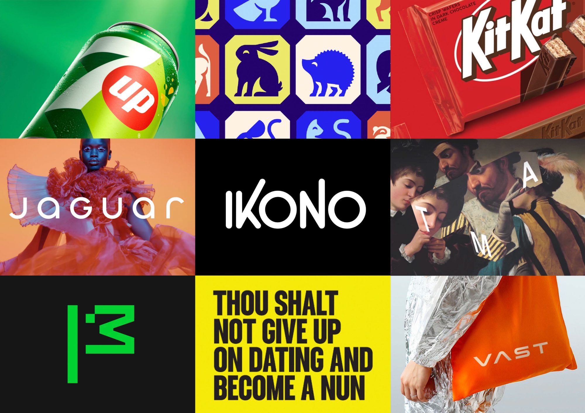
7UP: Fizzy moments of joy
Grade: A
Pepsi’s portfolio refresh began last year with the rebrand of its flagship soda, and continued in 2024 with the redesign of 7UP. Nothing radical about this rebrand, but the citrusy palette, upward energy, and punchy vibe all combine for a bright new look that is still 100% 7UP—with a modern twist.

Bumble: Don’t mess with nuns
Grade: F
Coined “The Bumble Fumble,” this dating app’s 2024 rebrand is a cautionary tale for companies thinking of shortcutting the important research and discovery phases of a rebrand. Lacking proper research, Bumble launched a rebrand campaign that not only failed to address the real frustrations of their users, but managed to disparage nuns and offend most women in the process.

RSPCA: Awwwwwww
Grade: A+
We love a good legacy brand refresh, and the RSPCA rebrand, the first in 50 years for the world’s largest welfare animal charity, does not disappoint. More than just a modernization, the rebrand is rooted in comprehensive research, designed to reconnect with society, and engineered to support the charity as it tackles unprecedented animal welfare challenges.

Toledo Museum of Art: Ultra-modern heritage
Grade: A
Sticking with the legacy theme, we’re big fans of the new TMA system. The rebrand was a much-needed update and departure from its previous system, which was clunky and dated. The new visual identity is dynamic, dimensional, unpredictable and, in execution, strikes a perfect balance of emphasis between museum identity and featured art.

KitKat: Break me off a piece
Grade: B
KitKat has joined the chorus of food brands opting for a retro look with their recent rebrand. More of a tasty refresh than a complete rebrand, the focal point of this update was the logo, which features straighter, chunkier type that is designed to look as if it’d give a loud, tasty snap if broken in two.

Jaguar: An automotive hail mary
Grade: TBD
A lot has already been said about this circus. The vast majority has been negative, and perhaps rightfully so, but we’re going to give the executives at Jaguar credit for having the courage to pull the trigger on what they surely knew was going to be a controversial scorching of 100 years of heritage. But with sales in a death spiral, this desperate last-ditch attempt at relevance might yet turn out to be a stroke of brilliance. As Jaguar’s chief creative officer Gerry McGovern stated, “We’re delighted to have your attention.”

Mozilla: Fun with ASCII
Grade: A
For fans of early web aesthetics, there’s much to love about this new system from internet trailblazer Mozilla. From the black and white palette to the cleverly pixelated logomark and mascot, Mozilla’s new brand identity is a nostalgic system that delivers on their brand strategy to “reclaim the internet.”
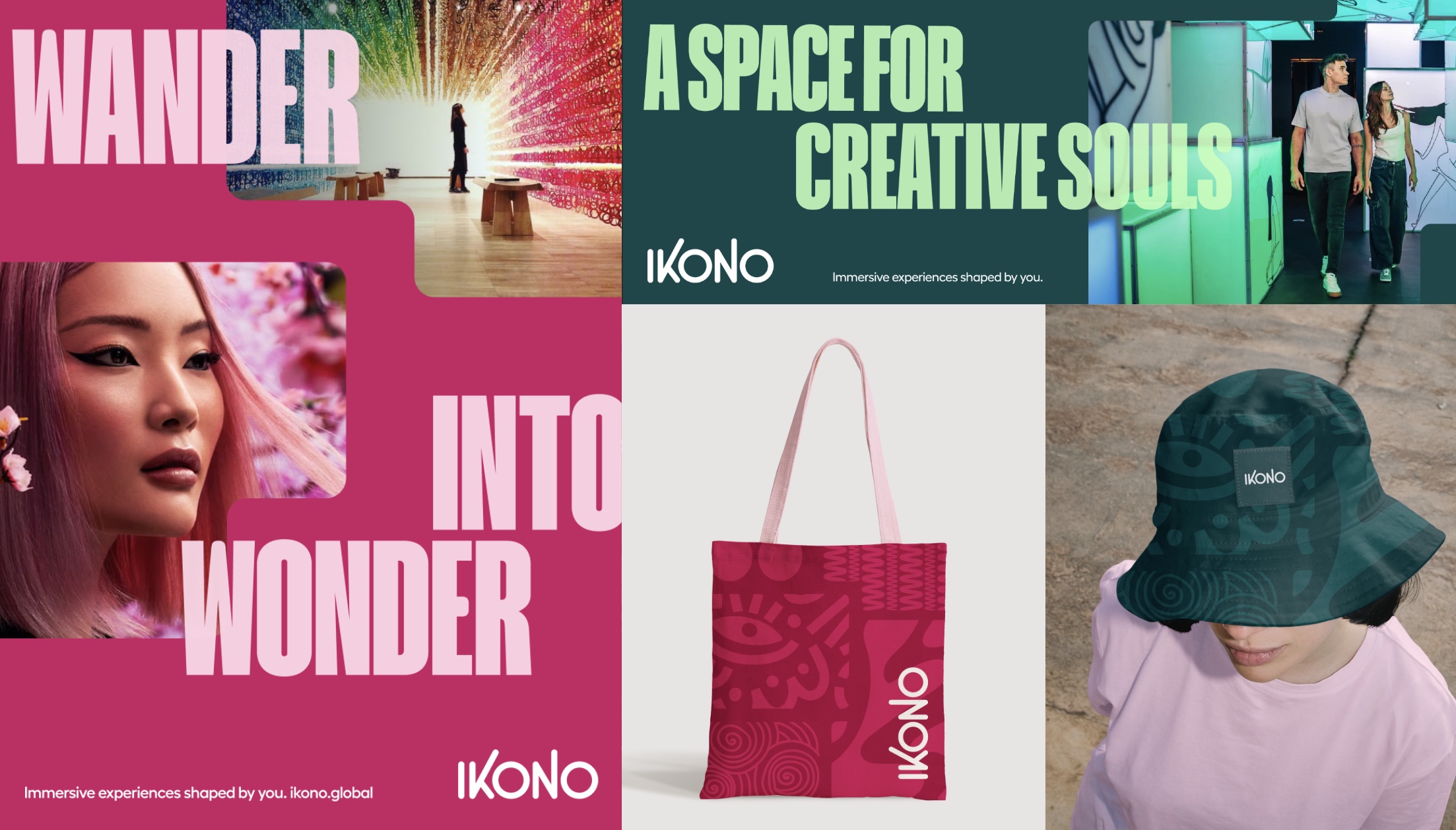
IKONO: Redefining immersive
Grade: A+
Maybe some bias here, but the IKONO rebrand was one of our team’s favorite projects of the year. The new identity combines a vibrant palette, unique shape library, custom illustrations, bold type, and a playful voice to showcase IKONO’s eclectic worlds that combine art, play, and the unexpected.
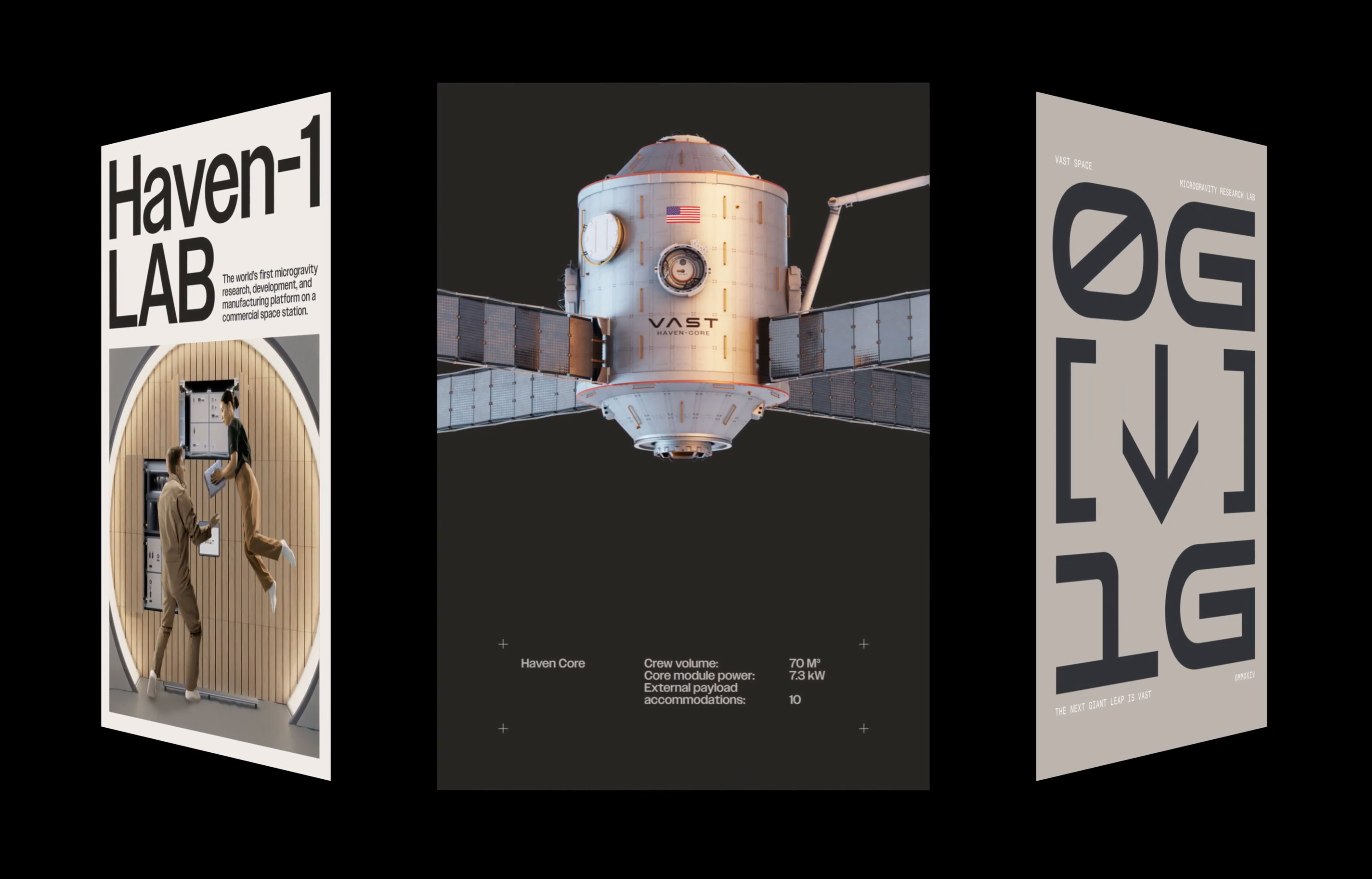
Vast: The next giant leap
Grade: A+
As a creative partner to NASA’s Space Center Houston, we’re constantly on the lookout for giant brand leaps in the space exploration industry. Vast’s striking new identity revisits the 1970s ethos of NASA with stunning attention to detail.
Sign up for more Traina news, insights and updates.
By signing up to receive emails from Traina, you agree to our Privacy Policy. We treat your info responsibly. Unsubscribe anytime.