A client guide for evaluating creative
5 techniques to ensure your feedback is rooted in sound strategy
Too often, we see clients pour time, energy, and budget into crafting a solid brand strategy—only to shelve it the moment the creative magic starts happening. The result? A visual identity that looks sharp but lacks substance. Your brand strategy isn’t just a checked box; it’s a compass that can guide you through the creative process and help you separate the “looks slick” from the “actually works.” Below we share five techniques to make sure your new brand identity, campaign or package design isn’t just pretty—but powerfully on point.
Your brand strategy isn’t just a checked box; it’s a compass that can guide you through the creative process and help you separate the “looks slick” from the “actually works.”
A quick note on definitions
Before diving into evaluation techniques, let’s define what’s being compared:
Strategic foundation, and more specifically, your brand’s positioning, guides how your brand is intended to be perceived by a specific audience relative to your competitors. It’s the unique space you aim to occupy in the market, defined by what your brand promises and how it acts (its personality).
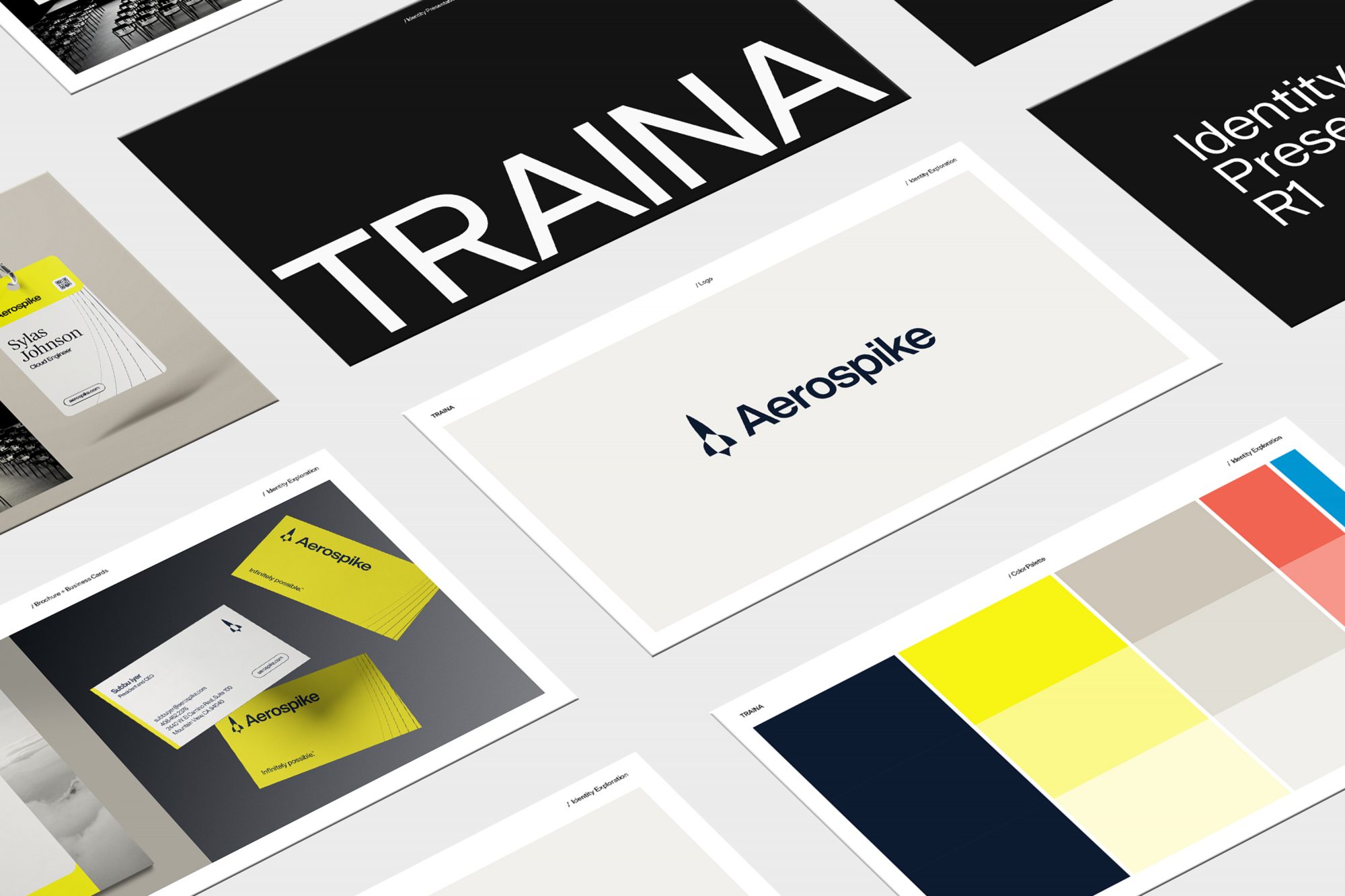
Brand identity is your brand’s visual expression—the complete look and feel that includes your logo, color palette, imagery style, typography, graphic elements, and layout principles used across all communications.
Your evaluation toolkit
With these definitions in mind, let’s explore some practical techniques to help you move beyond subjective design preferences and make strategically sound decisions.
Technique No. 1:
Reframe your feedback
This first technique is a simple exercise in word choice, but fair warning, it can be difficult to put into practice. As you provide feedback on the visual concepts in front of you, avoid using “I like” or “I don’t like” and frame your evaluation through a more strategic lens instead.
Rather than:
“I like the minimalist design approach”
Instead say:
“The minimalist design approach reinforces our positioning as the simplified solution in a complex market”
Rather than:
“I don’t like the use of blue and orange”
Instead say:
“The color palette doesn’t seem appropriate for our brand because…”
While you may hold impartial, valid reasons for “liking” or “disliking” certain aspects of an identity system, avoiding “like/dislike” provides assurance that your critique of the work is indeed objective and strategically-minded.
Technique No. 2:
Play the competitor card
As you’re evaluating design solutions, conduct this simple thought experiment: Imagine each of your key competitors is unveiling a new brand identity tomorrow. Would your proposed identity system feel equally appropriate for them? If the answer is yes, you may need to push harder for differentiation that aligns specifically with your unique positioning.
Sign up for more Traina news, insights and updates.
By signing up to receive emails from Traina, you agree to our Privacy Policy. We treat your info responsibly. Unsubscribe anytime.
Technique No. 3:
Write it out
Another means of evaluating the appropriateness of an identity system concept is to succinctly describe it. Jot down the first 2-4 adjectives that come to mind when viewing the identity system. Now compare these descriptors with your brand’s desired personality attributes. While you don’t need perfect alignment, you should see clear correlation rather than contradiction. If your brand aims to be “approachable” and “human”, but your initial reactions to the identity system include “serious” and “technical,” there’s a disconnect to address.
Technique No. 4:
Identify visual cues
This technique helps you rise above all the nuances and details of amazing design work. Identify the one or two most dominant elements in the identity system and temporarily ignore the rest. These are your visual anchors—the elements that will create immediate brand recognition. Now critically evaluate how these elements reinforce your positioning strategy. For example, if your positioning emphasizes simplifying complex processes, but your dominant visual element is an intricate illustration system, you may be sending mixed messages.
Technique No. 5:
Break it down
Instead of evaluating the entire visual identity system as a whole, assess each element (color, typography, imagery style, etc.) individually against your positioning strategy. Score each element as “supports,” “neutral,” or “conflicts.” While not every element needs to actively support your positioning, none should conflict with it. If you find multiple “neutral” elements, consider whether you’re missing opportunities to reinforce your strategy.
Beyond beautiful
Consider using some or all of these techniques when evaluating brand identity concepts. As you go through the creative evaluation process, regularly check yourself by asking “Am I evaluating based on strategic fit rather than personal preference?” (This isn’t to suggest that a brand identity can’t satisfy both business goals and appeal to your design sensibilities. It most certainly can.)
Remember, creating a visually compelling brand identity is only half the battle—ensuring it aligns with and reinforces your strategic positioning is what transforms mere decoration into purposeful branding. It also ensures your investment in brand strategy continues to work for you long after the creative files have been delivered.