2023 Rebrand
Report Card
Traina’s annual look back at the winners and losers of a tumultuous year in rebranding.
2023 was a remarkable year for rebranding as companies raced to catch up with the cultural shifts that have redefined our world. Enjoy our first annual Rebrand Report Card—a look back at the best and worst rebrands of 2023.
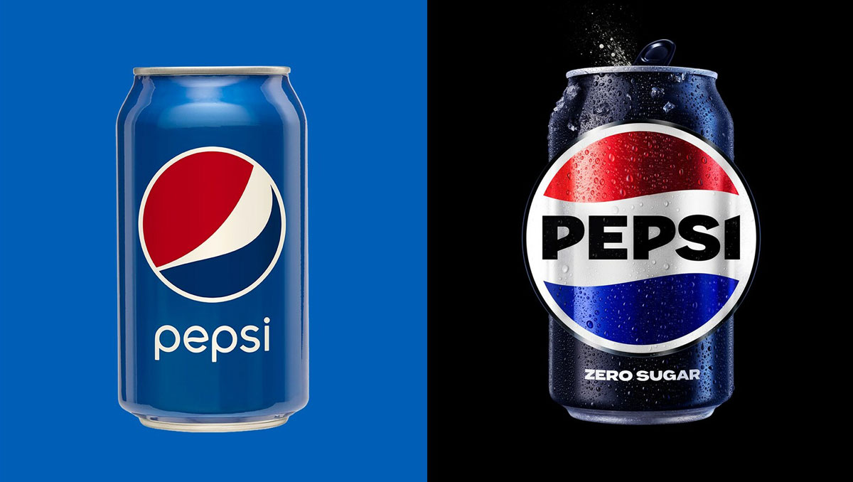
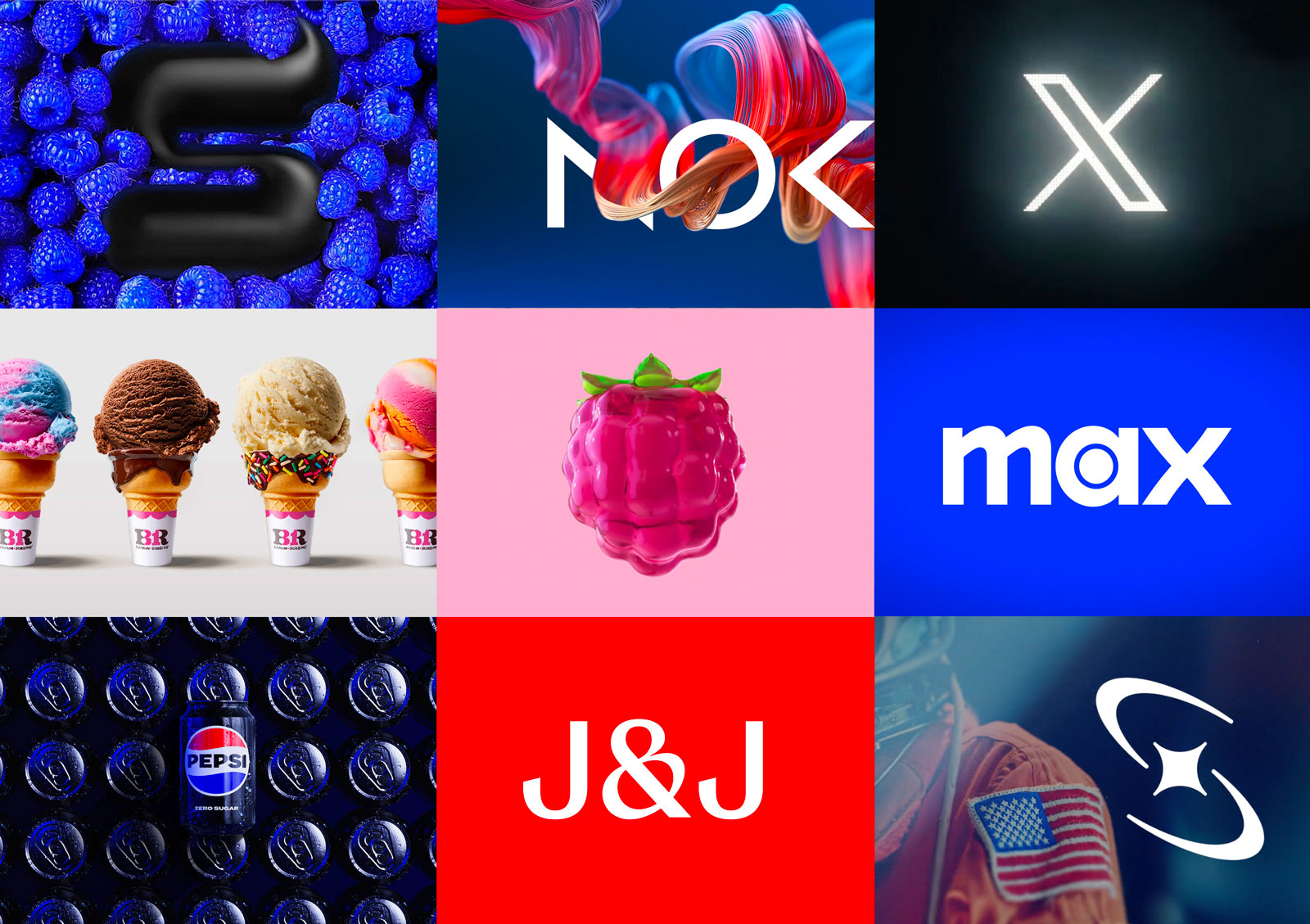
Pepsi: A refreshing move
Grade: A+
As the ultimate challenger to an entrenched heritage brand, Pepsi is constantly evolving its brand to stay fresh, connect with new audiences, and reflect culture. Pepsi’s 2023 rebrand preserves heritage while rejuvenating the system with animation, a bold new logotype, and a modern color palette (we love the black).
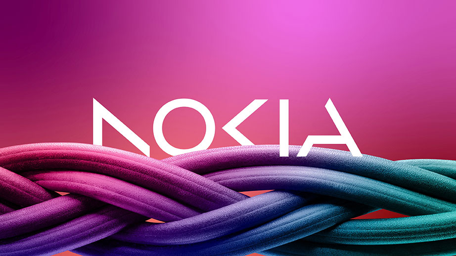
Nokia: To hell with heritage
Grade: A-
While this rebrand has gotten mixed reactions online, we admire Nokia’s courage in parting ways with their iconic logo and emphatically declaring their new vision as a company. And while the cut letter style is perhaps overused, this execution feels unique and fun, compelling the viewer to engage with the logo.
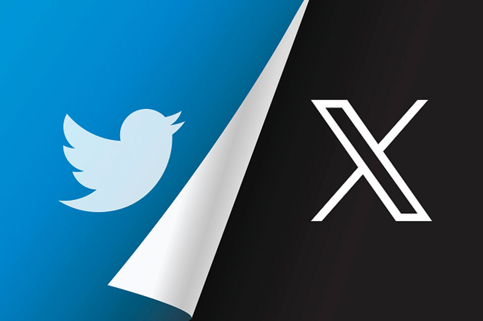
Twitter: One bird. One stone.
Grade: F
Perhaps no rebrand has ever been as universally hated as Elon Musk’s obliteration of the Twitter brand. It’s criminal. However, if a rebrand is intended to reflect the new direction of a company—then perhaps this one is a wild success. Like its new brand identity, “X” appears to be in a dark and dismal place.
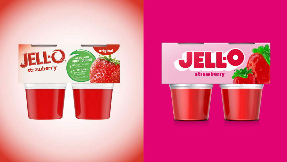
Jell-O: Jiggly goodness
Grade: A
Sometimes a rebrand just feels right. The execution is so familiar, so on-point and dialed in, that the only question is “Why didn’t this happen sooner?”. That’s the case with Jell-O, whose playful refresh combines 3D block letters, flat colors, and hyperreal renders of fruit and pudding to deliver a delicious new visual system.
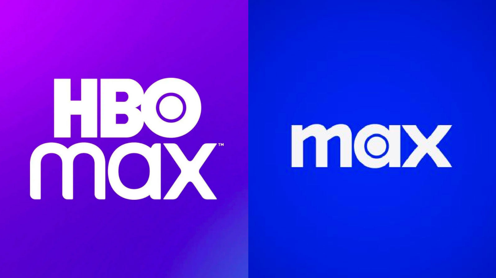
HBO Max: But why?
Grade: D
This rebrand plays out like a Jim Gaffigan joke: “Here me out…you know that part of our name that’s synonymous with excellence? Let’s kill it.” It’s hard to process the corporate logic behind this rebrand—that dropping “HBO” would somehow expand the platform’s reach. Our prediction: HBO Max returns in 2024.
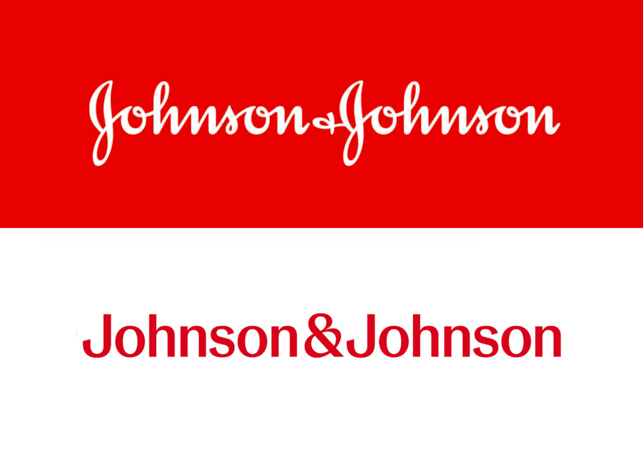
Johnson & Johnson: Unscripted
Grade: C+
Another seismic abandonment of brand equity occurred when Johnson & Johnson dropped its 138-year-old script logo in favor of something…disappointingly pharmaceutical. Although the new logo lacks personality and distinction, we do love ampersands.
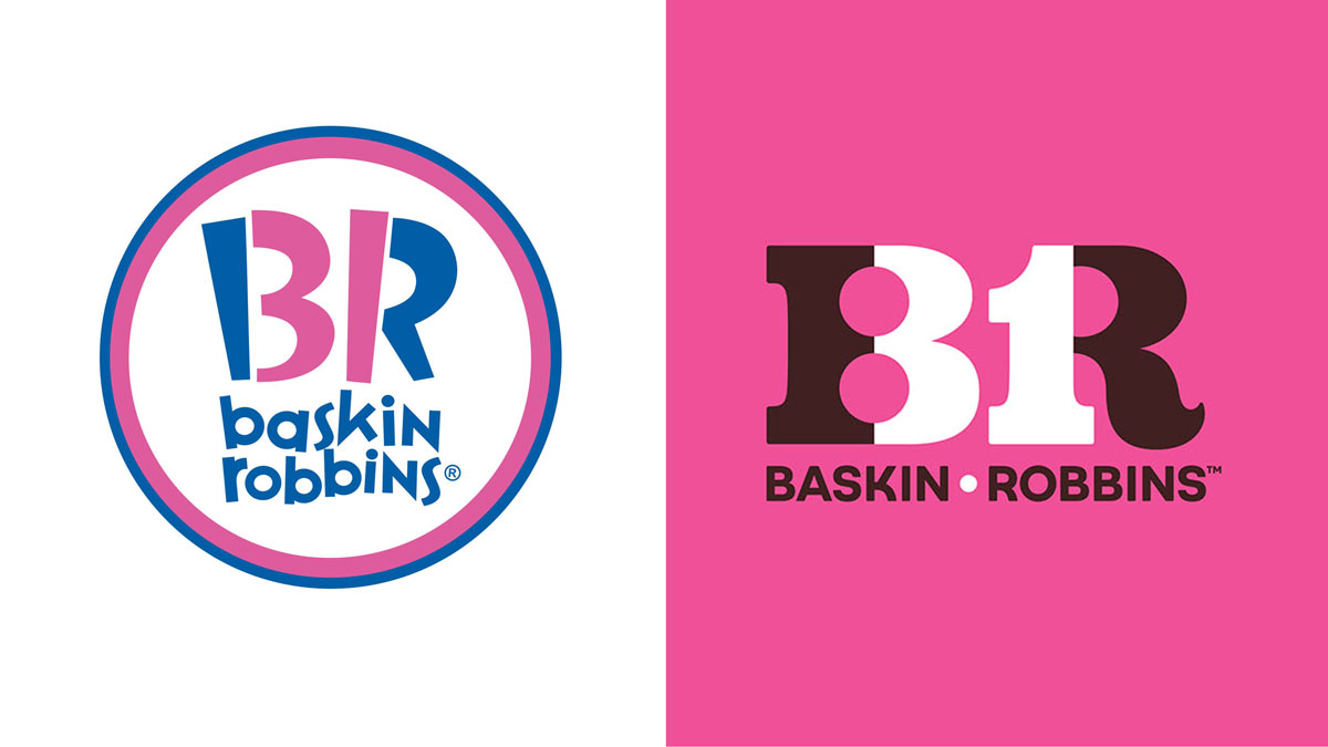
Baskin Robbins: Seize the Yay
Grade: B-
This rebrand was long overdue, and the move away from the klitchy pink and blue identity was a no-brainer. The vibrant new color palette, much improved typographic union of the “BR” and “31” logo, and “Seize the Yay!” tagline are all sweet improvements.
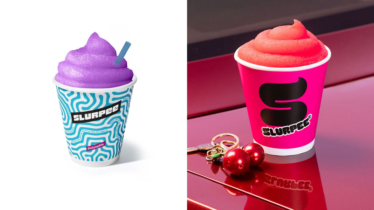
Slurpee: Brain-freezing fun
Grade: A+
From the slushy dollop monogram to the icy peaks of the custom font, this rebrand is just wild, brain-freezing fun. And the entire visual identity system delivers on that theme.
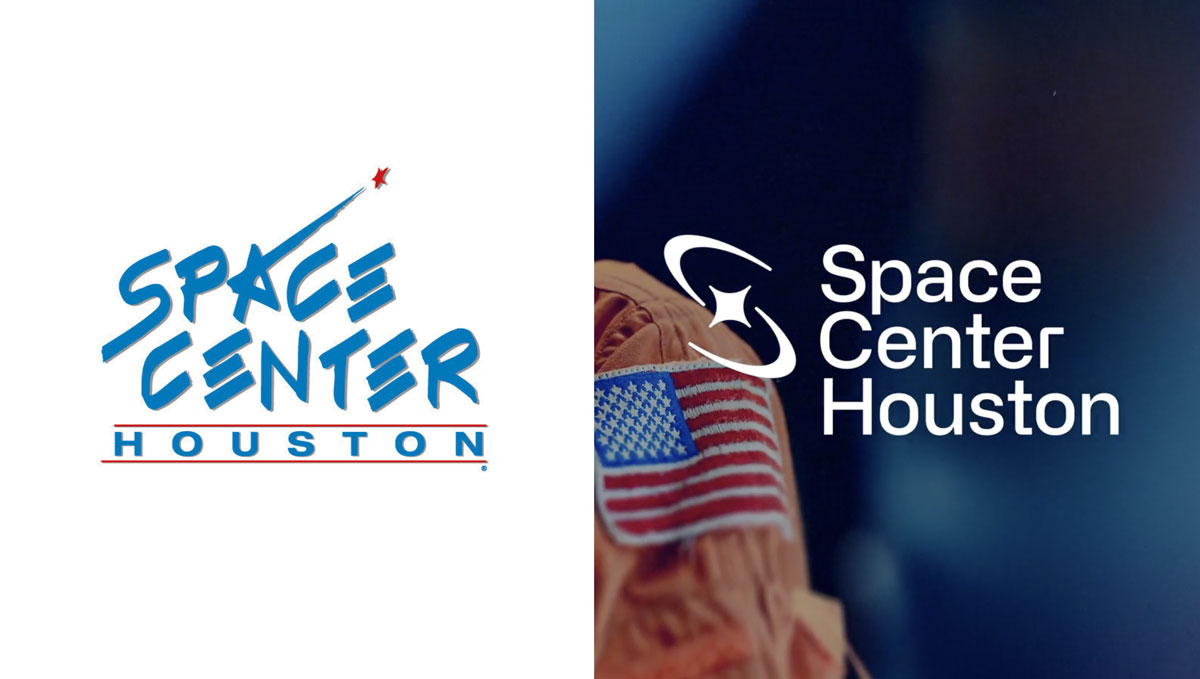
Space Center: A giant leap
Grade: A+++
OK, maybe we’re a little biased on this one. But the first rebrand of NASA’s official visitor center in 30 years was an astronomical leap forward—one that positions the organization to play a leading role in the future of space exploration. Check it out.
Sign up for more Traina news, insights and updates.
By signing up to receive emails from Traina, you agree to our Privacy Policy. We treat your info responsibly. Unsubscribe anytime.