A rebrand that brings people and space closer together
Services PROVIDED:
Brand strategy
Visual & verbal identity
Brand Guidelines
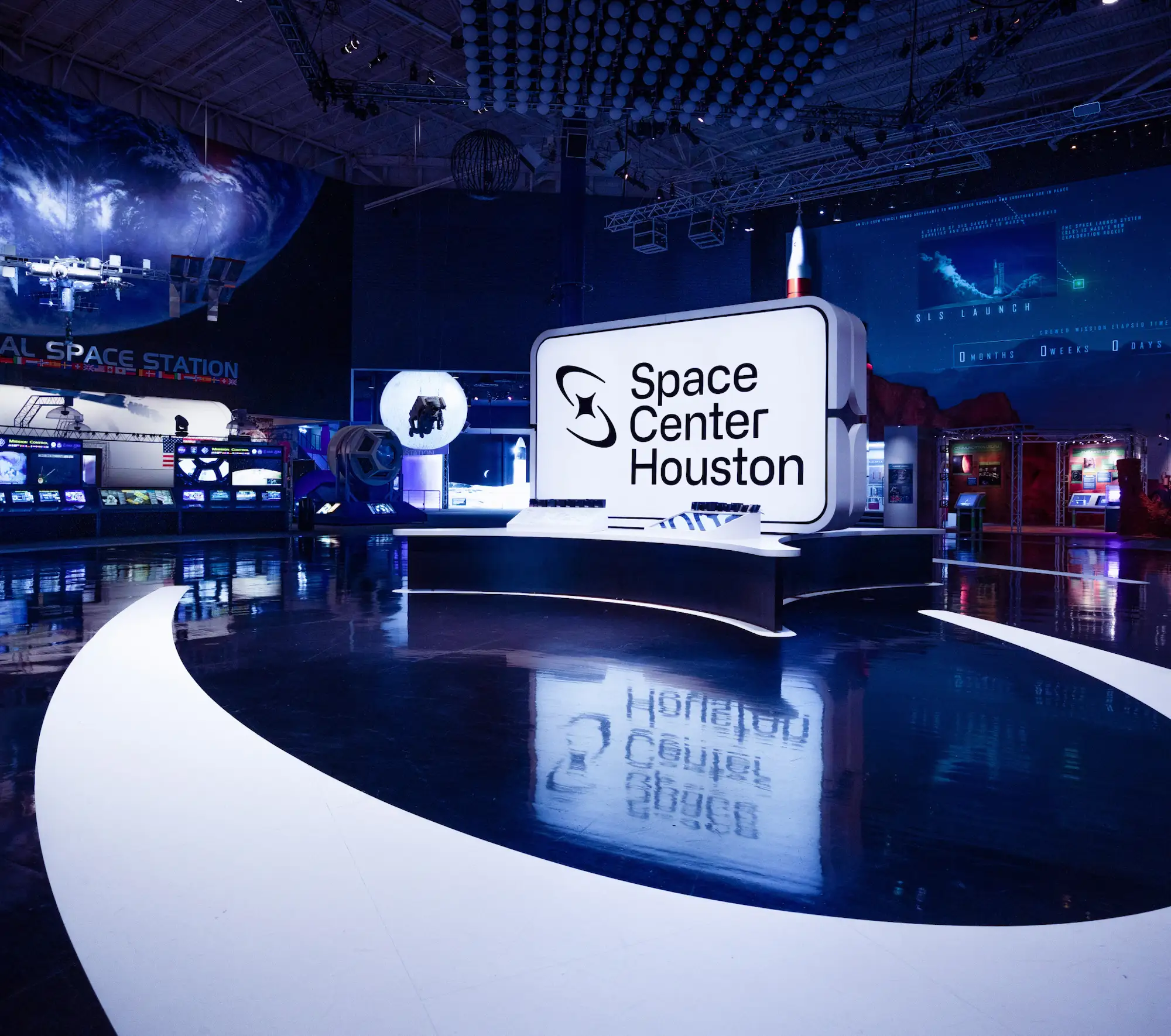
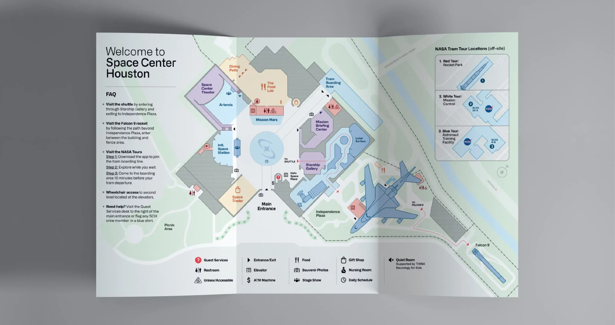
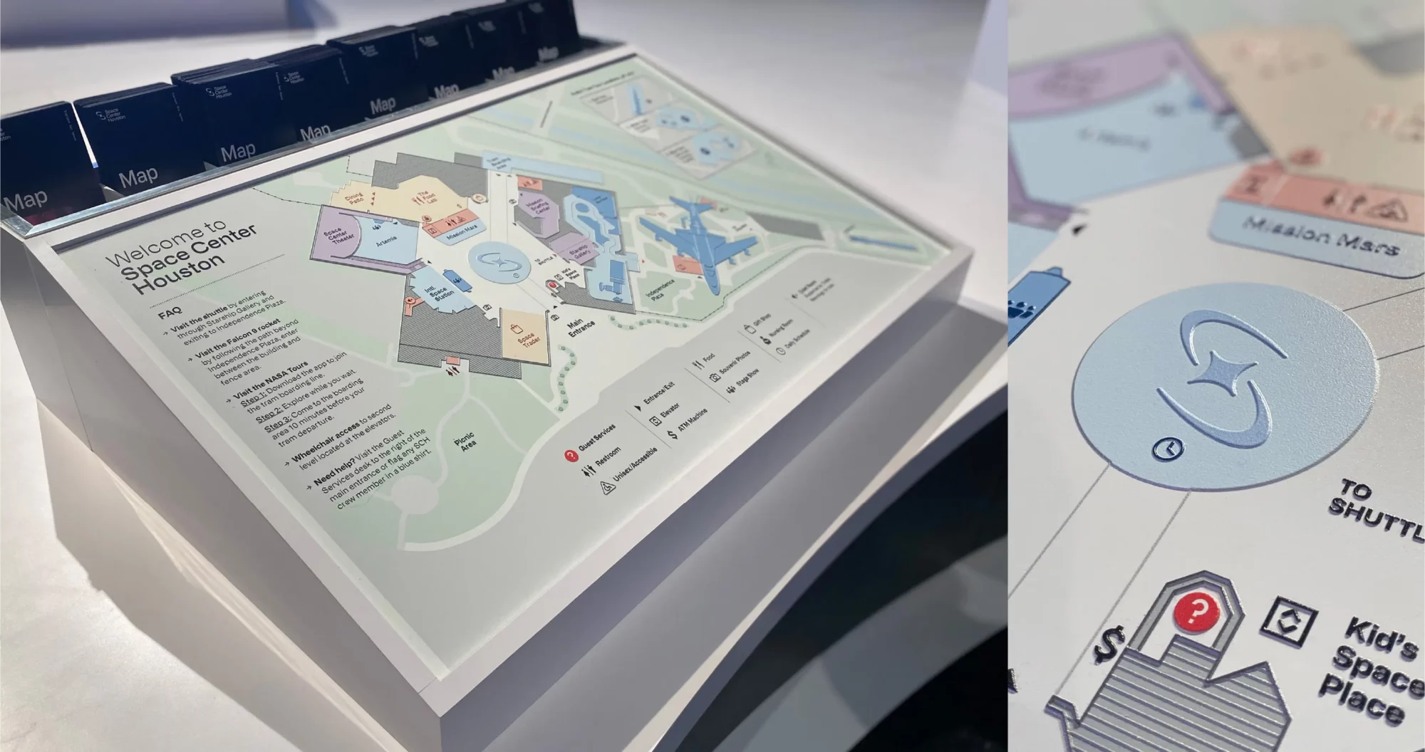
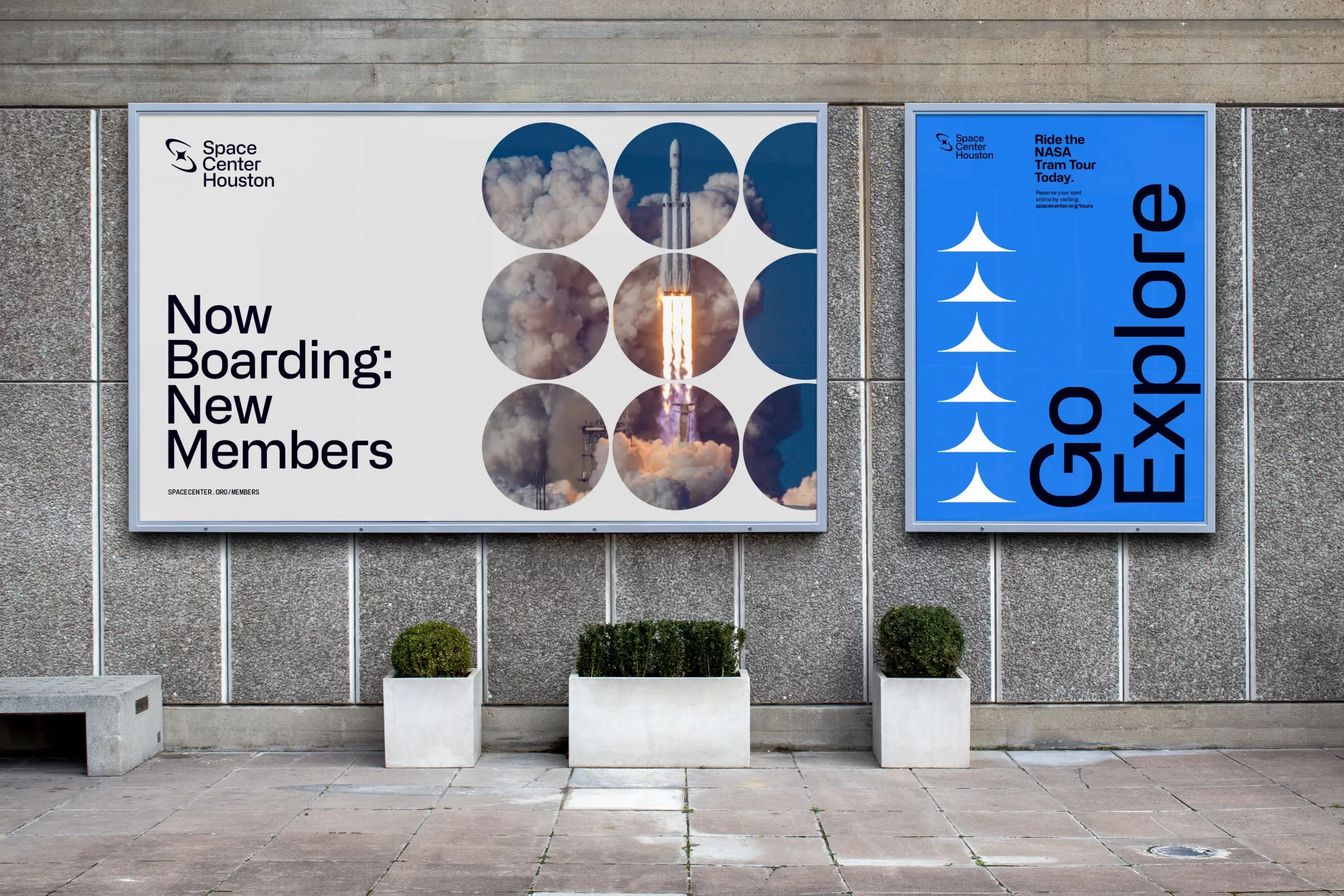
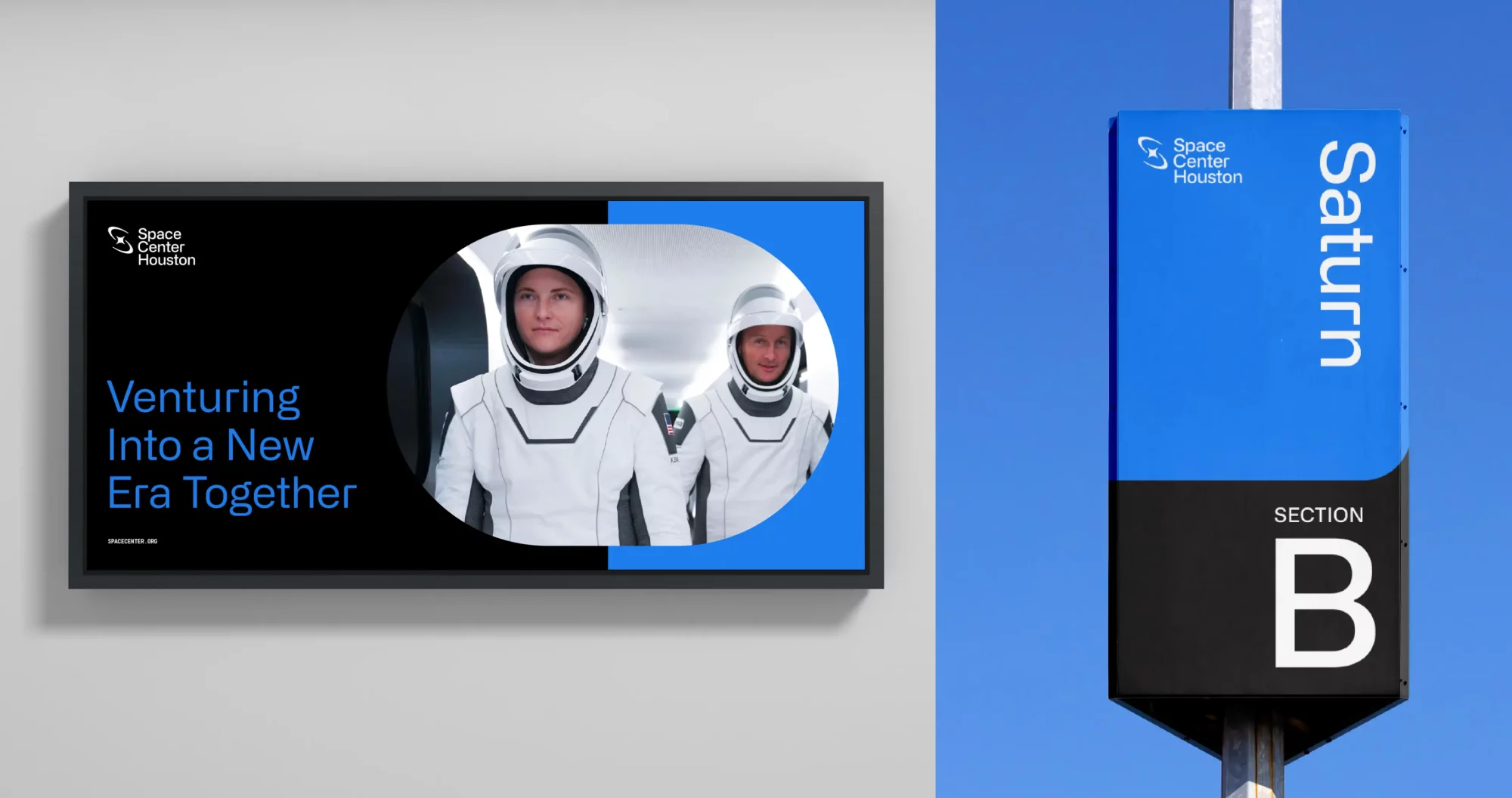
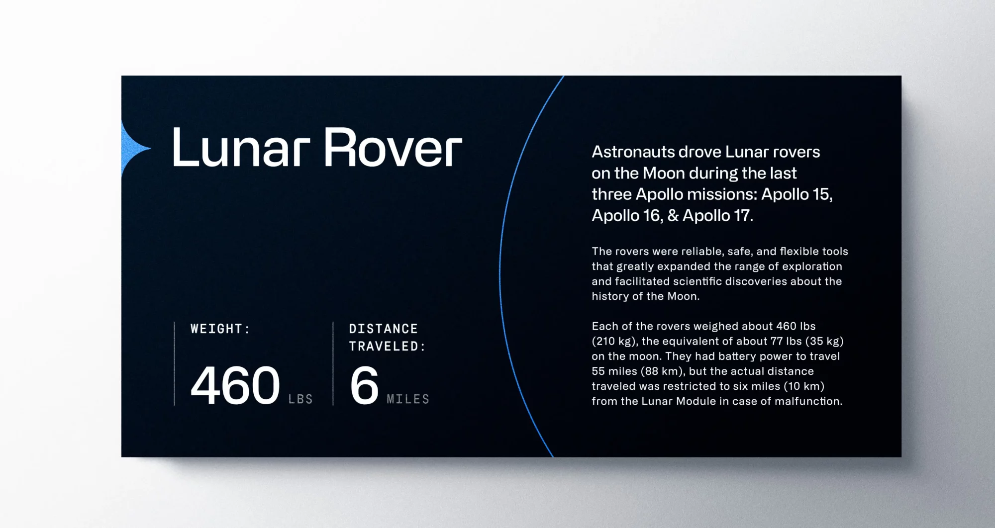
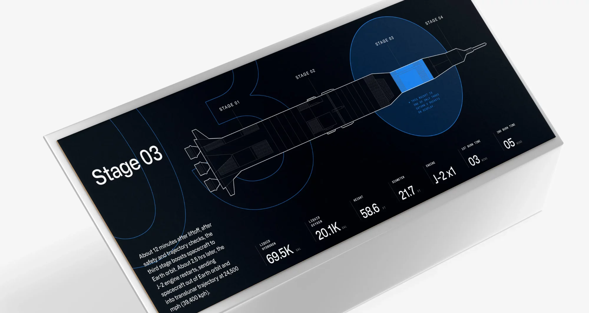
Environmental Graphics
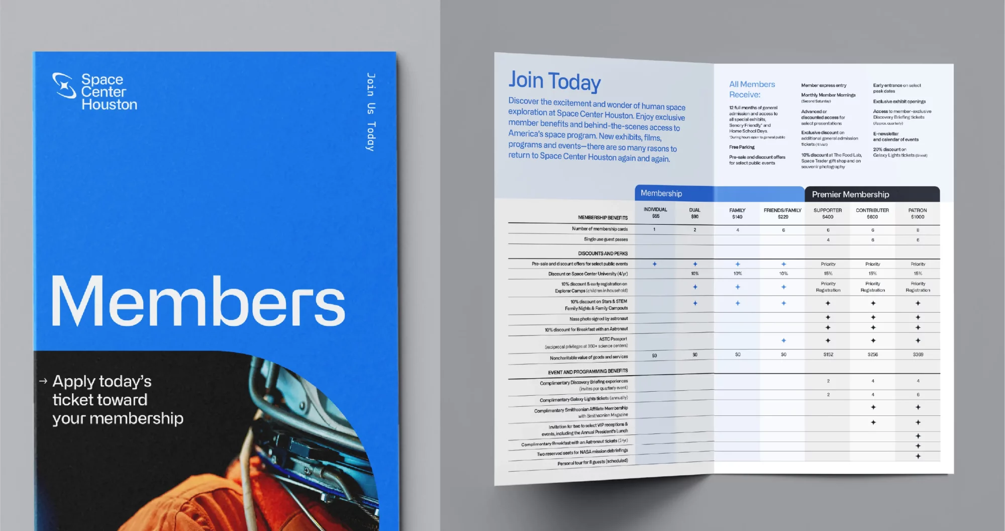
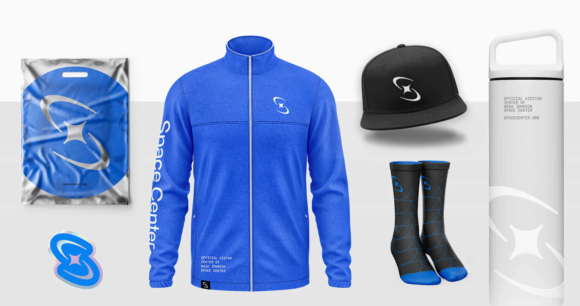
Marketing Assets
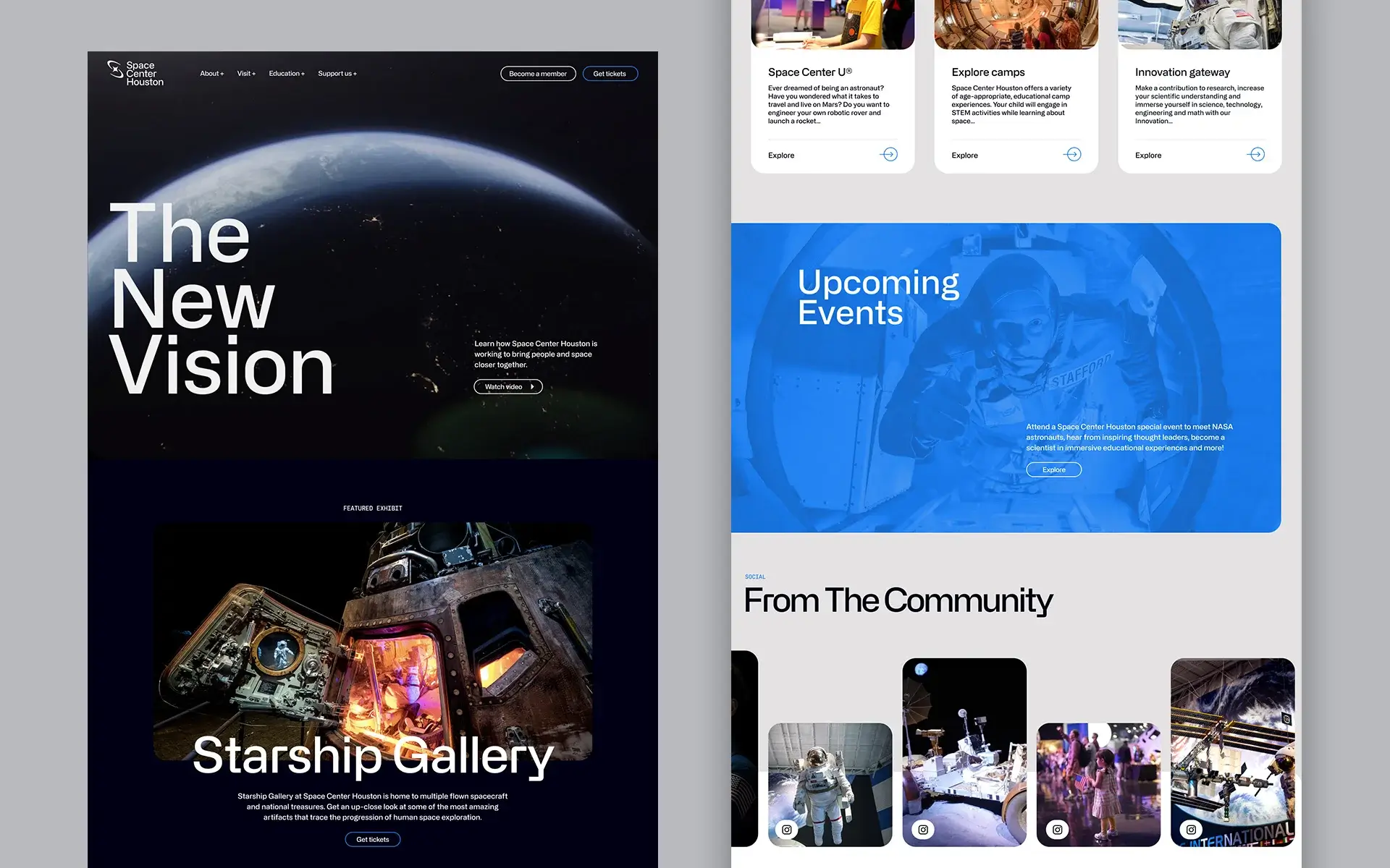
Website/UI design
Social Media Templates
Insight
A revitalized space industry led by new NASA initiatives and innovative companies like SpaceX has reignited the public’s fascination with space.
Challenge
Space Center Houston is a nonprofit space destination and the public entrypoint to NASA’s Mission Control. Over time, it’s been pegged as a museum solely focused on the past, largely due to a brand dating back to 1992. This perception belies big plans ahead: becoming a hub in a new era of space exploration, building partnerships beyond NASA and immersive training facilities that simulate the Moon and Mars.
Solution
Shifting the perception of Space Center Houston entailed reimagining every facet of the 30-year old brand: ideology and brand architecture, visual and verbal identities, a renewed digital presence and comprehensive brand activation. Traina’s full-scale strategic rebrand revived the awe and fascination once evoked by Space Center Houston.

Traina’s strategy and identity work drive the brand anthem video, produced by Houston’s Vision Production Group.
STRATEGY
Moving beyond a museum
With the best era of space exploration lying ahead, Space Center Houston would be a connector of private companies, NASA, and above all, the public. This ambition is captured in a robust brand strategy, centered on a concise and resonant purpose: To bring people and space closer together.
IDENTITY
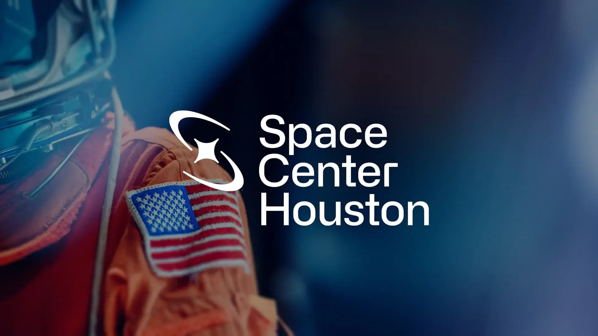
The new face of space exploration
Traina’s bold identity system equally suits Space Center Houston’s ambition, designed for equal footing with elite partners like SpaceX and Blue Origin, yet able to stand on its own with distinction.
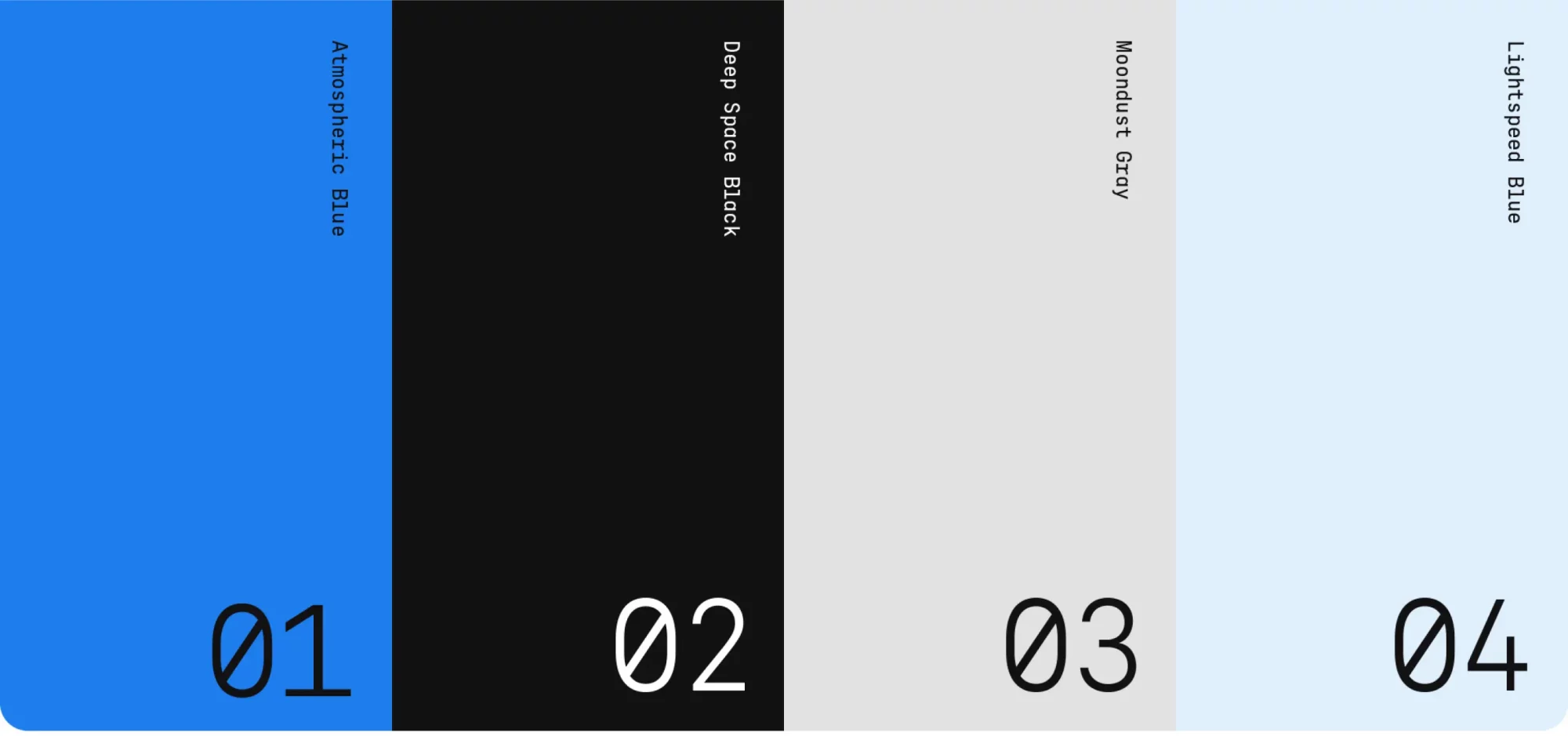
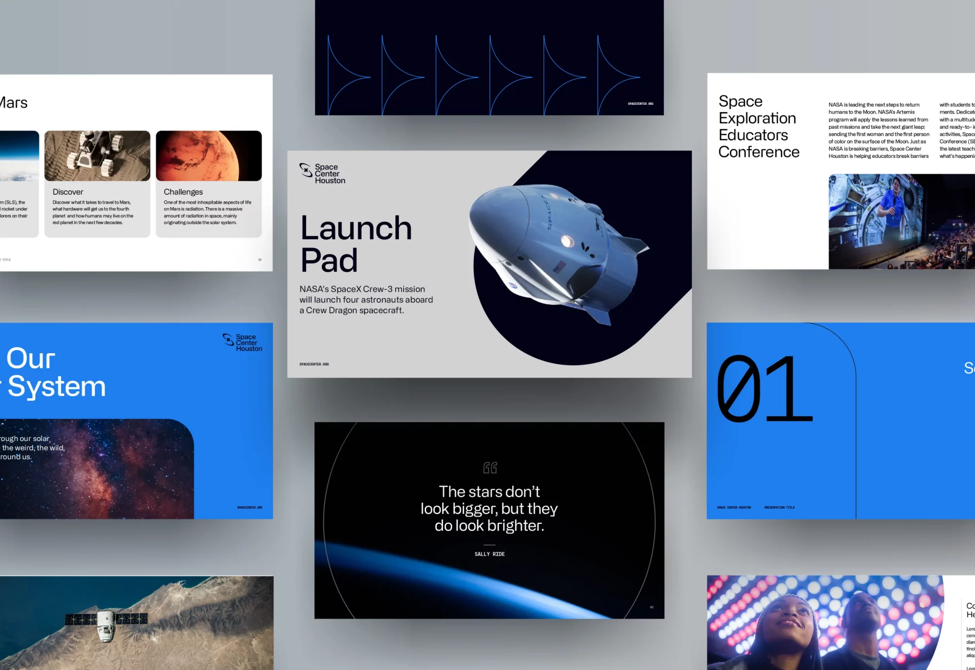
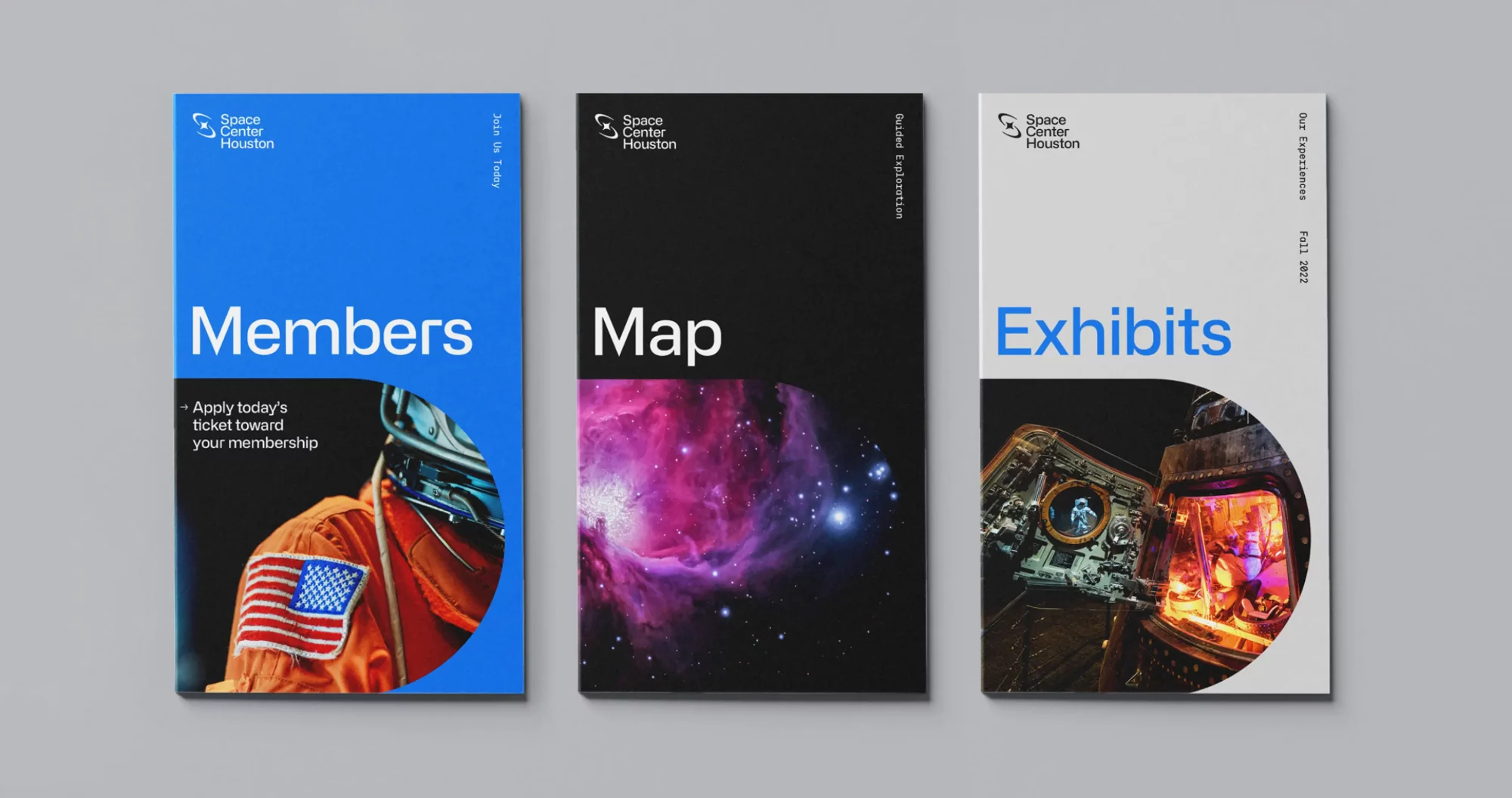
Visual System
A geometric grid serves as a foundation for an expansive library of shapes, forms and patterns used throughout the brand. The shape system translates to encasements and layers that can express the brand with depth and dimension.

Monoline icons built on a grid bring consistency across brand offerings, while updated photography features a mixture of awe-inspiring
deep space, modern spacecraft, and emotive close-ups of guests that elicit a sense of excitement and wonder.
I recommend listening to Traina’s point of view because it’s very refreshing. The way they articulated the business case behind their recommendations was high-level. Listen to Traina and leverage their experience.”
Erik Blanchard
Dir. of Comms + Marketing
Campaign
Campaign
Traina provided Space Center Houston with go-to-market strategies and internal rollout presentations, and was also on-site to launch the brand campaign with a massive media event.
The trust and creative partnership that created the new brand carries on today and into the future, as Traina continues to transform Space Center Houston into the leading institution in space exploration.
Results
Results
Since the brand launch, Space Center Houston has had a banner year of record-setting attendance, revenue and enrollment in special programs. Along with leading development of space commissions for the state of Texas and in the nation, they have seen a marked increase in online and in-person engagement.
Increase in email revenue
Increase in web transactions
Increase in web revenue
Exponential increase in Facebook video views
ACCOLADES/PRESS
Graphis Design Awards – Logo, Silver
Graphis Design Awards – Rebrand, Silver
The One Show – Rebrand, Gold
AMA Houston Crystal Awards – Best Brand Guidelines
AMA Houston Crystal Awards – Best Rebrand
AMA Houston Crystal Awards – Best Website
AMA Houston Crystal Awards – Best Public Display