A design system made for marketers
Services PROVIDED:
BRAND STRATEGY
VISUAL & VERBAL IDENTITY
BRAND GUIDELINES
MARKETING ASSETS
WEBSITE/UI DESIGN
Insight
A brand must speak to its core qualities without saying a word. So a platform meant to simplify must have a clean and cohesive design system at first sight.
Challenge
After years helping top companies streamline their marketing resources, MarcomCentral expanded their brand architecture to bring digital asset management to the masses.
Solution
Drawing from the ease and agility of their platform, we built a digital-first brand focused on vibrant, beautiful simplicity.
INSIGHTS
Know your audience
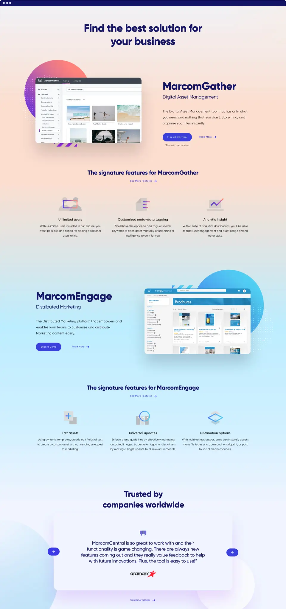
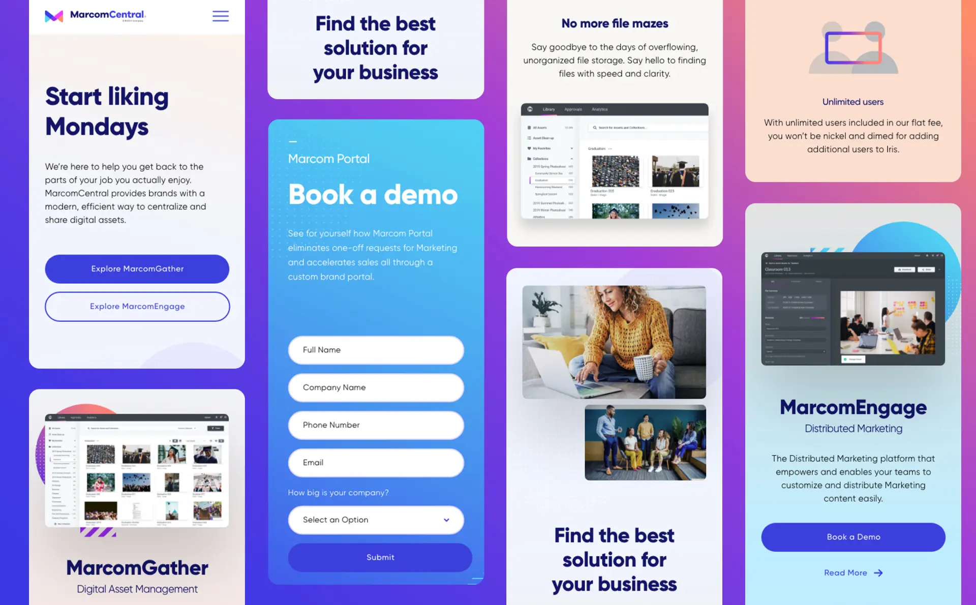
Most data asset management systems have either not enough functionality or way too much. MarcomCentral took their enterprise-level solution to small and medium businesses with a focus on simple, streamlined efficiency—which we applied to their new brand.
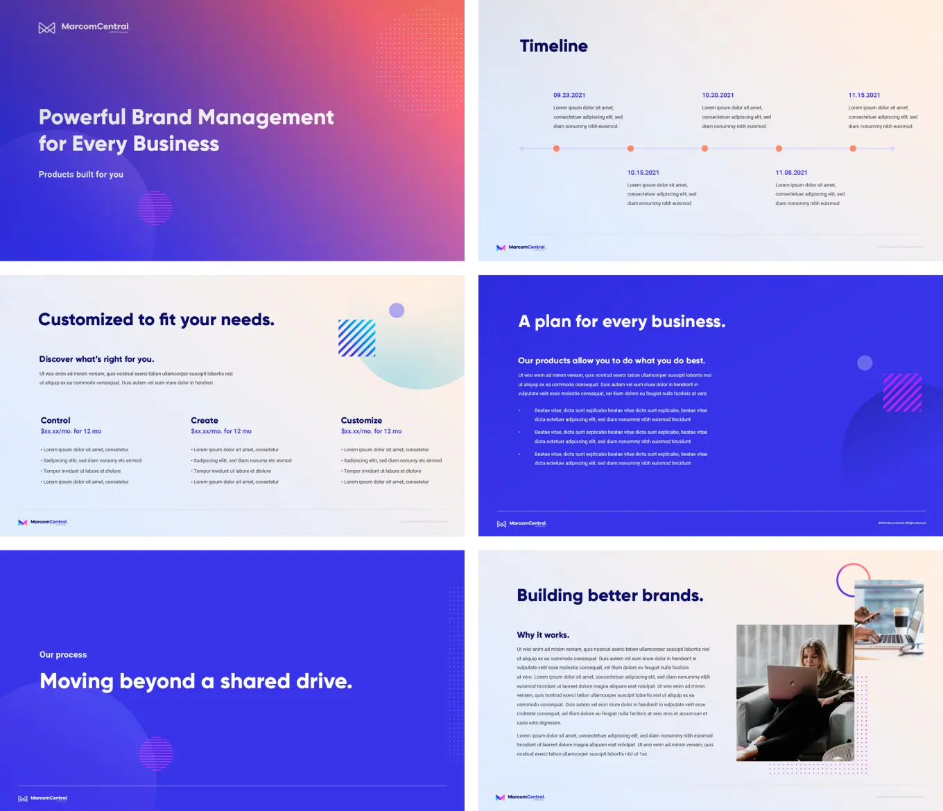
Our UX strategy winnowed down 20+ web pages into an intentional 12-page user journey showcasing the platform’s organizational strength. Animation further conveys a sleek user experience, creating memorable brand engagements on every page.

IMPLEMENTATION
Simplicity and versatility were focal points in the creation of a visual identity. Where competing data management systems left users drowning in a sea of blue, MarcomCentral’s multifaceted platform lent itself to a bolder, vibrant expression utilizing a spectrum of design techniques.
Flexible logo
A multicolor logo design was inspired by the variety of components in the platform, with different pieces all coming together to form a cohesive and memorable mark.
Smooth animation reflects the simplicity in which digital assets are brought together, while the shape language can be deconstructed and used in elements throughout the brand system.
Color palette
Where competing data management systems swam in a vast sea of blue, our multicolor logo and brand design is a bolder, vibrant expression for a multifaceted platform.
Smooth animation reflects the simplicity in which digital assets are brought together, while the shape language can be deconstructed and used in elements throughout the brand system.
Iconography and Gradient
Shape elements in the design system are used as custom icons to unify and categorize MarcomCentral’s features. A colorful gradient canvas further underpins the system with a range of color spaces evoking the fluidity of the software.
Results
Systemized design
Where MarcomCentral now brings simplicity and multifunctionality to marketing departments of any size, their brand likewise presents the tools, features and possibilities of the platform in a refined and cohesive system.