2025 Rebrand Report Card
Traina’s annual look back at the winners and losers of the year in rebranding.
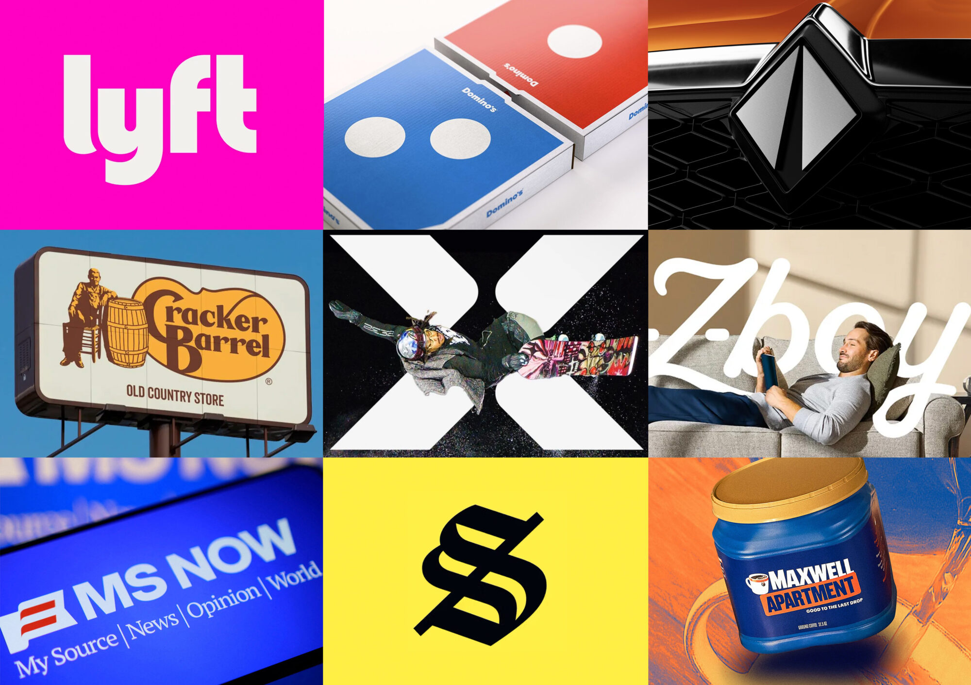
If it weren’t for one very notable exception, 2025 was a relatively quiet year for rebrands. Most brands like Amazon, Lyft, and Walmart opted for quiet rollouts that were barely noticeable to the untrained eye. On the other end, there was the Cracker Barrel rebrand—an effort that in any other era would have gone largely unnoticed. We’ve picked out the bangers and bombs in our third annual Rebrand Report Card. Let’s roll:
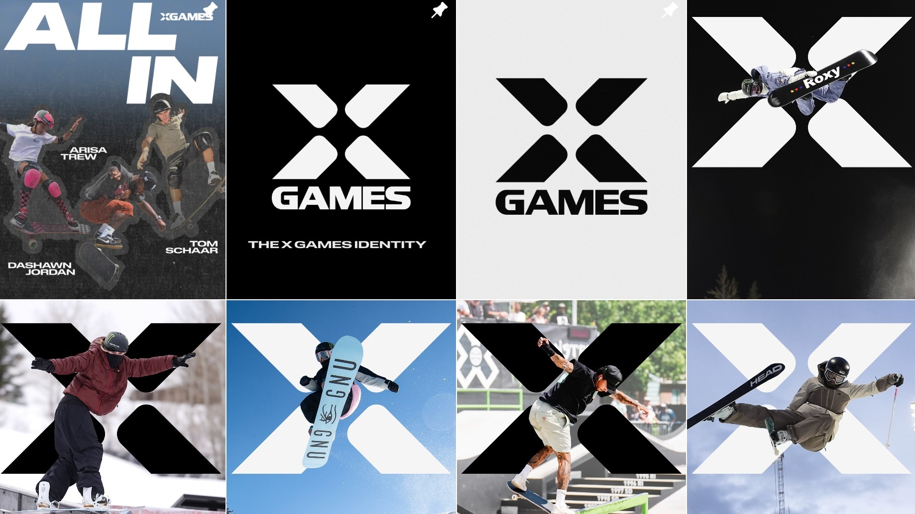
X Games: Not so Extreme
Grade: D–
Most of the noise surrounding this rebrand accuses it of being birthed in a corporate boardroom. Brutal feedback, but not entirely unjustified. The flagship brand of extreme sports should exude attitude, grit, and fearlessness. Instead, the work ignores the brand’s rich heritage and personality, and plays it far too safe for a brand that’s all about pushing human boundaries.

La-Z-Boy: Long Live the Lazy
Grade: A
Much like Cracker Barrel, La-Z-Boy was a brand on the verge of fading into history. Ironically, the team reached back 100 years to their original logo for inspiration as they reimagined the logo and visual system. But the real genius was in the new brand voice, which found expression in successful campaigns like “JOMO” (joy of missing out), “Long Live the Lazy”, and “The Decliner”—an AI-powered chair that helps reclinees draft text messages to cancel their plans.
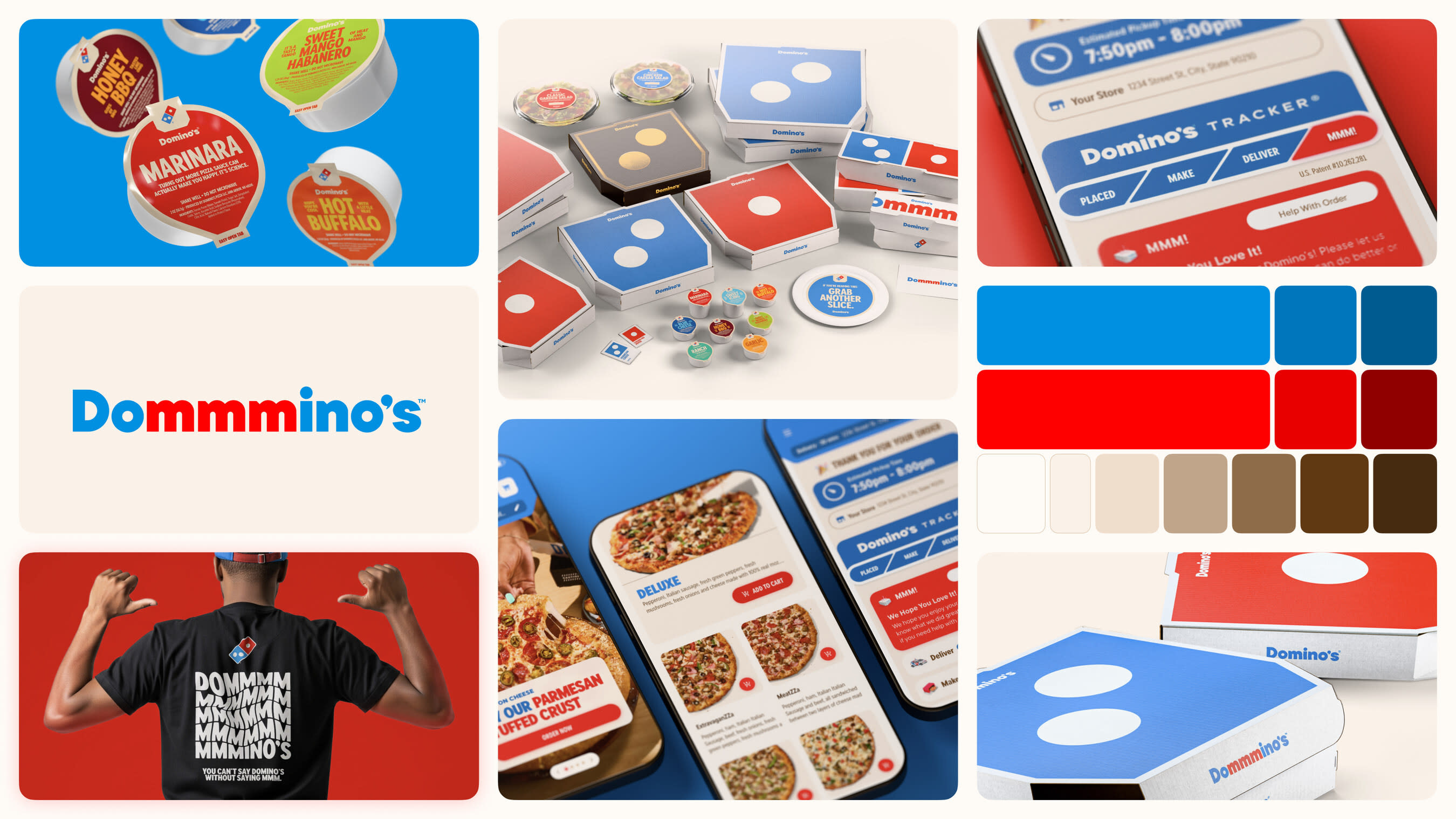
Domino’s: Rebrand of the Year
Grade: A+
From the “mmm” of its new “cravemark” to the playfulness of its new pizza box designs, to its addictive new jingle by Shaboozey, the Domino’s rebrand is arguably the best rebrand of 2025. Perhaps most notable is the fact that the rebrand was done while the company was thriving—at the top of its game. This quote from Domino’s CMO is straight from Traina’s lexicon: “Most companies rebrand themselves when they’re struggling, but after years of category-defying growth, this refresh is about continuing to push to be the best version of ourselves.”

MS NOW: “Bacronym” Debacle
Grade: F
This new name begs the question, “Did you guys miss the whole HBOMax trainwreck?” The layers of mystery behind this renaming are thick: The long-defunct “Microsoft” element was kept. The only news-relevant “NBC” element was yanked. Finally, “NOW” was slapped on, along with the very smooth backronym: “My Source for News, Opinion and the World”. At least they secured the domain, right? Right??
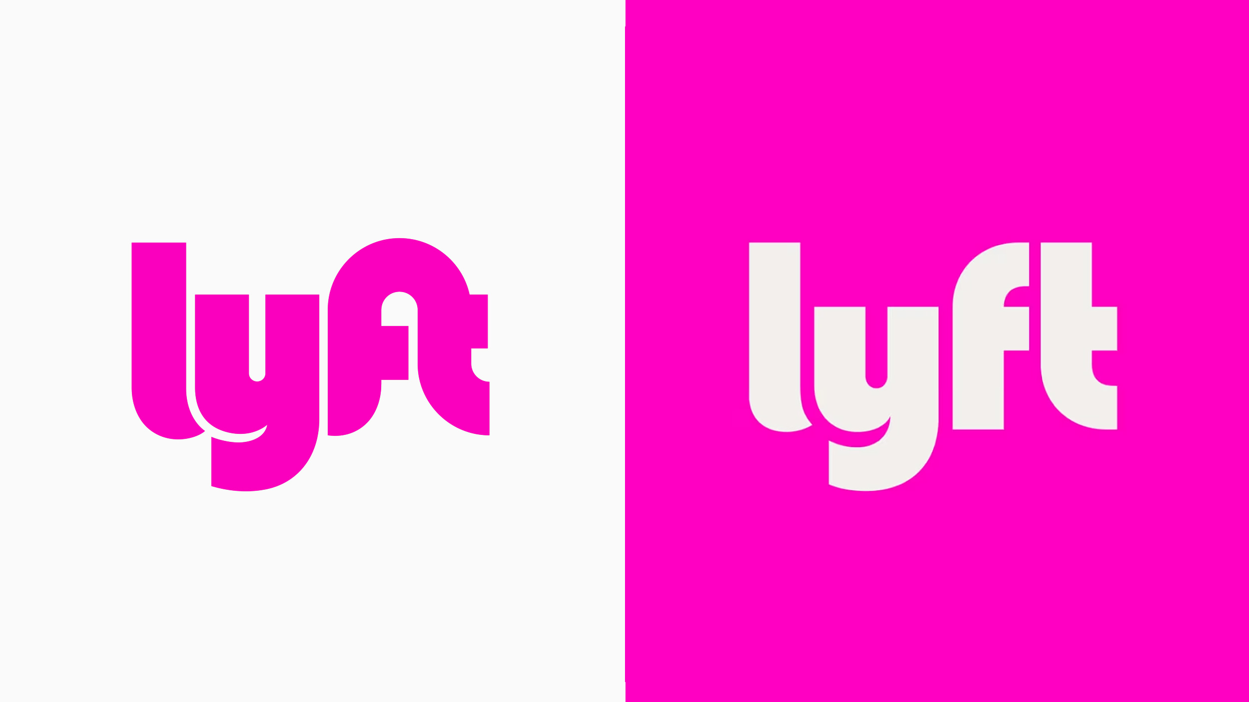
Lyft: Subtle but Savvy
Grade: A
If you’re a typophile like everyone at Traina, then you’re going to love this one. Earlier this year Lyft began quietly rolling out an expanded color palette, custom typeface, and other subtle refinements. But the shining star of this subtle system refresh is the logotype, which was retooled for a more mature and readable look. As is the case with all great rebrands, the diligence is in the details.
Solflare: Stronghold of the Free
Grade: A
To the outsider, the world of crypto can feel like a volatile experiment, filled with obscure jargon and mystery. Crypto wallet Solflare recognized that to expand its core audience, it would need a new brand identity that builds trust with newcomers. Combining vintage bank aesthetics with a striking yellow palette, the rebrand reestablishes Solflare as safe, secure, and accessible.
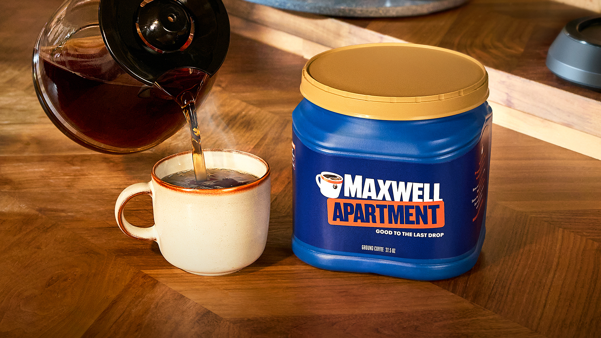
Maxwell Apartment: Gimmick of the Year
Grade: TBD
Taking a page from the “International House of Burgers”, Maxwell House is running this tongue-in-cheek renaming campaign that makes light of the homeownership crisis that most of its audience is feeling. Further extending the concept, Maxwell House/Apartment is offering customers a “12-month lease” of their coffee, complete with a formal lease agreement. Clever? Sure. Tone-deaf? Probably. Effective? Remains to be seen.
International: Heritage Rebrand of the Year
Grade: A
We’re big fans of this B2B rebrand that perfectly blends past, present and future. Everything from the clean, simplistic reductions in the logomark to the CGI renders, evocative photography, custom typeface, etc., all blended to create a sophisticated visual system that applies heritage details with purpose.
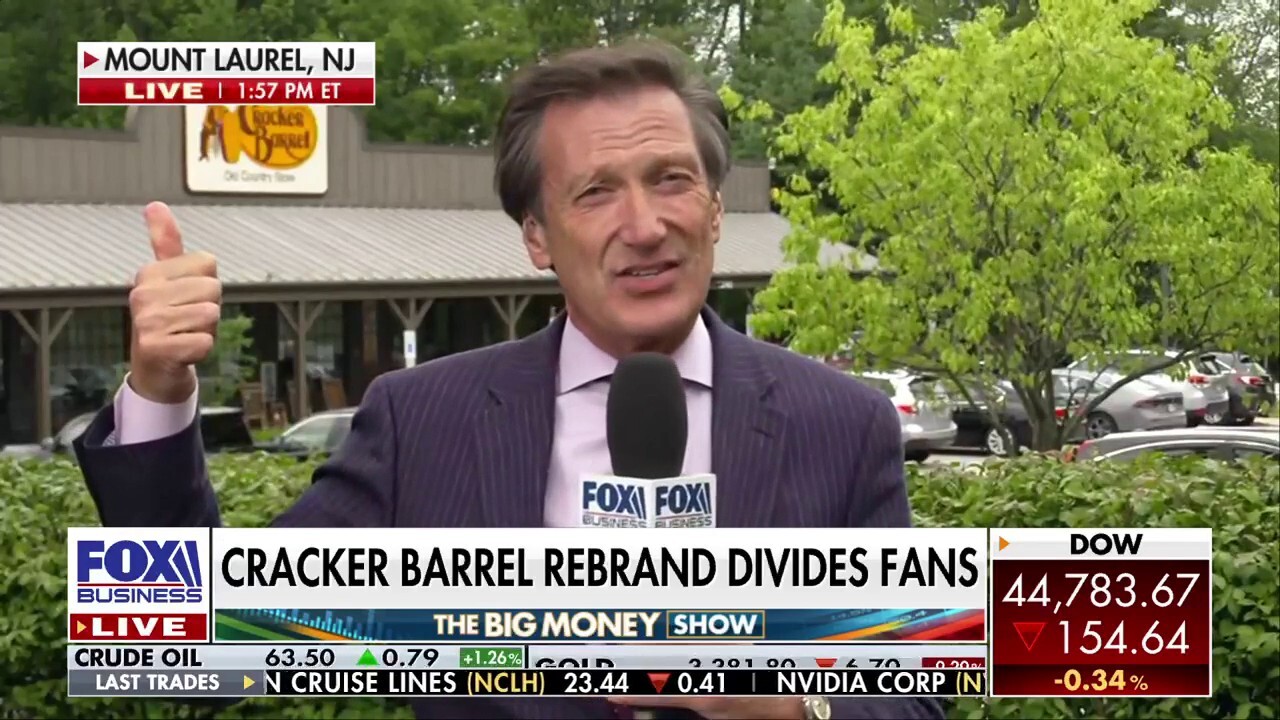
Cracker Barrel: “Old Country” Collateral Damage
Grade: F*
As a branding professional born in the deep South and raised on Cracker Barrel biscuits, I feel qualified to opine on this mess. First, I believe a Cracker Barrel rebrand is critical and long overdue, for multiple reasons spanning shifting demographics, changing tastes, and common sense. It’s a dusty, rusty old identity that is quickly losing relevance and, by all accounts, revenue.
*I actually liked this rebrand. I felt it gave the brand a desperately needed refresh without severing its “old country” roots. But at the end of the day, it was hauled into our cultural mayhem, politicized, and labeled ‘woke’ by individuals who have probably never set foot in an Old Country Store. Ultimately, the backlash prevailed, leaving Cracker Barrel with the same troubled brand and business that the rebrand might have resolved.
If you enjoy seeing rebrand brilliance and carnage as much as we do, feel free to check out our 2023 and 2024 Rebrand Report Cards.
Sign up for more Traina news, insights and updates.
By signing up to receive emails from Traina, you agree to our Privacy Policy. We treat your info responsibly. Unsubscribe anytime.