A bold rebrand for a tech leader that defies limits
Services PROVIDED:
Brand strategy
Visual & verbal identity
BRAND GUIDELINES
ENVIRONMENTAL GRAPHICS
Marketing Assets
Website/UI design
Insight
In an industry filled with copycat competitors claiming to offer what you do (and they can’t), clarity is key.
Challenge
When you’re a category leader, everyone follows your lead. For Aerospike, it was becoming increasingly difficult to differentiate their offering while competitors were parroting their tactics and falsely claiming to do the same.
Solution
Through the development of a bold positioning strategy, razor-sharp messaging and a distinctive visual language, Aerospike took back ownership of its story and its rightful position as the NoSQL database king.
VISUAL IDENTITY
A visual system that reflects the singularity of the technology
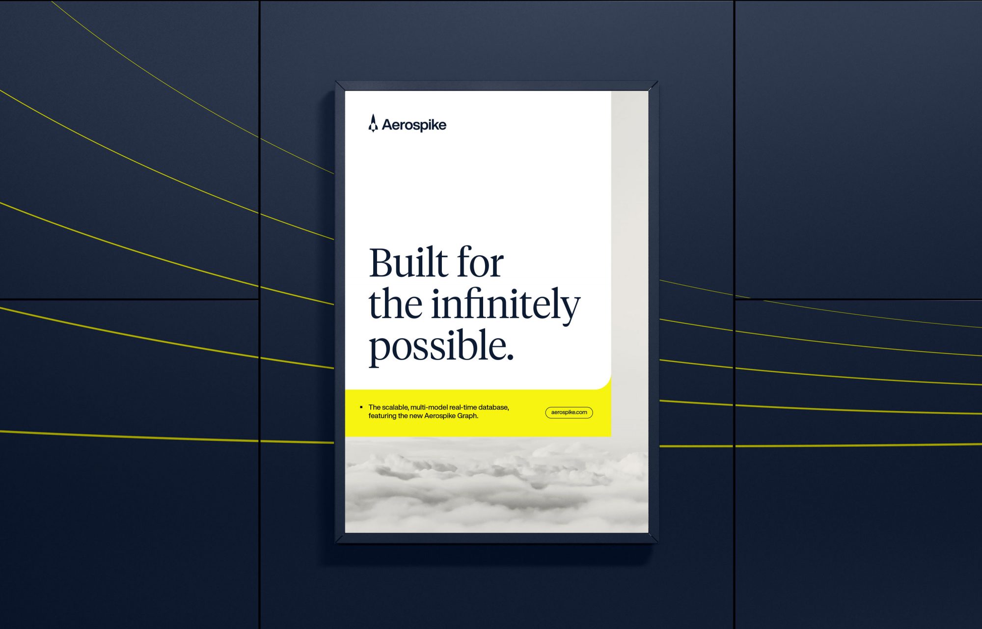
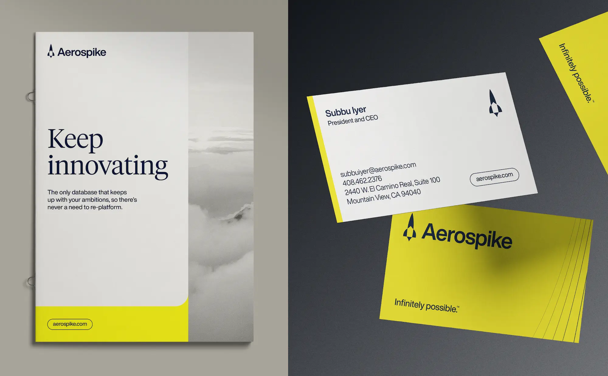
Most database brands share a juvenile look and feel—a kitschy vibe presumed to resonate with developers. For Aerospike we rejected this condescending approach in favor of a modern and mature visual identity. It reflects the sophistication of their technology and the aspirational spirit of their new brand strategy.

brand MESSAGING
External messaging that hits hard
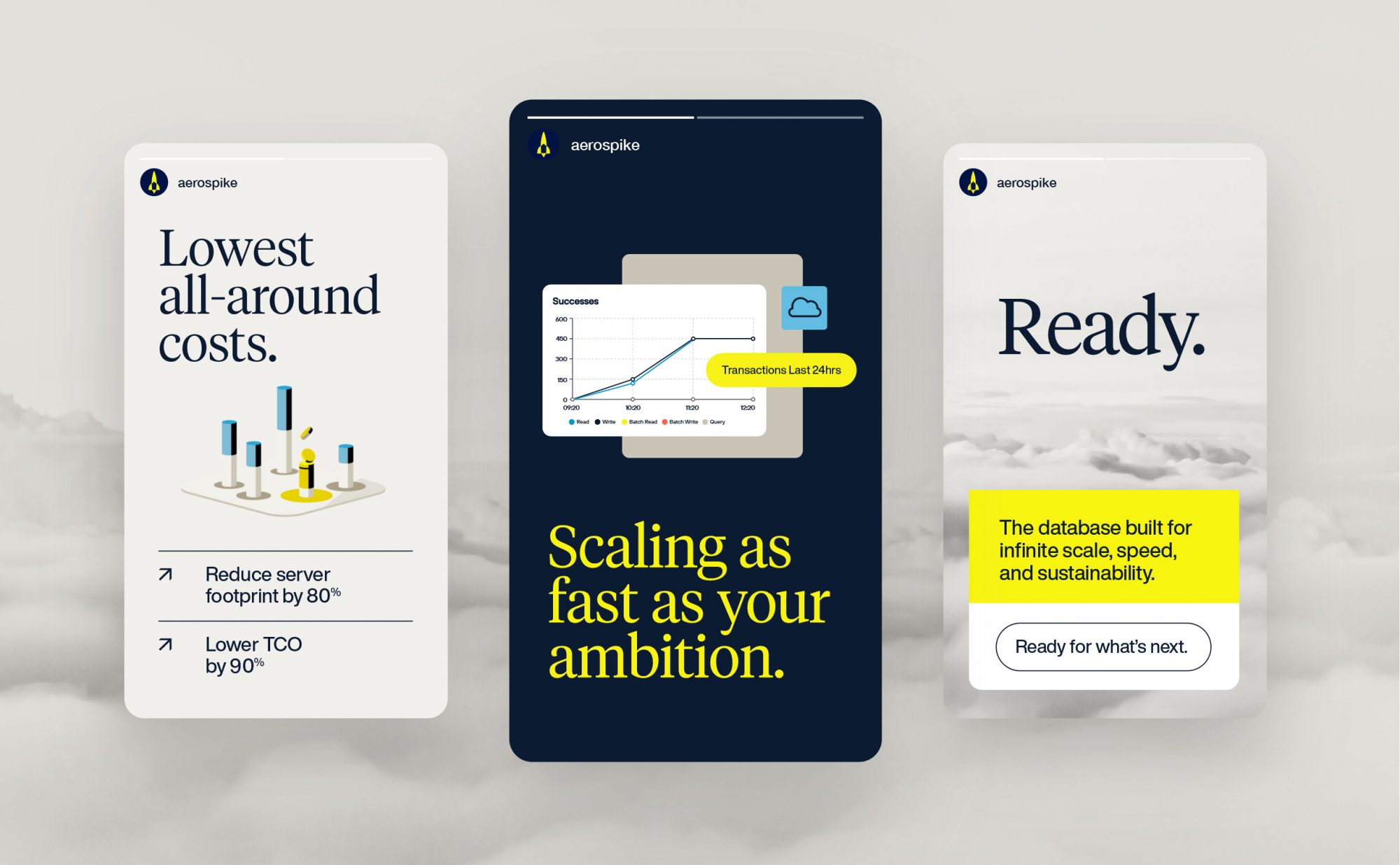
For Aerospike to rise above the “me too” competitive noise and accelerate the sales process, its messaging needed to be ruthlessly clear. A messaging framework was crafted that provides the language, voice, and tone to convey the infinite scale, speed, and savings that only Aerospike can deliver.

Brand Activation
Bringing a new brand to life
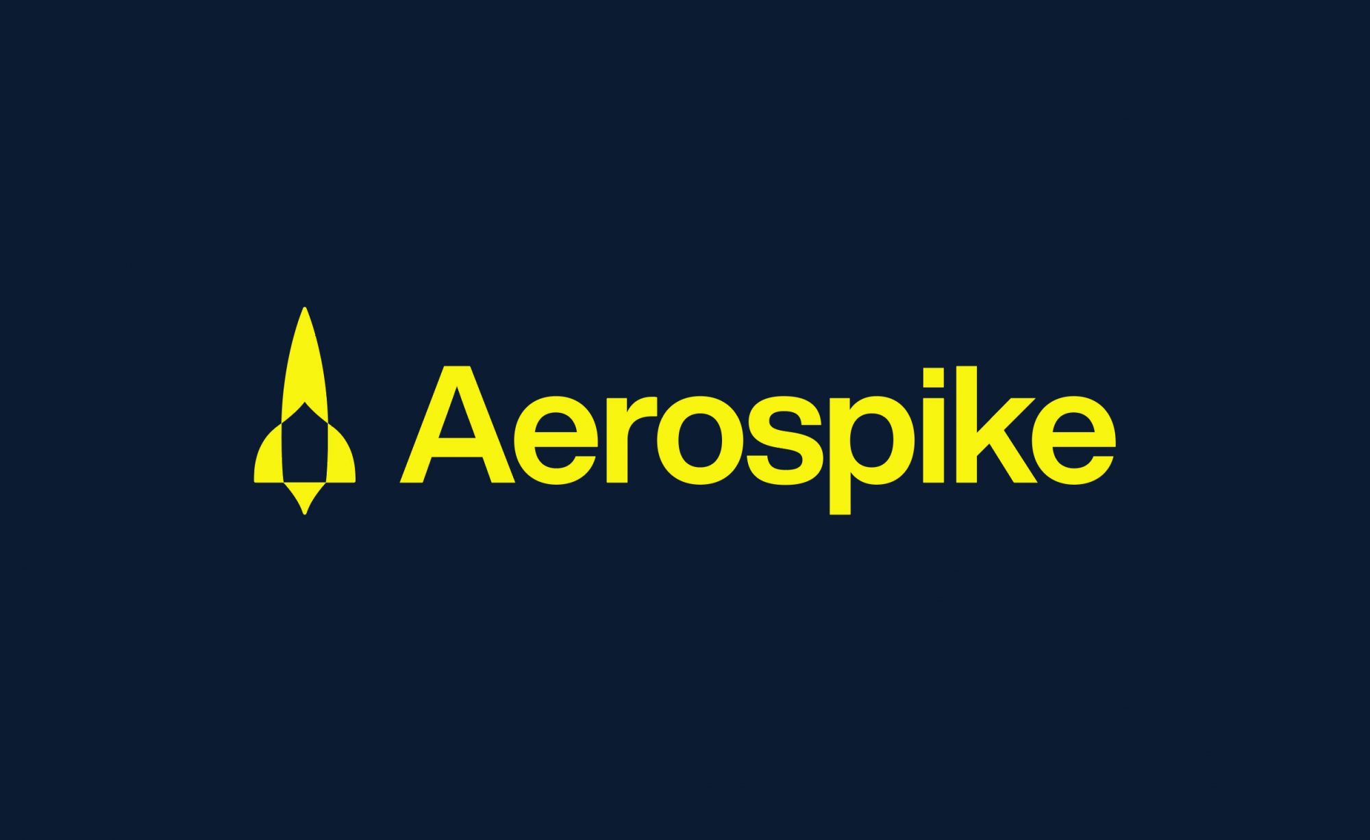
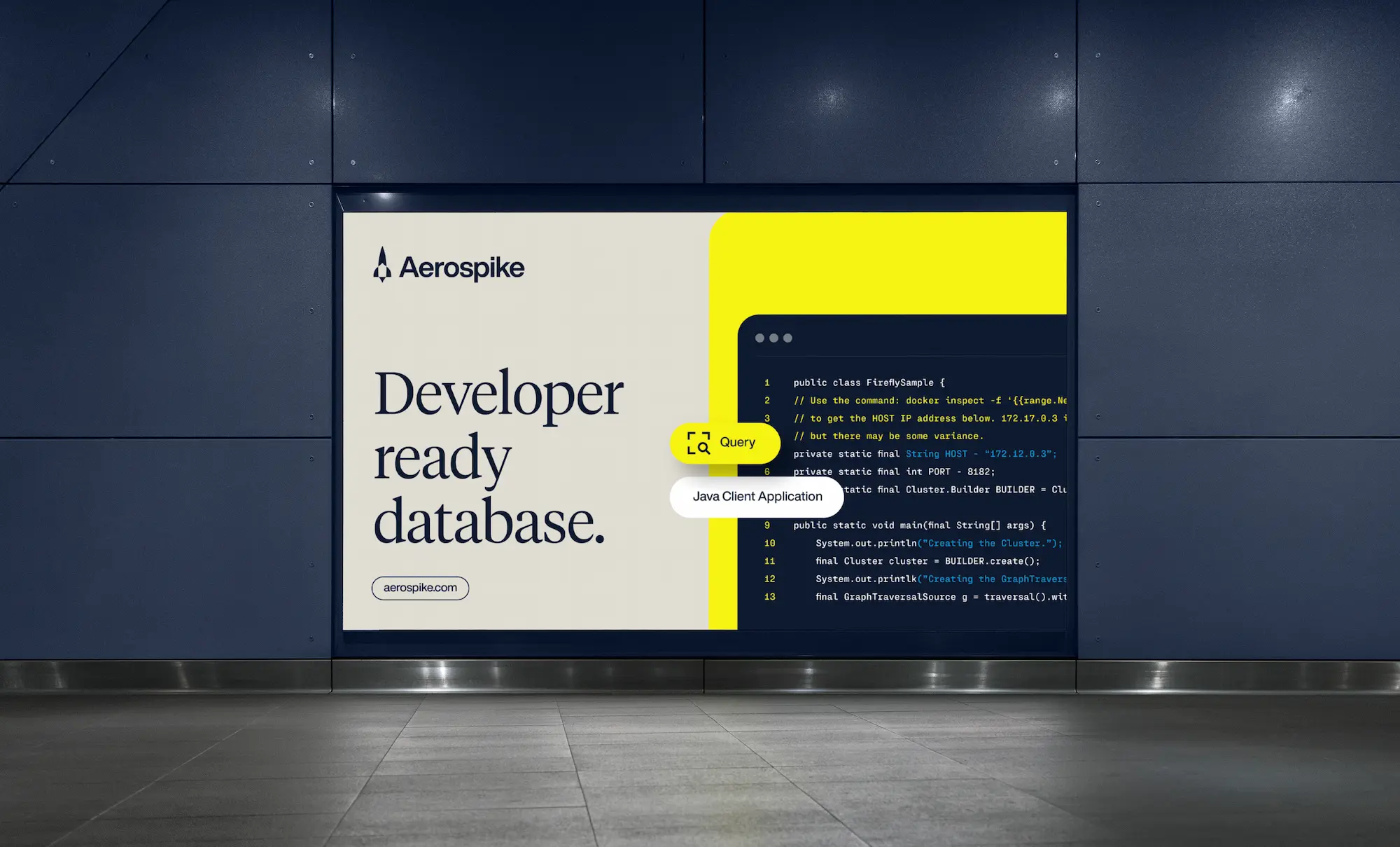
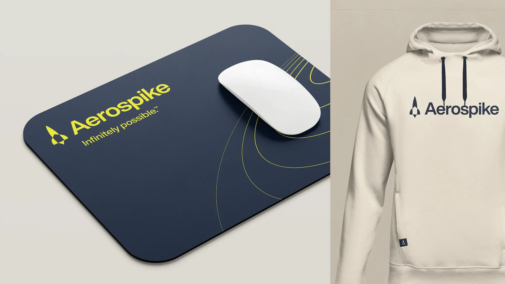
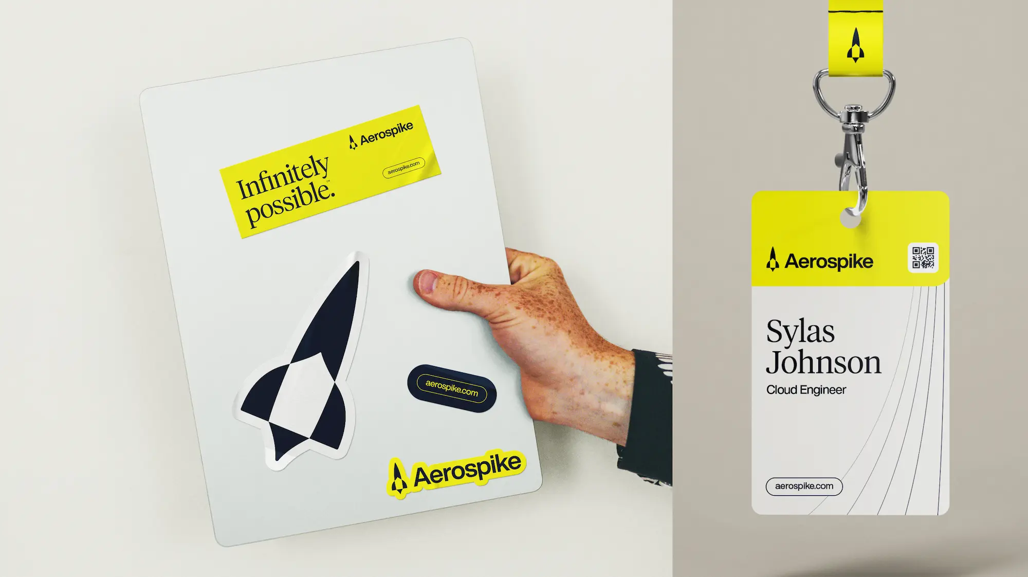
An aerospike is a thin, antenna-like structure mounted onto the cone of a rocket. It is also a type of advanced rocket engine. So leaning into the visual language of rocket science and space provided a distinctive look and a consistent theme across all brand touchpoints.





ACCOLADES/PRESS
Graphis Design Awards – Logo, Gold
Graphis Design Awards – Rebrand, Silver

