Our latest news and views.

Deciding on the right creative agency can be difficult. Use these 5 steps to find the agency that will challenge, collaborate, and elevate your vision.
Read the Article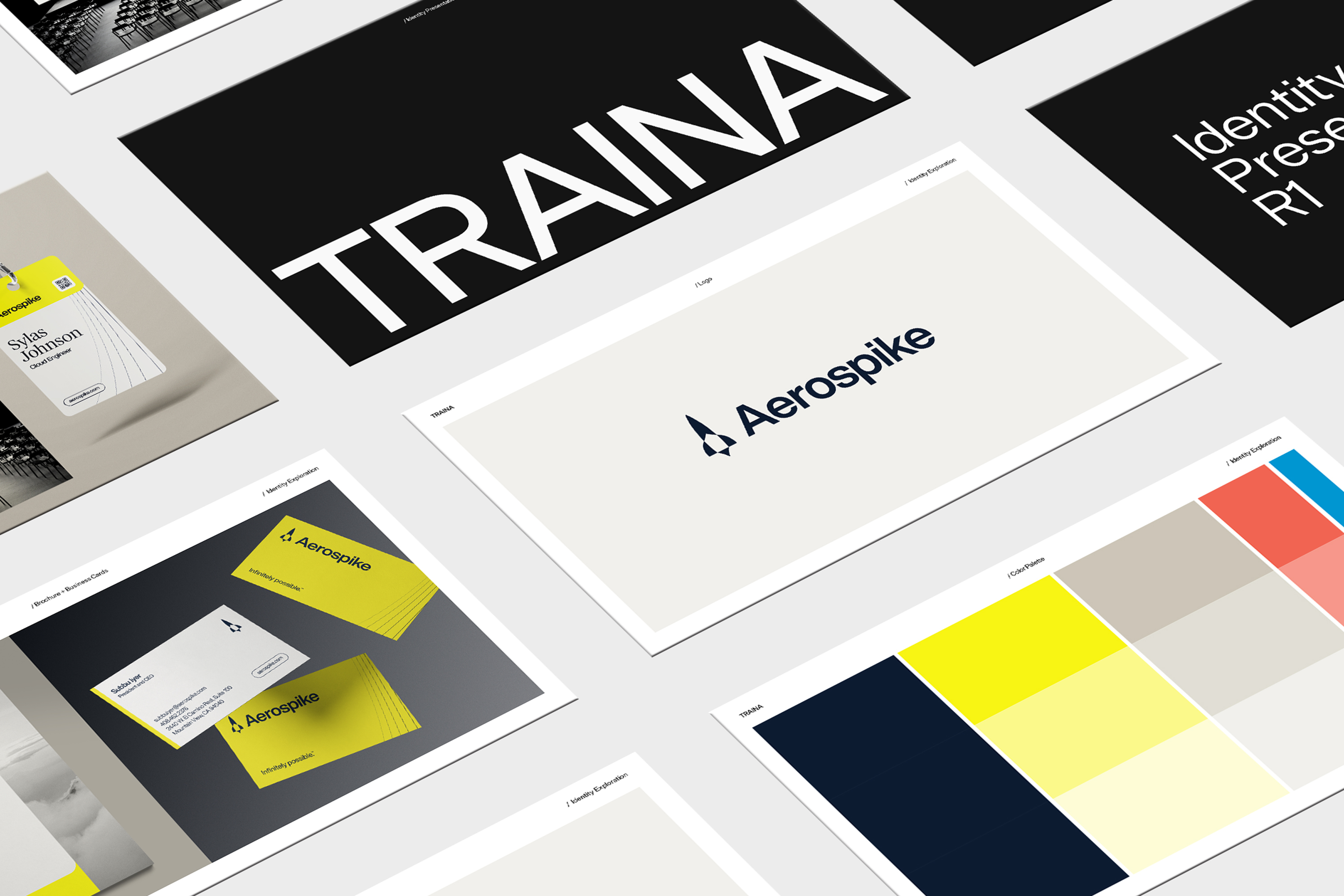
Nothing beats the excitement of an initial creative presentation. But feeling equipped to provide constructive feedback can be a challenge for clients. In this article we explain how to use your strategic positioning as a guide for evaluating concepts.
Read the ArticleSign up for more Traina news, insights and updates.
By signing up to receive emails from Traina, you agree to our Privacy Policy. We treat your info responsibly. Unsubscribe anytime.

Through the power of great design, you can establish your company and your technology as innovation leaders.
Read the Article
Traina’s annual look back at the winners and losers of the year in rebranding
Read the Article
Merging creativity with consumer appeal
Read the Article
The terrifying truth: Even the most hideous name can’t doom a good business and brand
Read the Article
7 symptoms that suggest a little nurturing may be necessary
Read the Article
5 tips on how to successfully refresh a legacy brand
Read the Article
A quick-start guide and template for internal launch planning
Read the Article
Traina’s annual look back at the winners and losers of a tumultuous year in rebranding
Read the Article
A successful brand launch supports the most vulnerable of patients—babies born prematurely.
Read the Article
And why postponing a desperately needed refresh can do irreversible damage to your brand.
Read the Article
CSO Matt Bachmann pulls back the curtain to reveal sources of inspiration when naming a brand.
Read the Article
Let’s get nuts. (And bolts.)
Read the Article
And how your magazine can give it to them. (Part 1)
Read the Article
A guide to making the most of those first precious moments when your brand strategy comes into the world.
Read the Article
Our creative and dev teams come together to explain how systematized design can be a huge advantage for companies seeking to maximize their brand.
Read the Article
Marketing director Danielle Higgins and creative director Erwin Hines discuss how brands and people can work together to uplift communities and move us all forward.
Read the ArticleCEO David Traina and chief strategy officer Matt Bachmann discuss how brand values keep a company culture improving and a strong brand moving.
Read the Article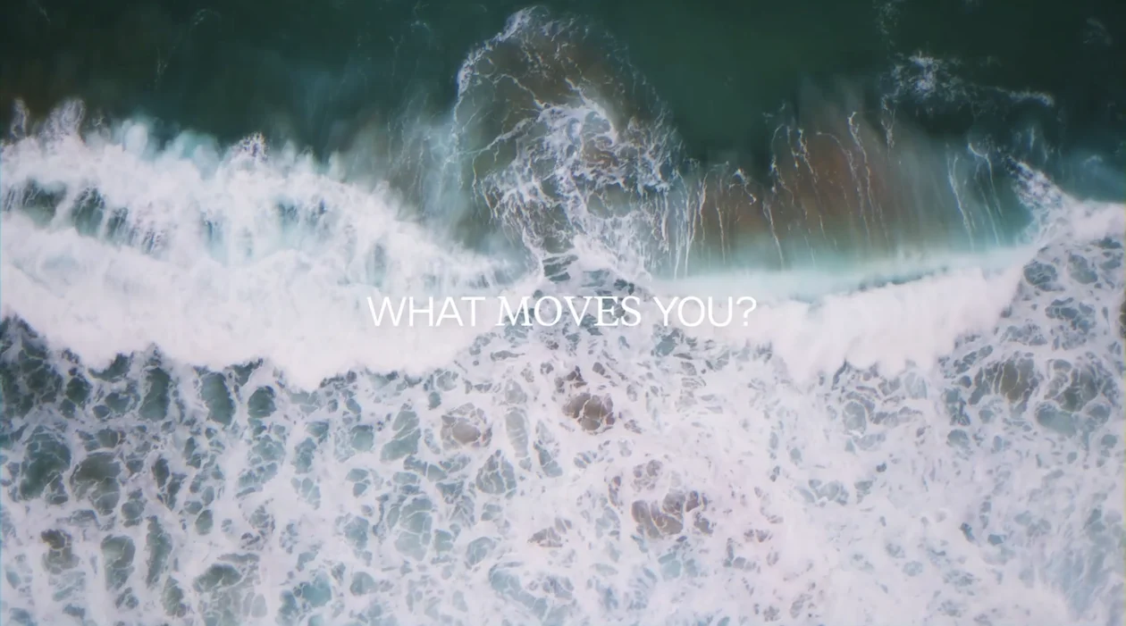
No matter the market, vertical or industry, today’s brands must move people if they want to move ahead. Here’s why we made the act of moving our manifesto.
Read the Article