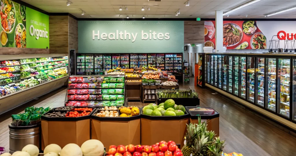
Building regulatory AI trust through a human-centered brand.
Services PROVIDED:
BRAND STRATEGY BRAND POSITIONING MESSAGING PLATFORM BRAND TAGLINE Visual identity WEB DESIGN + DEV WEB COPY BRAND GUIDELINES
Insight
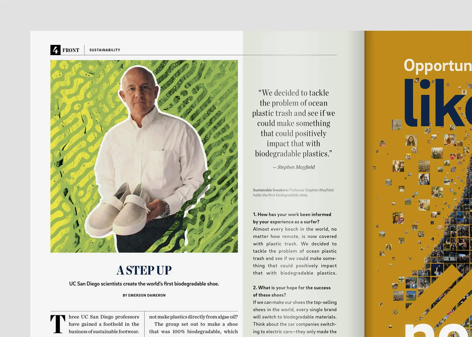
Regulatory experts are skeptical of AI without human oversight, yet seek a tool that can reduce manual effort with accuracy.
Challenge
Weave Bio needed to differentiate its AI-powered solution in a crowded market with legacy players and start-ups alike.
Solution
We established Weave as a human-driven platform that amplifies regulatory expertise rather than replacing it.
BRAND STRATEGY
Uncovering the trust barrier
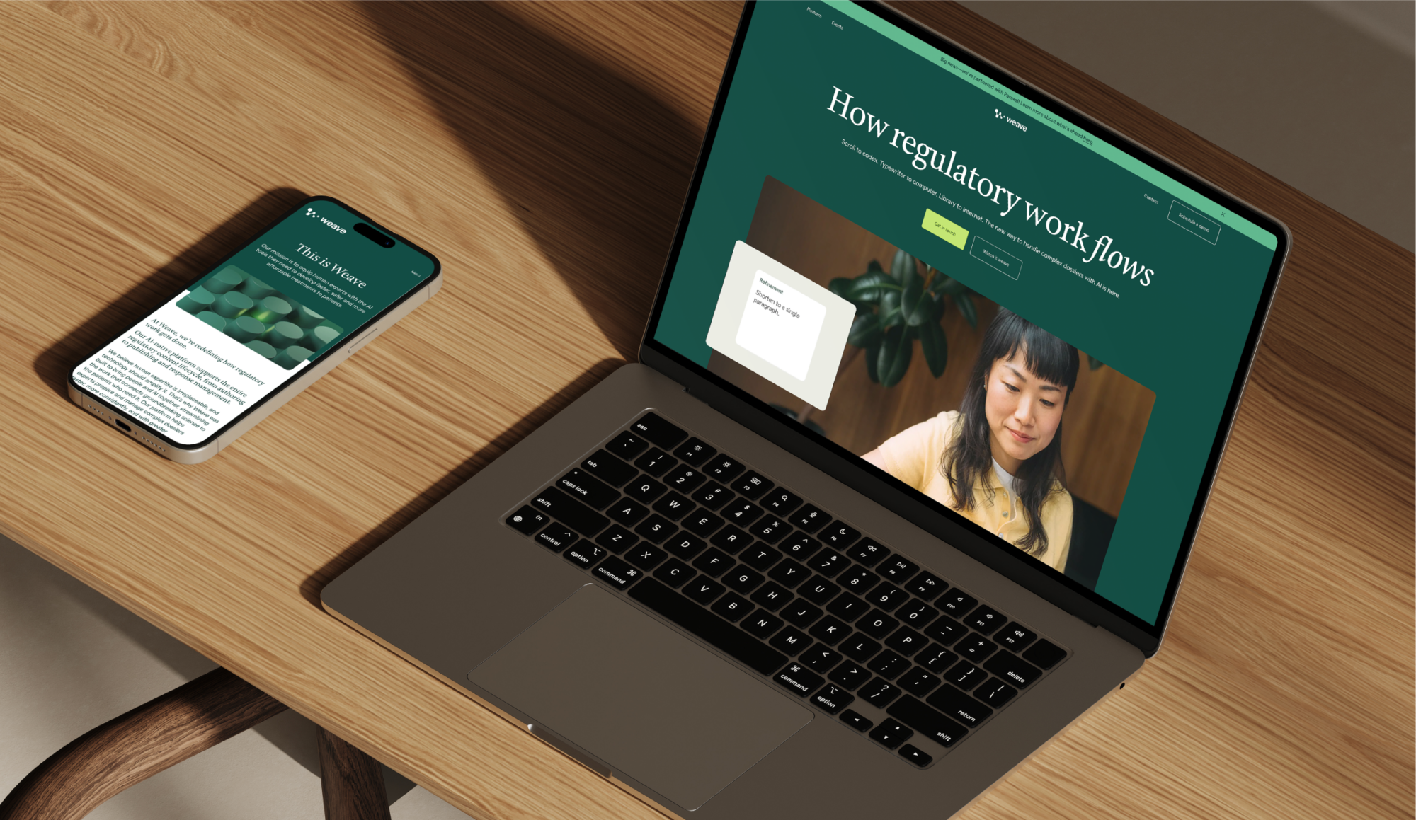
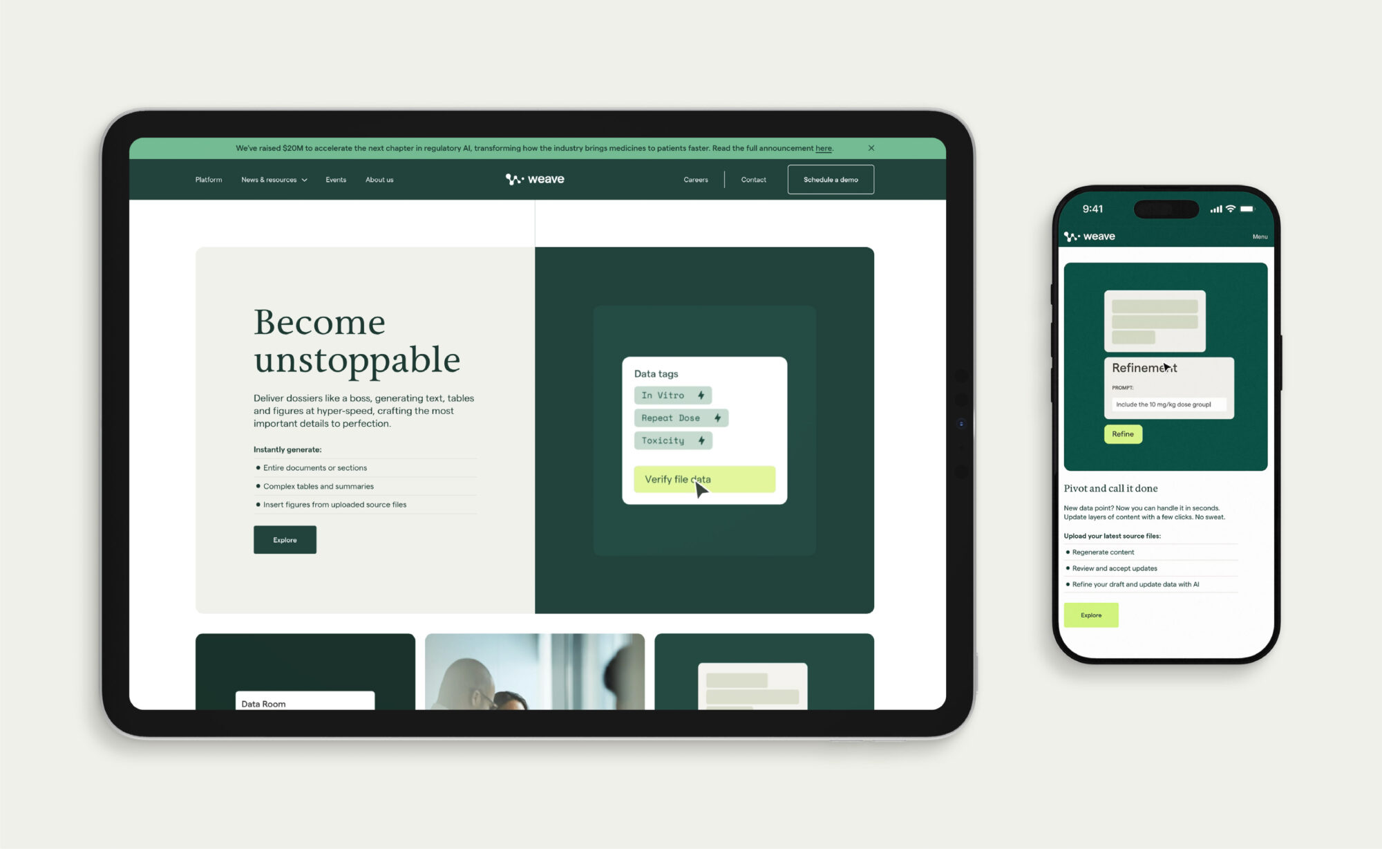
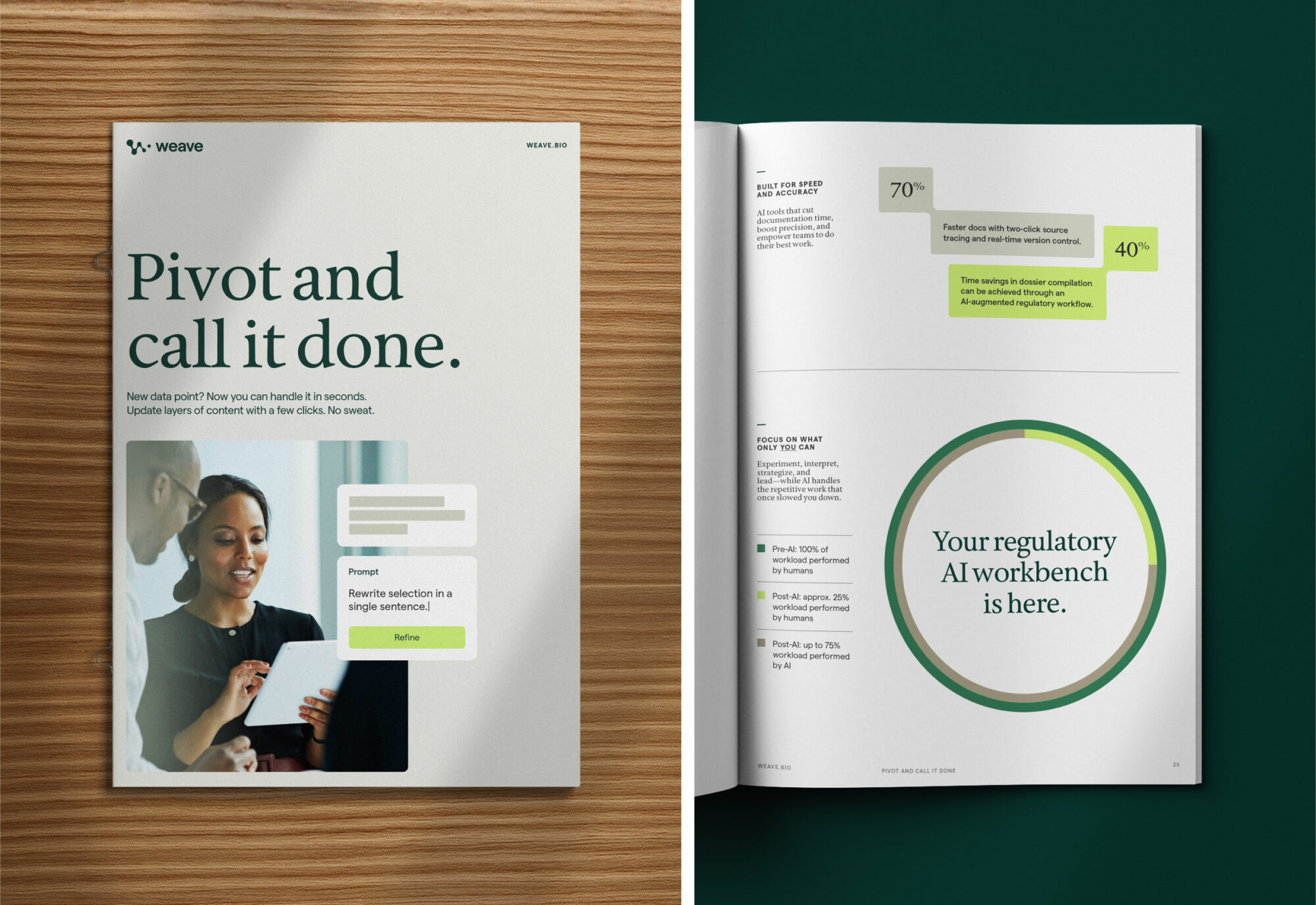
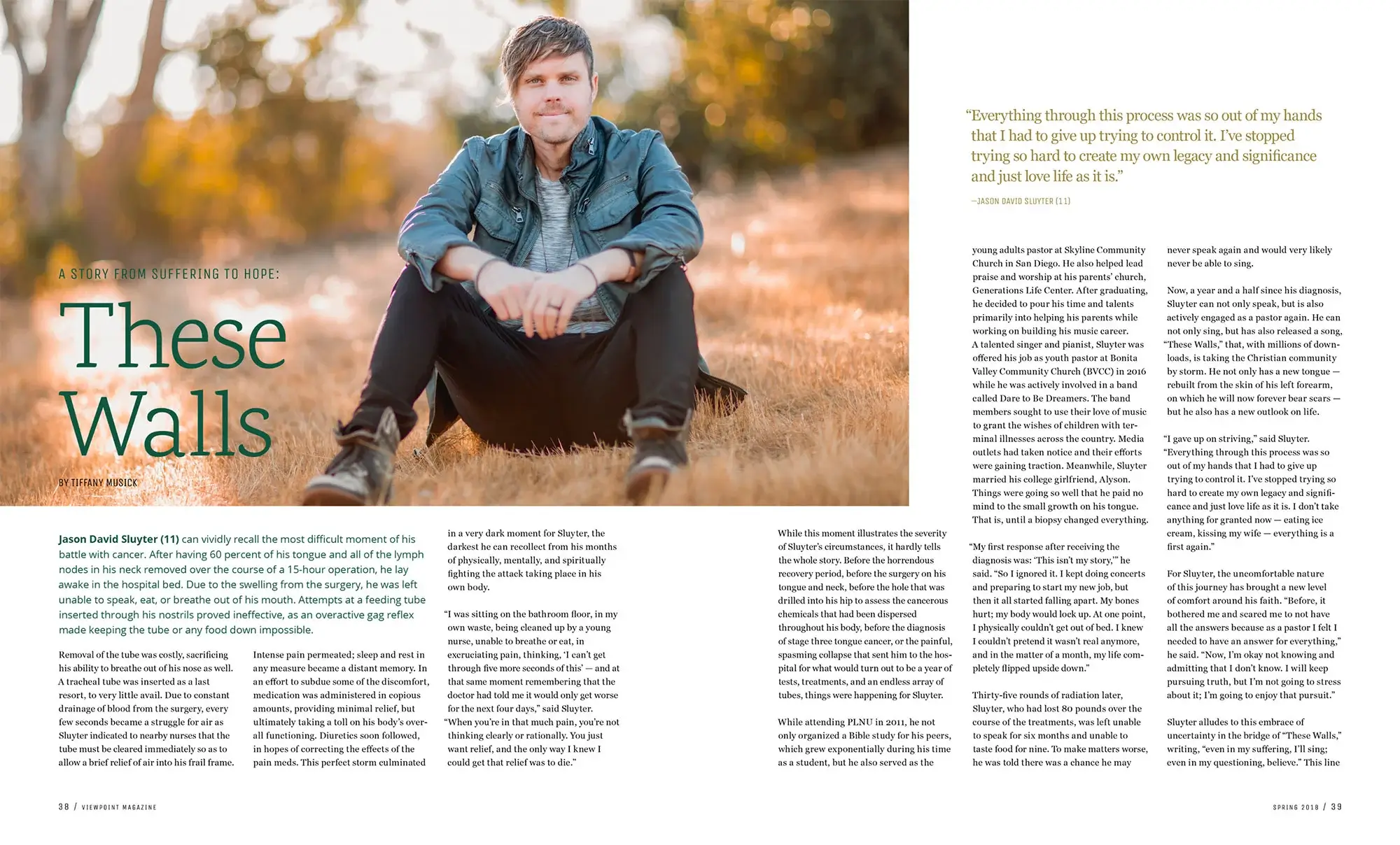
The real barrier to AI adoption wasn’t resistance—it was skepticism that any platform could deliver audit-ready dossiers. We positioned Weave as human-led AI, where regulatory experts direct the technology using their secure data, with verification and oversight built into every step.
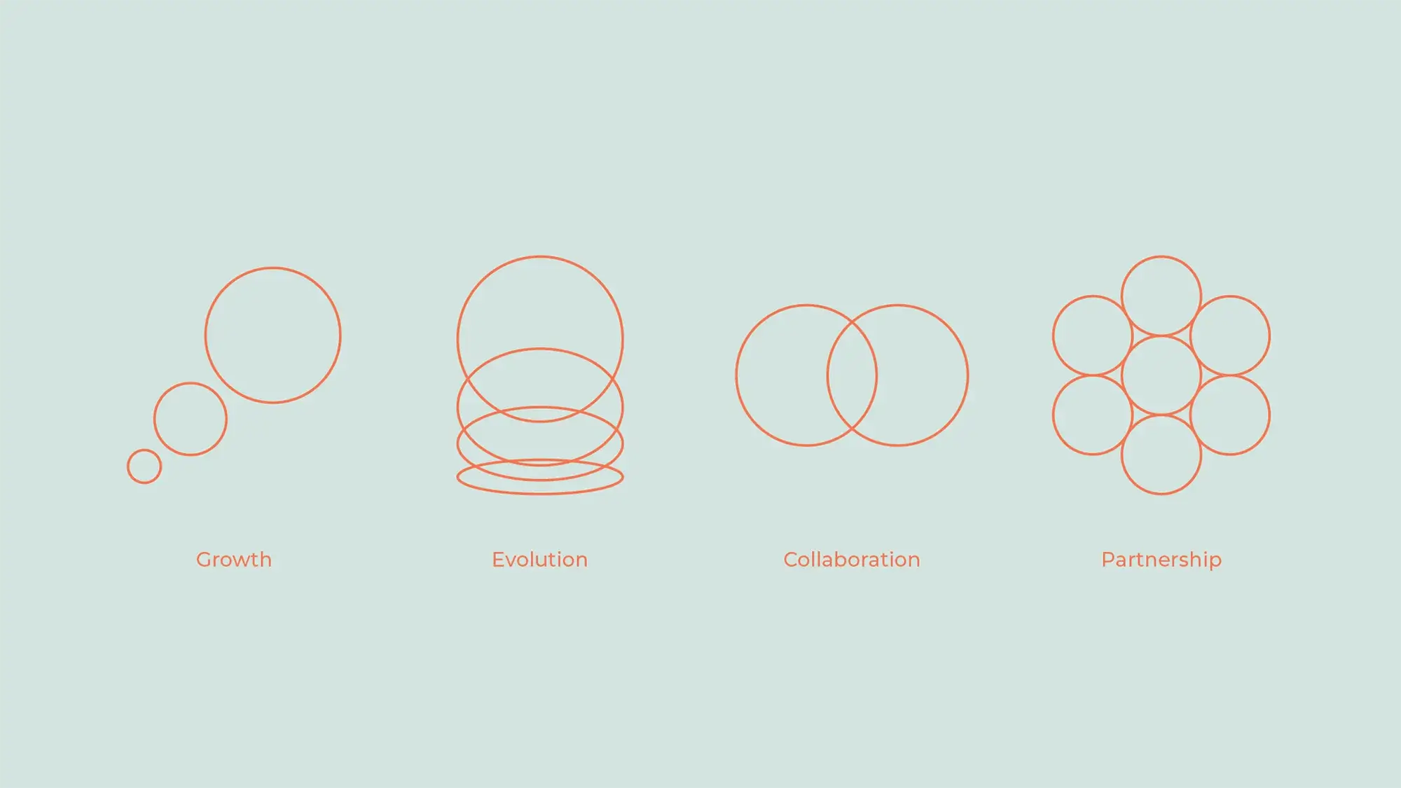
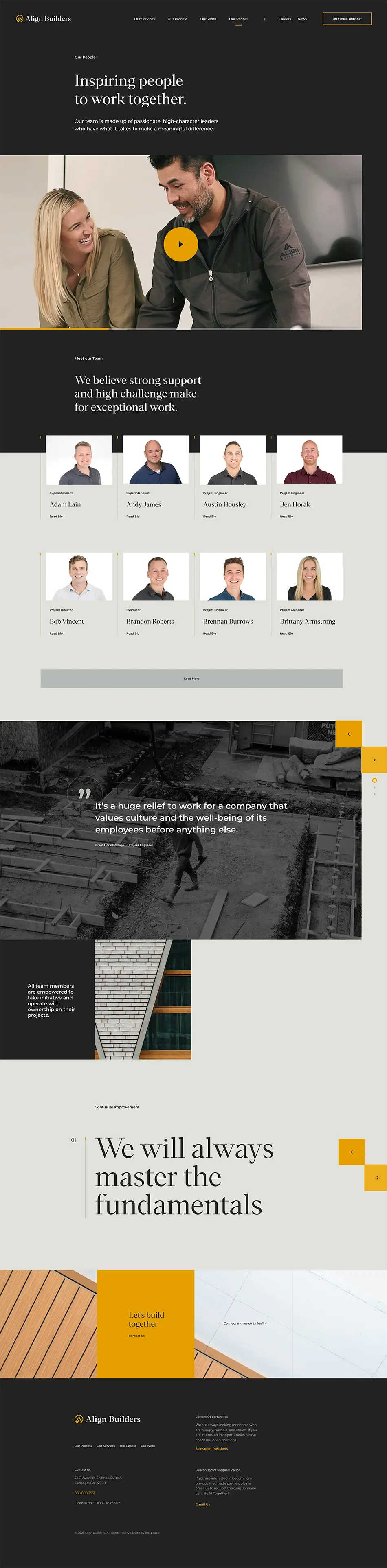
VISUAL IDENTITY
Balancing warmth and precision
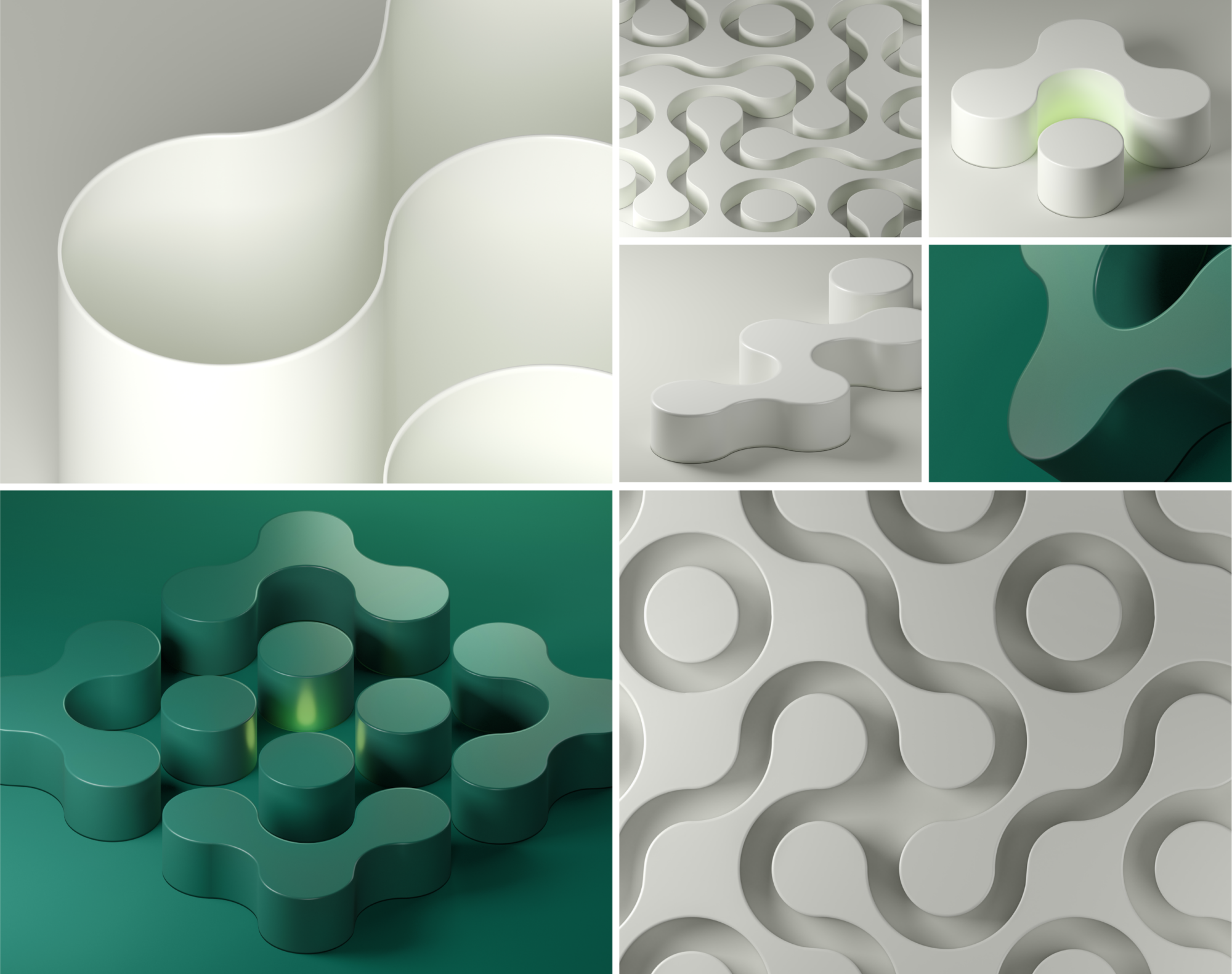
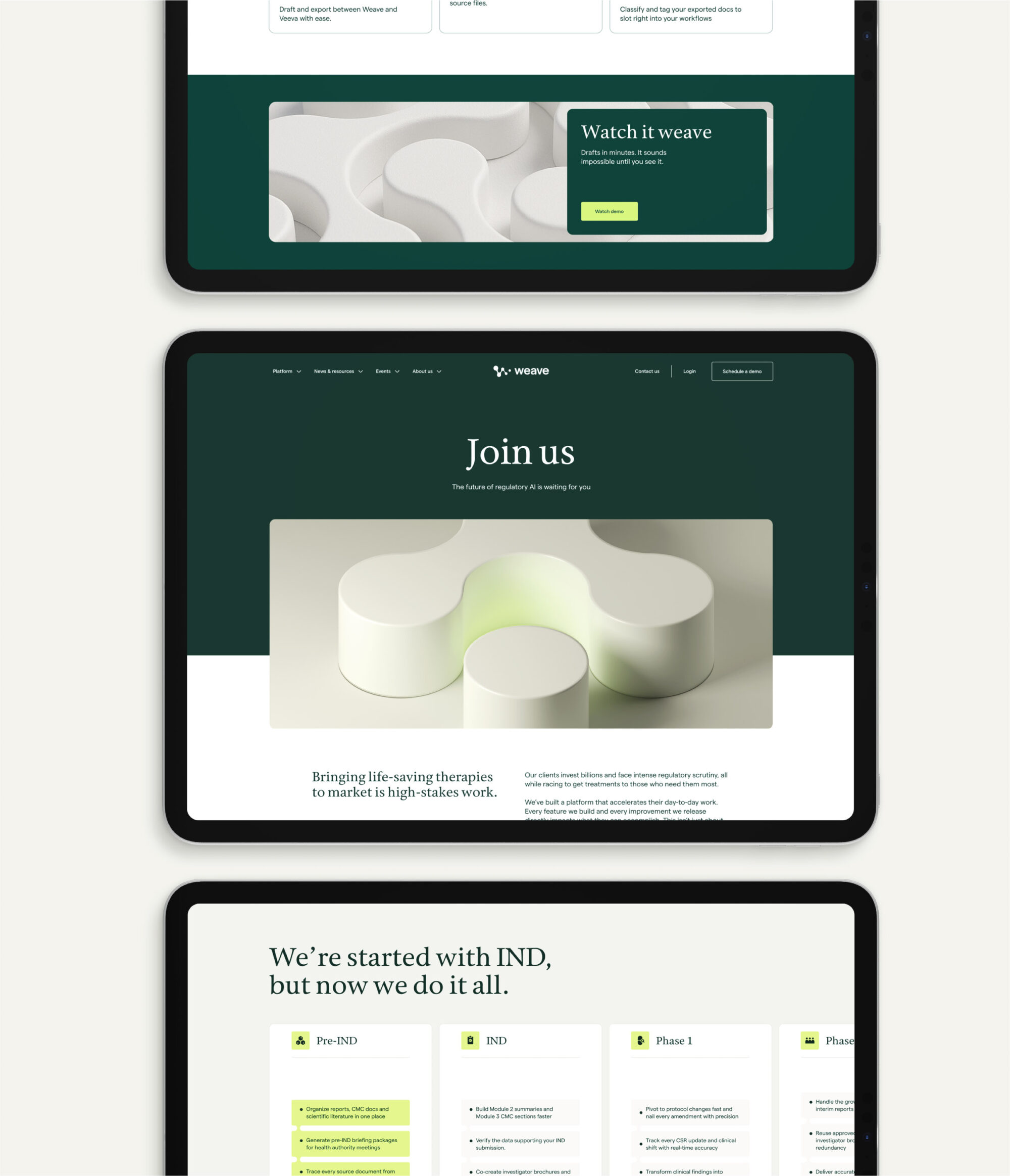
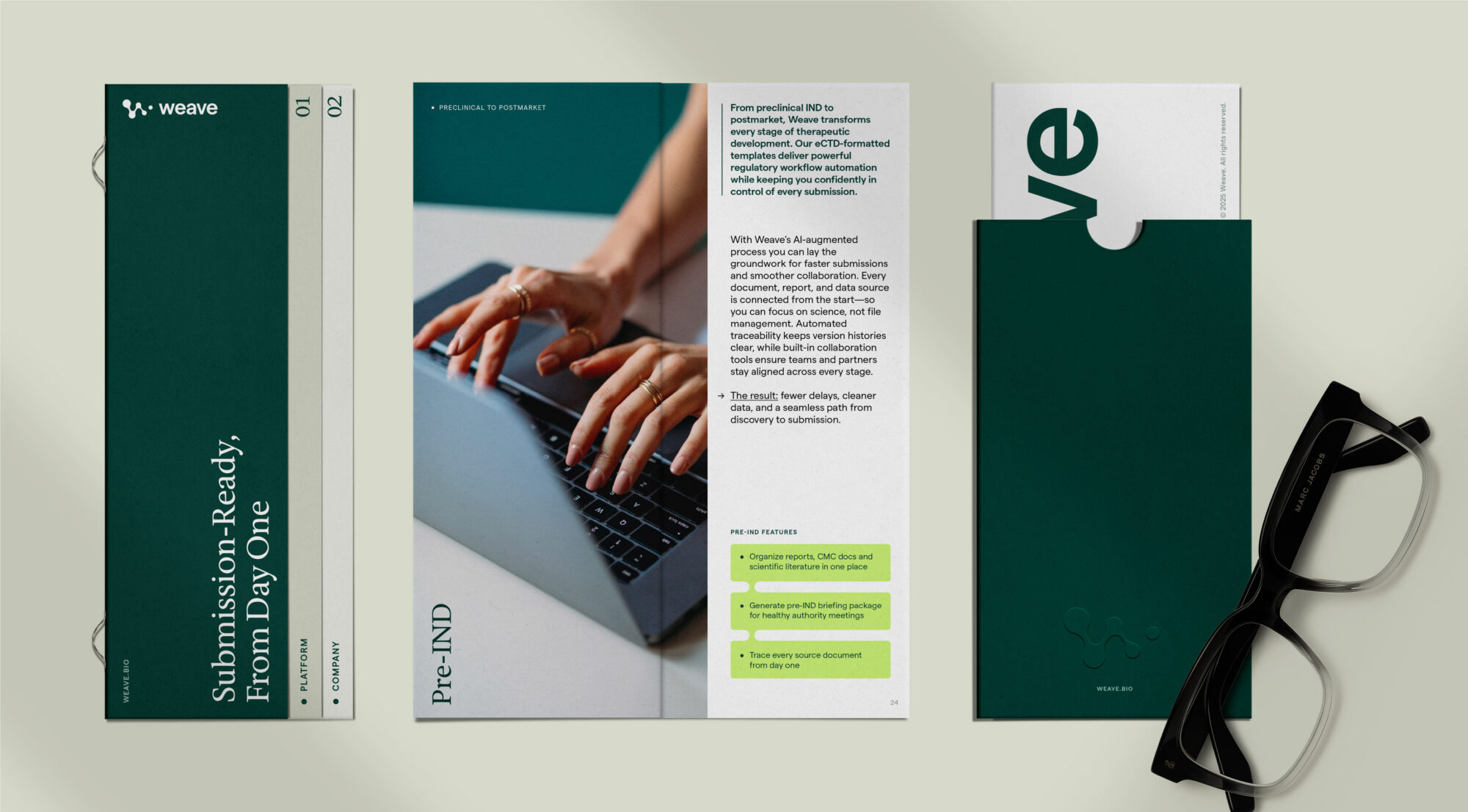
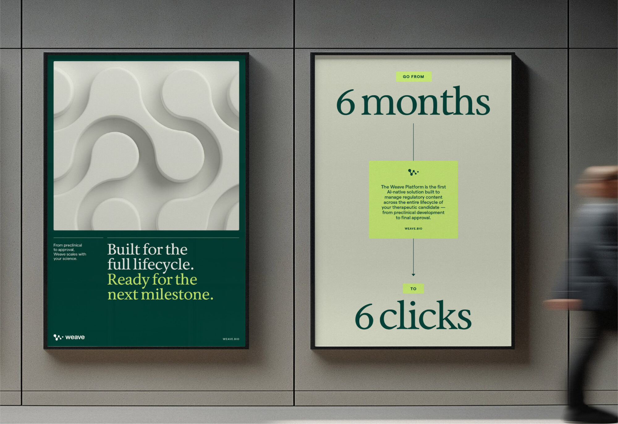
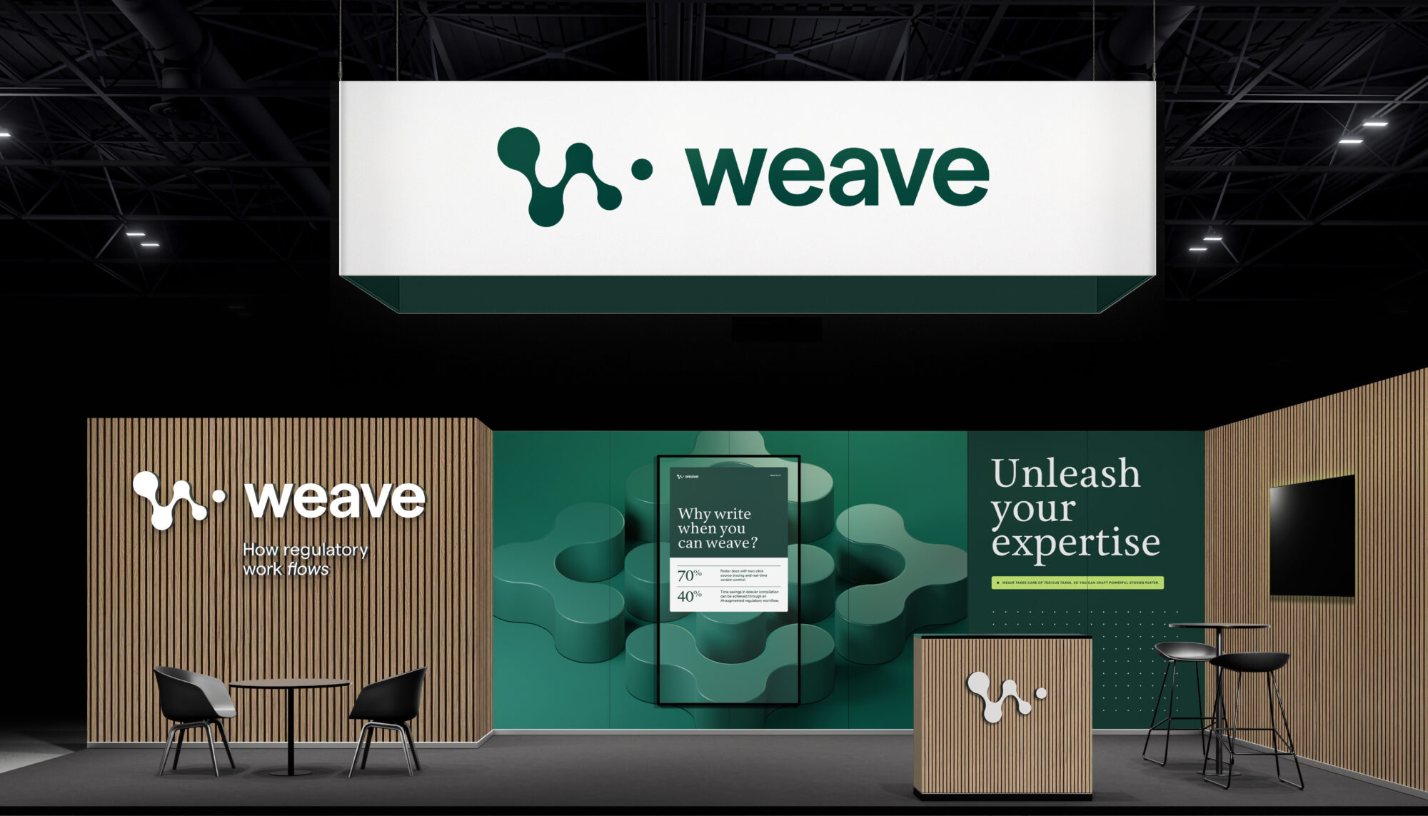
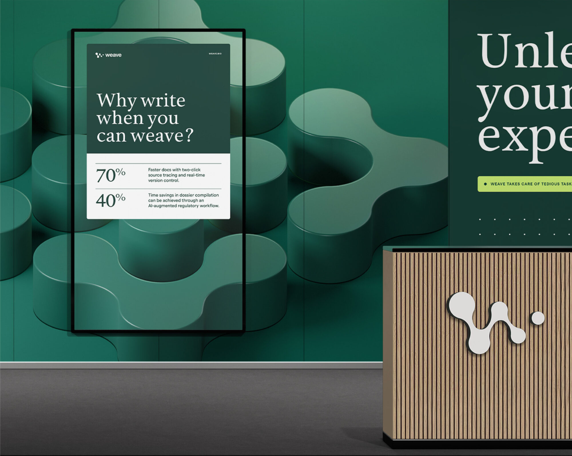
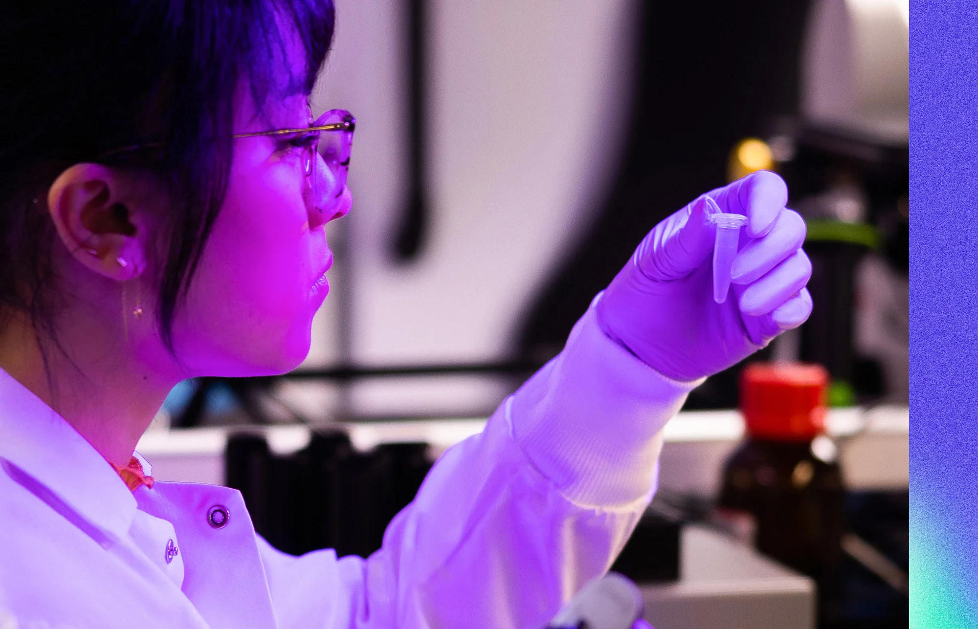
Weave Bio’s discerning clientele needed a system that could convey a sense of human warmth paired with elevated technical rigor. We developed a dynamic 3D graphic system inspired by the logo’s intersecting shapes—a signal of the platform’s continuous AI refinement and seamless integration of intricate regulatory data. Candid, in-motion photography humanizes the brand, while intuitive UI vignettes distill sophisticated product features into simple visual stories that build credibility quickly.
DIGITAL IDENTITY
An evidence-based digital showcase
The website addresses regulatory professionals’ core decision criteria head-on: accuracy, traceability and real-time collaboration. Video vignettes demonstrate platform precision in action, while customer testimonials validate audit-ready performance. The 3D graphic system animates through page transitions, visually reinforcing how Weave integrates detailed data. Every element serves a purpose—building trust through proof, not promises.
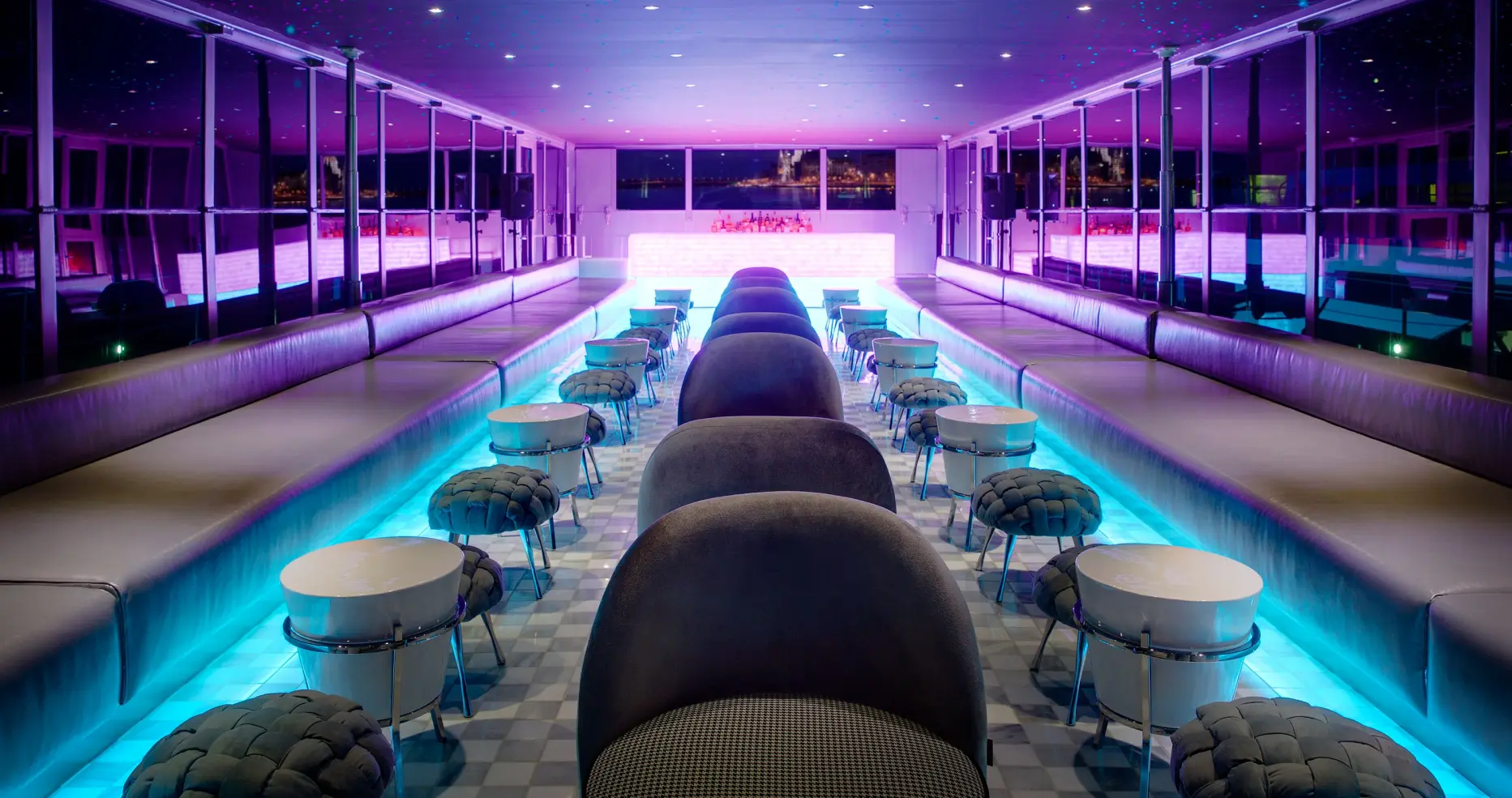
BRAND APPLICATIONS
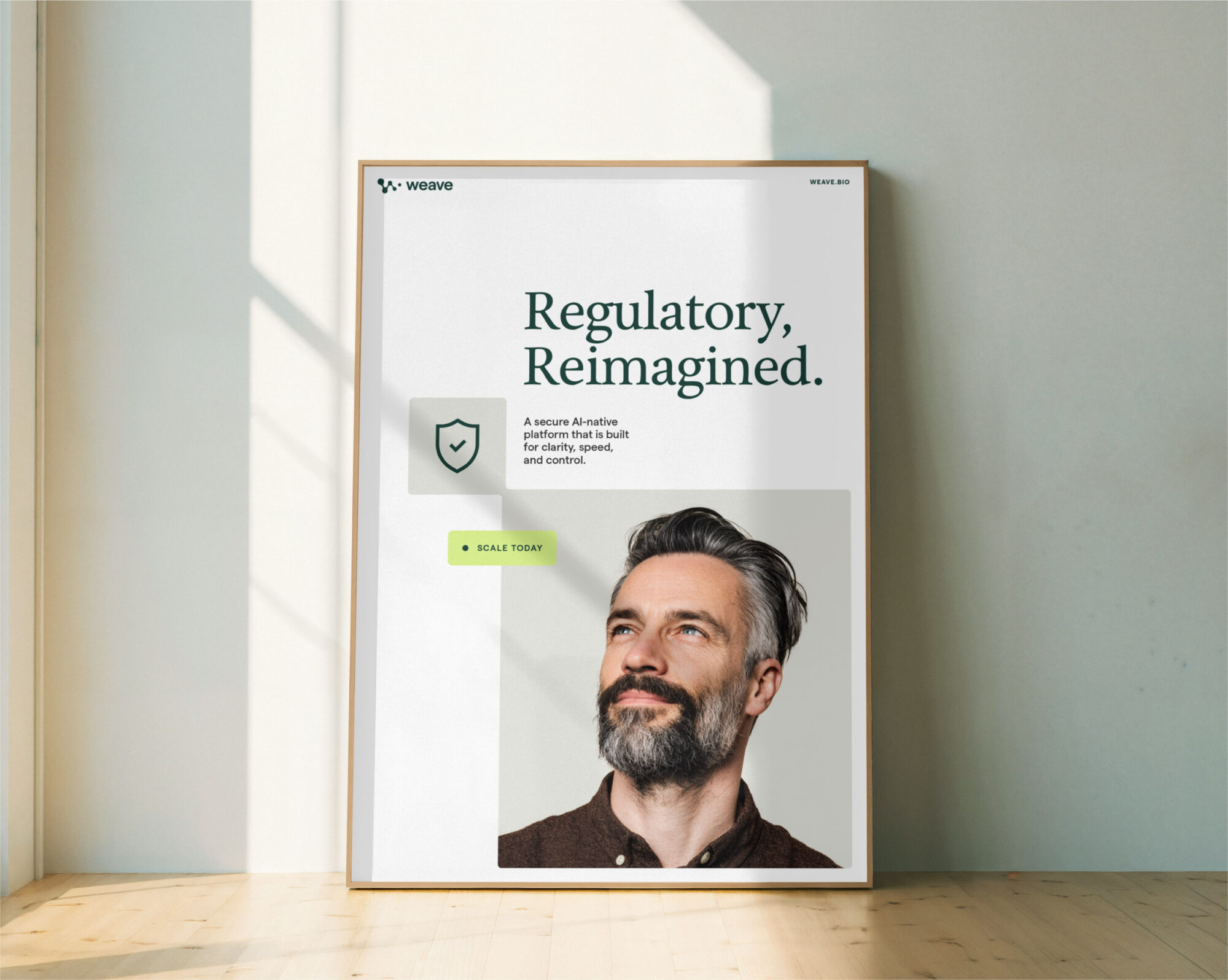
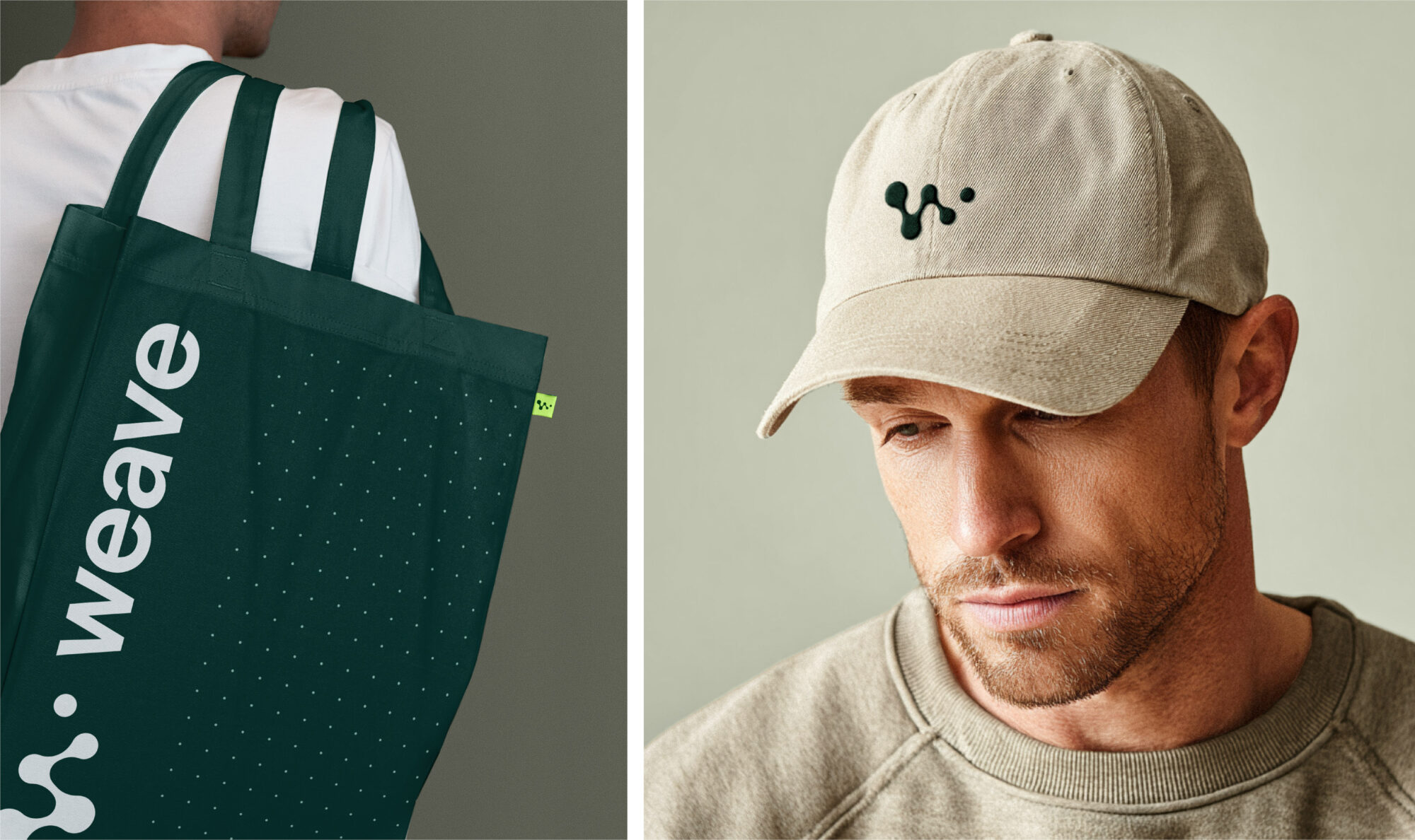
The brand system extends beyond digital into high-stakes sales moments and industry events. Posters pair candid photography with confident messaging like “Regulatory, Reimagined” to reinforce Weave’s human-led approach. Sales collateral distills platform benefits into clear visual hierarchies, while booth design uses the 3D graphic system and warm tones to stand out among competitors.
BRAND STRATEGY MARKET POSITIONING MESSAGING PLATFORM Visual identity WEB DESIGN + DEV BRAND GUIDELINES
Insight
Trust isn’t something you can claim with a name—it must be methodically earned through every touchpoint and interaction with your audience.
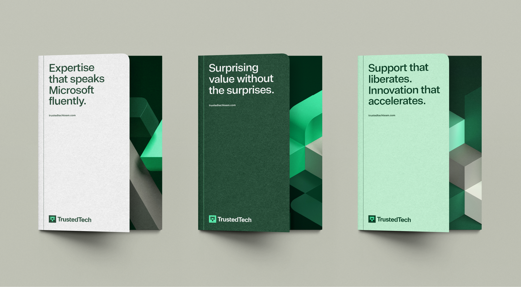
Challenge
Overcoming the deep-seated cynicism of a technology audience that failed to perceive the company as a trustworthy provider of the latest software products.
Solution
Re-imagine TrustedTech’s visual identity to reflect the same intelligence and sophistication that defines their technical solutions—creating coherence between the company’s promise and its brand expression.
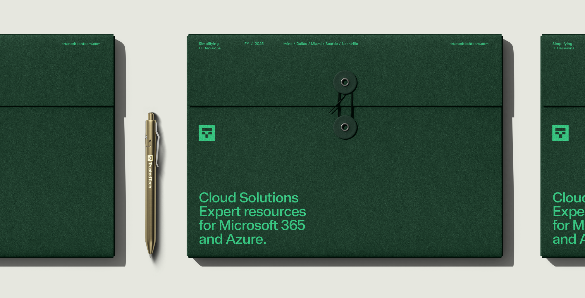
BRAND ELEMENTS
A visual system that uses restraint to say more
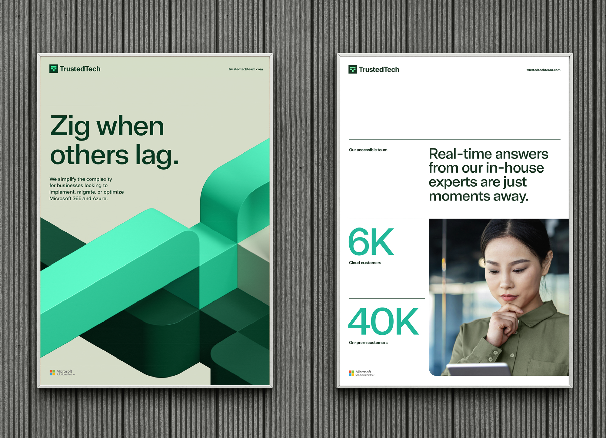
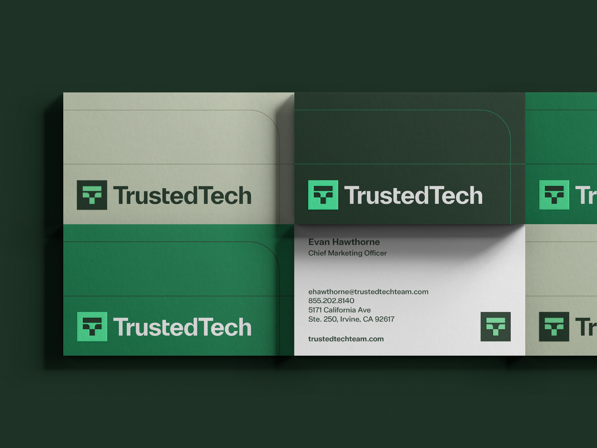
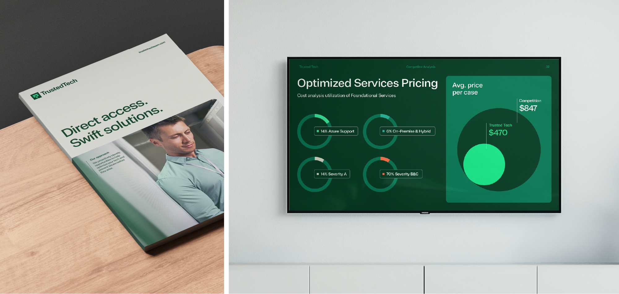
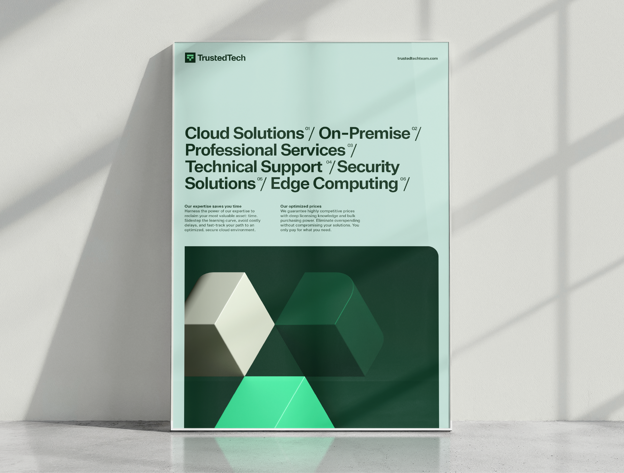
The typical software reseller crowds its own brand with the product brands it’s promoting. Disjointed marketing claims add further noise. The result is a chaotic mess that certainly doesn’t build credibility. We took the opposite approach for TrustedTech. From the rich natural tones of the color palette to the gravitas of the geometric shape language, the TrustedTech brand exudes strength and reliability. The logo’s double-T image mark sets a bold tone for the brand that inspires much of the visual system. And clean layouts with simple messaging sweep away the stereotypical clutter and confusion of the industry.
DIGITAL LAUNCH
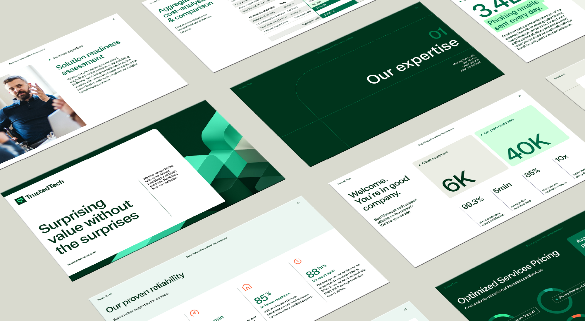
Modern meets mature
Digital is where a cloud service provider’s credibility can be won or lost in seconds. TrustedTech’s modern visual identity plays an important role in positioning the brand as a legitimate resource for IT professionals.
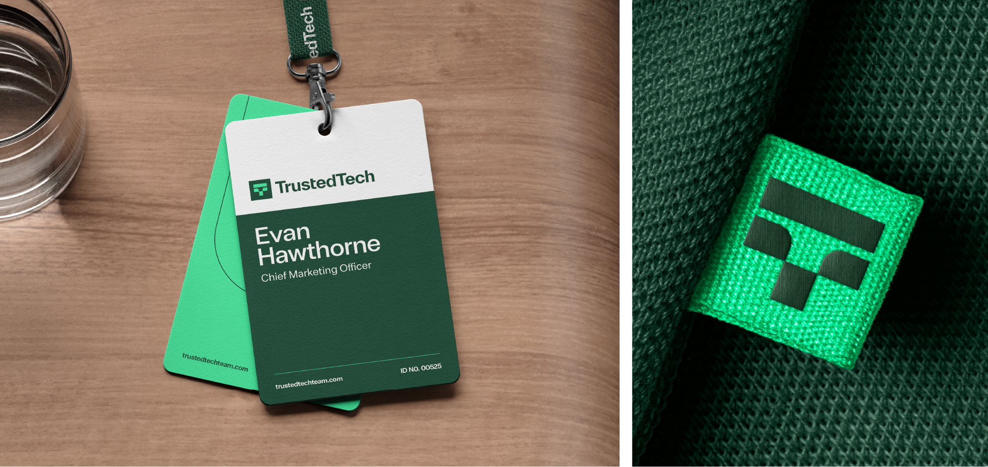
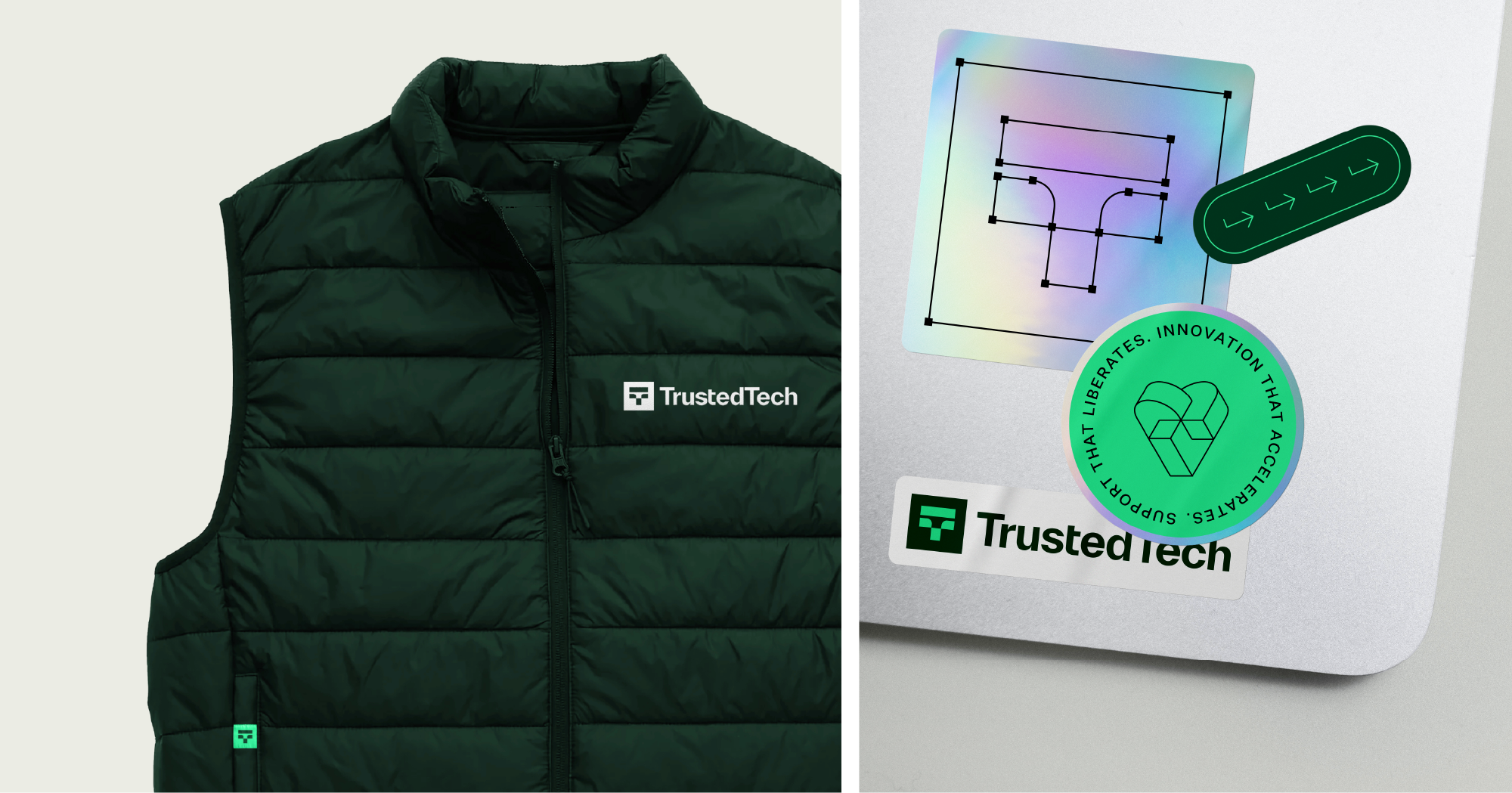
BRAND APPLICATIONS
Establishing authentic authority
Sophisticated and succinct, the re-imagined brand effortlessly conveys expertise across diverse touchpoints—elevating TrustedTech above the transactional to convey superior levels of capability and competence.
RESULTS
Making gains
Capturing the momentum of a growing company, the TrustedTech rebrand ushers in a new era for the organization:
As a young company, this was our first time going through a rebrand. We weren’t sure what to expect. Traina expertly led our team through the process, providing strategic guidance and amazing creativity at every turn. We couldn’t be more prepared for our next chapter.”
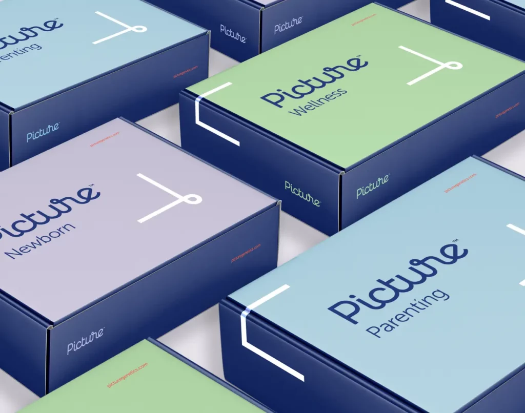
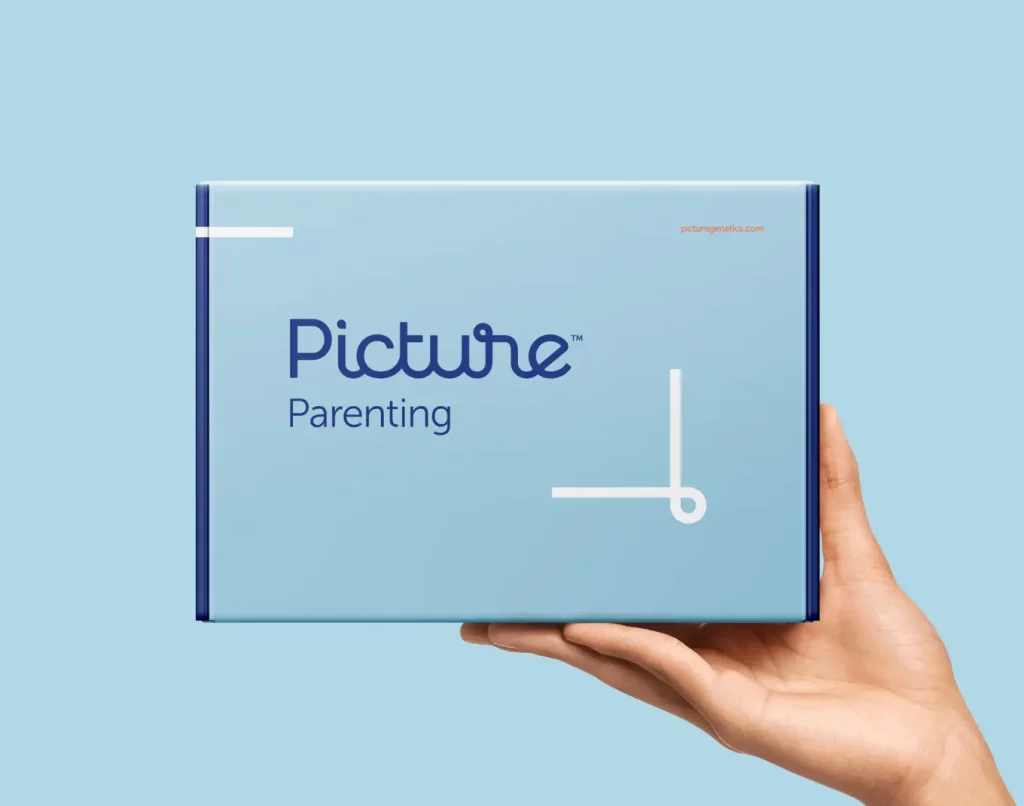
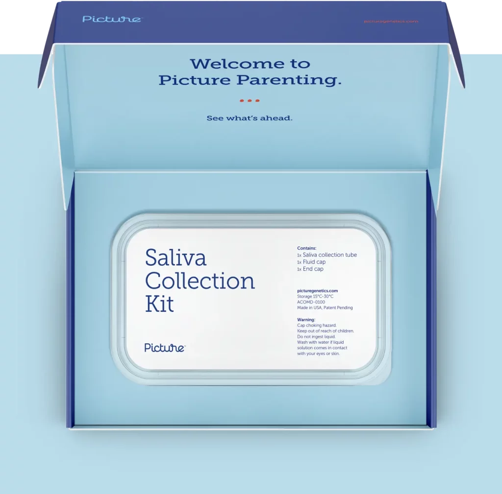
Moving high-performance health from niche to mass market
Services PROVIDED:
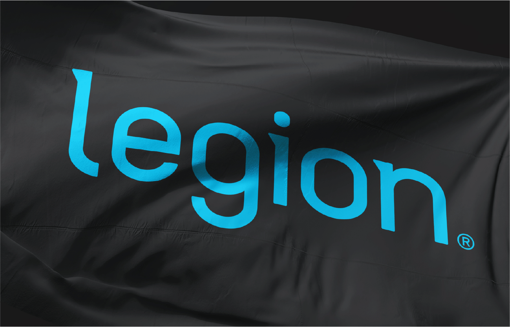
Visual identity BRANDing PACKAGING
Insight
Legion isn’t another hype-driven, pseudoscientific supplement brand—it’s clinically effective nutrition, made with the highest standard.
Challenge
Legion’s original brand was getting lost alongside macho supplement labels, overshadowing its commitment to quality, taste and health for everyone.
Solution
We repositioned Legion as clean, honest nutrition for everyone, not just body builders—spotlighting its premium, flavorful and pure ingredients.
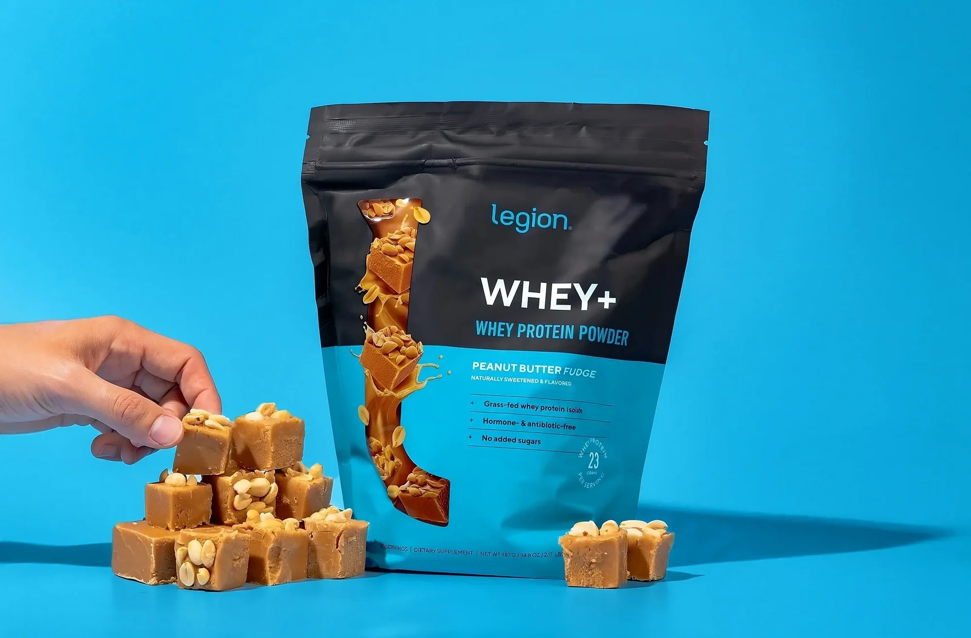
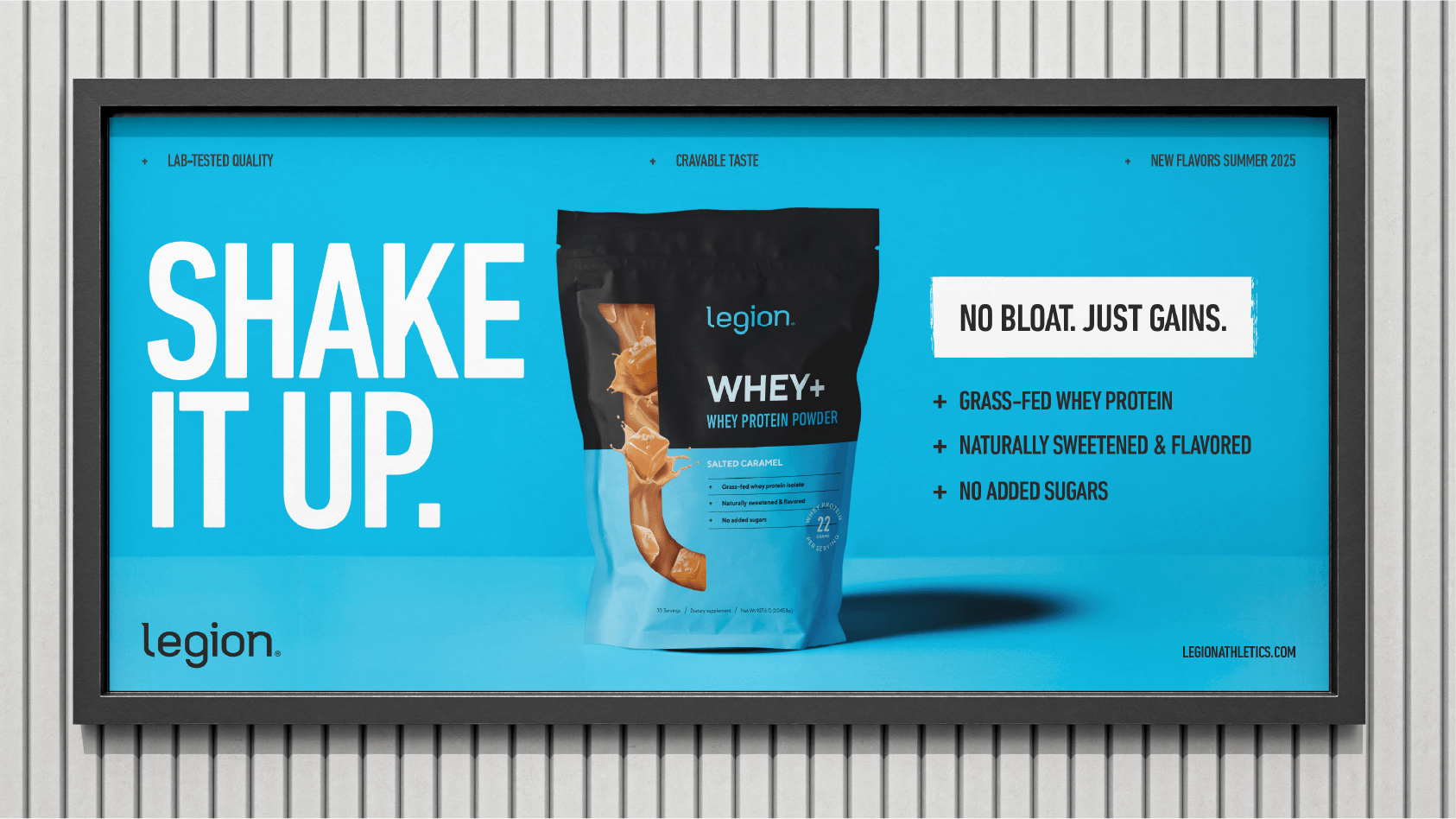
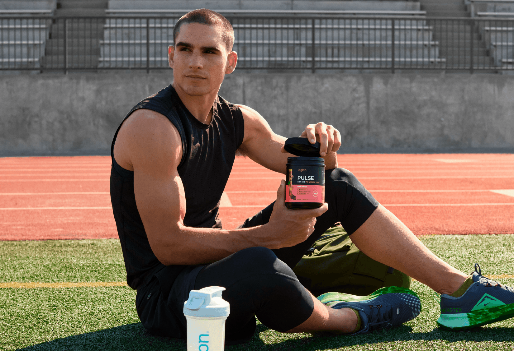
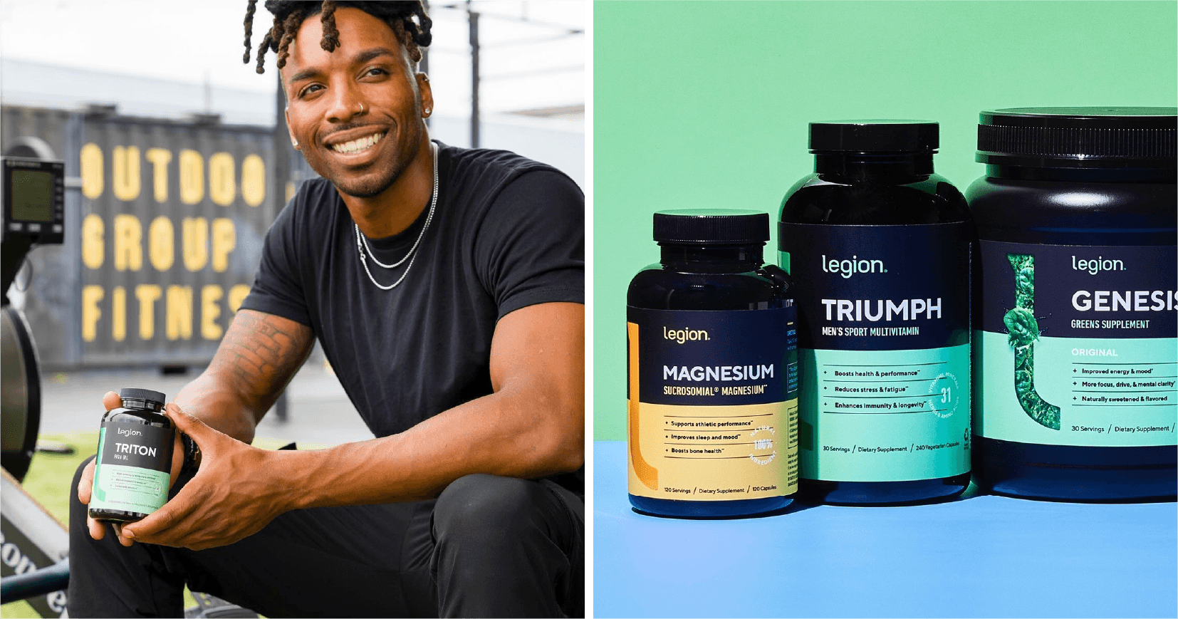
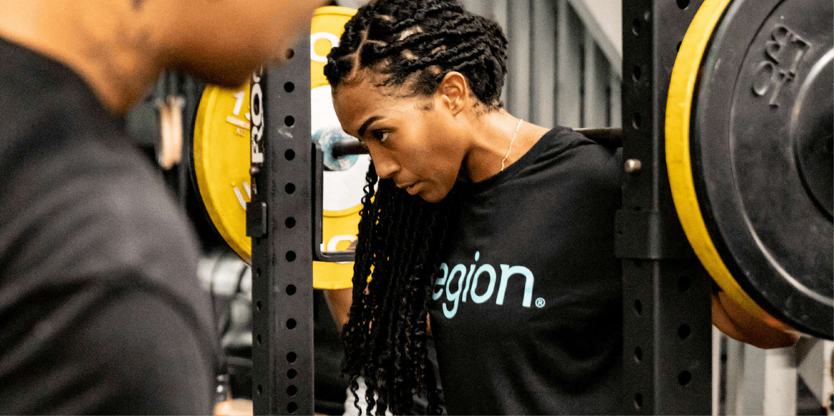
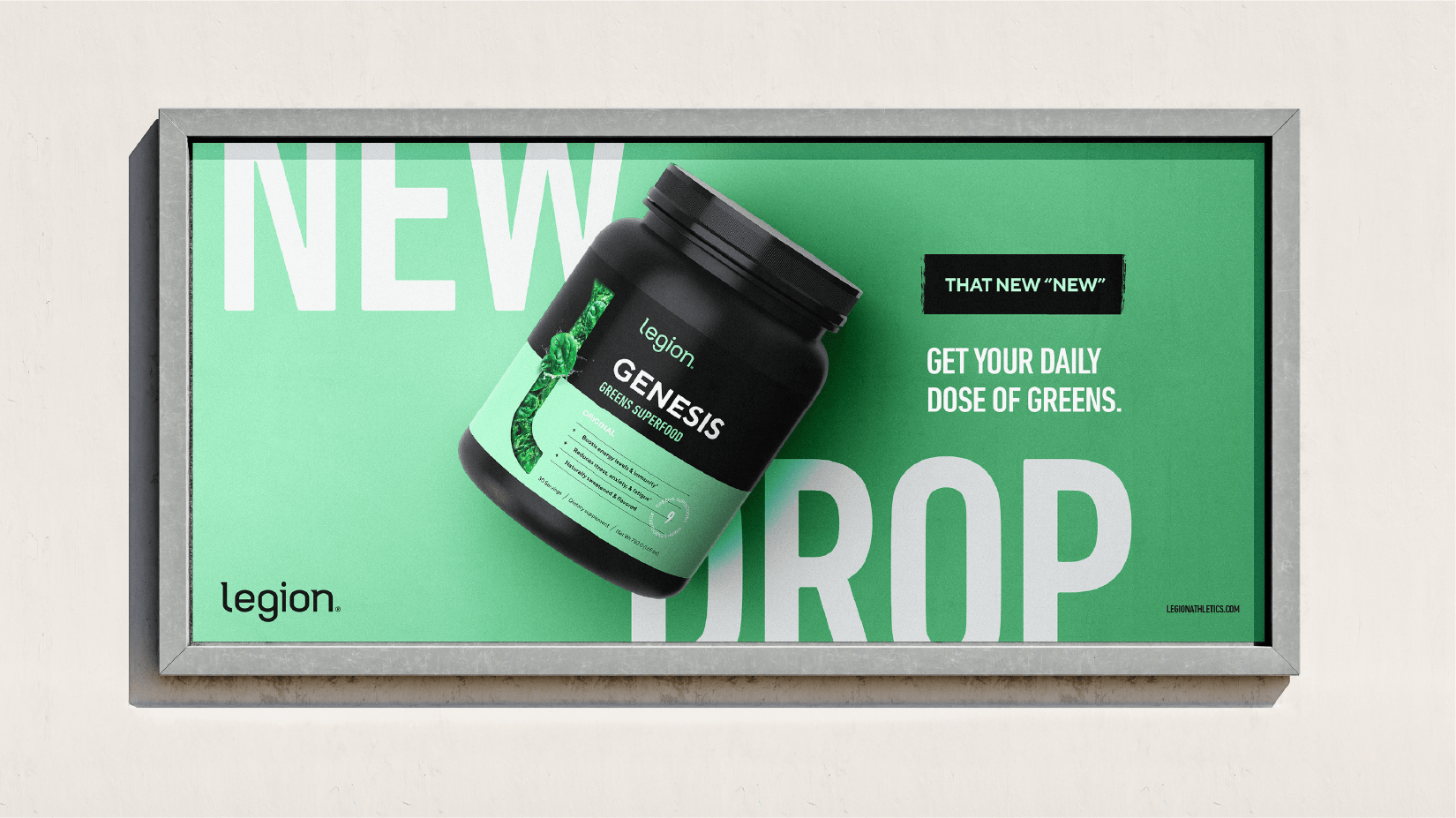
INTRO
Real quality you can see and feel
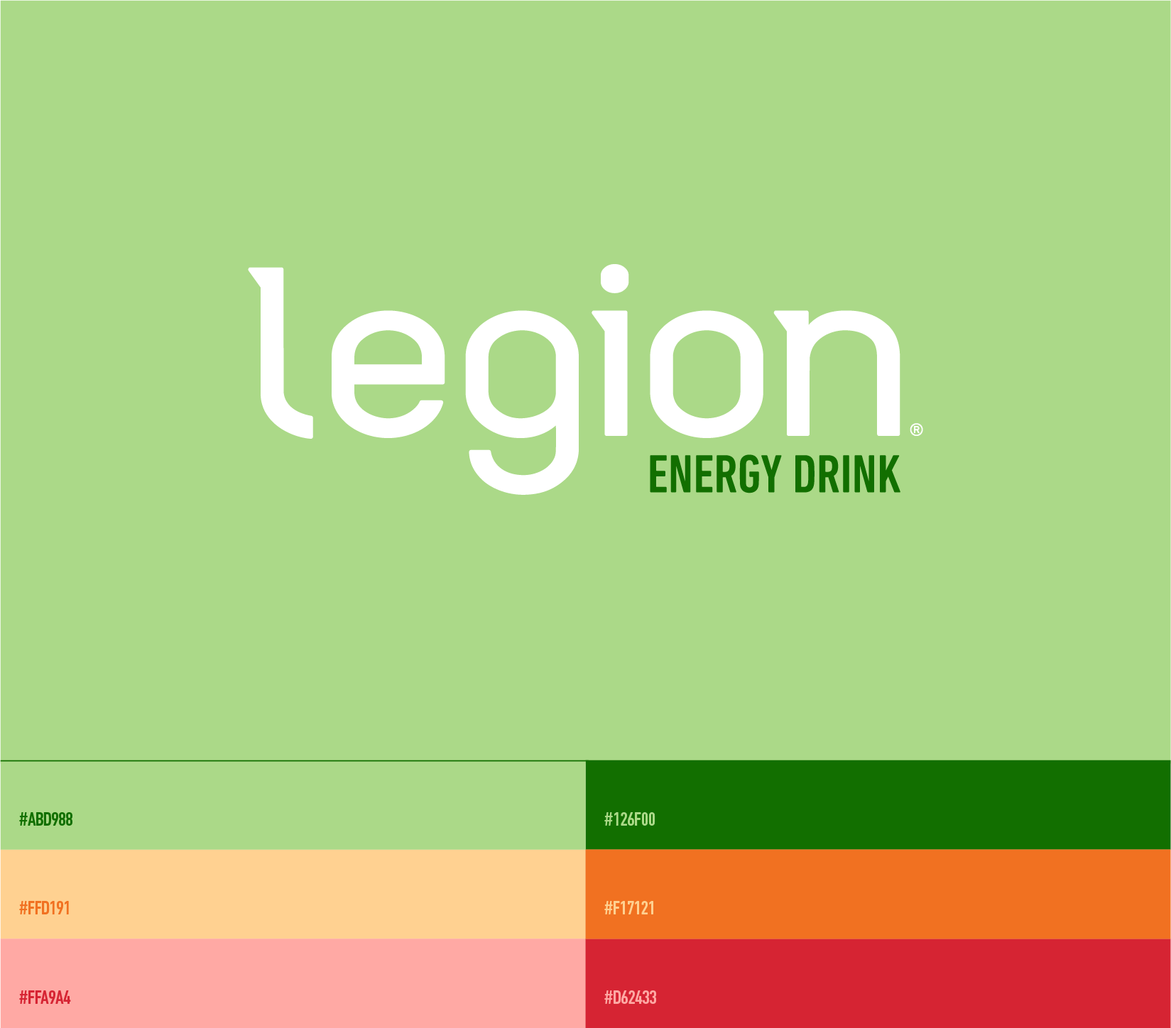
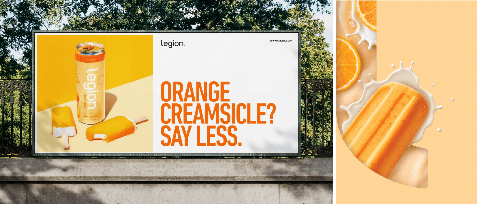
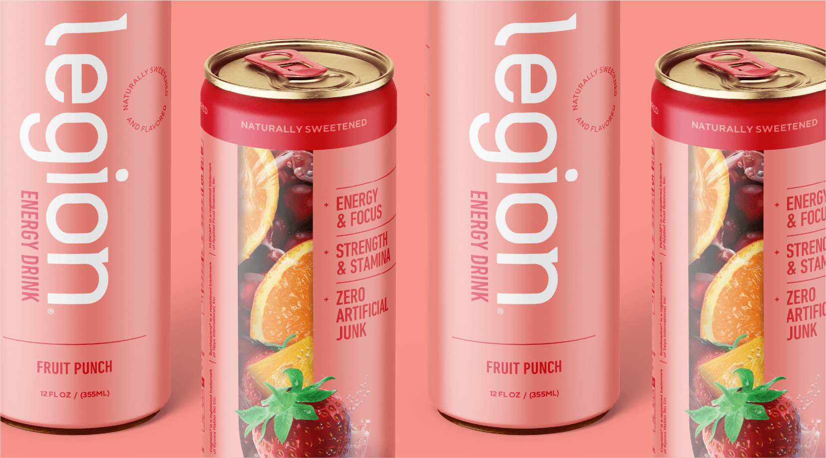
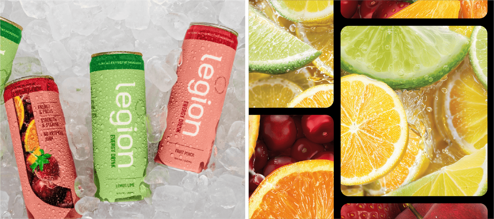
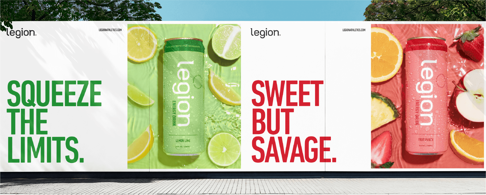
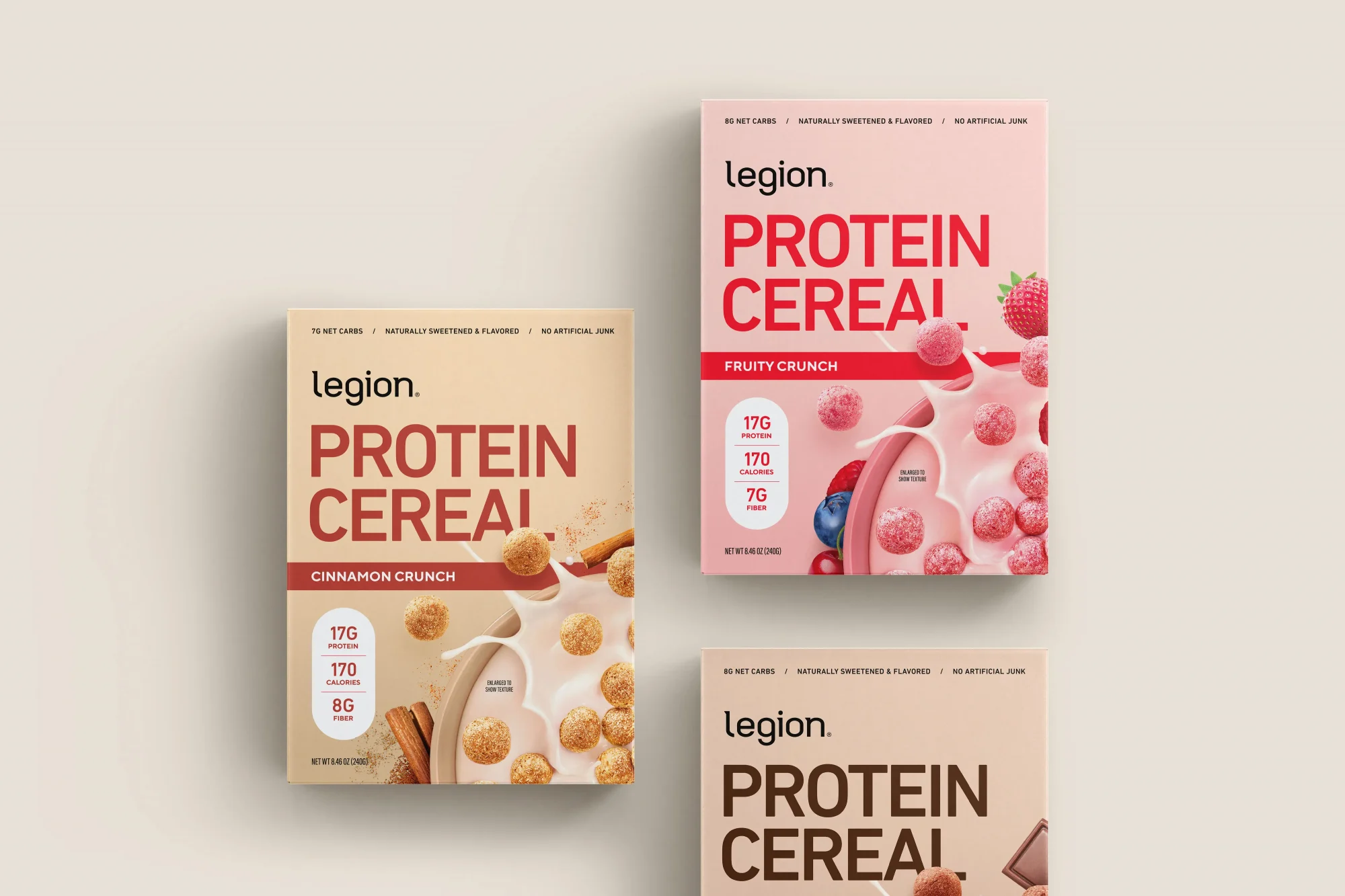
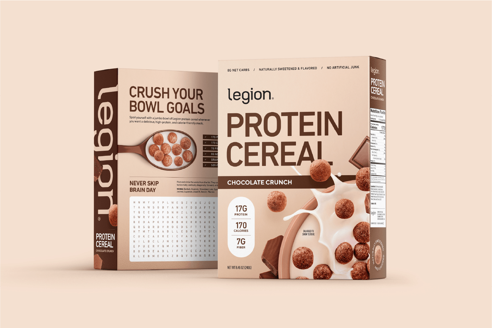
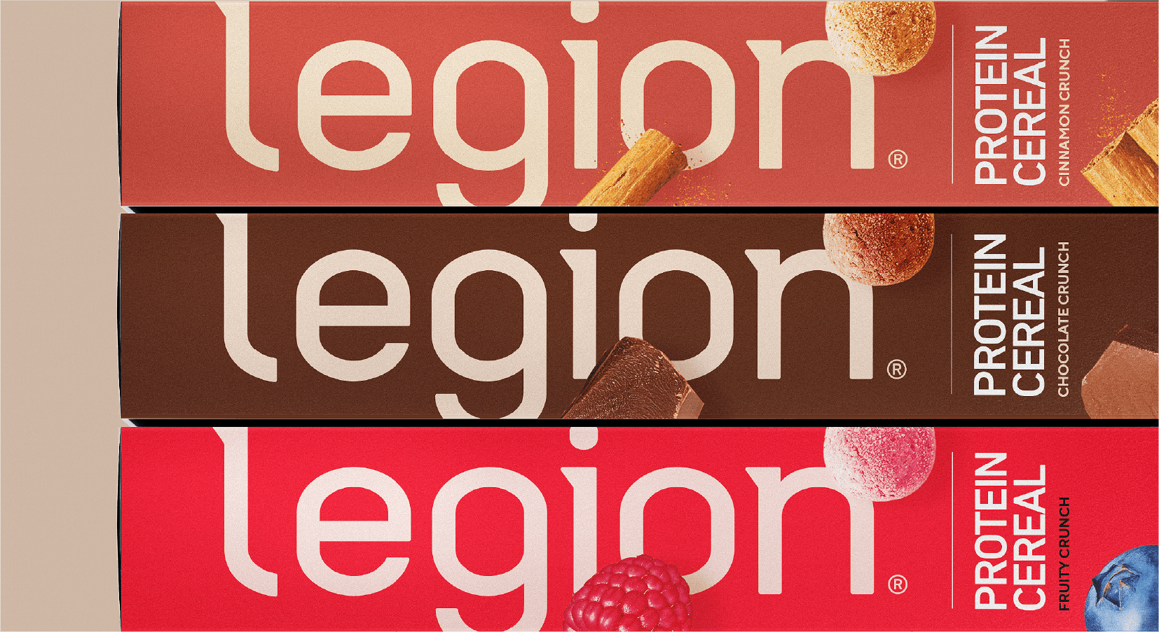
We designed a system that was less hardcore and more health-first. With over 40 SKUs spanning protein powder, energy bars, superfoods, vitamins and workout drinks, we wanted to take flavor cues off the sidelines, shifting them from a secondary element to the star of the show. Now Legion’s packaging is distinguished with hyper-realistic 3D images of fruit, caramel, chocolate and more, signalling that flavor and nutrition aren’t mutually exclusive.
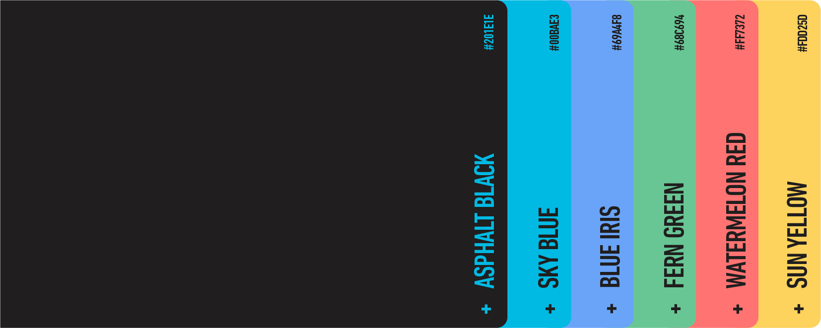
With a fresh, lowercase logotype and vibrant, approachable color palette, Legion demonstrates quality and inclusivity in every detail. Each energetic hue is tailored by product, while the iconic “L” logo builds brand equity and ensures every item stands out on the shelf. Each product type is distinguishable, yet consistent with the world of Legion—cementing their position as a mass-market offering you can trust.
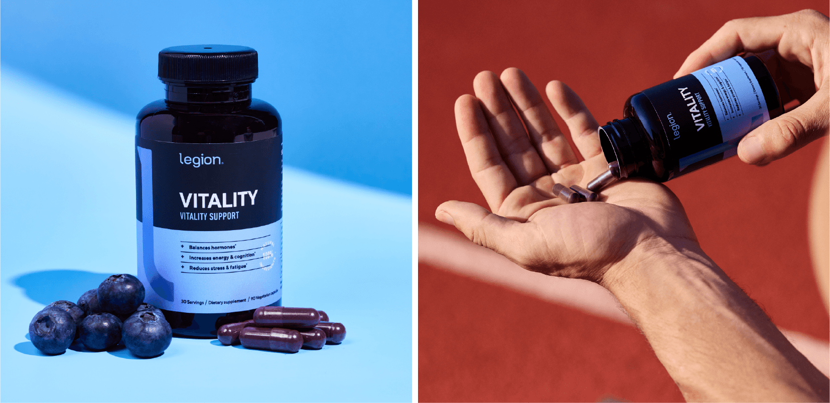
health supplements
Supplements—striking, clean and minimal
energy drinks
Energy drinks—fresh, vibrant and crisp
protein cereal
Protein cereal—convenient, clear and crave-worthy
RESULTS/TESTIMONIAL
Making gains
Legion quickly realized a surge in new and repeat customers alike. All told, the new position, tone and packaging opened up entirely new markets to this once-niche brand.
26% YTD year-over-year increase in revenue
60% increase in new customers
38% YTD year-over-year customer growth
1M+ customers
We’re very picky, and have high standards when it comes to design. Traina is one of the only companies we’ve worked with that consistently meets our high standards and expectations.”
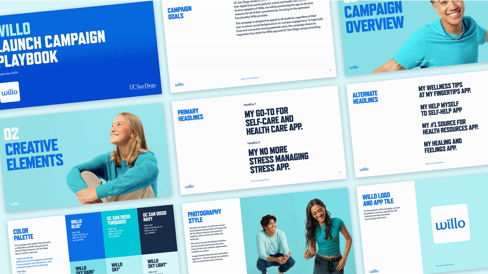
CAMPAIGN strategy CAMPAIGN identity MESSAGING ART DIRECTION Marketing Assets
Challenge
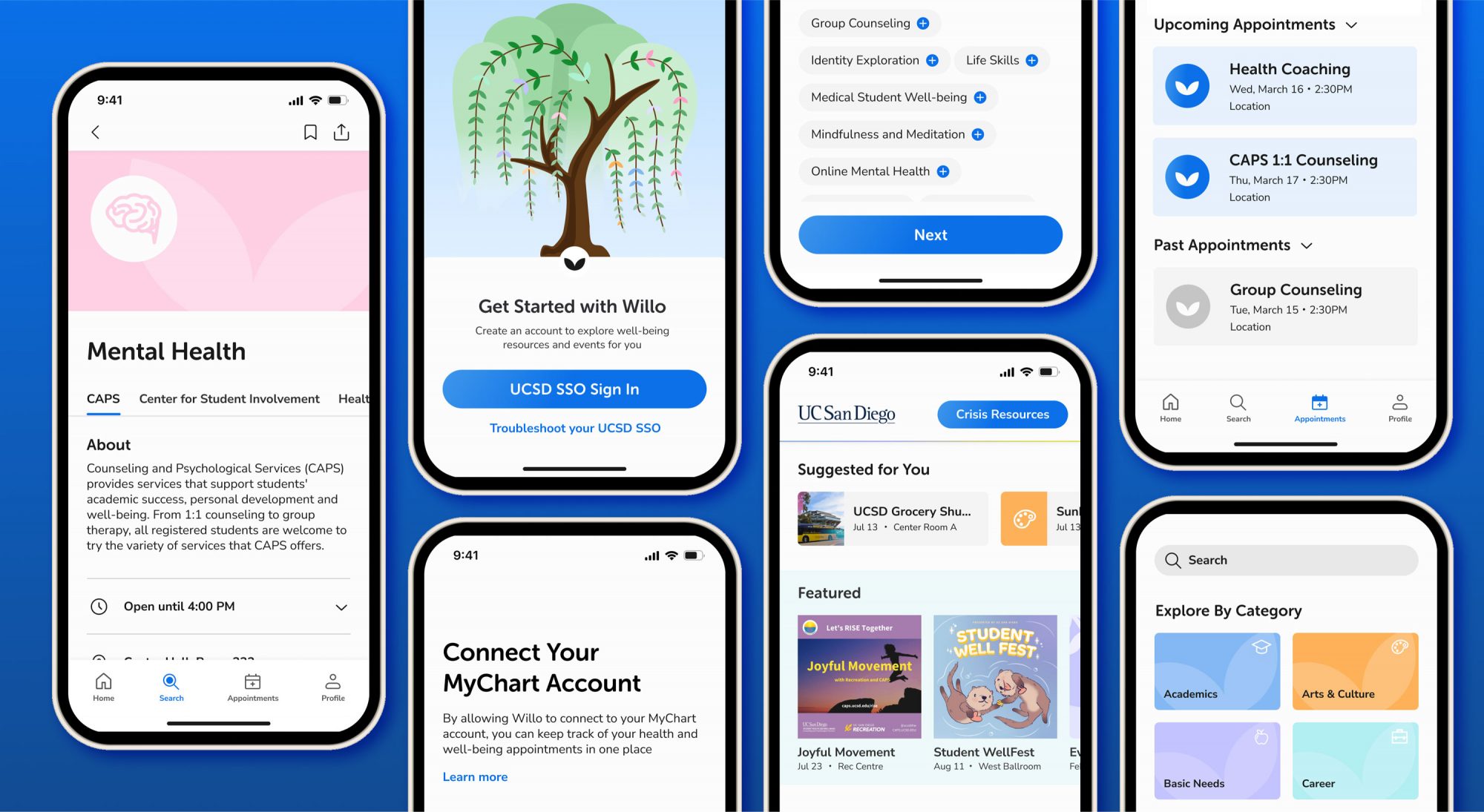
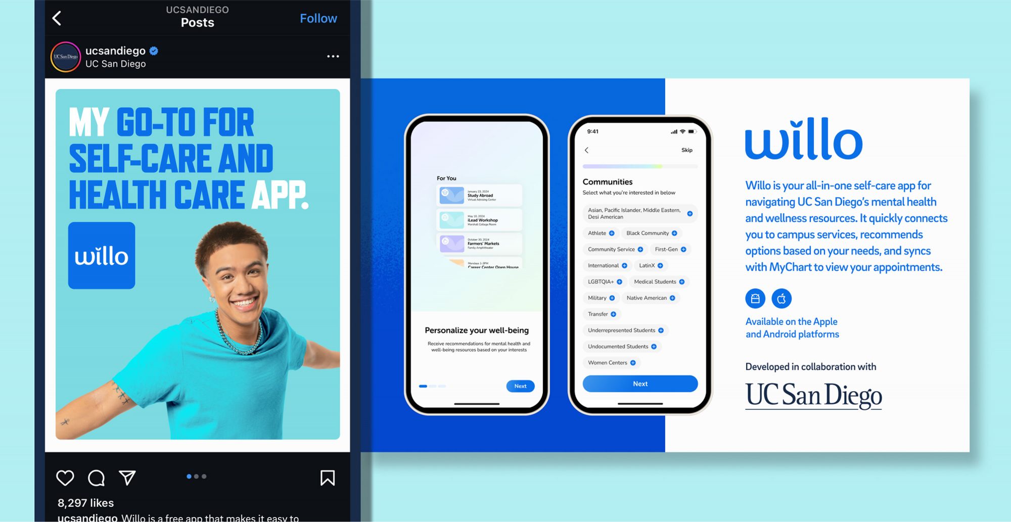
Willo is a new app created to help students locate, access and book mental health resources at UC San Diego. While building awareness for Willo was a primary goal, the campaign also aimed to address a key barrier to adoption: the misconception that mental health services are only for solving existing problems. Instead, we wanted to position Willo as a tool all students can benefit from proactively, helping them maintain well-being before challenges arise.
Insight
Students look to their peers when deciding whether to try services they’re hesitant about.
Solution
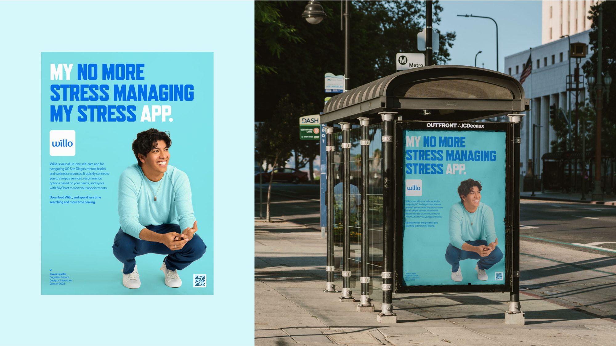
A campaign featuring student voices was created to build trust and deliver the message in an authentic and engaging way.
CAMPAIGN STRATEGY
Helping students manage mental health resources
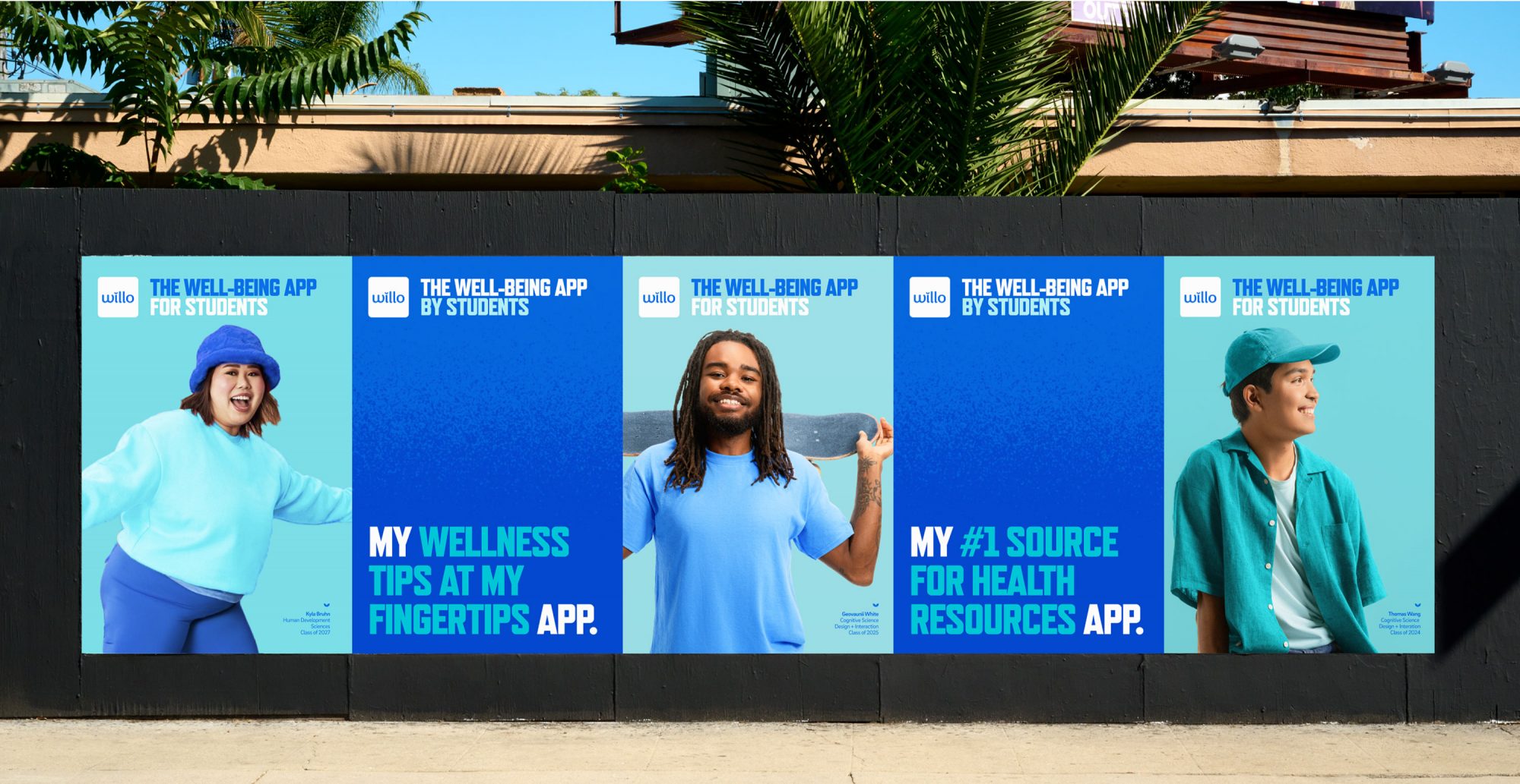
Willo was created to help busy students proactively manage their health and well-being. To drive awareness and adoption of the app we developed a marketing campaign designed to appeal to all students, focused on the fact that Willo was designed by UCSD students for UCSD students.
CAMPAIGN IDENTITY
Merging three brands for one audience
Willo is a UCSD campus app, developed through a partnership between the computer science and Health System teams—all of whom have their own brand identities. So developing a campaign identity that balanced the three, while standing out as a distinct product, was an early challenge. Our solution is a vibrant, colorful approach that borrows from all three, but leans heavily into the campus brand, since that’s where the campaign lives.
Final deliverables
Campaign playbook
Our initial engagement included the first set of tactics to help set the standard for future campaign materials. The final deliverable was a campaign playbook that defined the copy and photo direction, and included instructions for future application plus a set of templates for the internal marketing teams.
Graphic assets
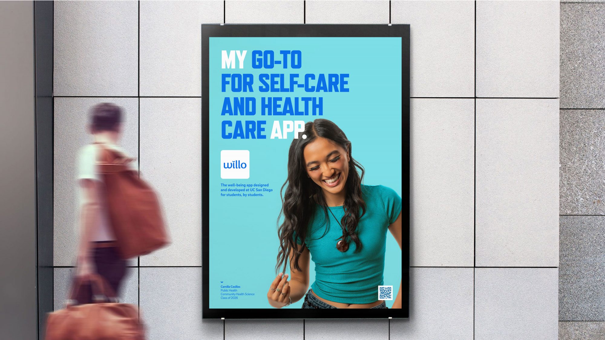
A truly authentic image library
Our primary goal with the campaign photography was to capture an authentic, emotional representation of real students. In fact, every student featured in the campaign played a key role in developing the app—from engineering and coding to UI design. The candid style conveys the feeling of freedom and ease students feel when they have access to the many wellness opportunities available on campus. The images aim to reflect the tone of the Willo brand—natural, relaxed and confident, with an occasional touch of whimsy.
brand application
Campaign messaging and rollout
To reinforce the student-endorsed strategy, the messaging delivered student benefits in their voice. Quick and casual statements summed up key features of the Willo app and photography was tagged with the student identification complete with year, major and focus. The bulk of the campaign was rolled out via on-campus signage, university digital properties and social media, weaving the Willo message into the everyday lives of students.
CONCLUSION
The final word
“Willo is designed specifically to address the mental health needs of our diverse community,” said UCSD Chancellor Pradeep K. Khosla. “This trailblazing app prioritizes student health and well-being, with a strong focus on mental health support.”
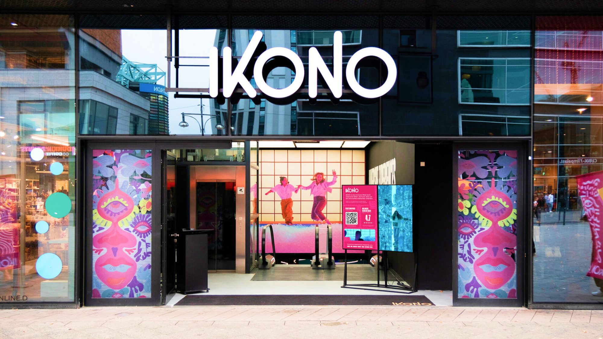
IKONO is an immersive experience brand that combines art, play and the unexpected to delight visitors. With locations in seven major cities across Europe and more on the way, the company is experiencing rapid growth.
Challenge
IKONO is unlike the traditional, passive museums and one-sided offerings in the “immersive experiences” industry. They needed a brand strategy and identity to differentiate their brand from these other offerings.
Solution
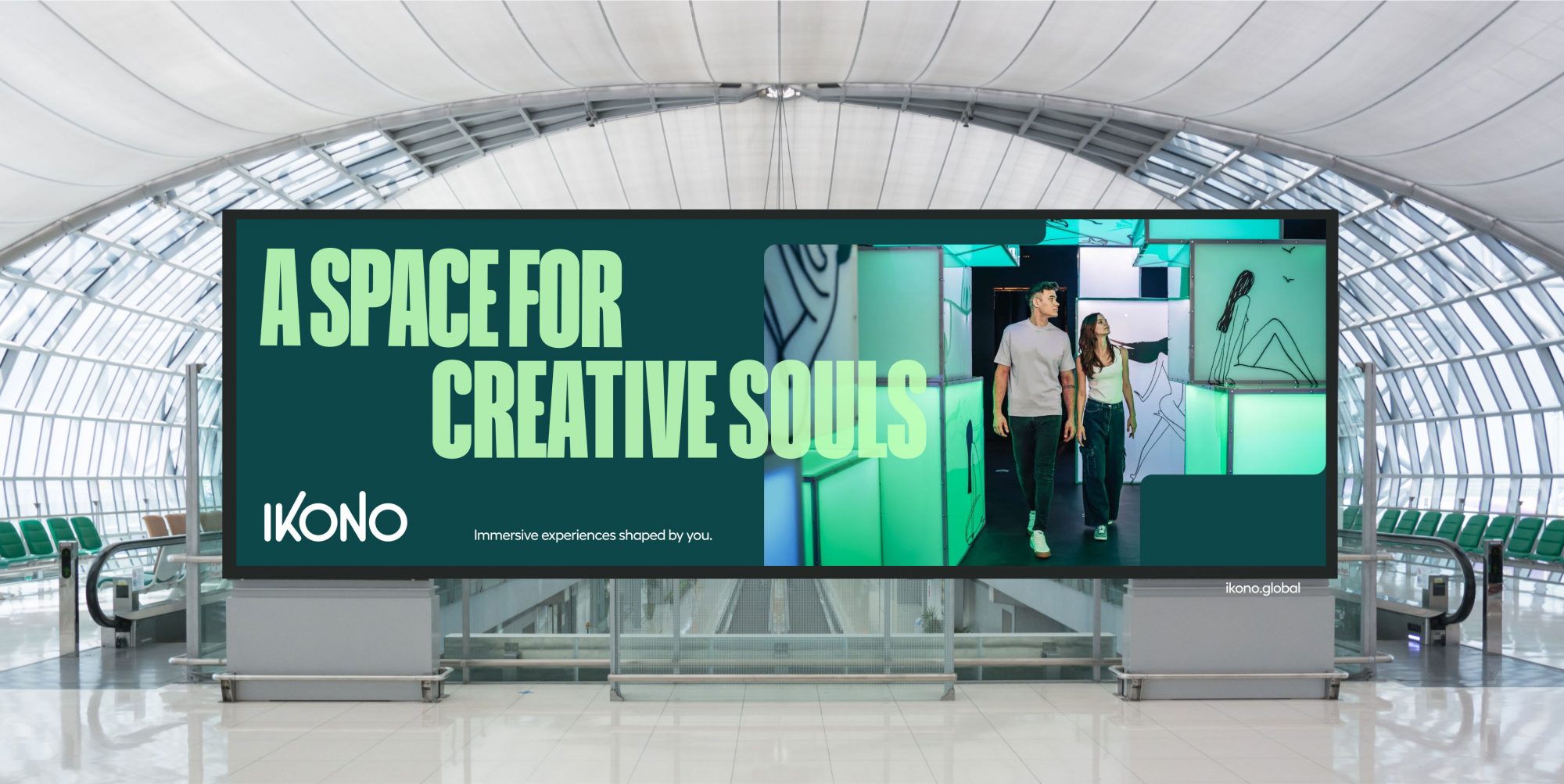
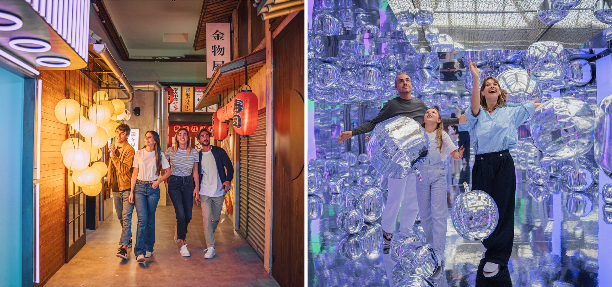
Visitors are drawn to IKONO by an innate desire for individuality, seeking out occasion to feel special and different. By embedding the free-form creativity of the IKONO experience into the brand itself, we crafted a unique identity that puts self-expression front and center.
BRAND STRATEGY
When disruption and immersion collide
When you think of immersive experiences, what comes to mind? Meow Wolf? The Vegas Sphere? That traveling Van Gogh exhibit? IKONO is an entirely new vision. While these are largely passive experiences, IKONO offers authentic immersion—full sensory interaction with eclectic worlds that reignite the limitless creativity within each visitor.
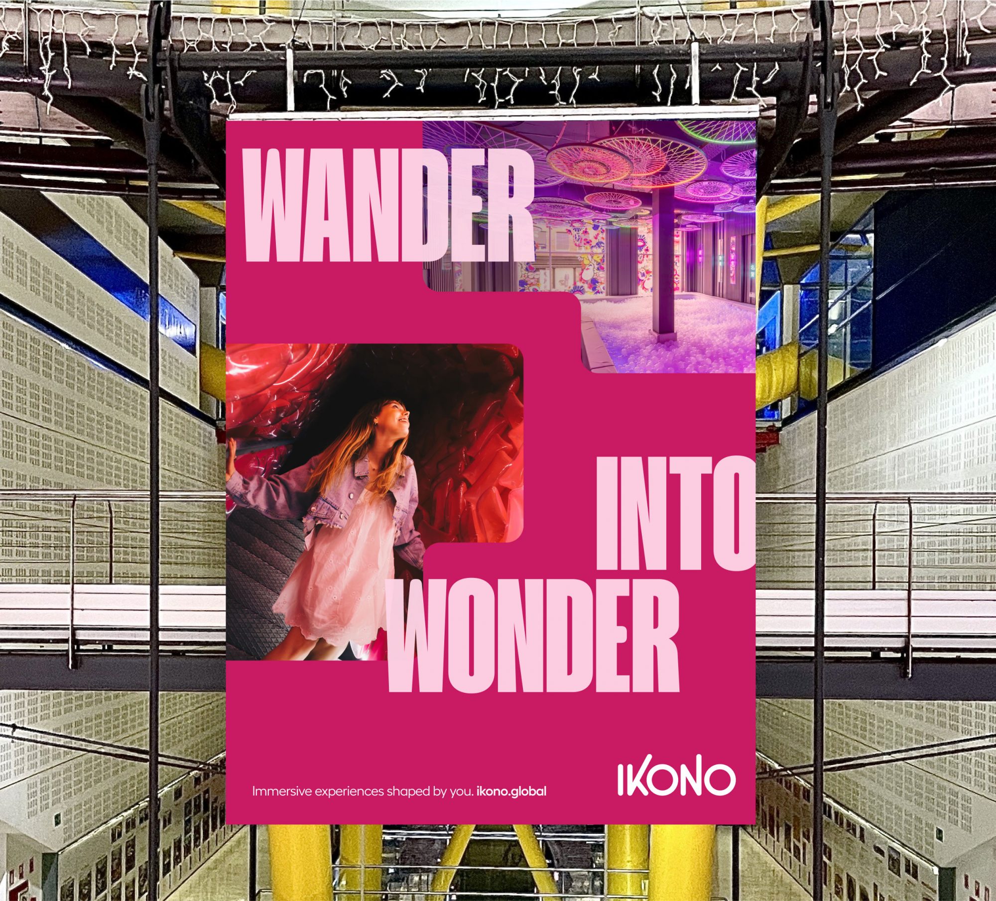
brand IDENTITY
Crafting an IKONIC visual language
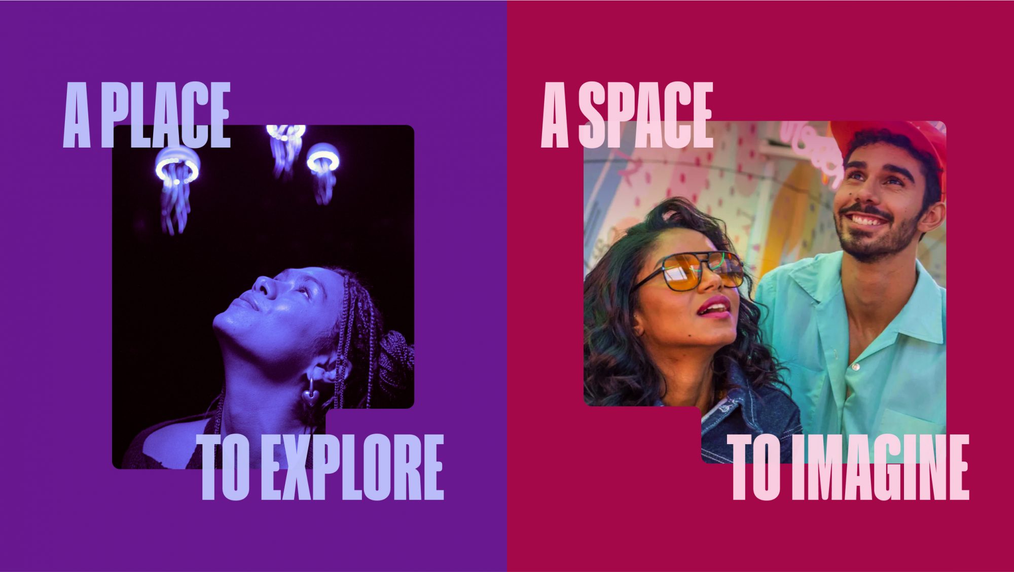
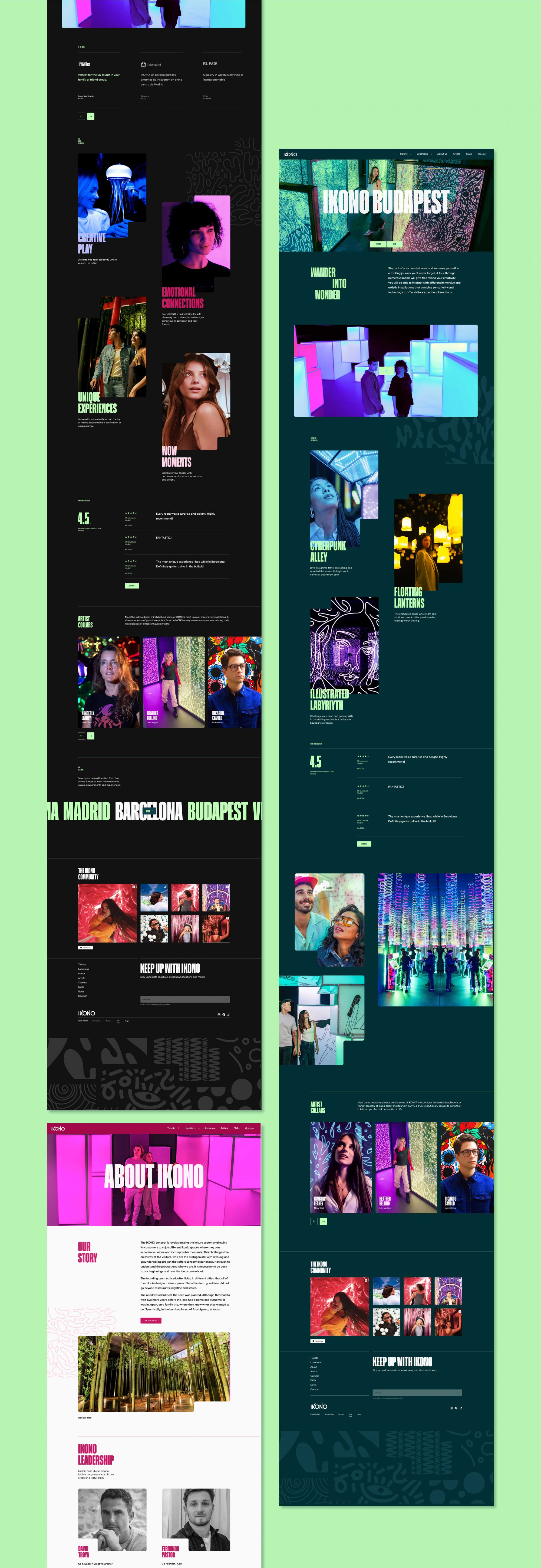
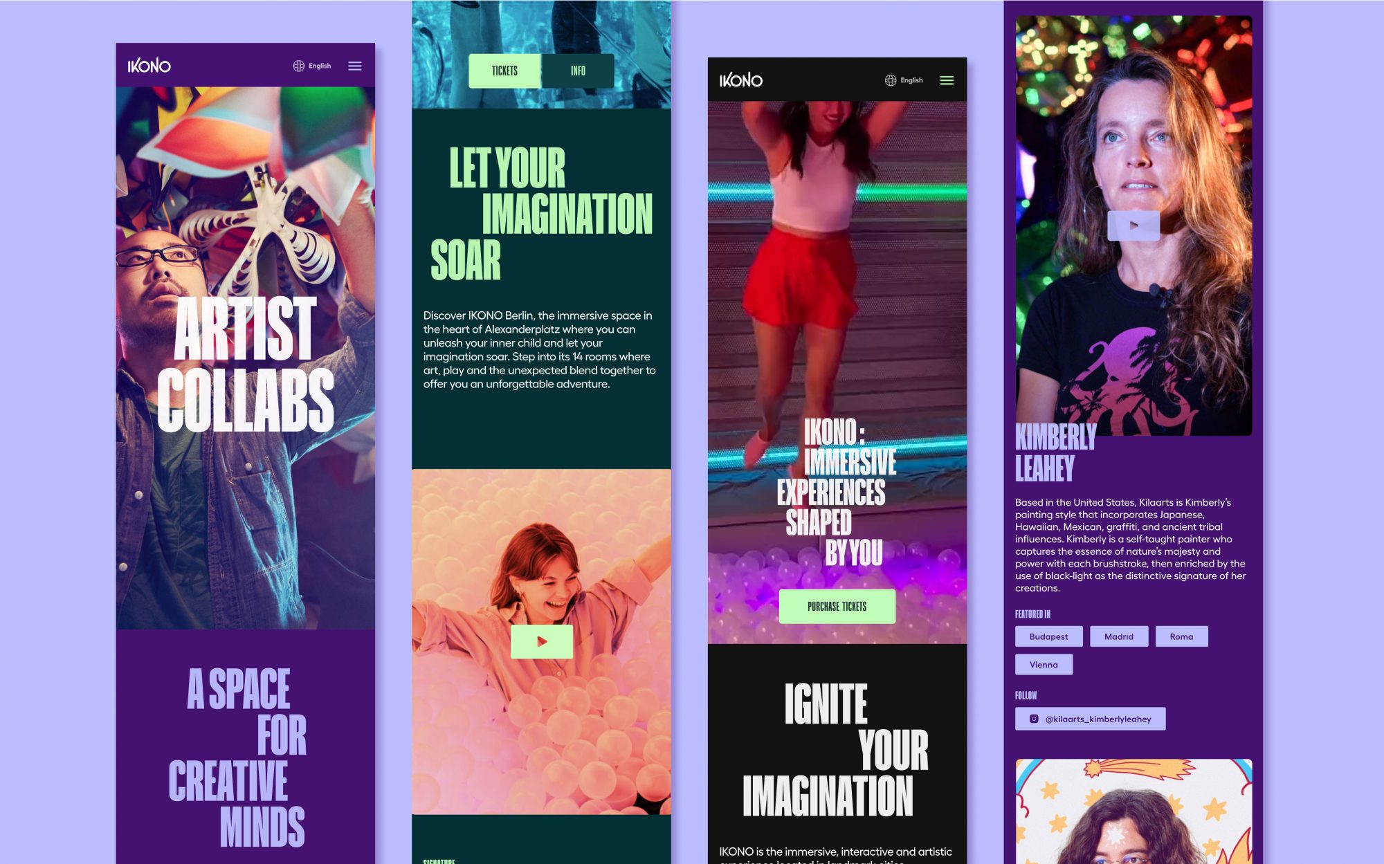
As part of our discovery process, our team traveled to Budapest and then Barcelona to see IKONO for ourselves. We knew from the moment we stepped inside that these extraordinary spaces would be the stars of our visual identity system. Our job was to craft a framework to showcase these moments—a bold, vibrant, and playful system that reflects the wonder of the IKONO experience.
Visual System
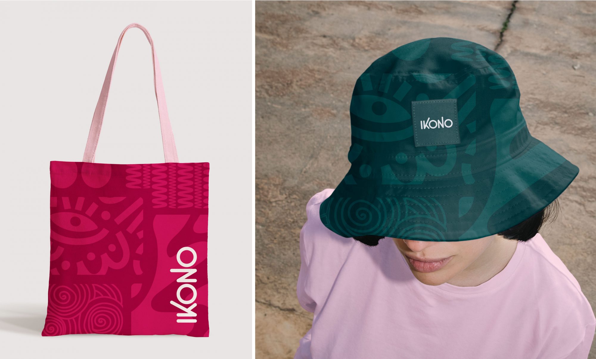
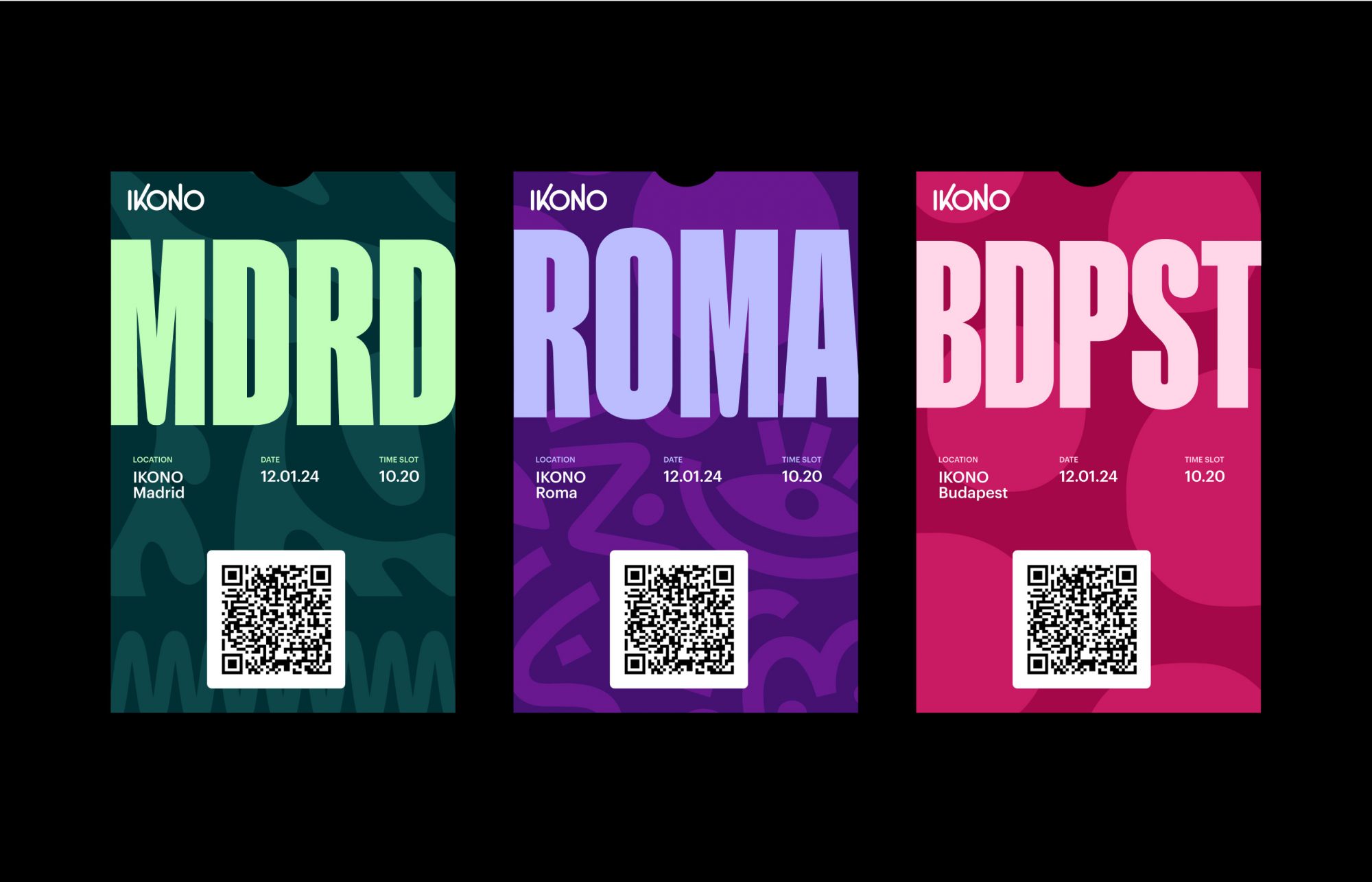
Patterns and Bento System
During our discovery process, we studied the floorplan of each location and were impressed by the thoughtful way that each room, or “world”, flowed into another. That flow inspired our “Bento System”, a library of modular shapes that serve as windows into these extraordinary worlds.
We also took inspiration from the artwork within the spaces to develop a series of patterns that provide a secondary set of elements that reflect the creativity of the brand, and bring cohesion to the system.
Brand Activation
Connecting the brand with community
The first test of any new brand is the rollout, and IKONO’s flexible new identity came to life seamlessly across the company’s ecosystem. From signage and merch to social and ticketing, the brand evolved and expanded in delightfully unexpected ways. Most importantly, it achieved our primary goal: to establish IKONO as a distinct and visionary trailblazer in the growing field of immersive experiences.
Digital Activation
A made-for-mobile website
With over 90% of IKONO’s web traffic coming from mobile devices, it was essential that we create a web experience optimized for those users. And with locations in six different countries across Europe and plans for more, language localization was also a priority.
The website itself is designed to be an immersive journey. Through rich imagery and video, the user is led through each location and given a glimpse into the eclectic worlds and imaginative spaces within IKONO.
Results
Results
Since the brand launch, IKONO has experienced tremendous growth, including three new locations opened, three more in the planning stages, and global expansion on the horizon. Our team is lobbying hard for a SoCal location.
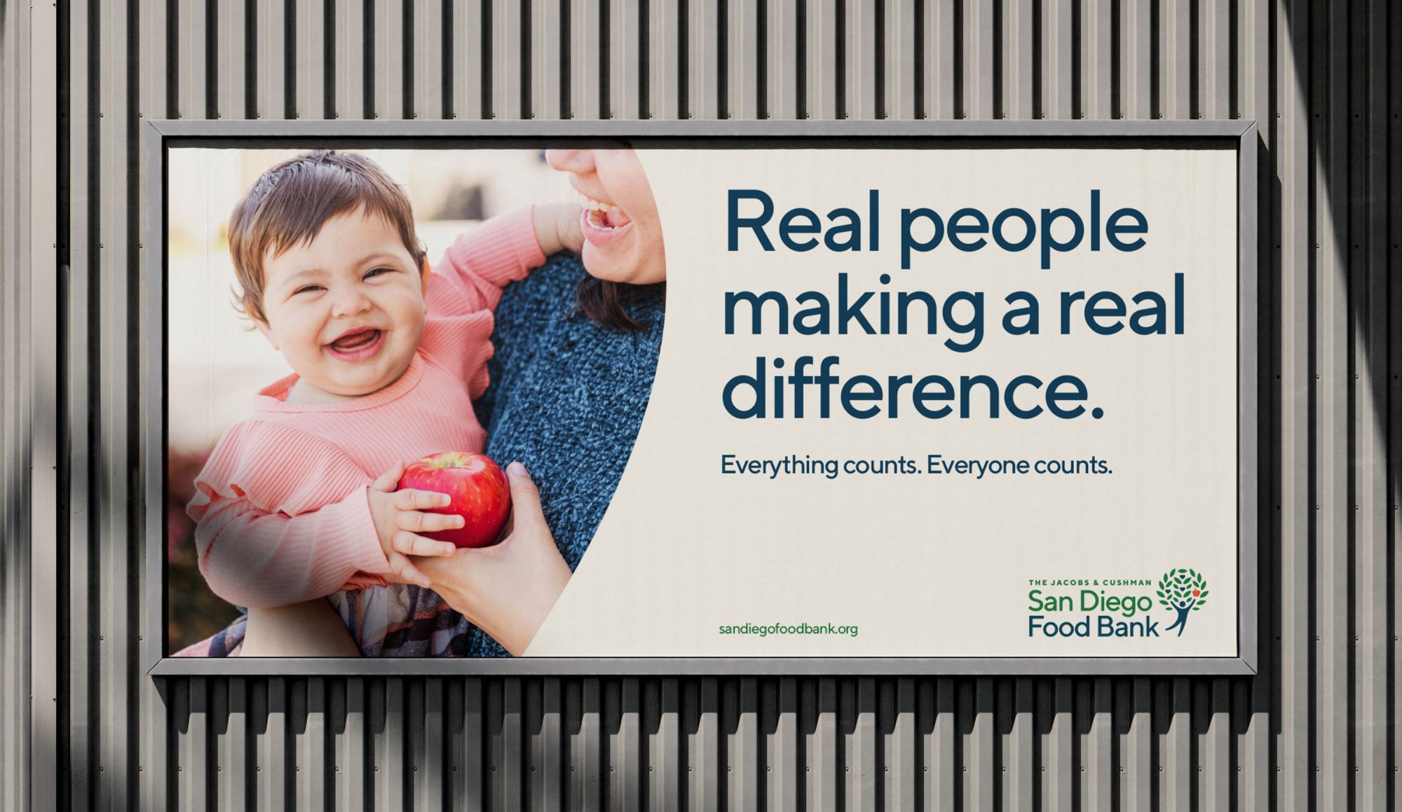
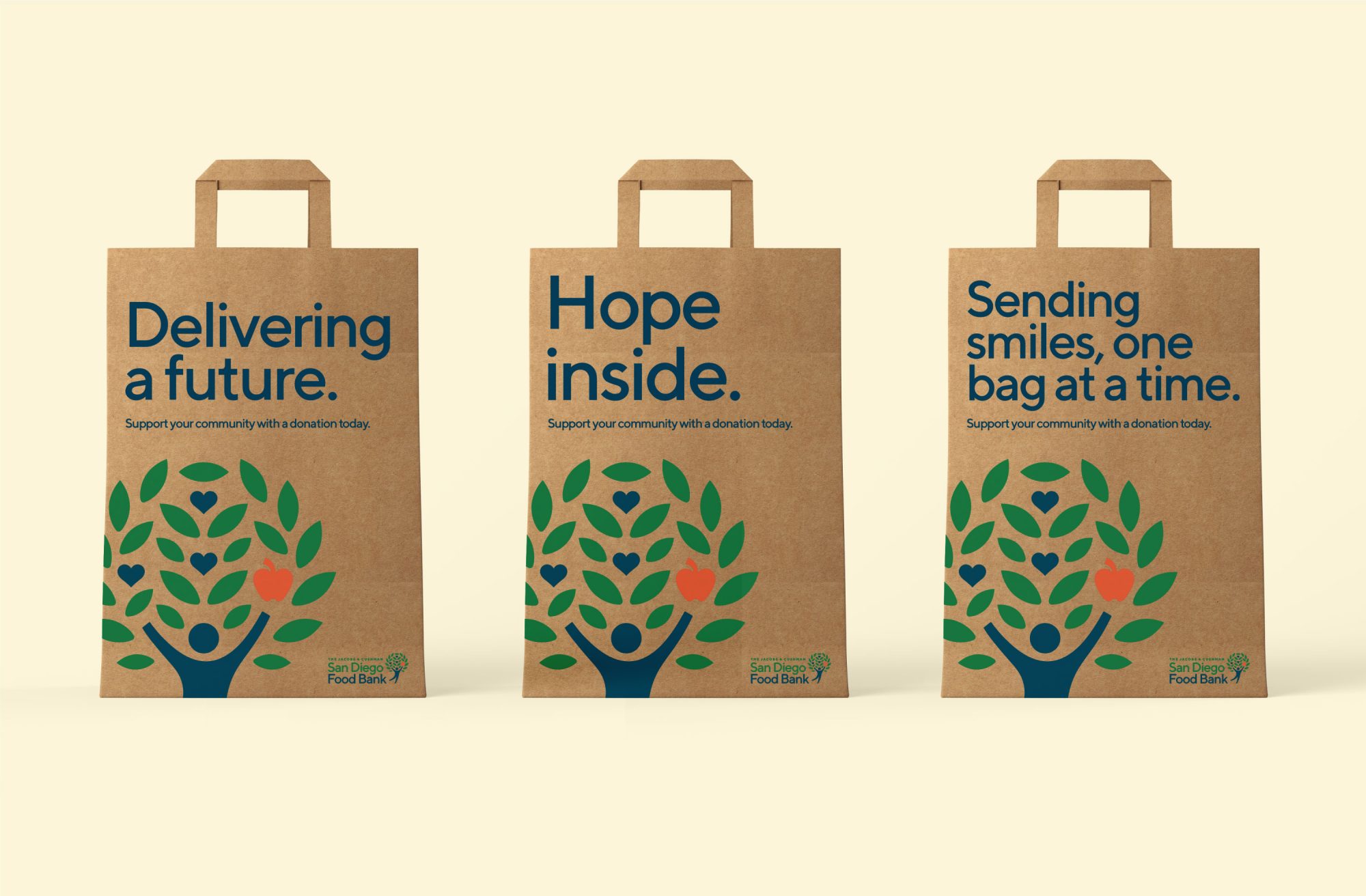
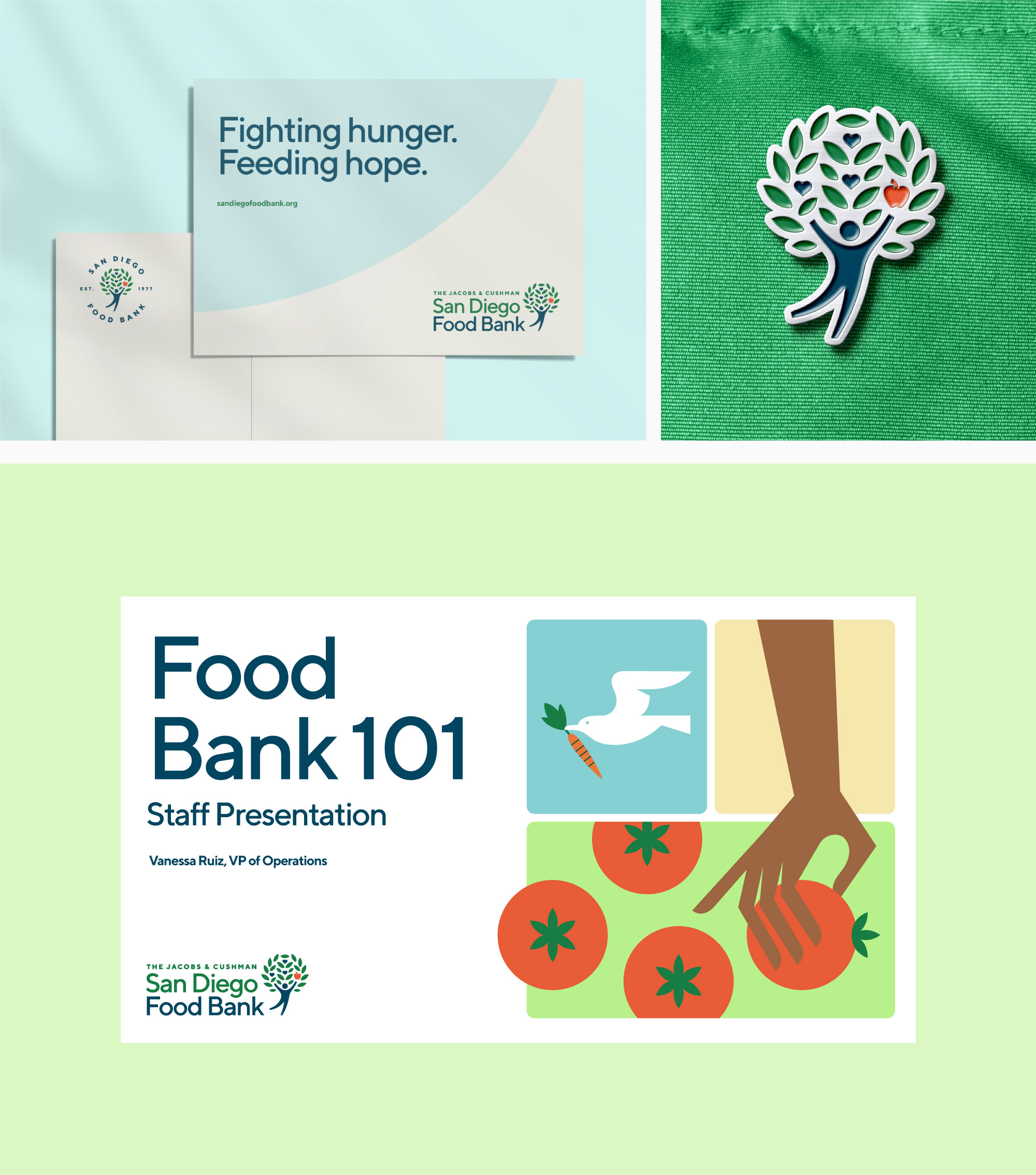
San Diego Food Bank’s existing brand had become outdated, and the organization’s brand guidelines lacked the messaging and tools to drive a cohesive and consistent story across all brand touchpoints.
Insight
Because it is a beloved organization within the community, refreshing the brand required an approach that modernized the identity without disconnecting it from its rich heritage and community trust.
Solution
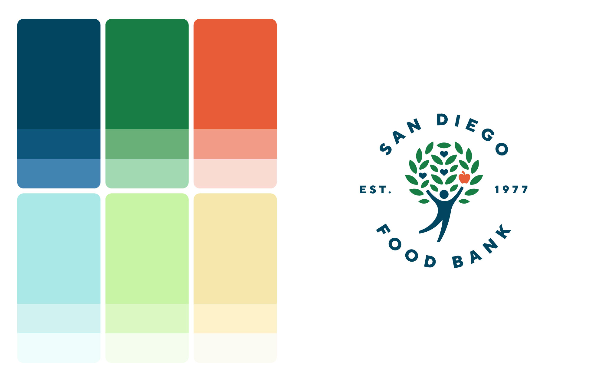
A thoughtful evolution of the logo, combined with a fresh new color palette, new fonts, updated photography, and distinct illustration style, all combined to produce a rebrand that felt both modern and warmly recognizable.
BRAND ELEMENTS
Refined and expanded for a bright future
The San Diego Food Bank logo—a highly recognizable mark in the community—was problematic due to its composition and complexity. So we set out to redesign a more effective logo while preserving its most familiar elements. The brand’s color palette draws inspiration from fresh produce and the SoCal region for a bright, welcoming feel.
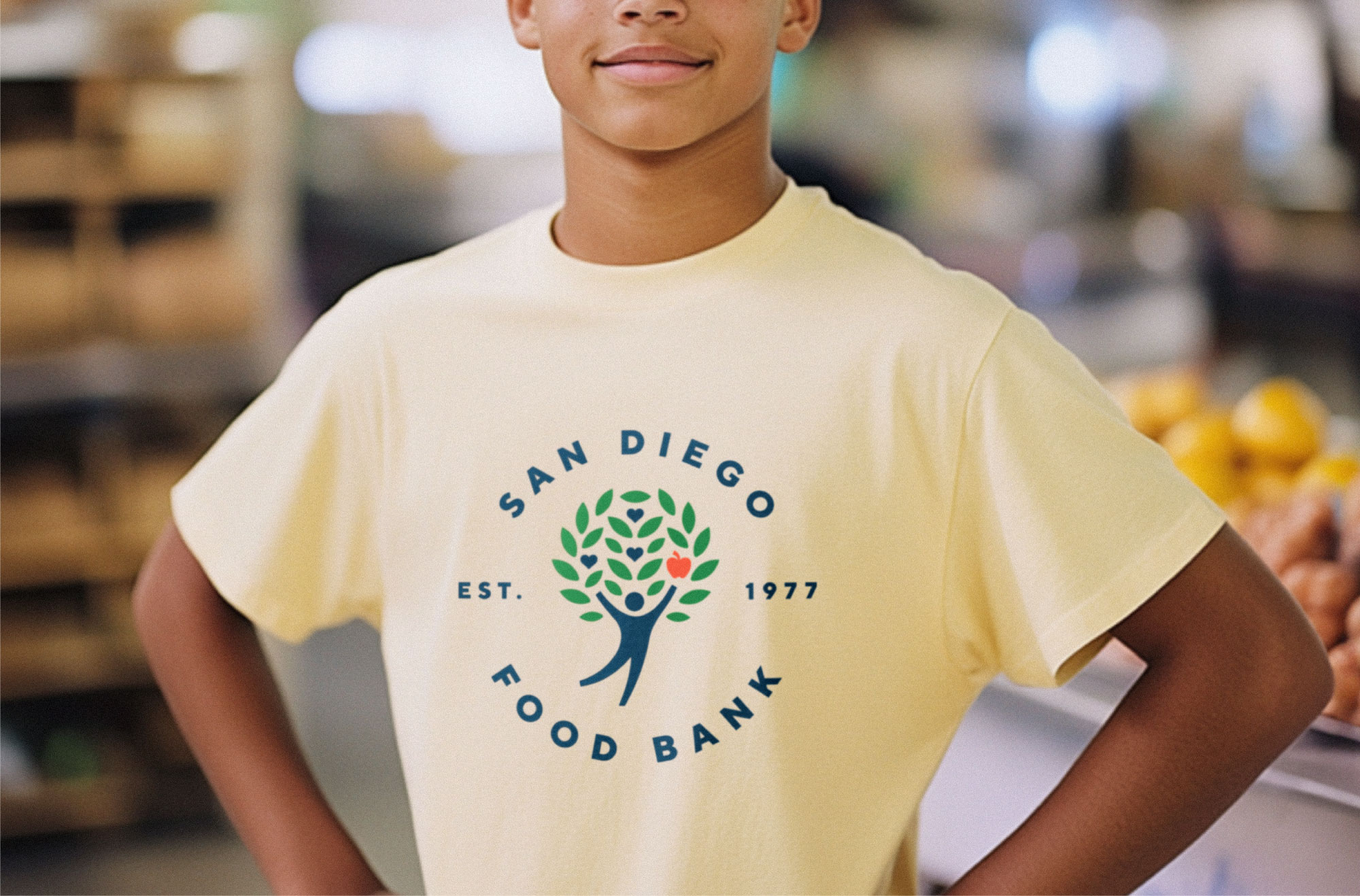
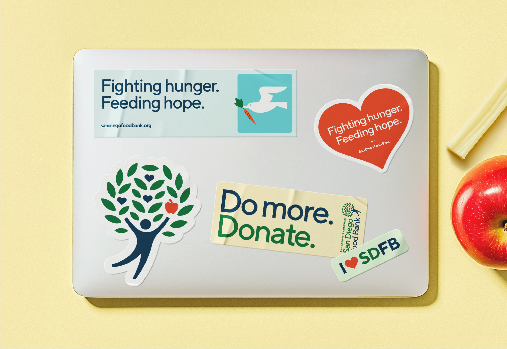
BRAND APPLICATIONS
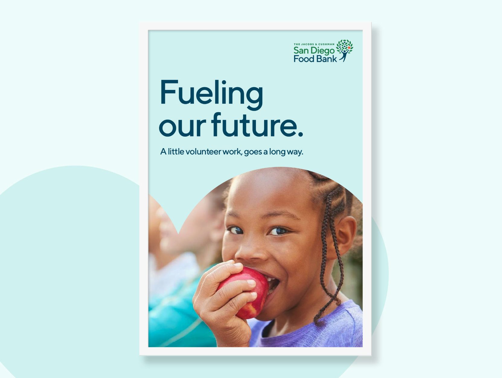
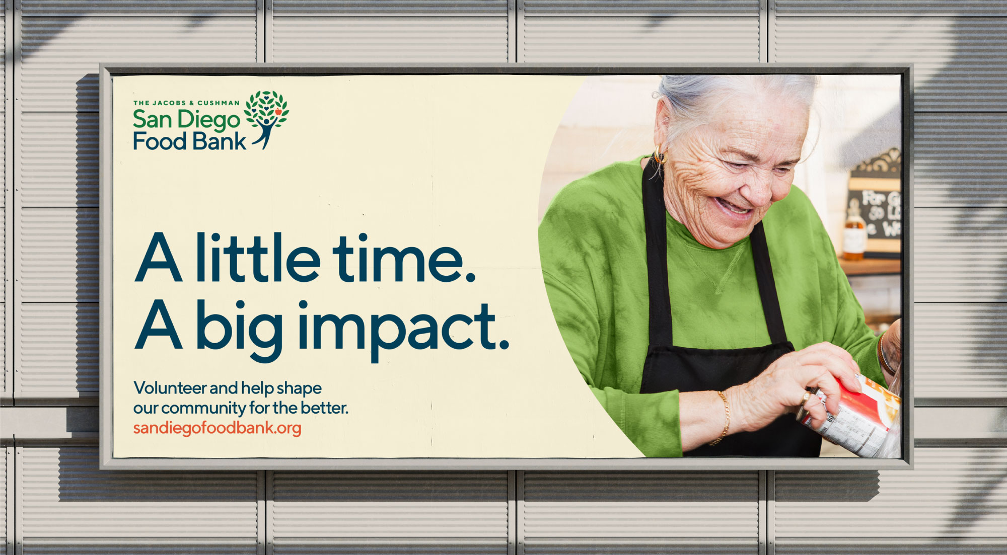
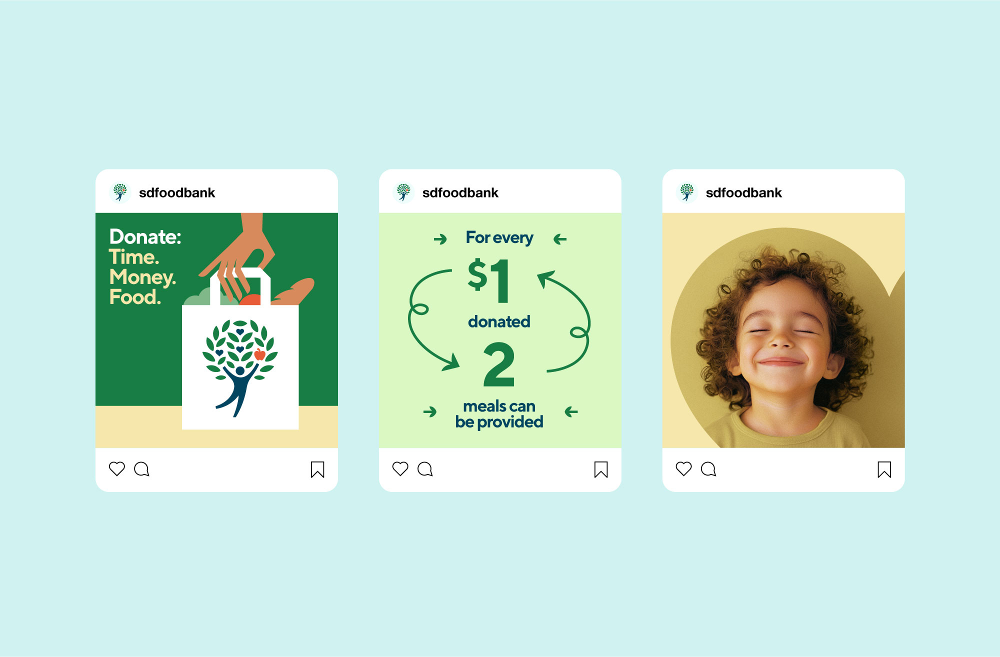
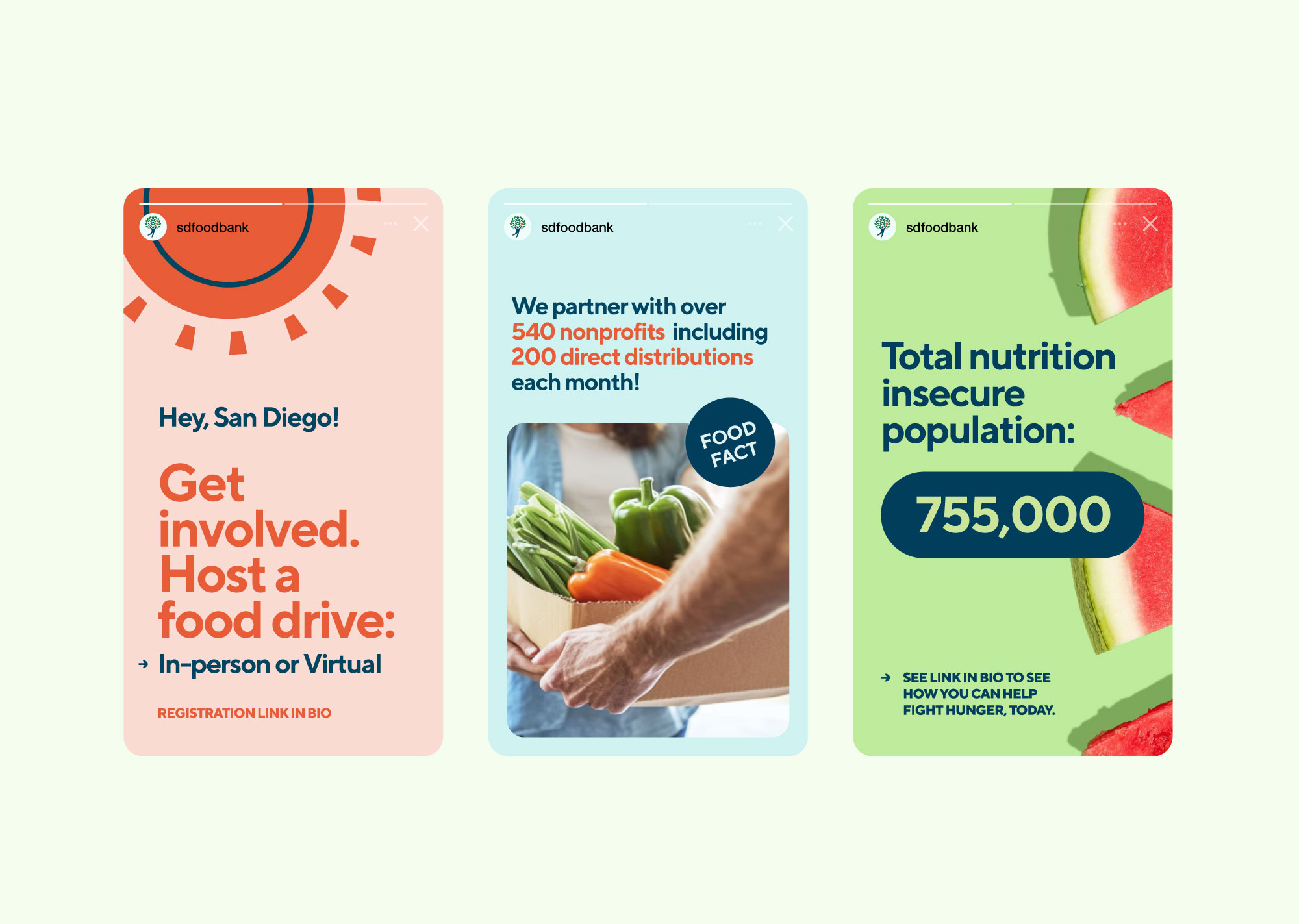
Capturing a spirit of hope and ambition
Through vibrant color, emotive imagery, and purposeful messaging, the new brand system radiates positivity and warmth across every experience. Each touchpoint is crafted to inspire engagement and deepen community connection.
Brand ROLL OUT
A healthy deployment
From fleet graphics to branded merchandise, our team orchestrated an extensive rollout that activated the brand’s full potential.
RESULTS
Ready for the next 50 years
With the expanded brand identity and guidelines, the San Diego Food Bank has begun telling a far more cohesive, consistent, and compelling story. The refresh has energized the team, and been wholeheartedly embraced by partners, stakeholders, volunteers, and everyone associated with the organization.
We cannot begin to thank you all enough for the amazing work you did for us. Our roll-out was a huge success. We appreciate your incredible support for us throughout this process—we all feel so lucky you were our partner!”
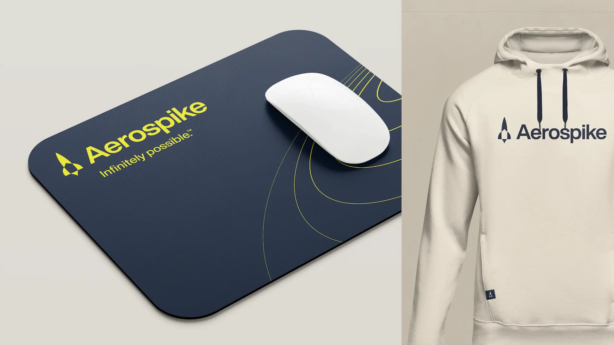
In an industry filled with copycat competitors claiming to offer what you do (and they can’t), clarity is key.
Challenge
When you’re a category leader, everyone follows your lead. For Aerospike, it was becoming increasingly difficult to differentiate their offering while competitors were parroting their tactics and falsely claiming to do the same.
Solution
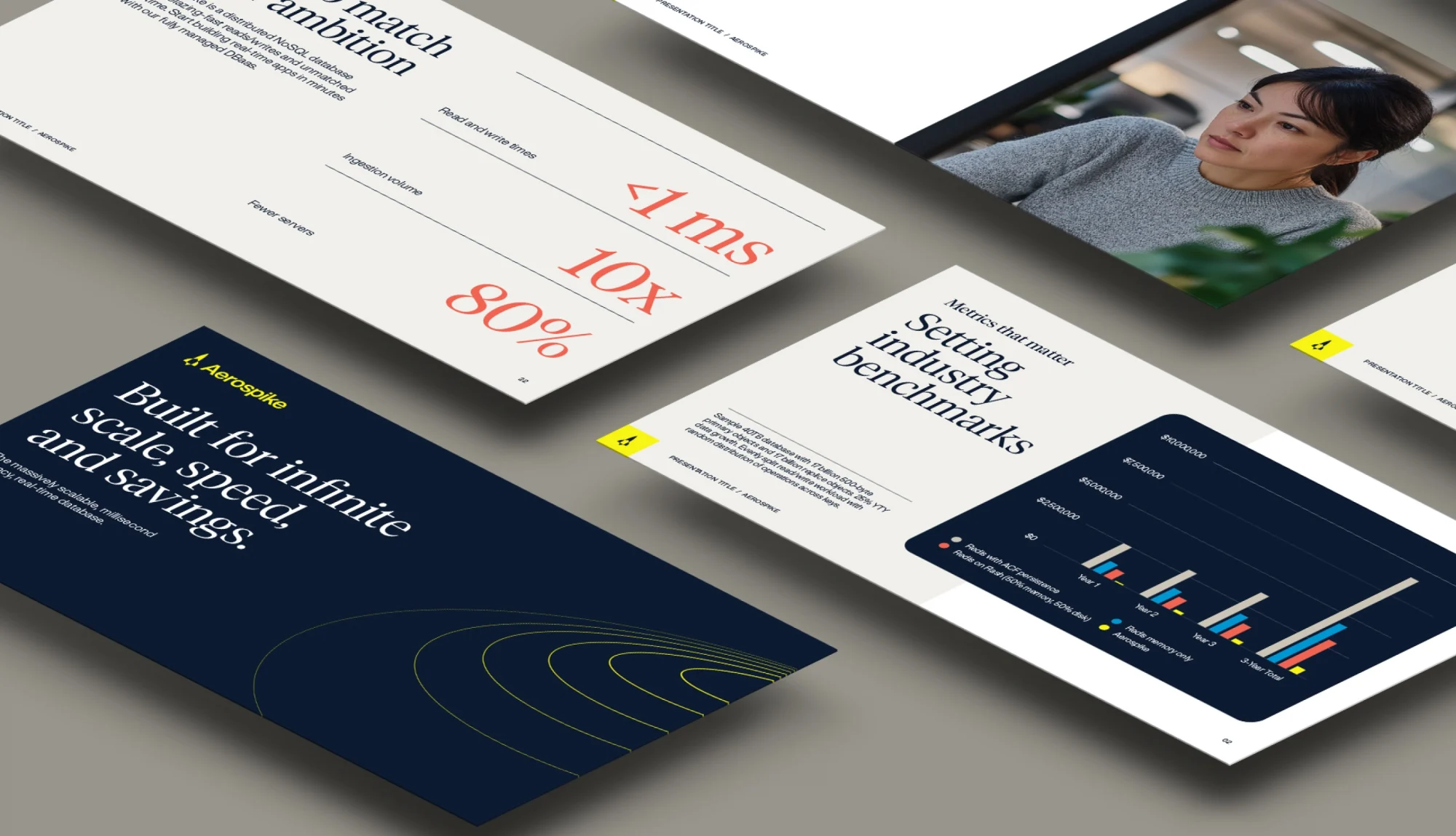
Through the development of a bold positioning strategy, razor-sharp messaging and a distinctive visual language, Aerospike took back ownership of its story and its rightful position as the NoSQL database king.
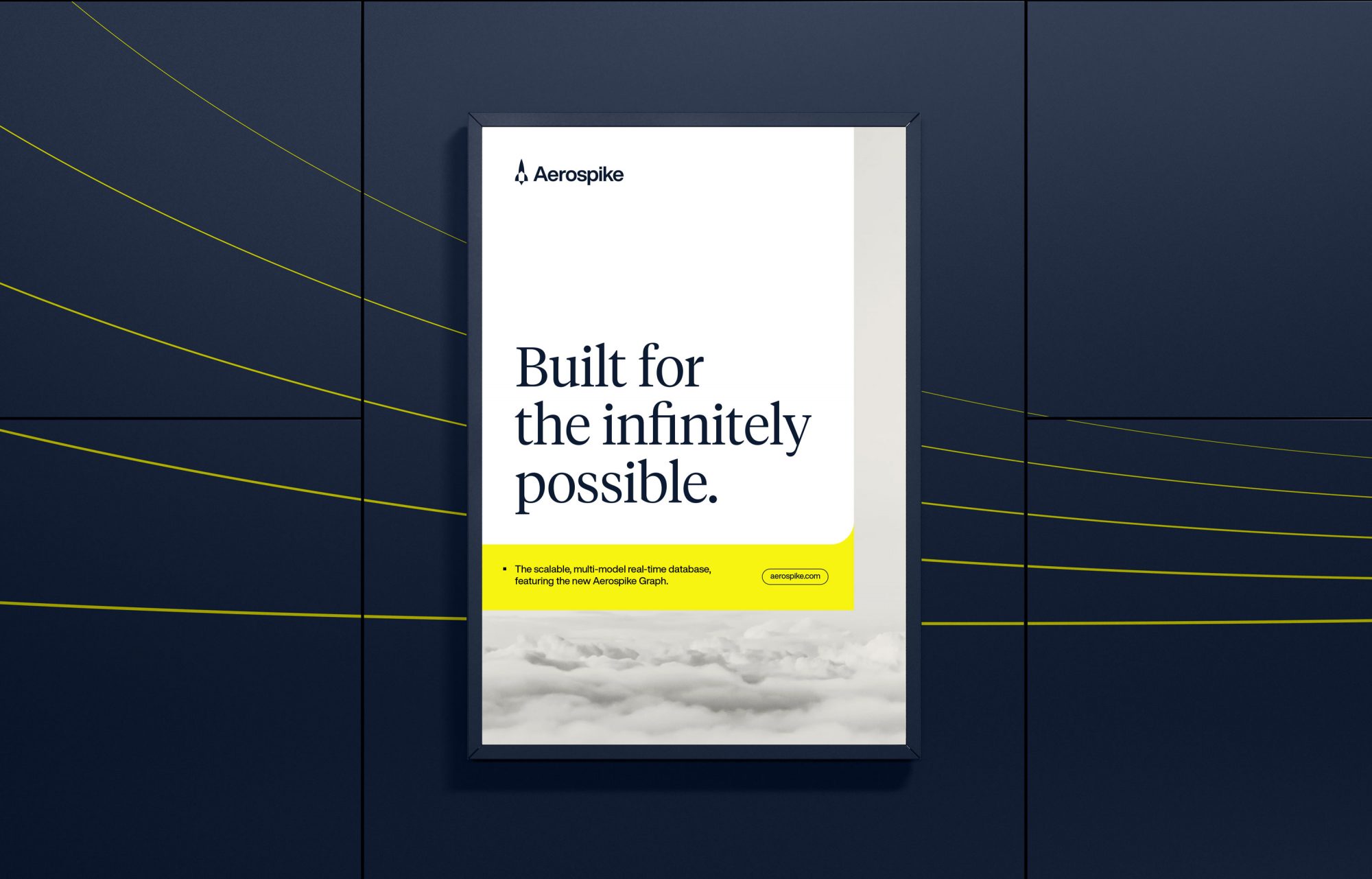
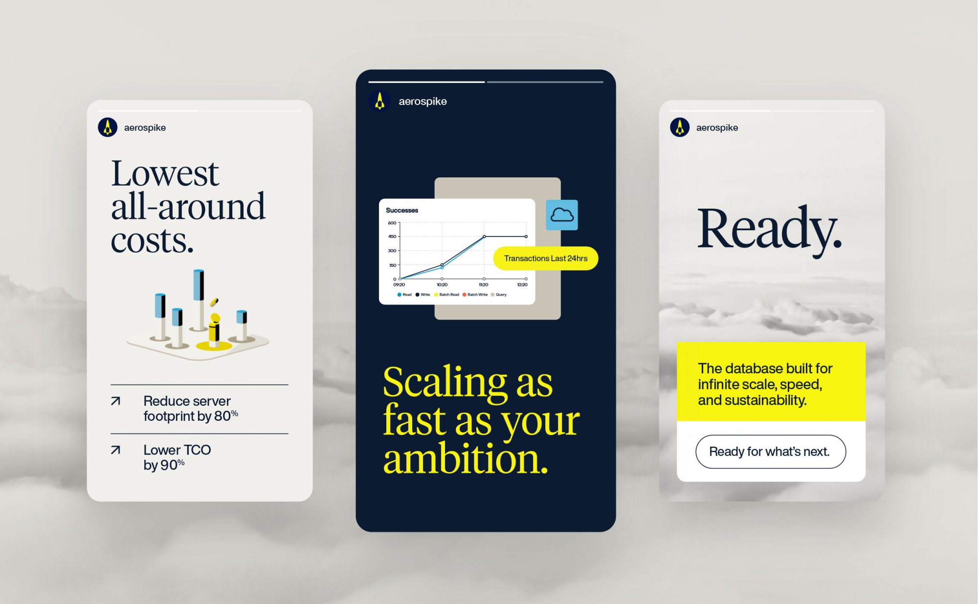
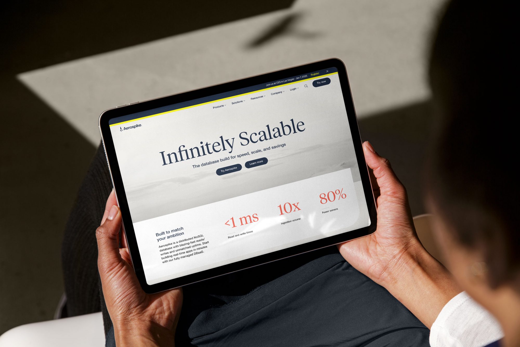
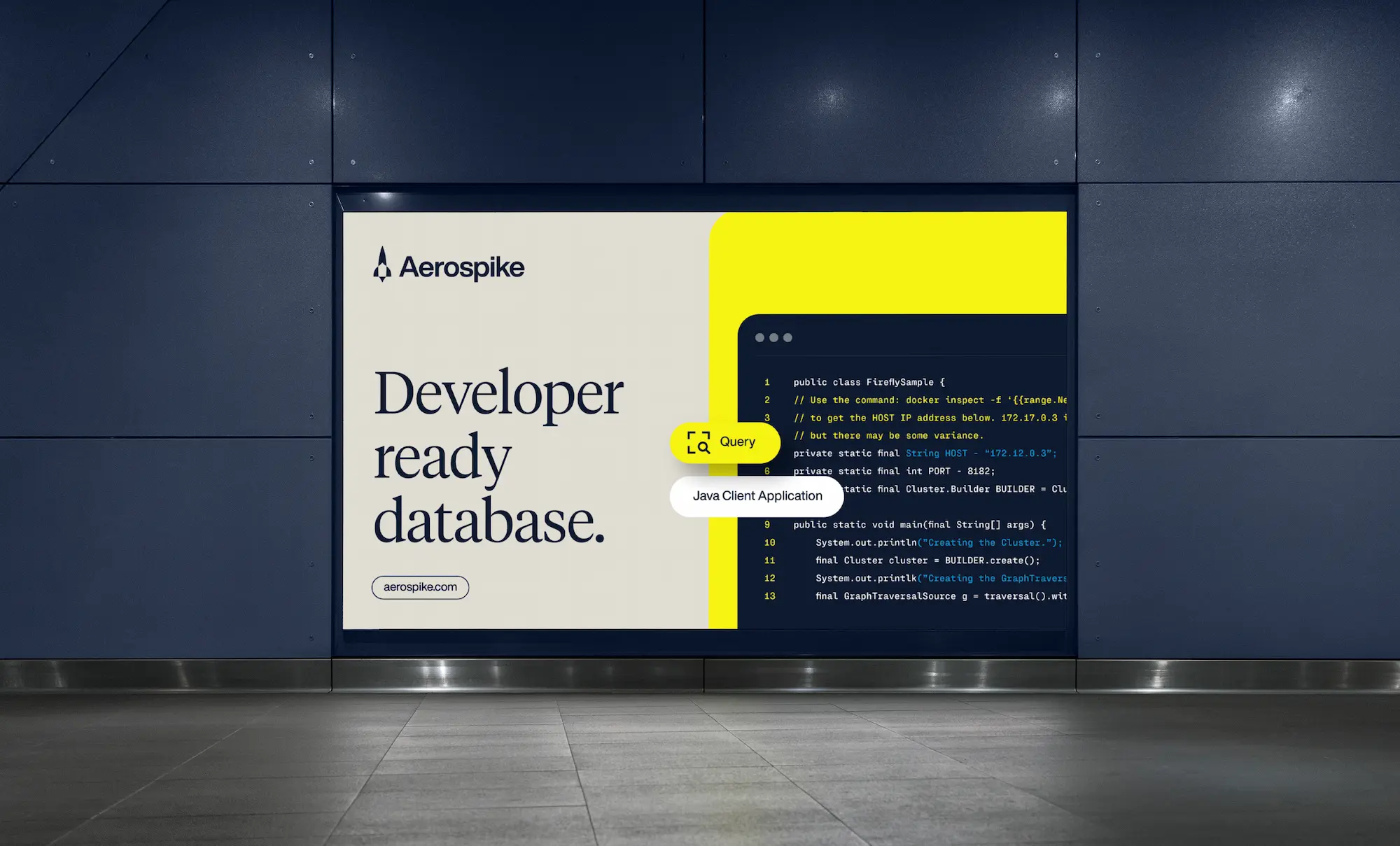
VISUAL IDENTITY
A visual system that reflects the singularity of the technology
Most database brands share a juvenile look and feel—a kitschy vibe presumed to resonate with developers. For Aerospike we rejected this condescending approach in favor of a modern and mature visual identity. It reflects the sophistication of their technology and the aspirational spirit of their new brand strategy.
brand MESSAGING
External messaging that hits hard
For Aerospike to rise above the “me too” competitive noise and accelerate the sales process, its messaging needed to be ruthlessly clear. A messaging framework was crafted that provides the language, voice, and tone to convey the infinite scale, speed, and savings that only Aerospike can deliver.
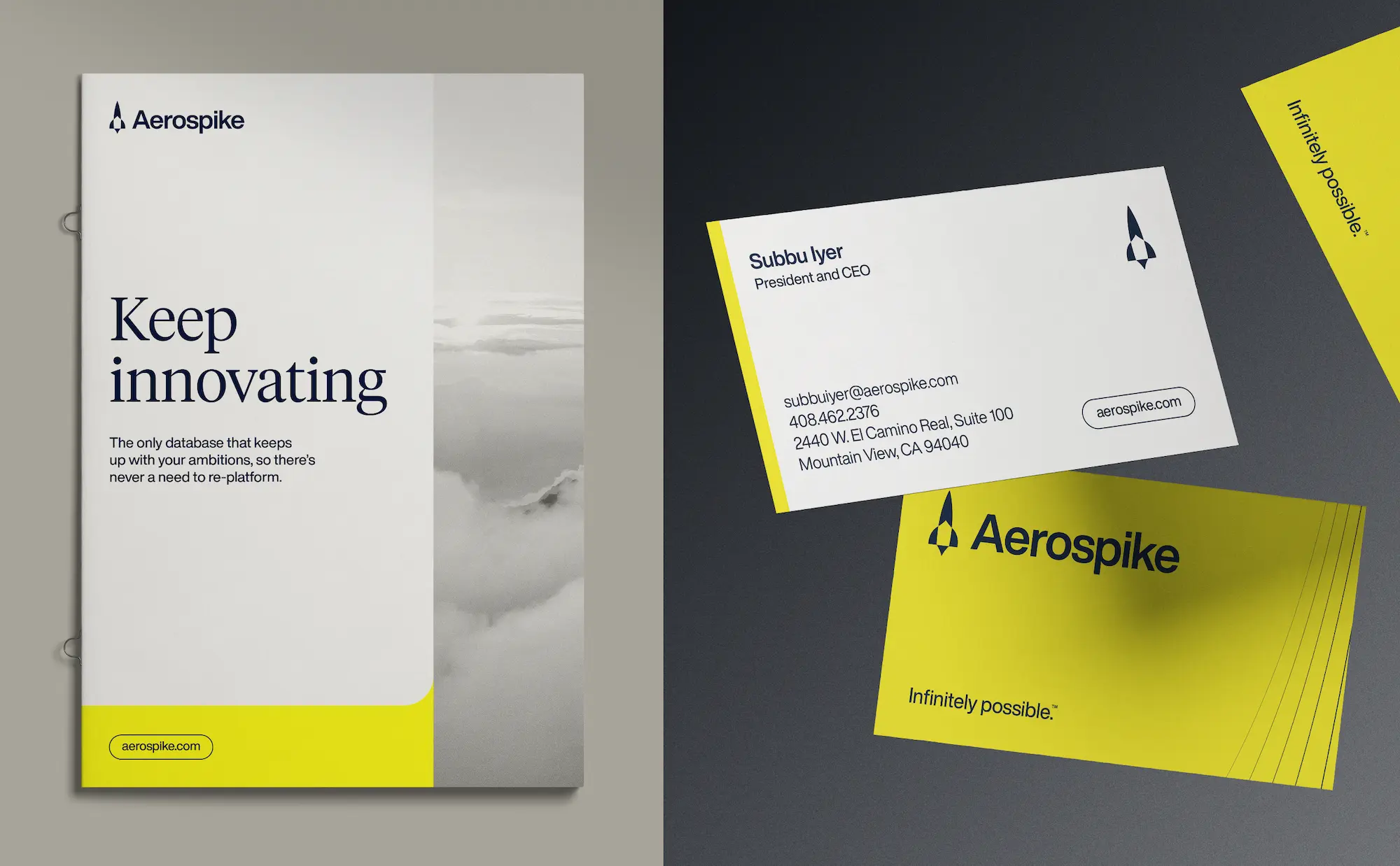
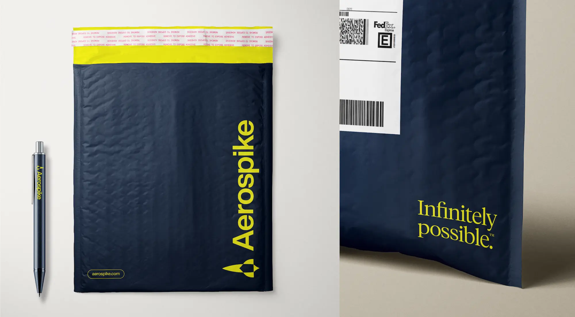
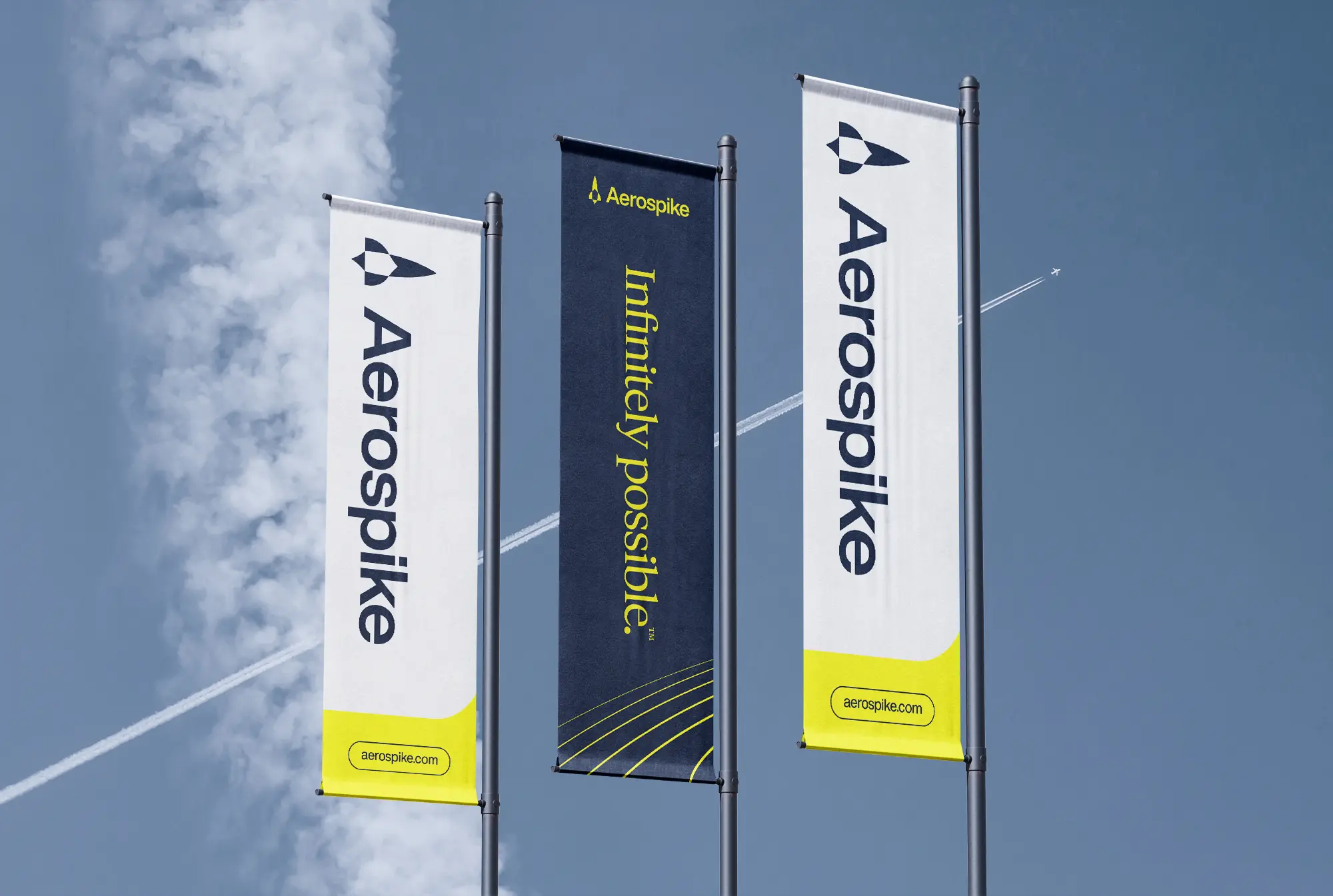
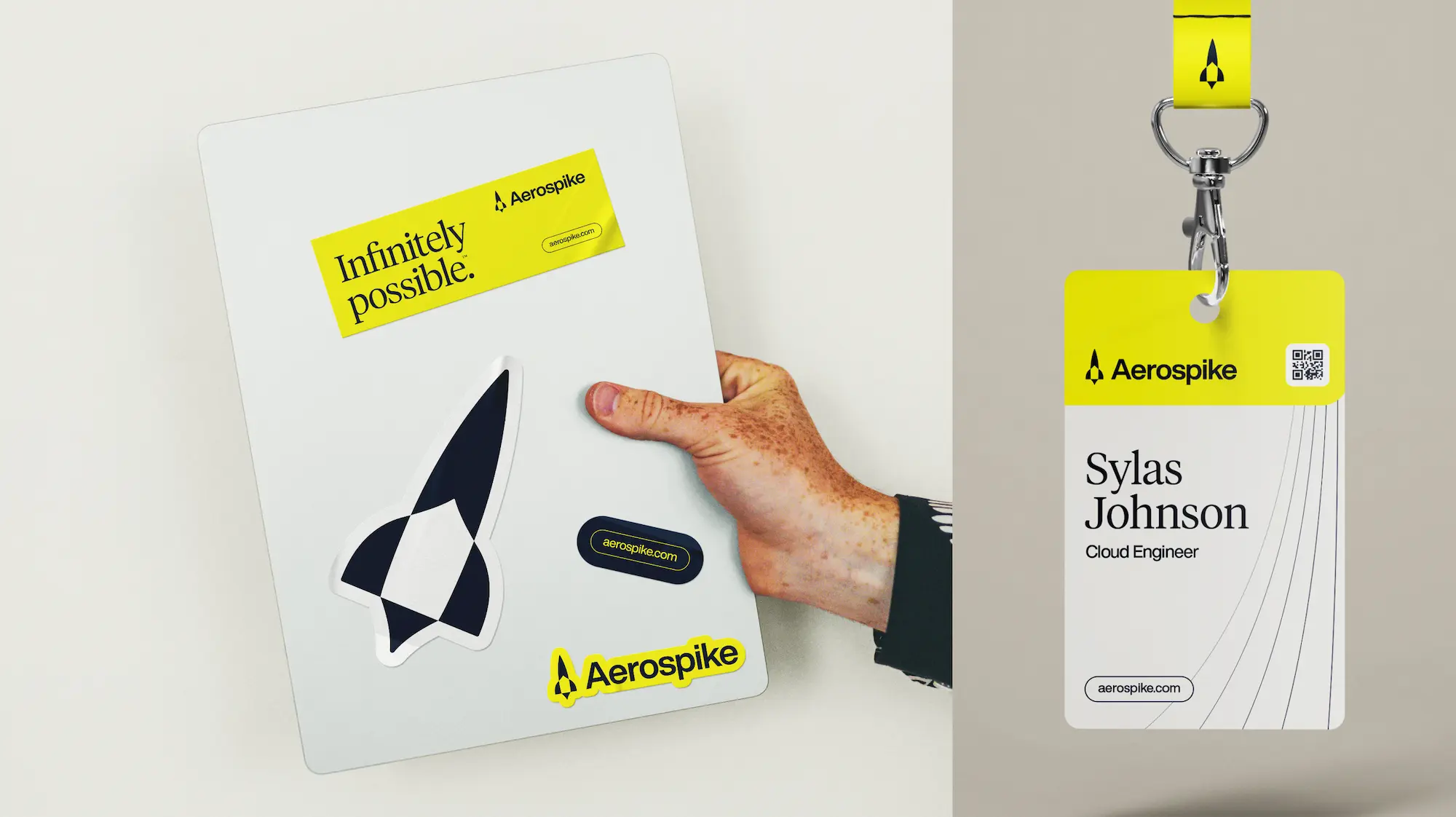
Brand Activation
Bringing a new brand to life
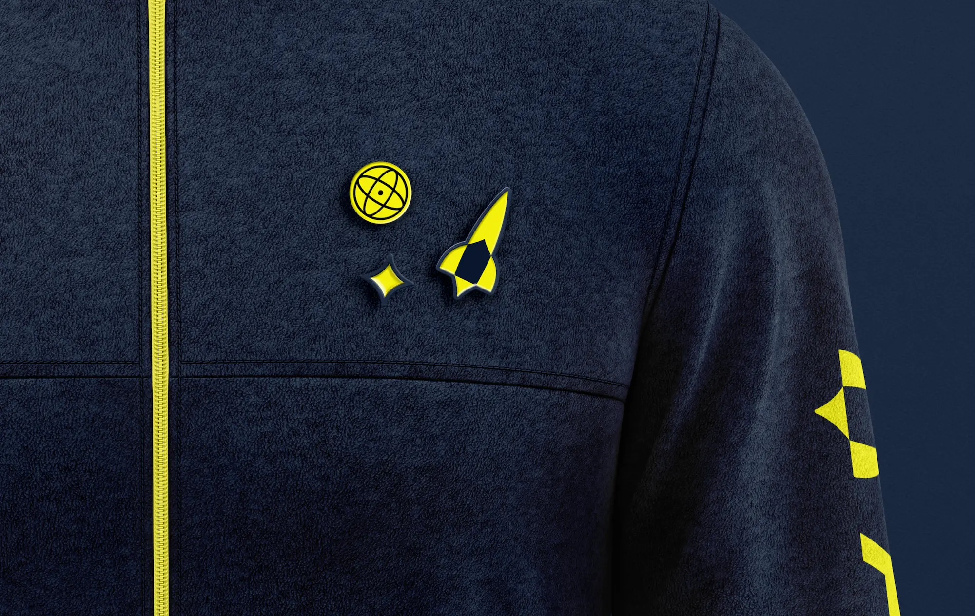
An aerospike is a thin, antenna-like structure mounted onto the cone of a rocket. It is also a type of advanced rocket engine. So leaning into the visual language of rocket science and space provided a distinctive look and a consistent theme across all brand touchpoints.
As UC San Diego Health sought to expand their geographical footprint and shift their focus from specialty to primary care, refreshing the brand became essential to attract a younger audience in a highly competitive category.
Insight
Appealing to new audiences often requires a delicate balance between preserving a brand’s roots and modernizing its identity for relevance in an evolving market.
Solution
Bring thoughtful evolution—not revolution—to the brand, infusing a distinctiveness that would allow UC San Diego Health to stand out in a homogenous landscape.
STRATEGY
Prescribing modernity and methodology
UC San Diego Health boasted a longstanding, local presence and strong reputation for providing quality healthcare. The essence of a great brand was already intact. Traina led the way in translating that essence into an expanded, modern identity. Then set about developing prescriptive guidelines and templates to instill a uniformity that the brand had previously lacked.
STRATEGY
Diagnosing opportunities for distinction
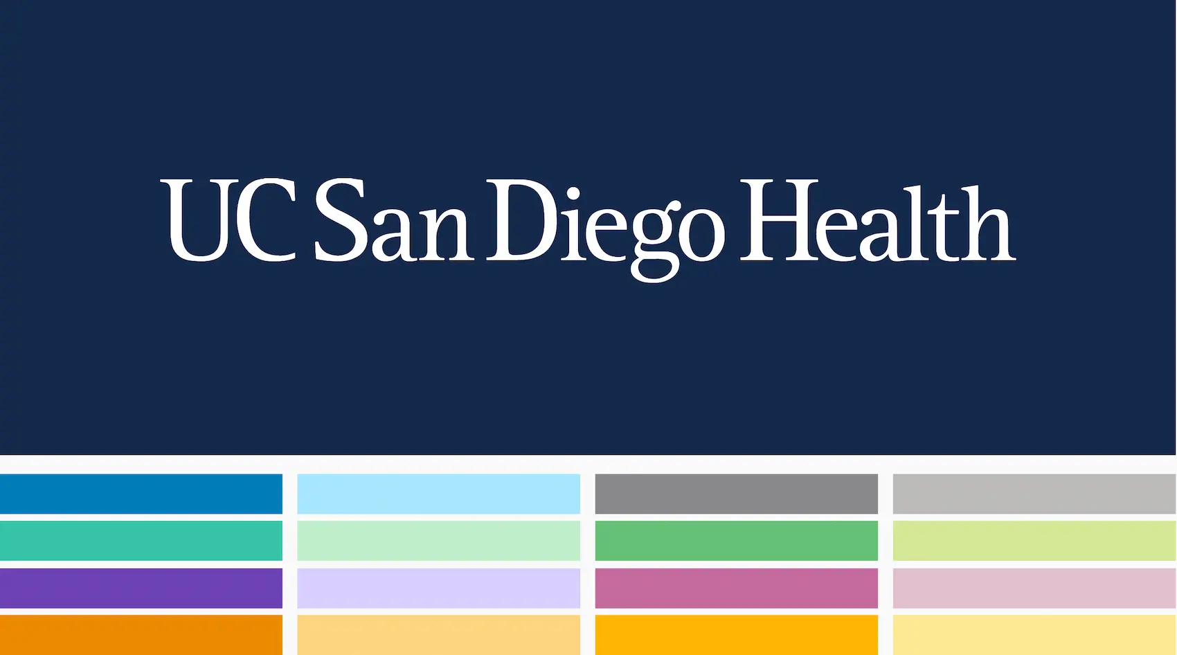
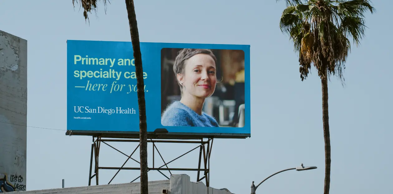
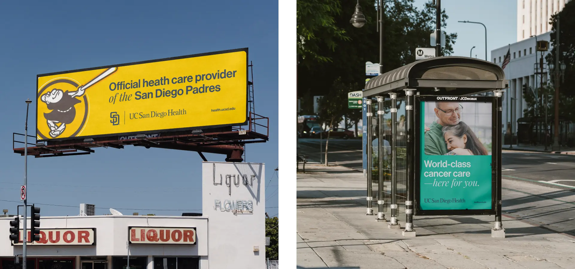
UC San Diego Health’s existing brand toolkit was somewhat limited and therefore difficult to implement for their brand and marketing teams. An audit of local competitors revealed the use of similar color palettes and generic imagery to convey mostly transactional messaging. Without changing the core tenets of the UC San Diego Health brand, we expanded the color palette, created a more friendly typographic approach and established a new, more emotive photography style to set them apart from the competition and connect on a more personal level with their audiences.
Brand Application
Connecting the brand with the community
Once the website was complete, the new brand was introduced to both internal and external audiences.
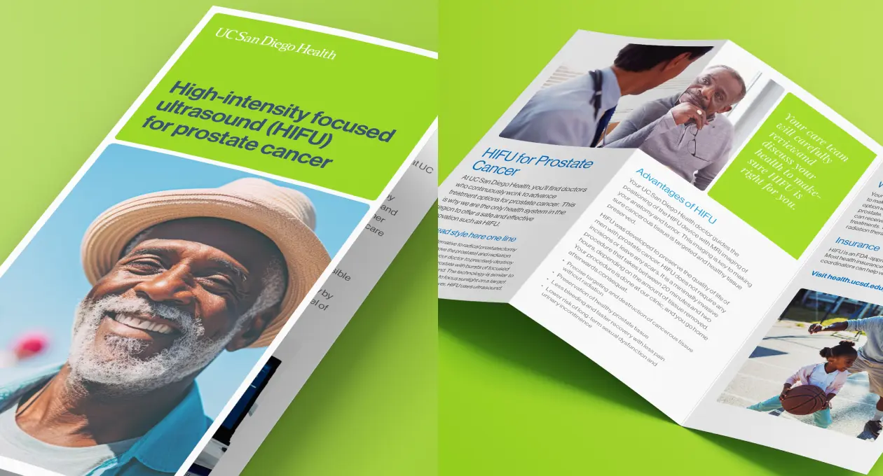
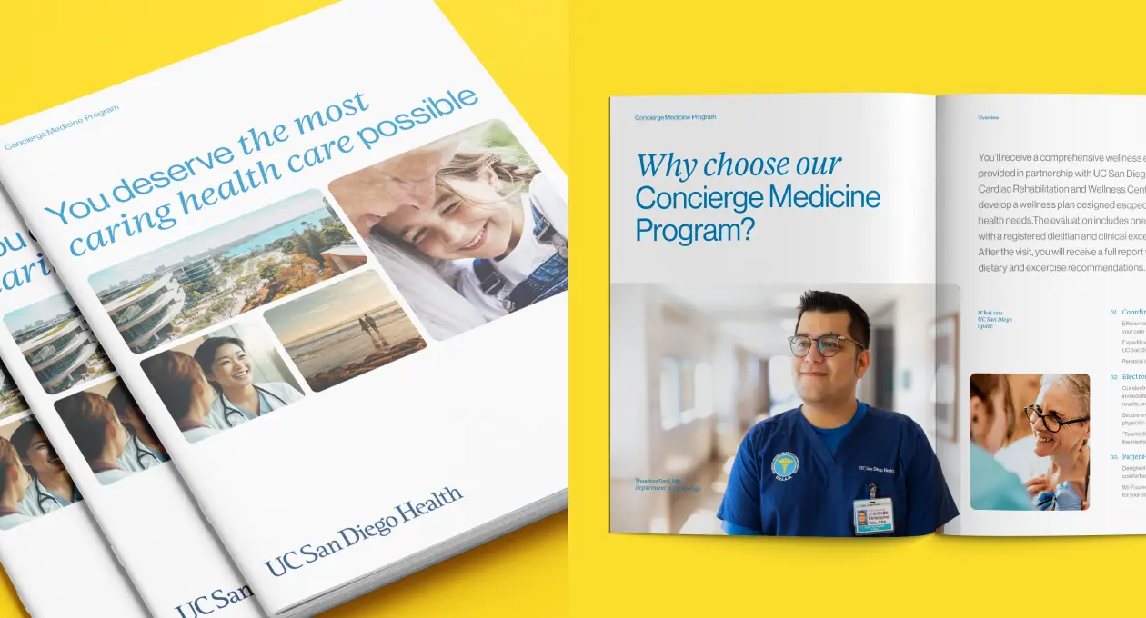
Internally, we delivered a new set of guidelines that included a series of templates for both internal and external marketing teams. The templates were designed to allow enough flexibility for their multiple audiences and uses, while retaining tight formatting for brand consistency.
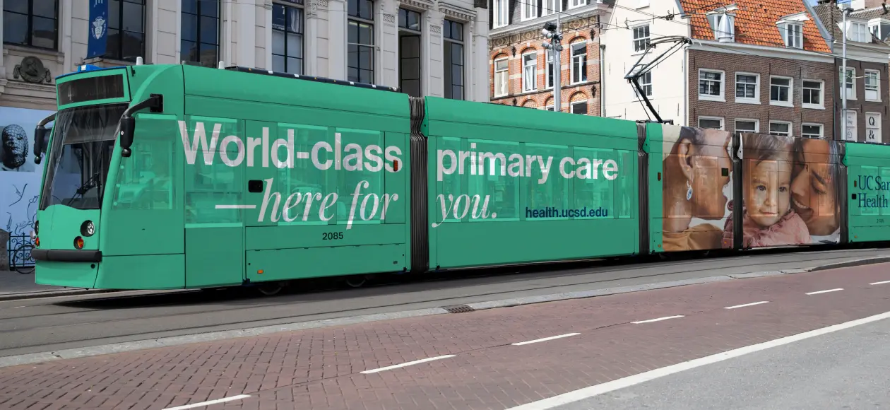
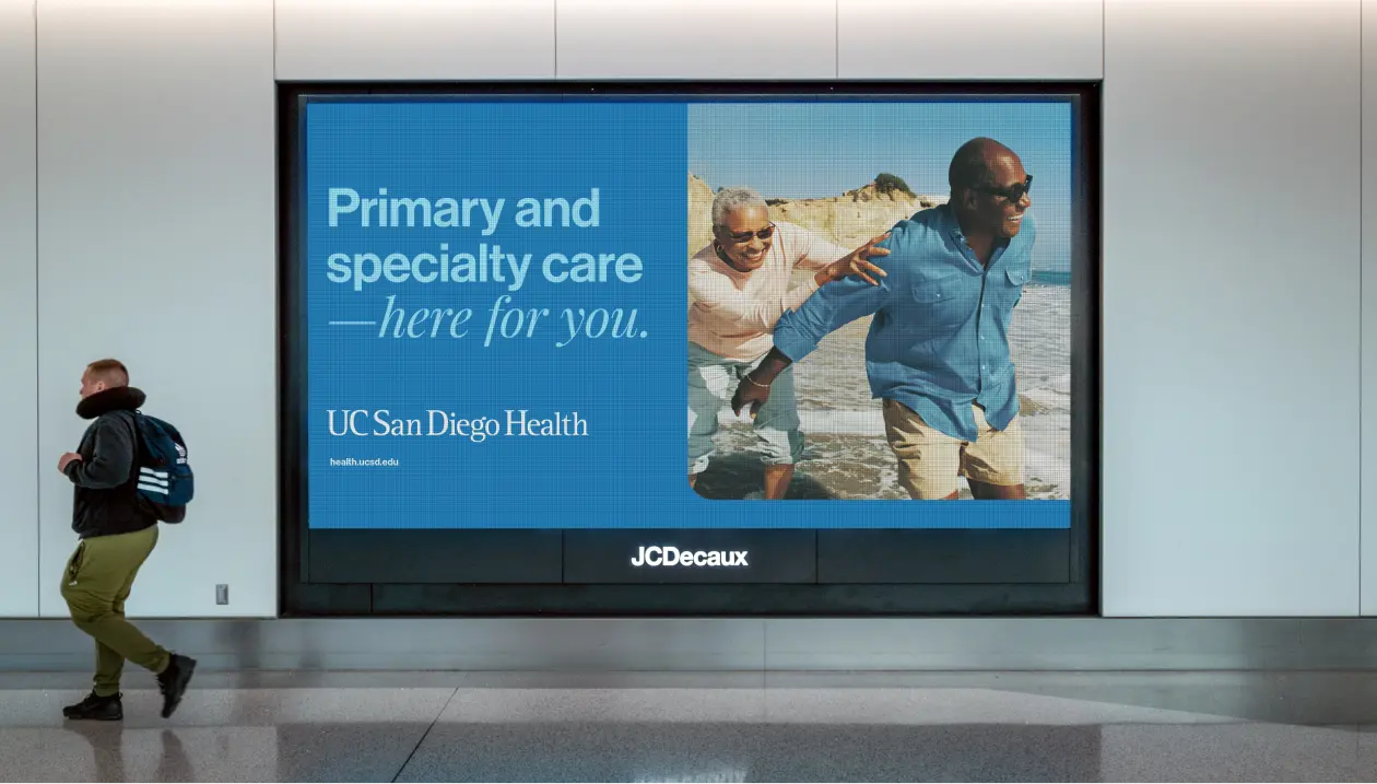
Externally we collaborated with the client’s creative team to develop a series of print and OOH ads that carried existing messaging, but delivered with the warmth and heart of the new UC San Diego Health brand.
Digital Activation
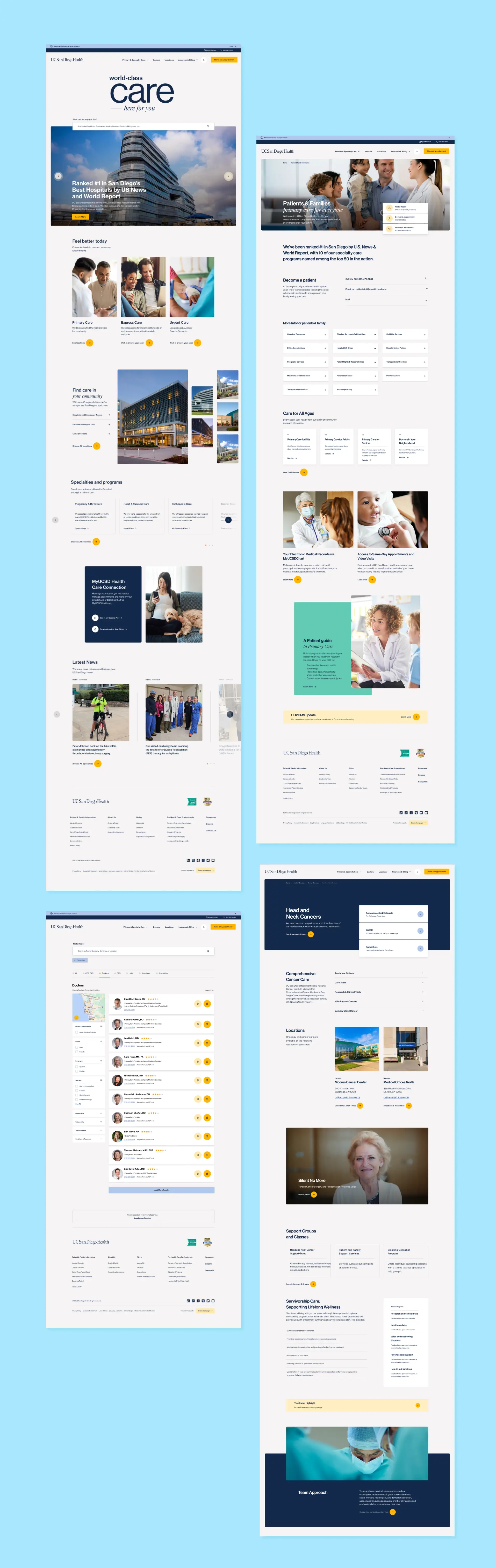
Performing a head-to-toe digital transformation
The move to a primary care provider necessitated an update to their website, to accommodate the expanded content and increased traffic. We designed a completely reimagined digital experience that expressed the new brand, yet emphasized user experience, accessibility and conversion. A design system was constructed for maximum flexibility and expansion, helping their internal team easily port over hundreds of pages of legacy content as well as create new pages and respond to changing content needs.
A brand built upon simplicity and clarity often stands above the rest.
Challenge
The concept of carbon removal to improve our climate is misunderstood, contentious, and still vying for credibility. That posed formidable communication challenges for carbon removal pioneer Captura.
Solution
Crystallize Captura’s positioning, messaging and visual identity to effortlessly convey its message with certainty and authority.
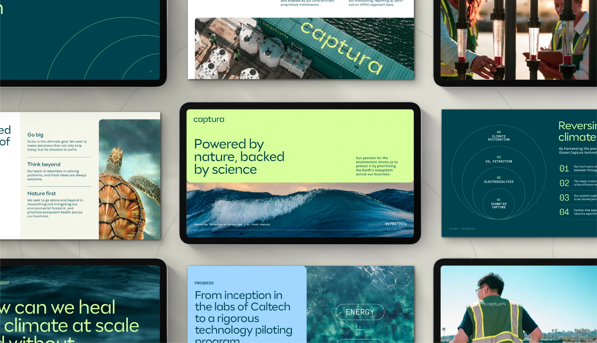
BRAND STRATEGY
Capturing the essence of a brand and its mission
Captura was at an inflection point. Having honed its unique Direct Ocean Capture technology, the company was transitioning from early stage startup to proven leader in harnessing the power of the ocean to improve the earth’s atmosphere. Led by Traina, a clear, comprehensive strategic foundation the company could rally around was developed–from its mission, vision and values to external messages for all key audiences.
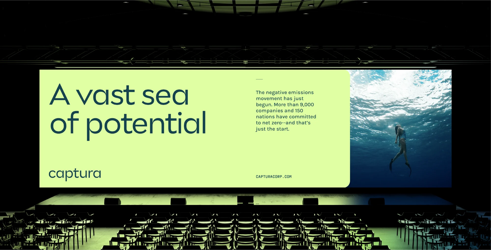
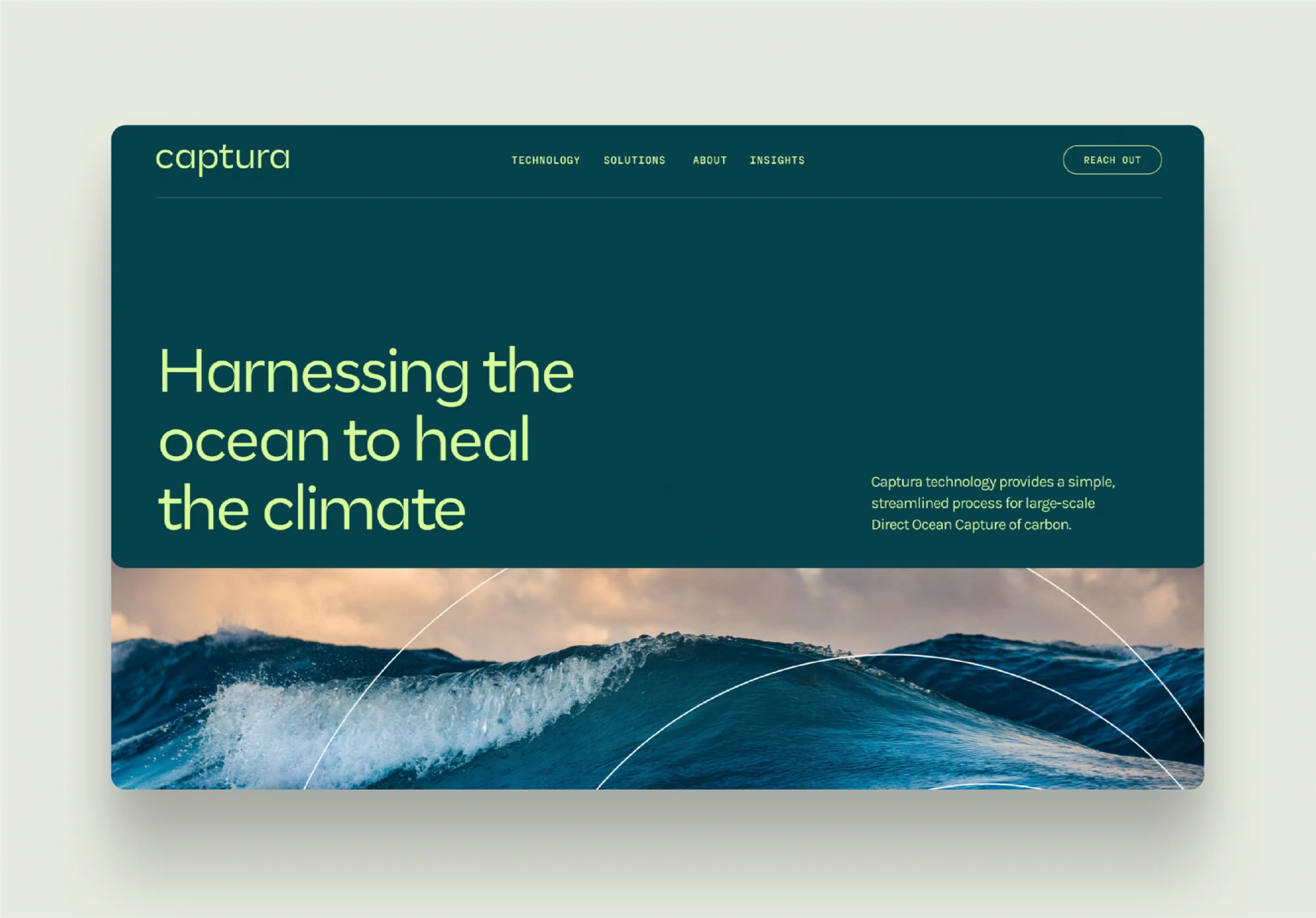
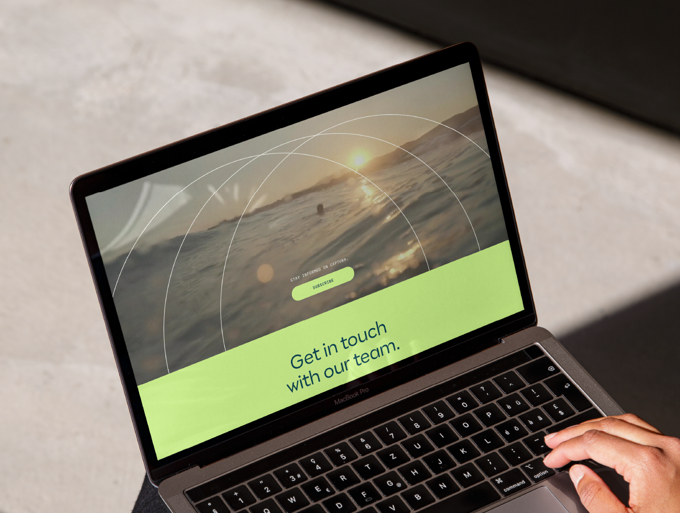
VISUAL IDENTITY
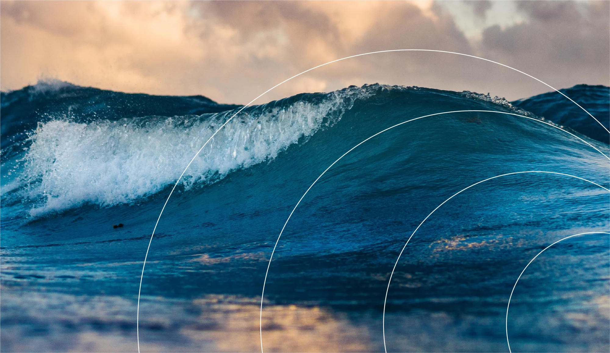
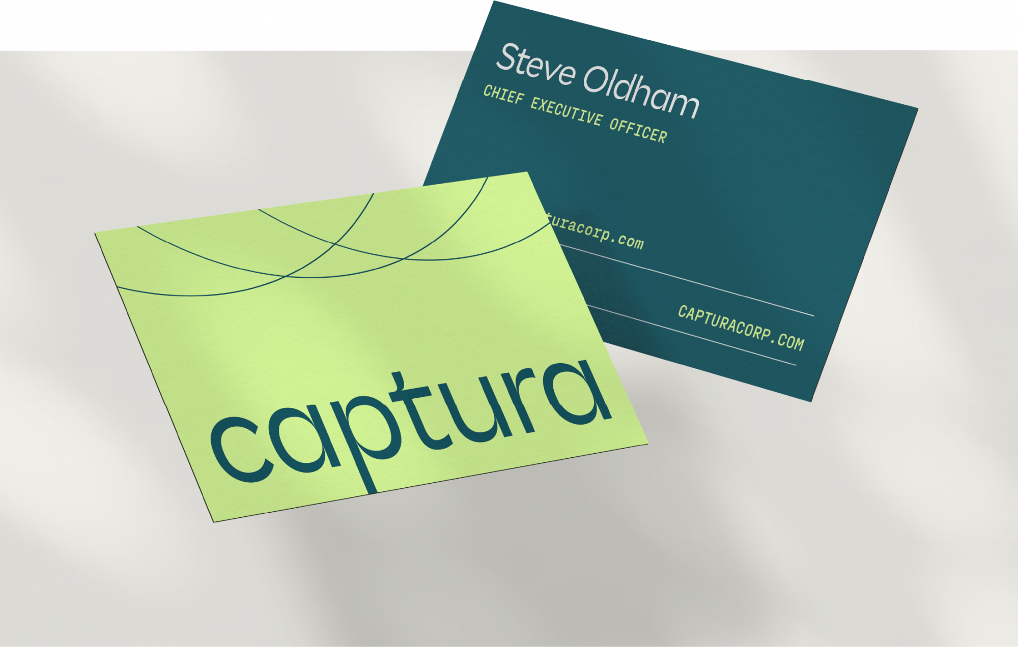
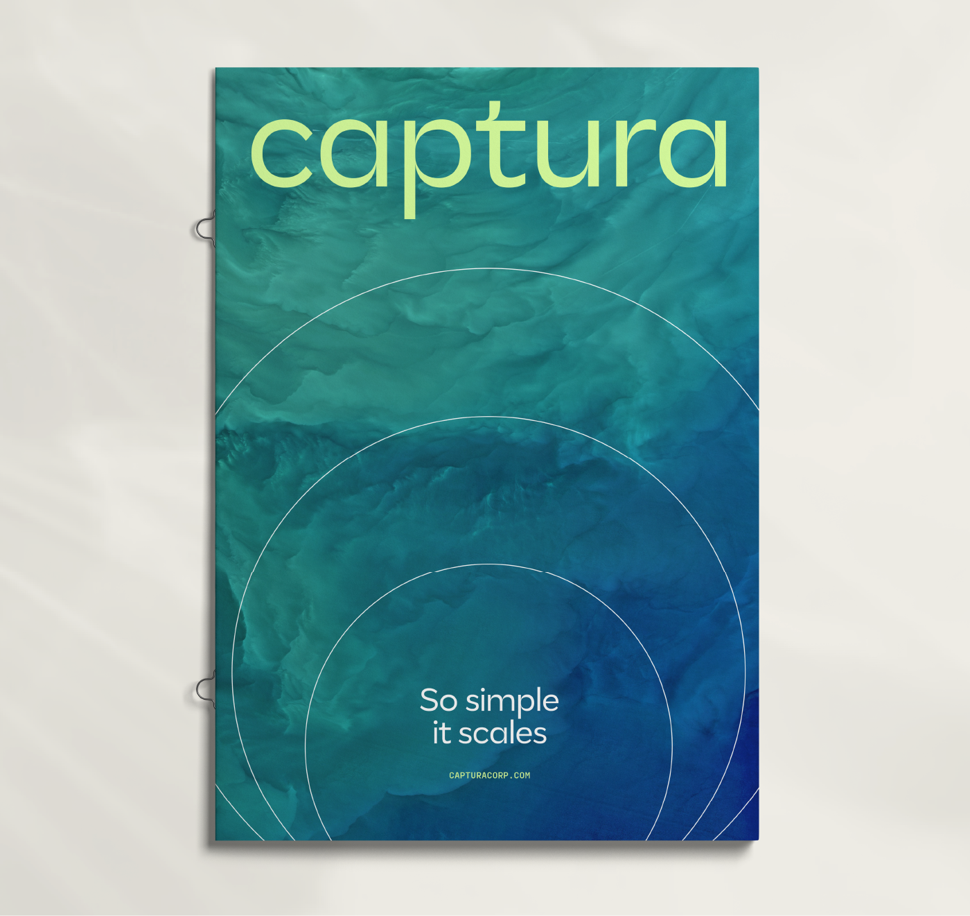
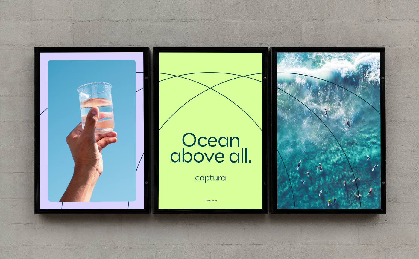
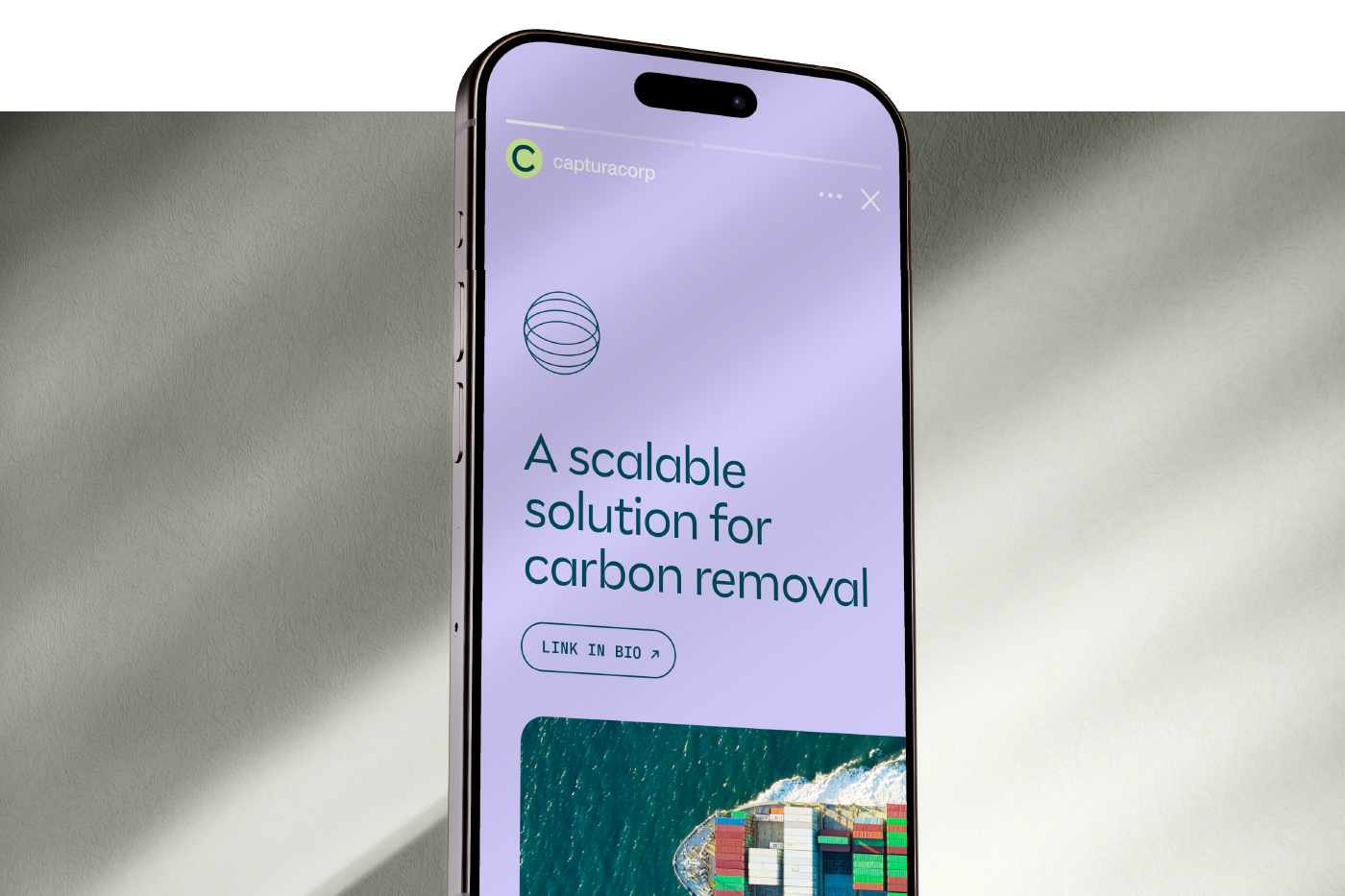
Creating a visual system that’s a true force of nature
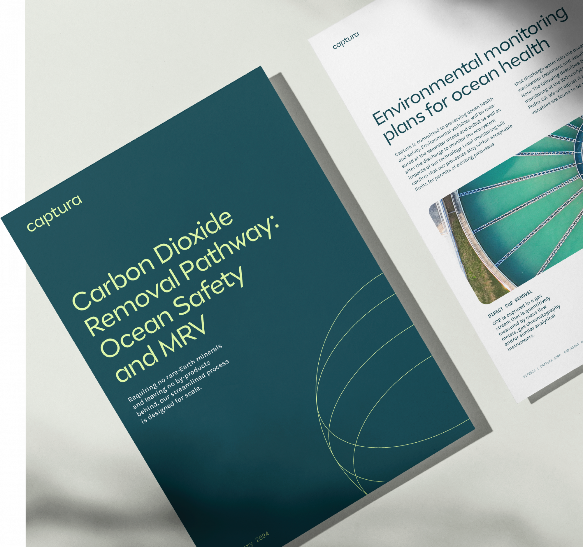
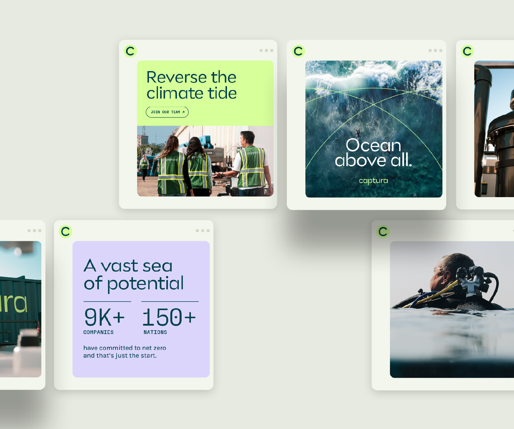
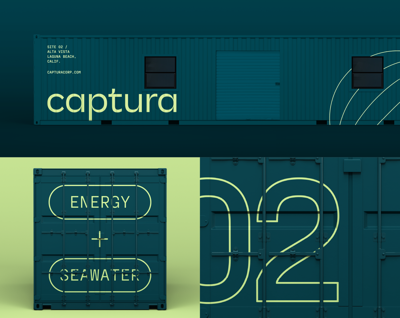
A confident, simple wordmark anchors Captura’s nature-inspired visual identity. The logo features tapered letters as a subtle nod to ocean waves. A bright color palette inspired by the natural world exudes energy and vibrancy. Flexible, monoline artwork adds a technical feel to the brand, while serving as both iconography and as large-scale graphic elements within the system.
brand applications
Embedding aspiration into every touchpoint
The brand conveys optimism and confidence through positive, concise messages. Clean, uncluttered layouts allow the copy to make an impact. Imagery is an intentional blend of nature, lifestyle and technology to further underscore Captura’s story.
Less is more
Elements are applied with deliberate restraint giving the brand a quiet confidence. Monoline artwork provides cohesion while its circular shapes suggest water ripples and the geometry of other natural elements.
DIGITAL
Elevating the brand’s most important messages
A new website showcases all elements of the identity system while bringing intentional pacing and hierarchy to Captura’s storytelling.
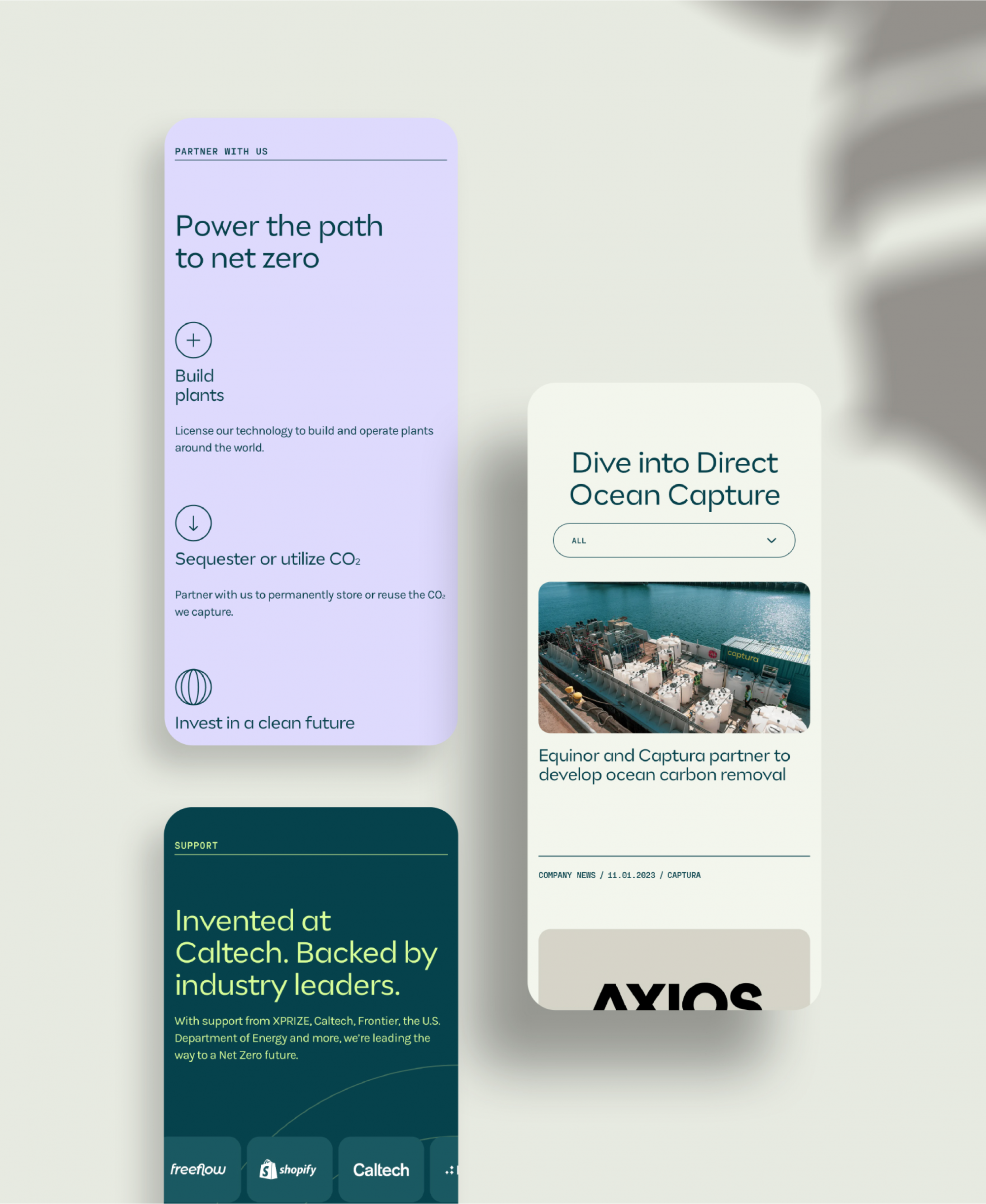
A collaborative atmosphere
Imagery and copy throughout the site apply the welcoming and accessible persona of a brand seeking valuable partnerships.
Social
Respecting the power of public sentiment
When it comes to climate concerns, the line between B-to-B and B-to-C falls away. We’re all invested. This meant providing Captura with the tools to join–and lead–the conversation.
All Aboard
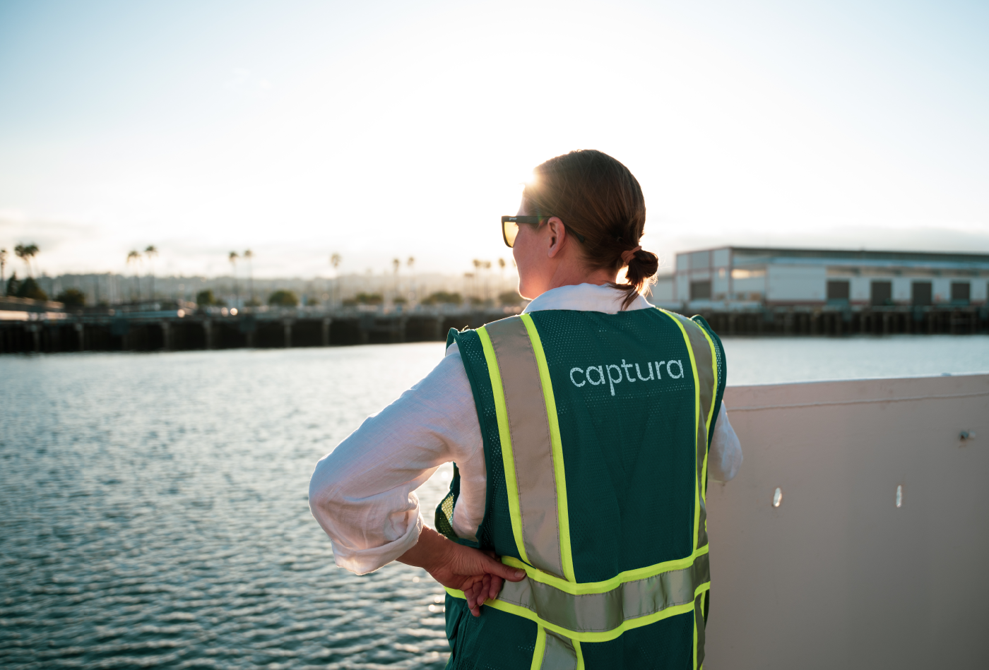
A brand with sea legs
The new Captura identity shines in all things marcom, but it’s also making an impact at the source of innovation. From ocean vessel equipment to branded life vests, the company is demonstrating in real time the power of presence and brand consistency.
Traina’s ability to very quickly come up to speed and understand the complex and technical aspects of our solution and industry really impressed me.
Brand strategy Visual & verbal identity Brand Guidelines Environmental Graphics Marketing Assets Website/UI design Social Media Templates
Insight
True togetherness is elusive in the remote era, which means retreats and events must be experiential and memorable—just like a hospitality brand.
Challenge
Having perfected the summer camp experience for any age, Allaway’s parent company was venturing into high-end bespoke events and company retreats. The brand we made together had to connect those two worlds.
Solution
From architecture and strategy to creative execution, we built the Allaway brand to be as elevated, seamless and enjoyable as their end-to-end planning and hosting process.
BRAND STRATEGY
Ideology with authenticity
Once immersed in their culture, we articulated a brand ideology that highlights their commitment to fostering community, and that is expressed in their attention to detail, warmth in interaction and standards of service.
These pillars, values and messaging led us to a name that captured the power of getting people together to connect outside of the day-to-day. It’s an experience that goes well beyond just a getaway—it’s Allaway.
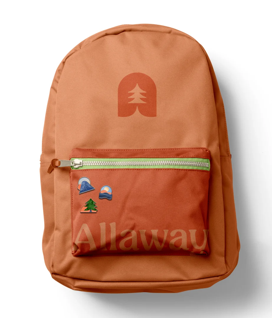
VISUAL IDENTITY
Natural forms that elevate nature
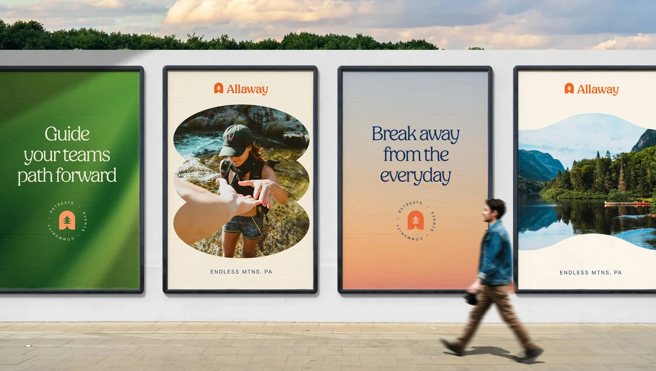
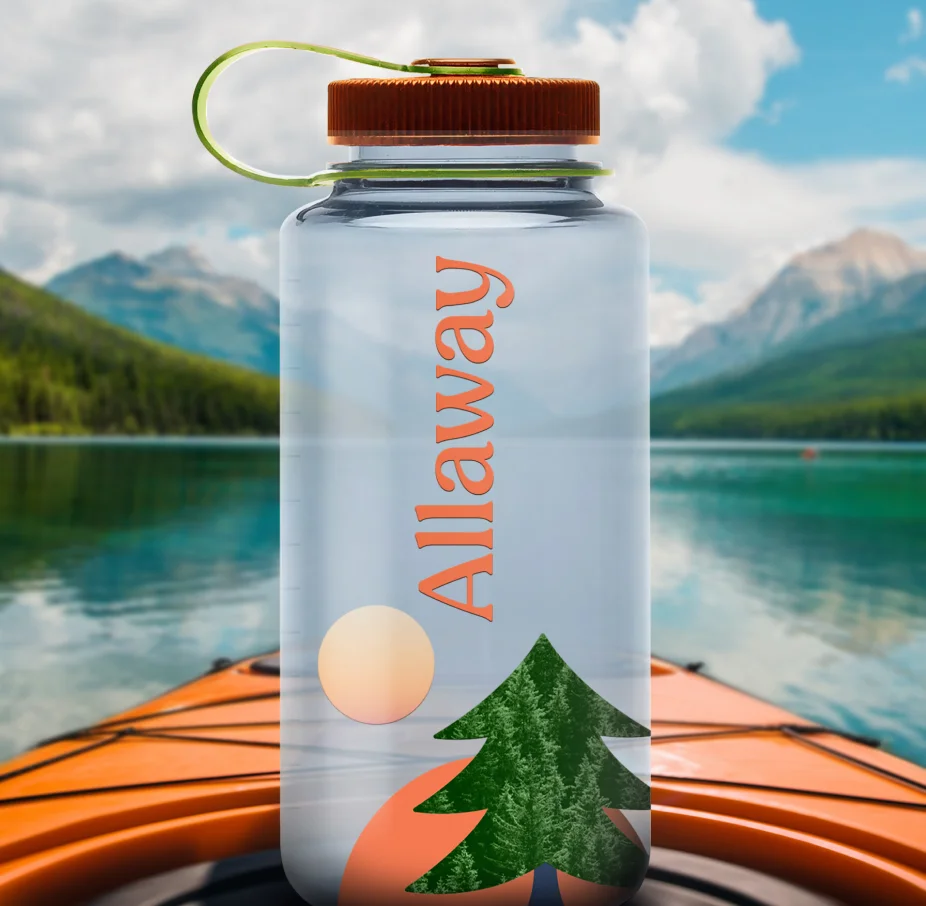
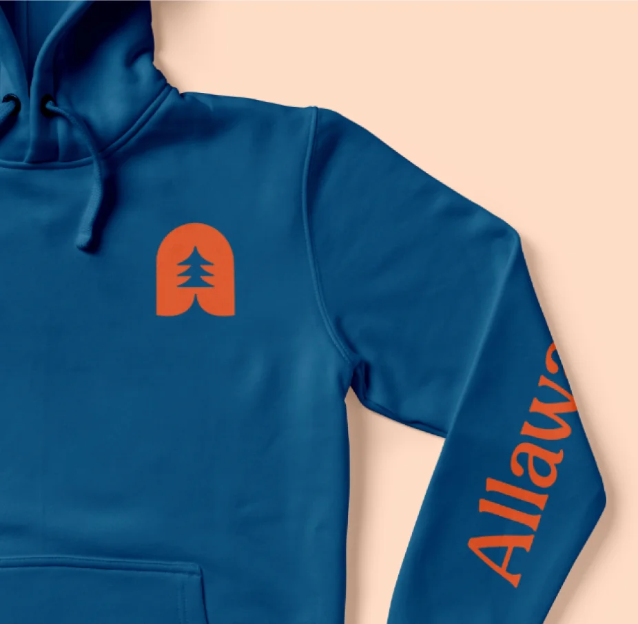
The Allaway logo is designed as a window into nature and represents the growth of community via the unique experiences they create. The three shapes of the tree are a subtle nod to the brand’s core offerings: Retreats, Events and Community.
The brand’s shape language is based on the five natural elements, extending the window concept throughout the brand system—-with diverse applications in advertising, printed collateral, social media and merchandise reminiscent of a memorable time away.
DIGITAL EXPERIENCE
Bringing the great outdoors online
This immersive motif launches their website with a stunning front door moment that whisks visitors into a dynamic experience that flows as smoothly as Allaway’s planning process, all of it detailed in clear, lively and joyful messaging.
Custom property indicator and iconography capture the elevated amenities and speak to the geography of their venues around the country, from mountains and forests to the desert and lakefront properties.
RESULTS
Our partnership with Allaway continues as Traina builds out their brand family with a parent company, distinctive physical venues and a robust presence for their sustainability efforts. But with a soft launch completed and swift expansion on the horizon, Allaway is already bringing forward-thinking companies in to bring authentic communities out.
We are extremely pleased and impressed with the service we have and continue to receive from the entire Traina team. For Lauren and me, it’s not only the quality of the work being delivered but also the quality of the people. Your team is filled with good people!”
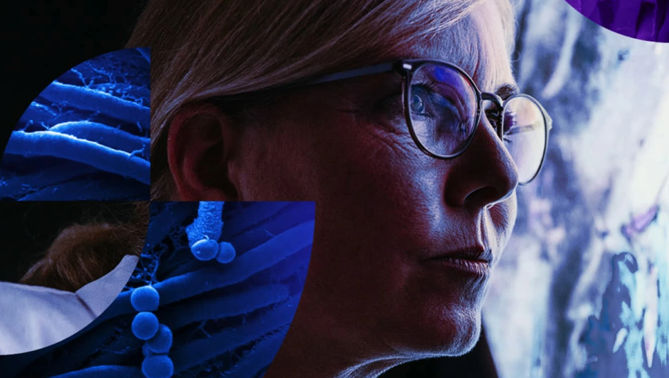
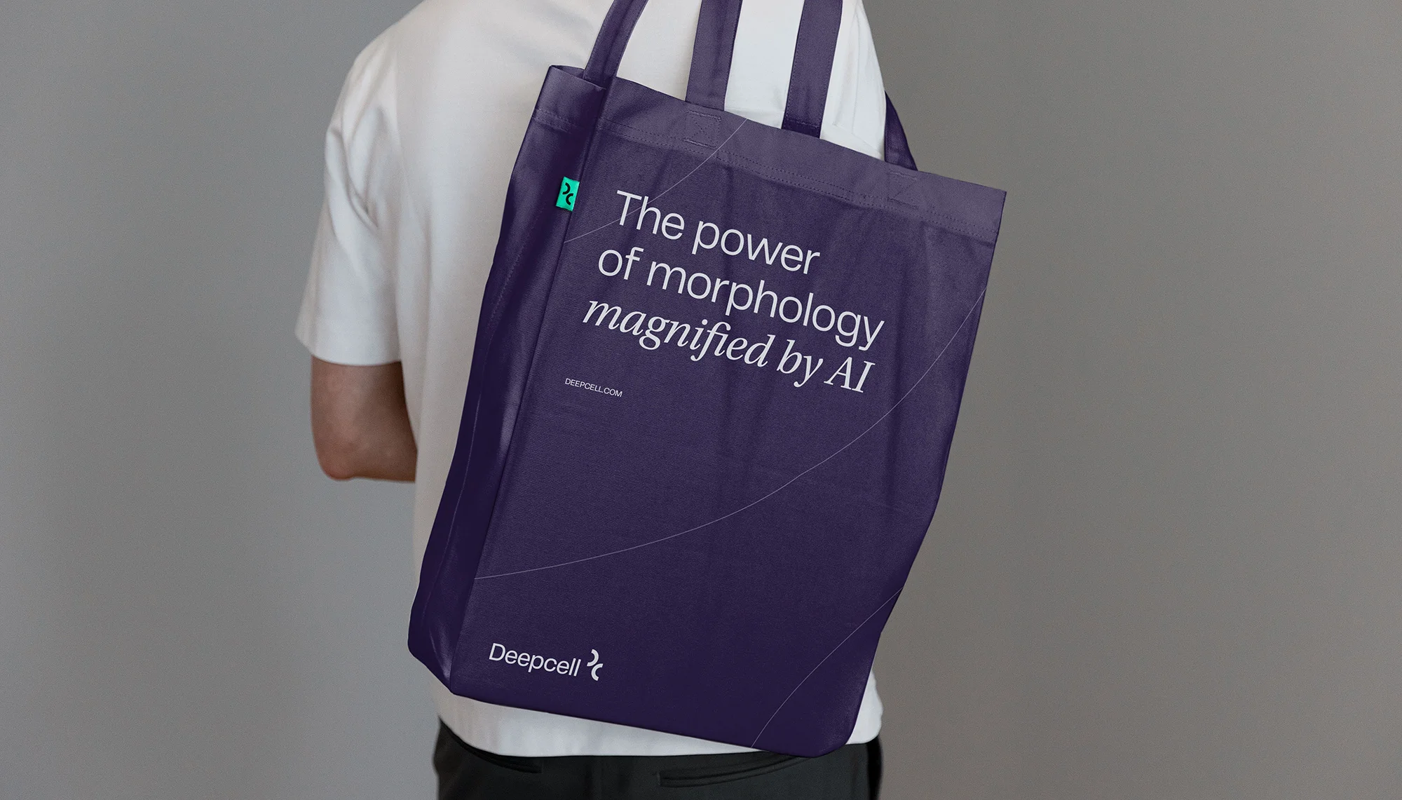
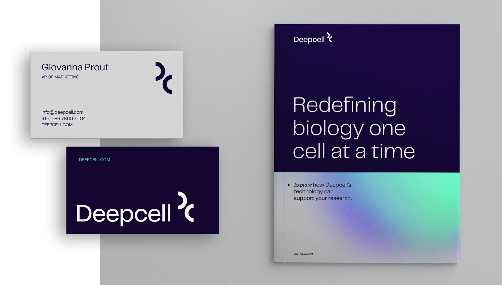
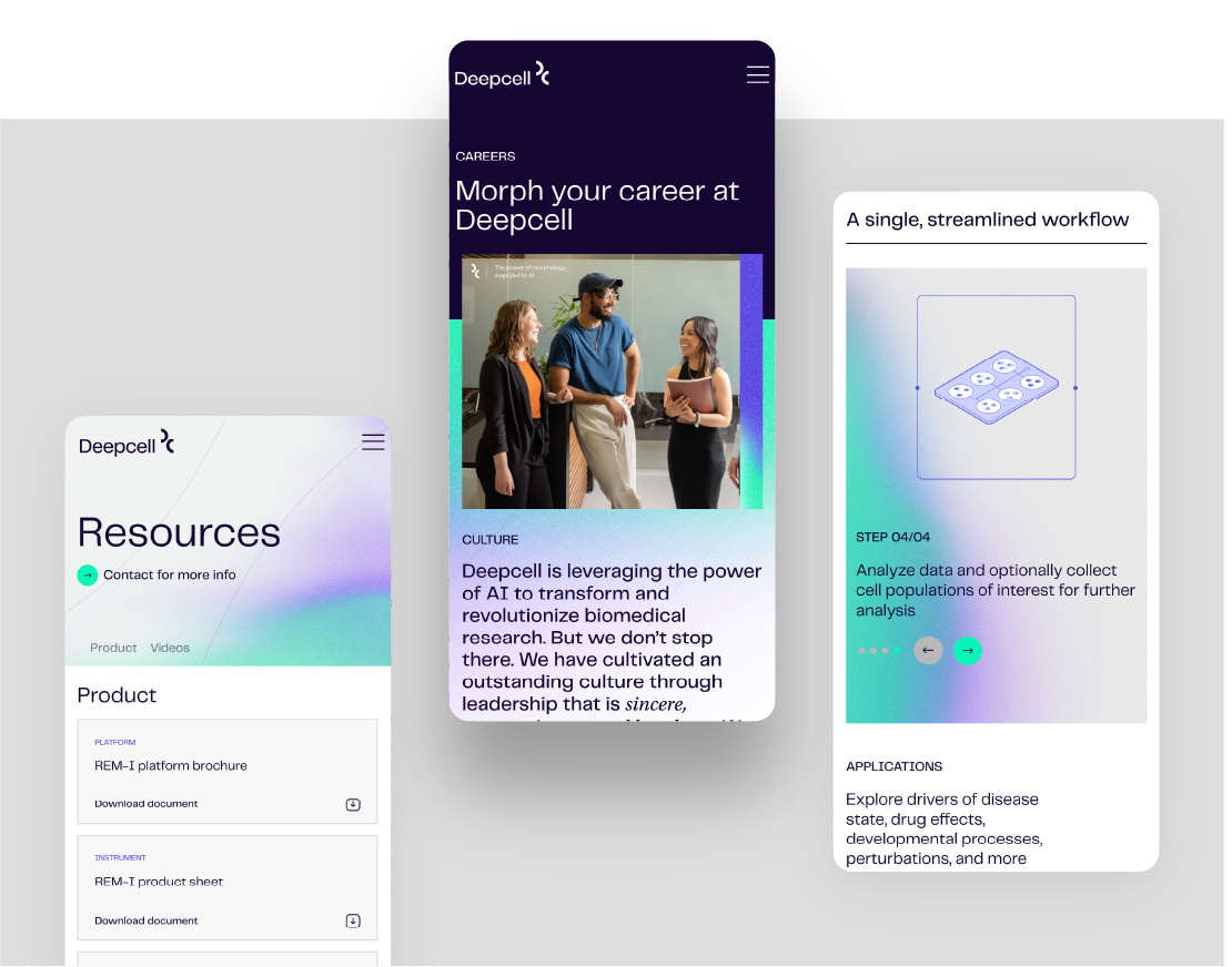
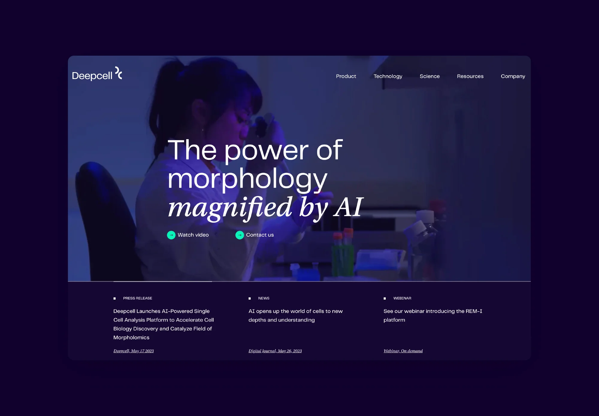
Designing the difference in a cutting-edge biotech brand
Services PROVIDED:
Brand strategy Visual & verbal identity Brand Guidelines Website/UI design Social Media Templates
Insight
Sometimes one word can be the key to unlock a brand’s freedom to be unique. In this case, “avant-garde” was the north star for a biotech identity as artistic as it is innovative.
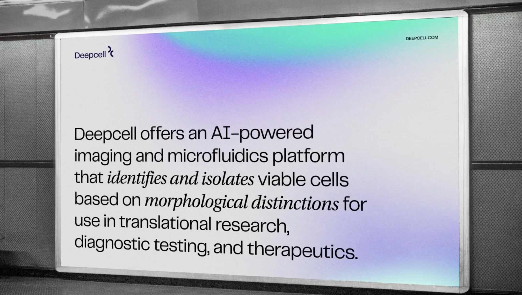
Challenge
Deepcell is introducing an entirely new way to analyze cells—not just a new product, but a new way of thinking. Their brand needed to convey a total paradigm shift.
Solution
The Deepcell brand is a stark departure from the competition’s sea of sameness, with a design system that uses visual abstraction to create a unified yet dynamic brand experience.
Strategy
Inclusive ideology
Deepcell began with a desire to expand cell morphology into a brand new field of morpholomics. At Traina, we began by translating the passion of Deepcell stakeholders into an ideology that spoke to the innovative thinking and techniques they bring to the industry.
The company’s values, positioning, pillars and personality were crafted with a theme of service to scientists—helping them make discoveries quicker and more frequently than ever before. Deepcell is not just about tools or tech, but the impact of its customers.
Photography and video by DCA, San Francisco
Brand Elements
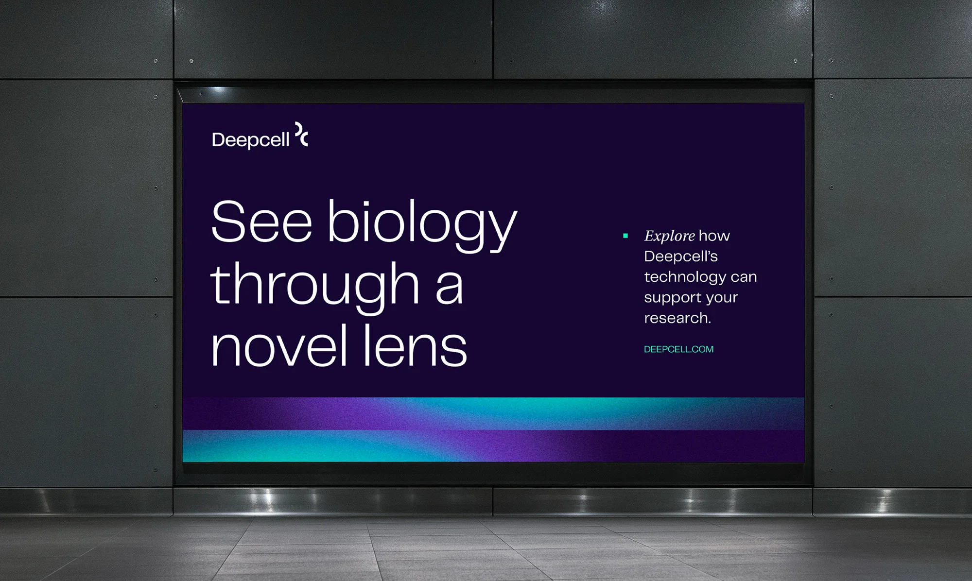
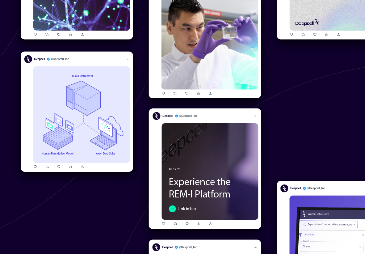
Deepening the brand
Innovation and collaboration are the heart of Deepcell, and now the heart of their brand. Their logo and wordmark have a technical feel that is now balanced by bold new colors that bring energy and vitality to the visual identity.
design system
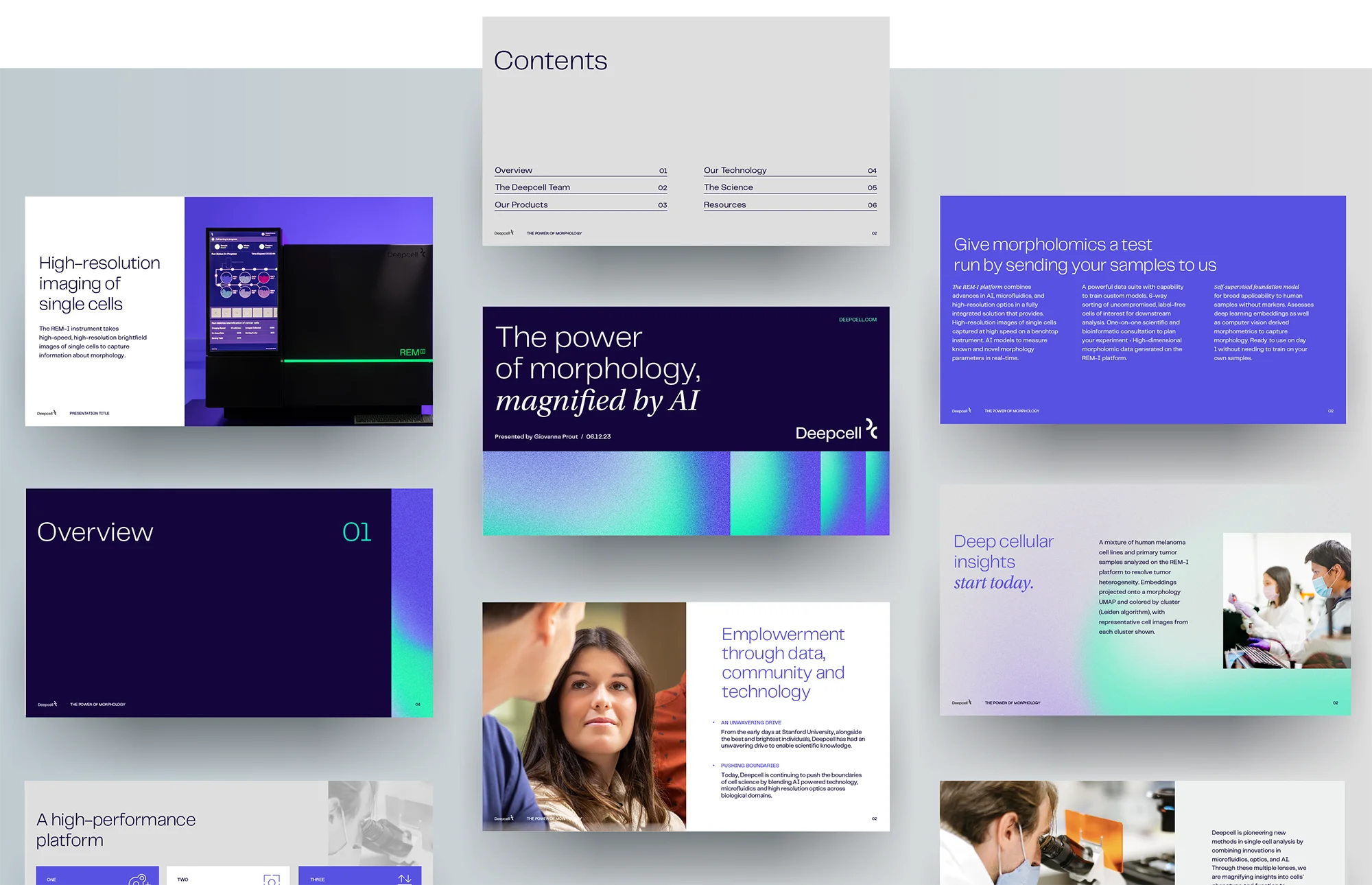
Gradient versatility
The Deepcell design system sings with a signature gradient effect referencing their in-depth cell imagery. The system is infinitely expandable via custom crafted shapes that can be zoomed into and cropped to complement any number of layouts, text treatments or display media. Beyond the free-form usage, we created a set of four core brand expressions, each imparting different qualities via distinct crop treatments and repetition techniques.
ICONOGRAPHY
Iconography was designed for distinction with an isometric orientation that roots the icon library in a consistent perspective and unifies it with pops of branded purple and green color.
Digital Design
Bringing depth to digital
All these brand elements come together in Deepcell’s digital experience, where the system provides cohesive sophistication across social platforms, media channels, and all throughout the web experience we designed and developed for their launch.
Results
Instant influence
The new brand powered Deepcell’s debut with a custom-built website and trade show presence at CYTO 2023 in Montreal. They reported a glowing reception and were able to enter the industry with a mature and confident brand that continues to set them apart from the start.
A rebrand that brings people and space closer together
Services PROVIDED:
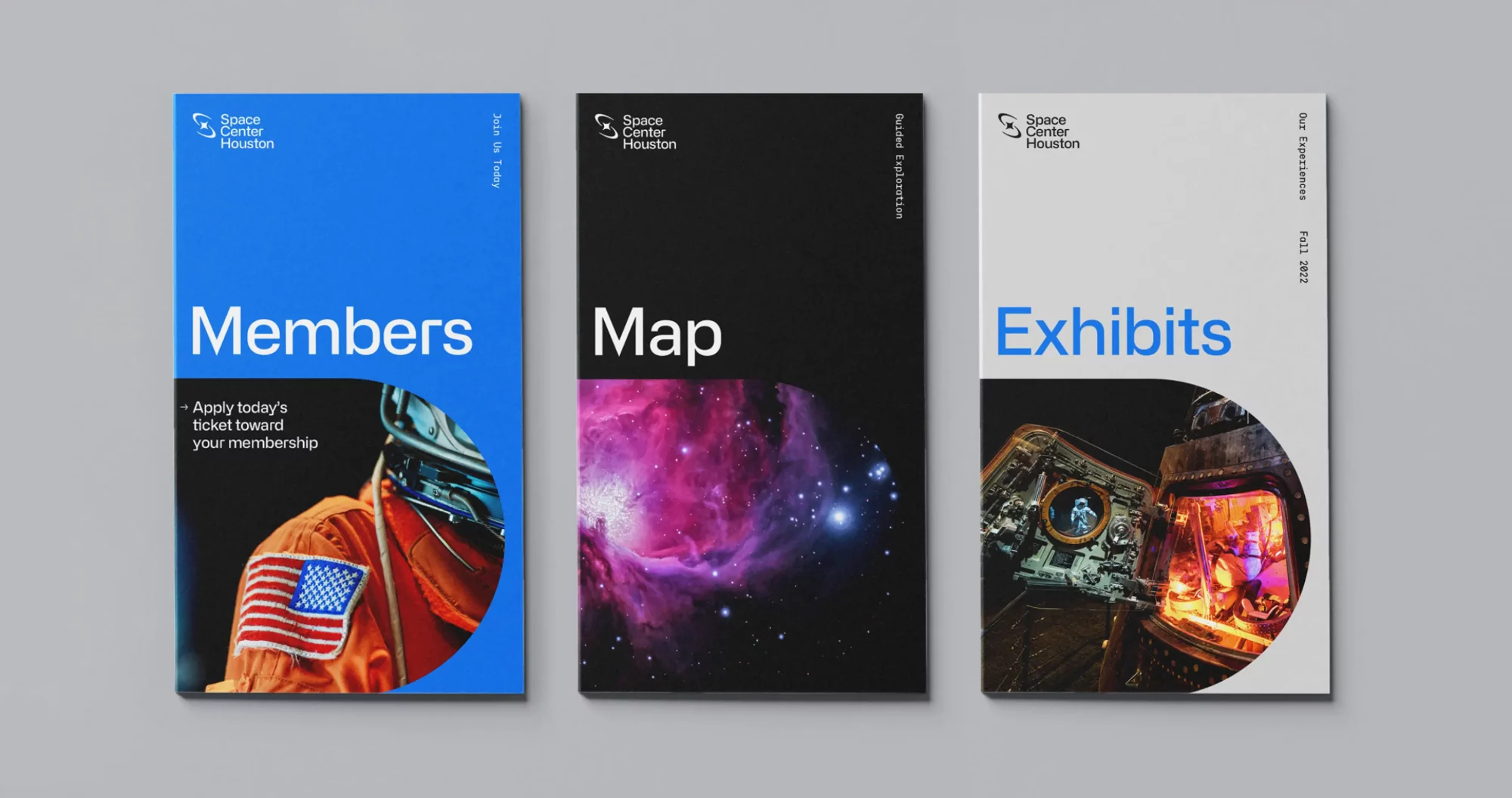
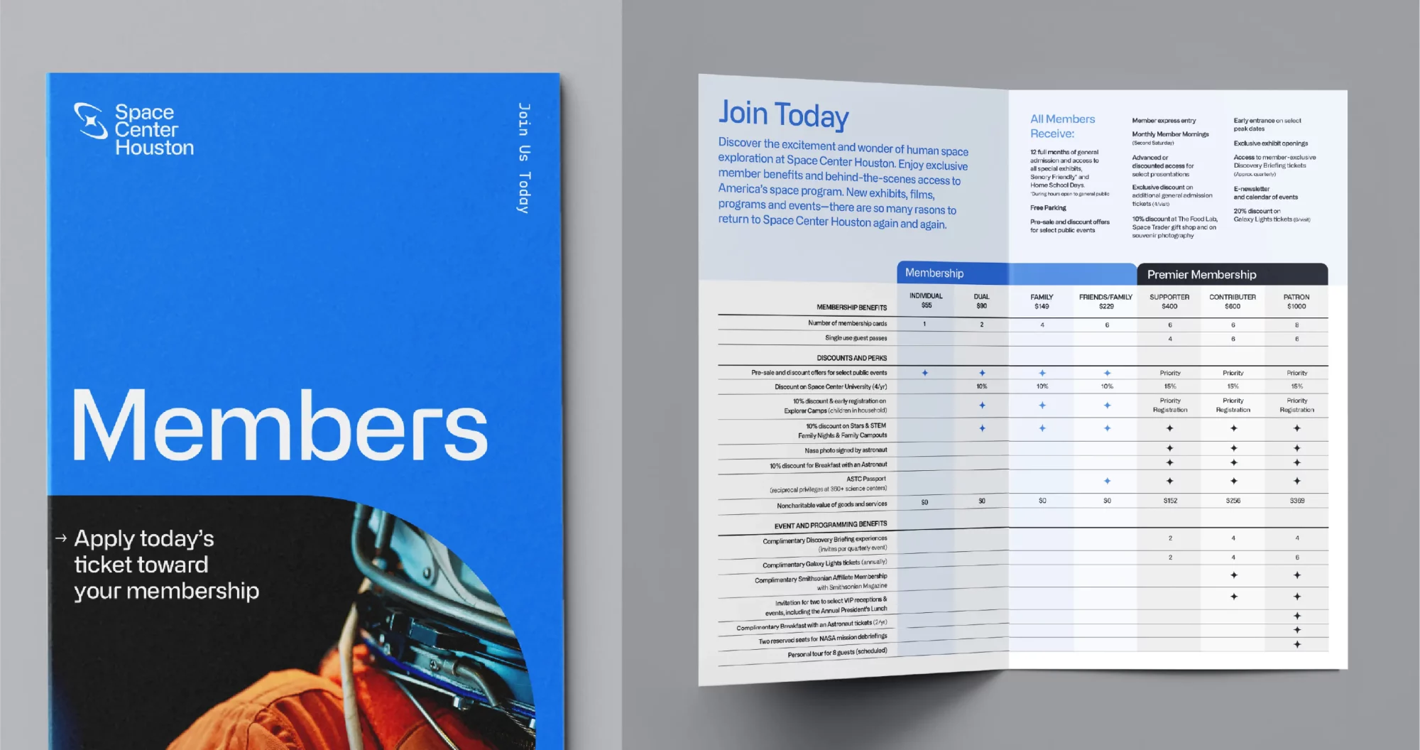
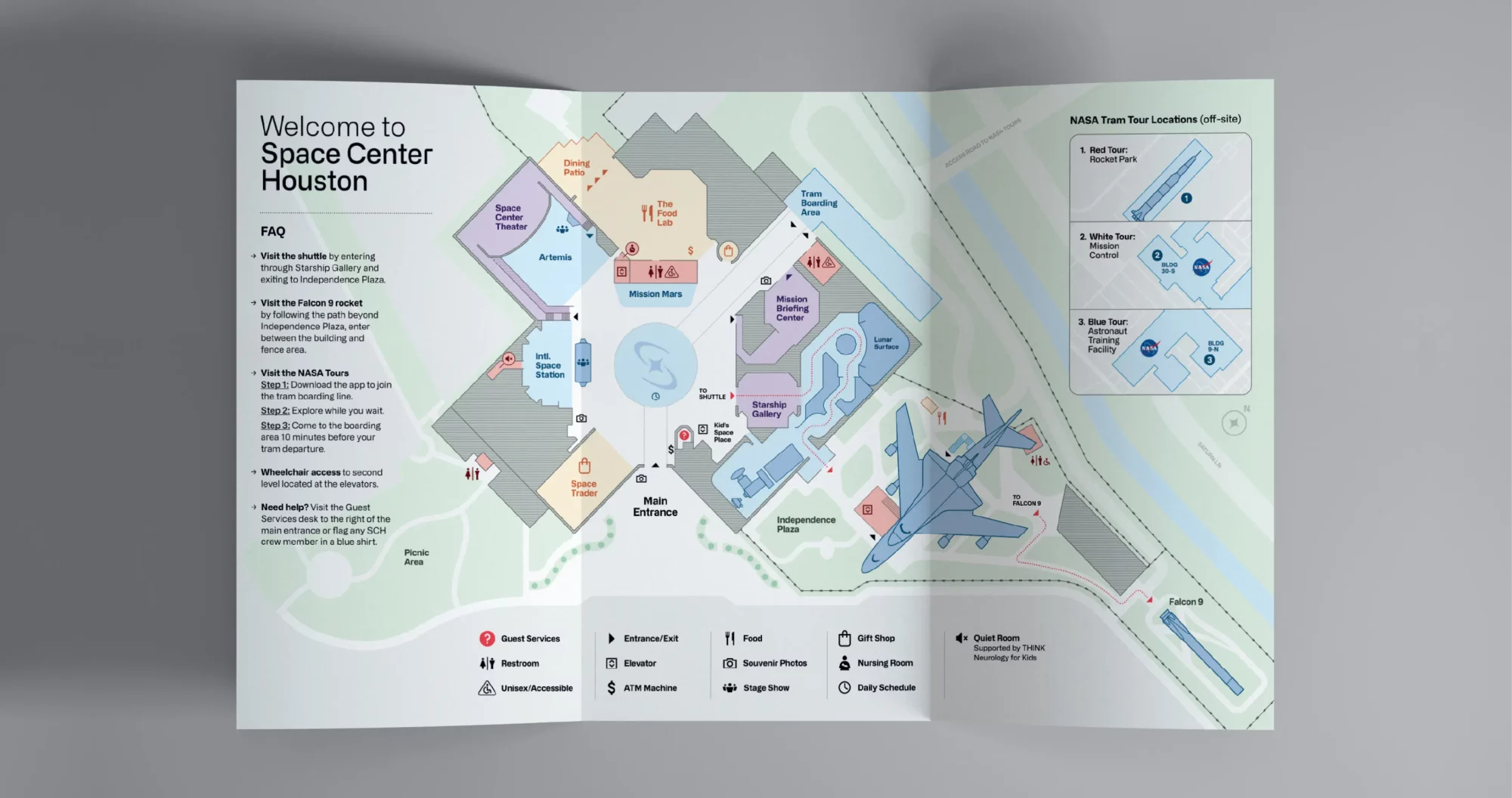
Brand strategy Visual & verbal identity Brand Guidelines Environmental Graphics Marketing Assets Website/UI design Social Media Templates
Insight
A revitalized space industry led by new NASA initiatives and innovative companies like SpaceX has reignited the public’s fascination with space.
Challenge
Space Center Houston is a nonprofit space destination and the public entrypoint to NASA’s Mission Control. Over time, it’s been pegged as a museum solely focused on the past, largely due to a brand dating back to 1992. This perception belies big plans ahead: becoming a hub in a new era of space exploration, building partnerships beyond NASA and immersive training facilities that simulate the Moon and Mars.
Solution
Shifting the perception of Space Center Houston entailed reimagining every facet of the 30-year old brand: ideology and brand architecture, visual and verbal identities, a renewed digital presence and comprehensive brand activation. Traina’s full-scale strategic rebrand revived the awe and fascination once evoked by Space Center Houston.
Traina’s strategy and identity work drive the brand anthem video, produced by Houston’s Vision Production Group.
STRATEGY
Moving beyond a museum
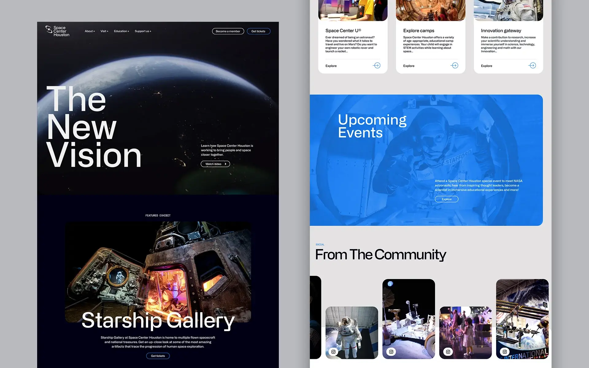
With the best era of space exploration lying ahead, Space Center Houston would be a connector of private companies, NASA, and above all, the public. This ambition is captured in a robust brand strategy, centered on a concise and resonant purpose: To bring people and space closer together.
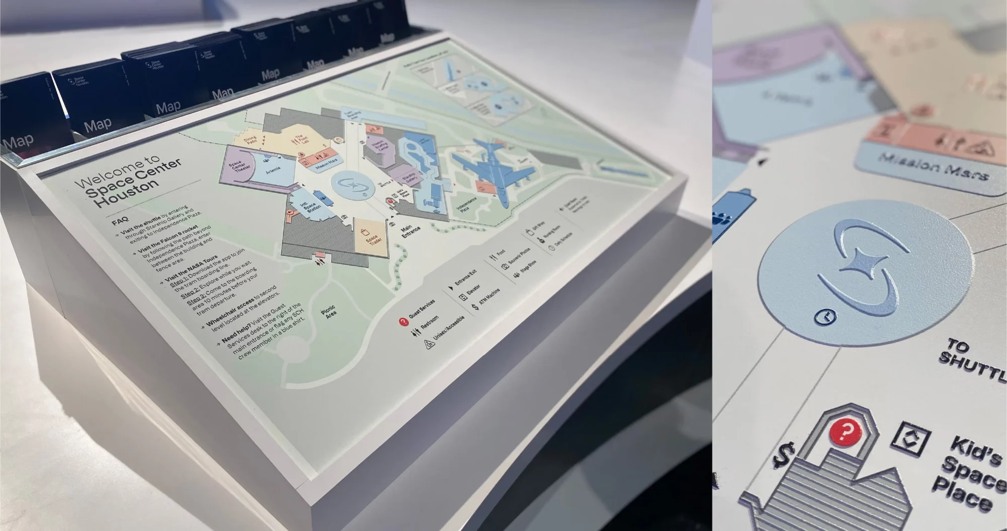
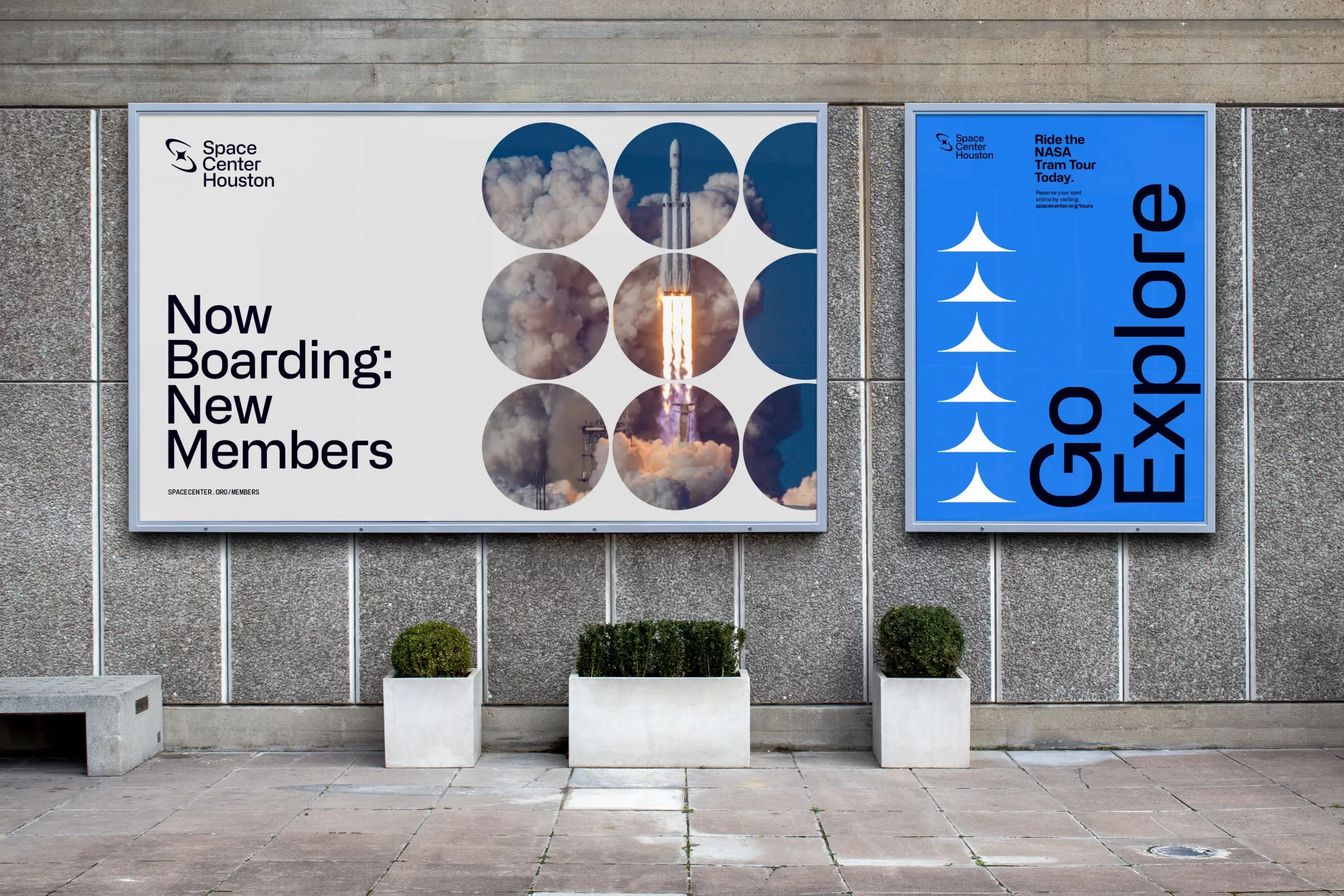
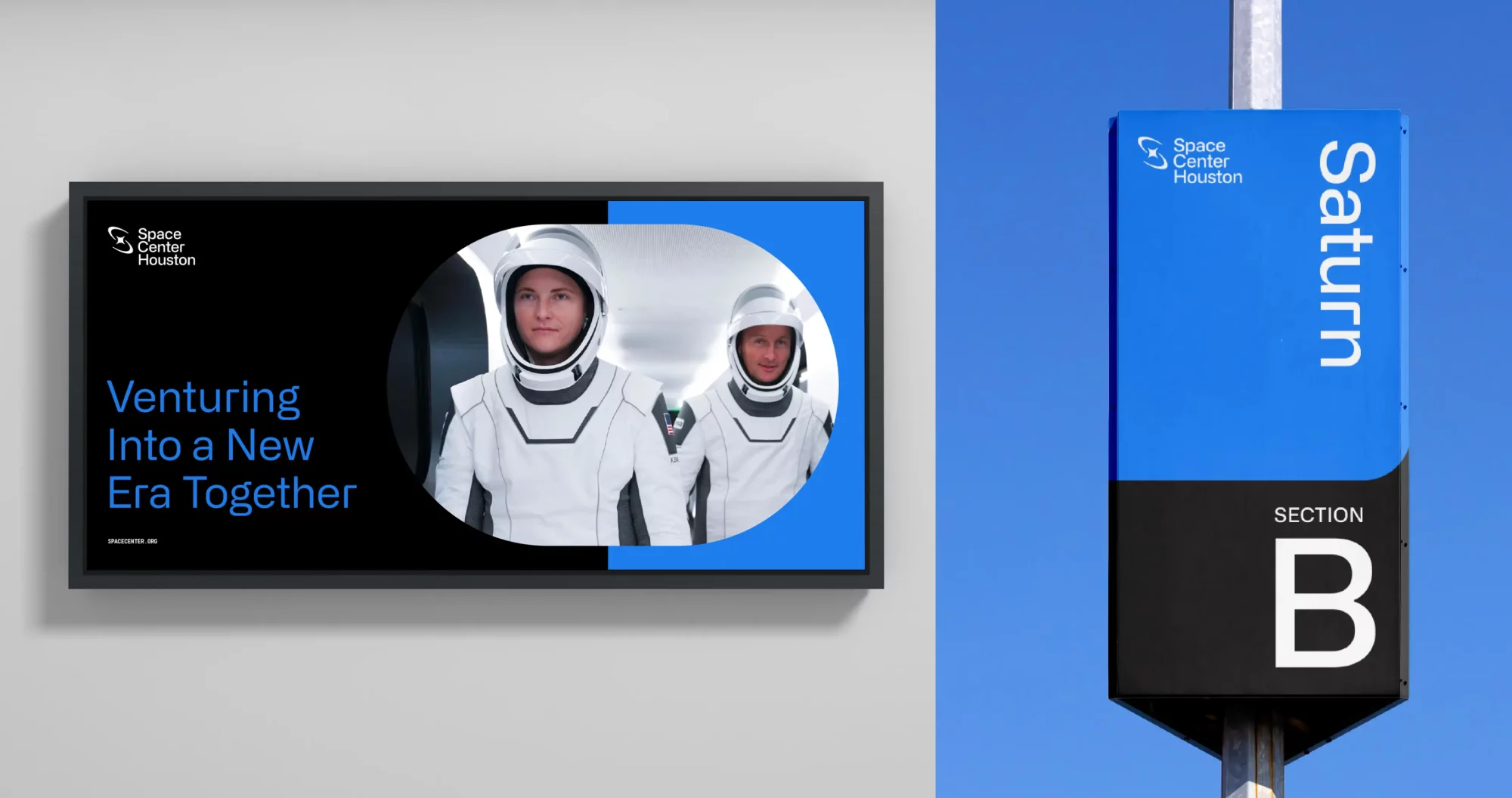
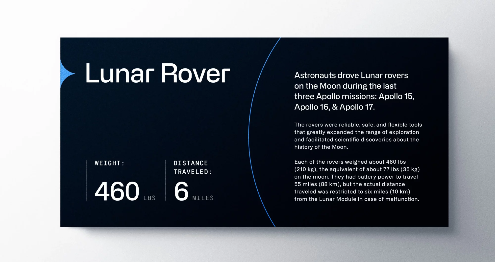
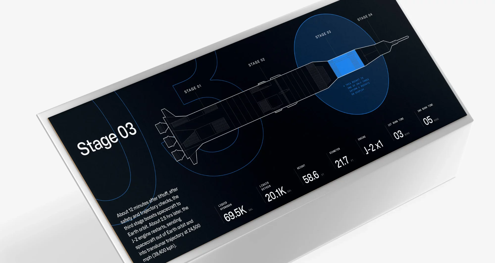
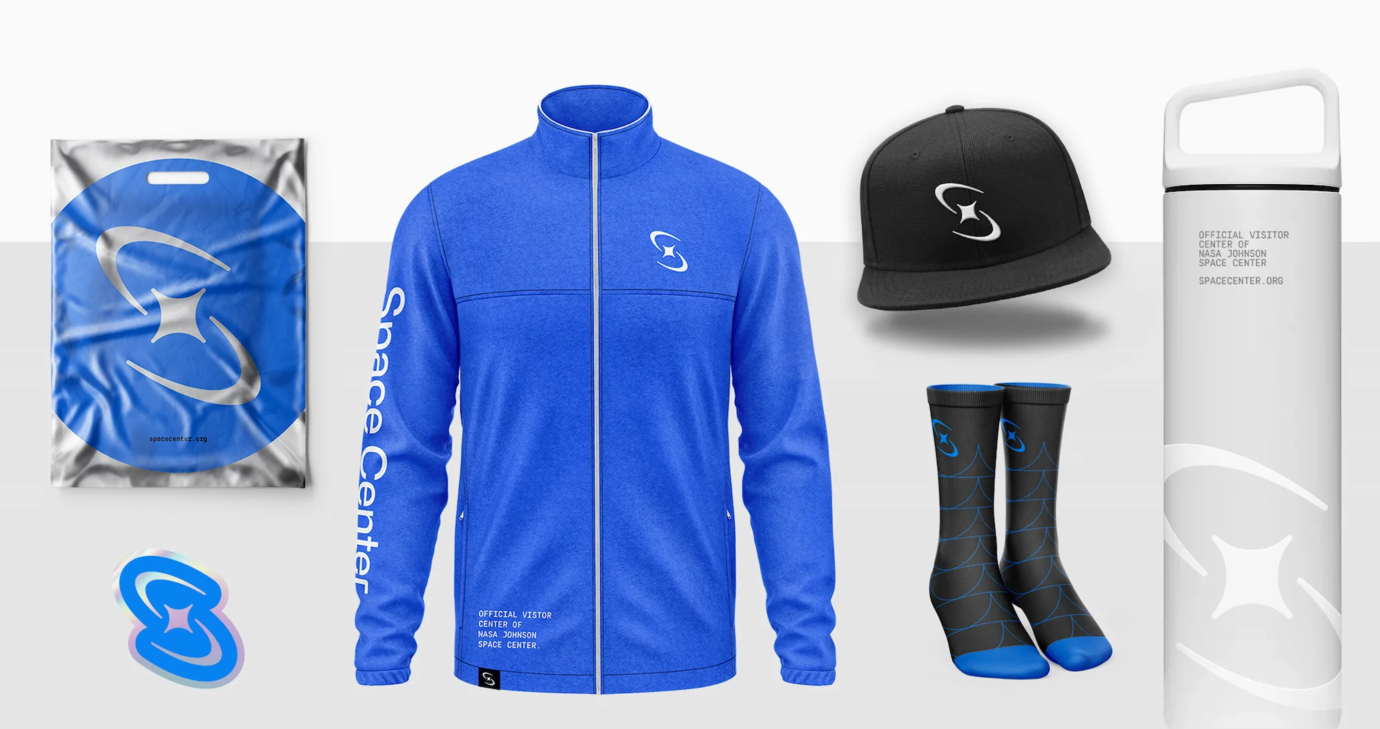
IDENTITY
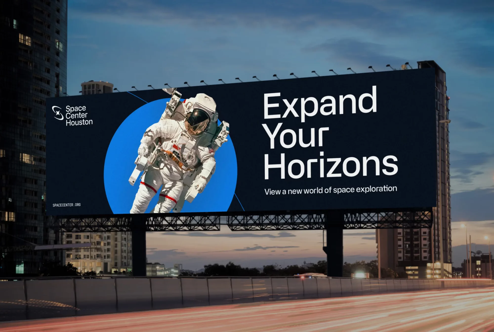
The new face of space exploration
Traina’s bold identity system equally suits Space Center Houston’s ambition, designed for equal footing with elite partners like SpaceX and Blue Origin, yet able to stand on its own with distinction.
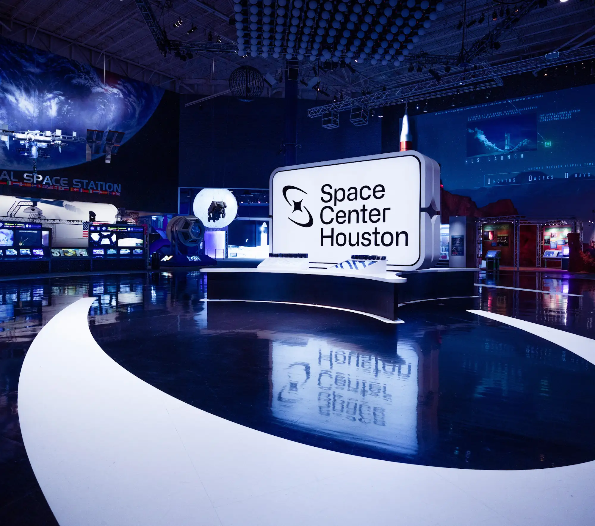
Visual System
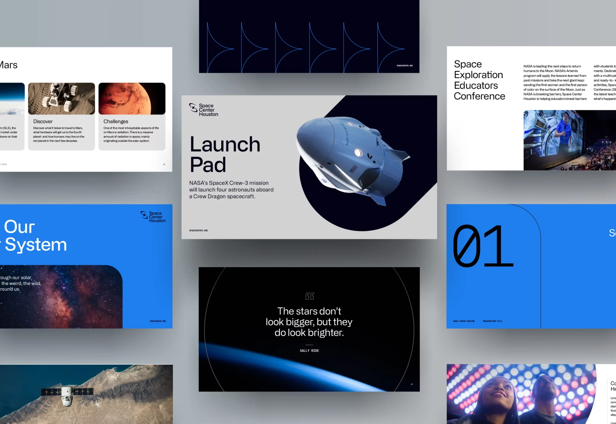
A geometric grid serves as a foundation for an expansive library of shapes, forms and patterns used throughout the brand. The shape system translates to encasements and layers that can express the brand with depth and dimension.
Monoline icons built on a grid bring consistency across brand offerings, while updated photography features a mixture of awe-inspiring deep space, modern spacecraft, and emotive close-ups of guests that elicit a sense of excitement and wonder.
I recommend listening to Traina’s point of view because it’s very refreshing. The way they articulated the business case behind their recommendations was high-level. Listen to Traina and leverage their experience.”
Erik Blanchard Dir. of Comms + Marketing
Campaign
Campaign
Traina provided Space Center Houston with go-to-market strategies and internal rollout presentations, and was also on-site to launch the brand campaign with a massive media event.
The trust and creative partnership that created the new brand carries on today and into the future, as Traina continues to transform Space Center Houston into the leading institution in space exploration.
Results
Results
Since the brand launch, Space Center Houston has had a banner year of record-setting attendance, revenue and enrollment in special programs. Along with leading development of space commissions for the state of Texas and in the nation, they have seen a marked increase in online and in-person engagement.
196%
Increase in email revenue
55%
Increase in web transactions
15%
Increase in web revenue
1438%
Exponential increase in Facebook video views
ACCOLADES/PRESS
Graphis Design Awards – Logo, Silver
Graphis Design Awards – Rebrand, Silver
The One Show – Rebrand, Gold
AMA Houston Crystal Awards – Best Brand Guidelines
The birth of a new name, a new brand, and a new category
Services PROVIDED:
Brand strategy Visual & verbal identity Brand Guidelines Marketing Assets Website/UI design Social Media Templates
Insight
Branding a merger bears several duties: unite converging teams, assure current customers of continued service, and sell the potential of the new venture.
Challenge
Three leading companies from healthcare and biopharma were uniting to close the loop in precision medicine, and their debut at the J.P. Morgan Healthcare Conference was two months away. Time was of the essence, and branding began even as the business itself was being finalized.
Solution
Traina devised a sharp strategy and stunning brand system to unify internal teams and stand out as a market disruptor. Innovation is manifest throughout the brand: in name, brand story and position, visual and verbal identity, a microsite and promotional video.
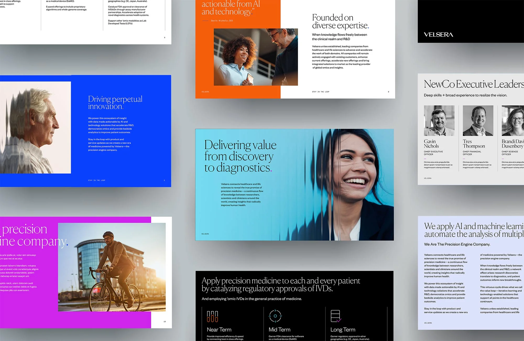
STRATEGY
Becoming a precision engine
Velsera needed to articulate what the three businesses could promise as a collective and also position the business for expansion. In developing a strategy, Traina had to find the sweet spot of claimable value today and potential for tomorrow.
From this came the concept of an engine, an analogy for how Velsera moves data between healthcare and research to power precision insights and generate momentum for discovery.
Seamless Connection
Shared Intelligence
Collaboration / Partnership
Trust
Precision
VISUAL SYSTEM
Branding an emerging business.
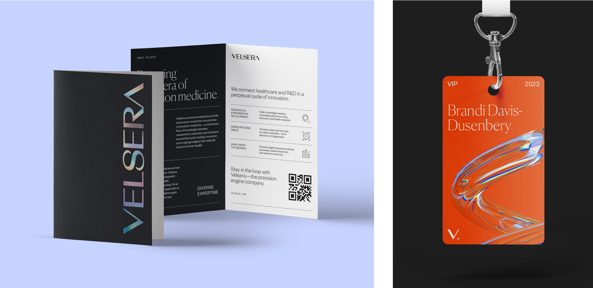
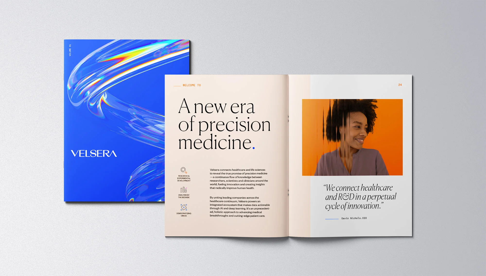
The continuous flow of information inspired use of 3-D imagery to express this cycle—an image system that could change and morph as the company further evolved its category.
NAMING AND VISUAL IDENTITY
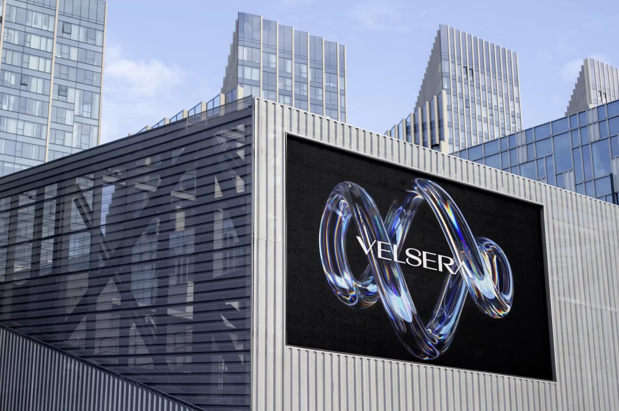
What a name reveals
A unique visual aesthetic required an equally inventive name. Velsera, an anagram of “reveals,” alludes to the breakthroughs the company can create at scale.
Our creative teams embedded the company’s core value loop into the central “S”, the symbolic heart of the identity.
Distinctive typography employs bookends of inverse angles, which represent Velsera in an abbreviated image mark.
Aesthetic balance and creative tension plays throughout the brand—blending fluid 3-D motion with the stability of refined type, color blocking and cinematic photo treatments.
ROLLOUT
A buzzworthy brand launch
Velsera’s debut at J.P. Morgan included a premium launch party, floor presence and Traina on hand to prepare additional materials for a last-minute CEO keynote.
The brand continues to create buzz well after launch, and our messaging has been key in rallying employees together as a single precision engine.
Traina continues to keep Velsera moving, with a full website in production and further evolution of a brand designed to elevate an industry.
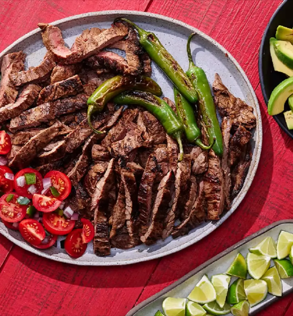
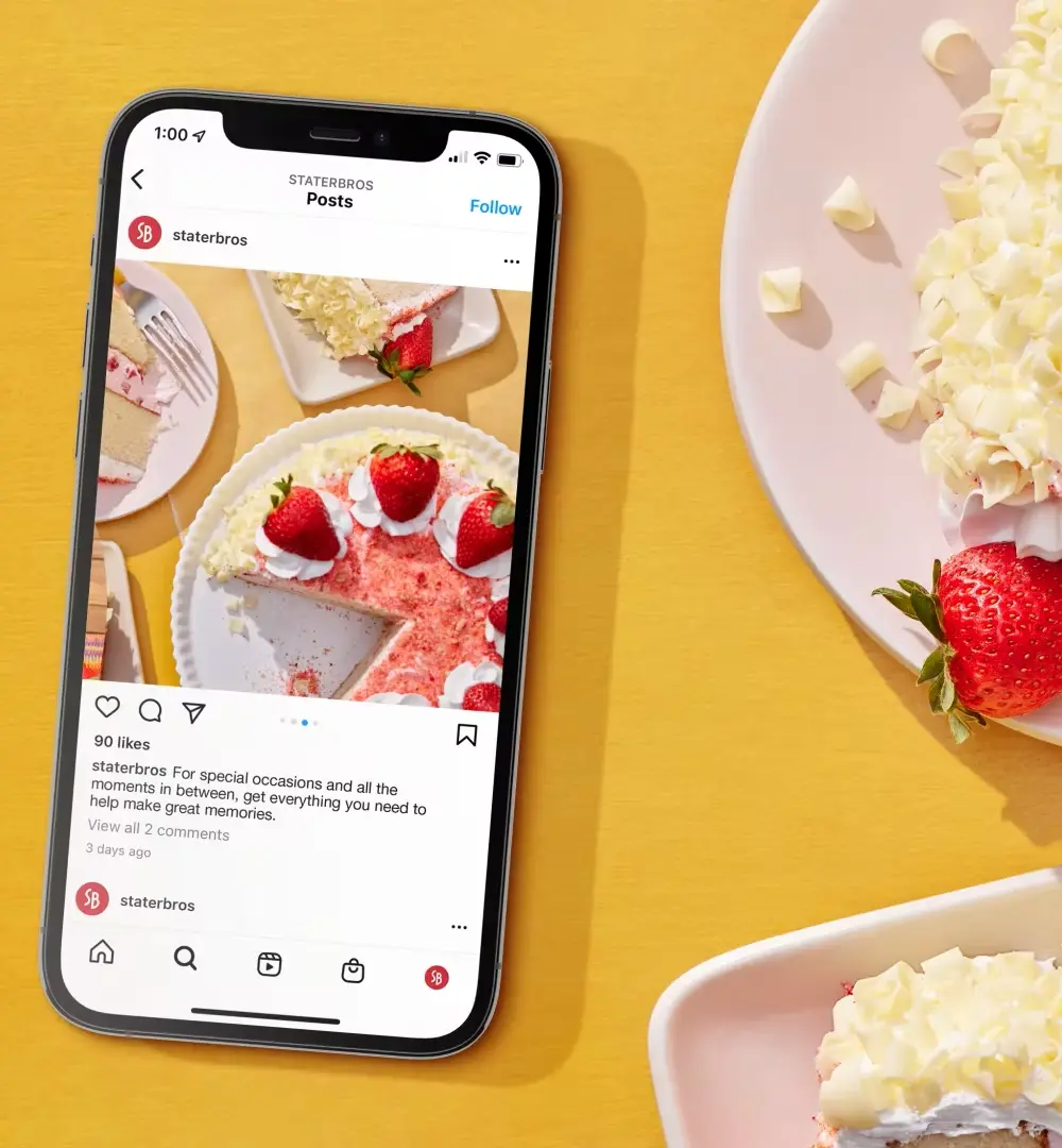
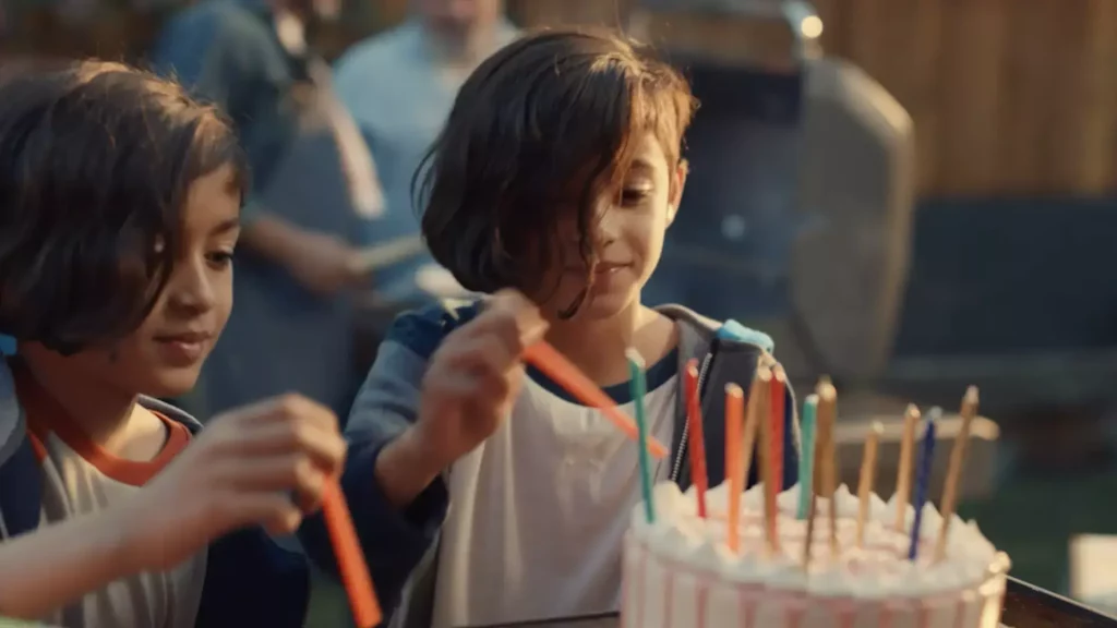
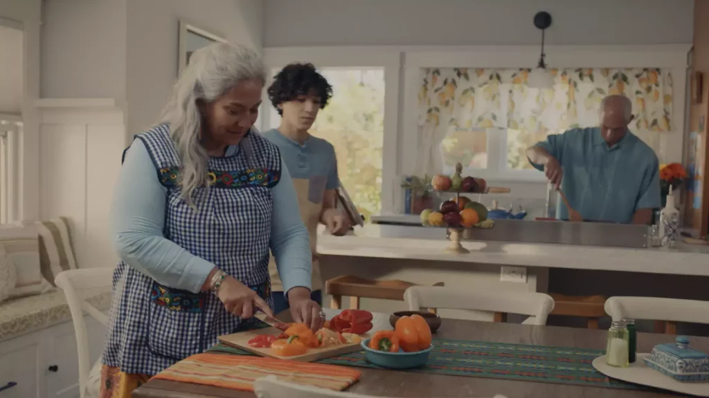
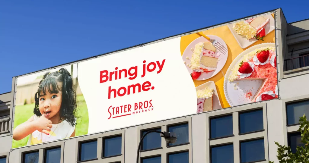
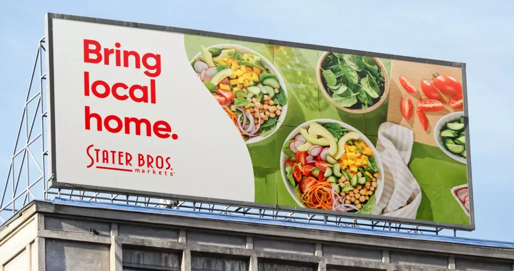
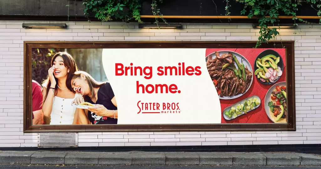
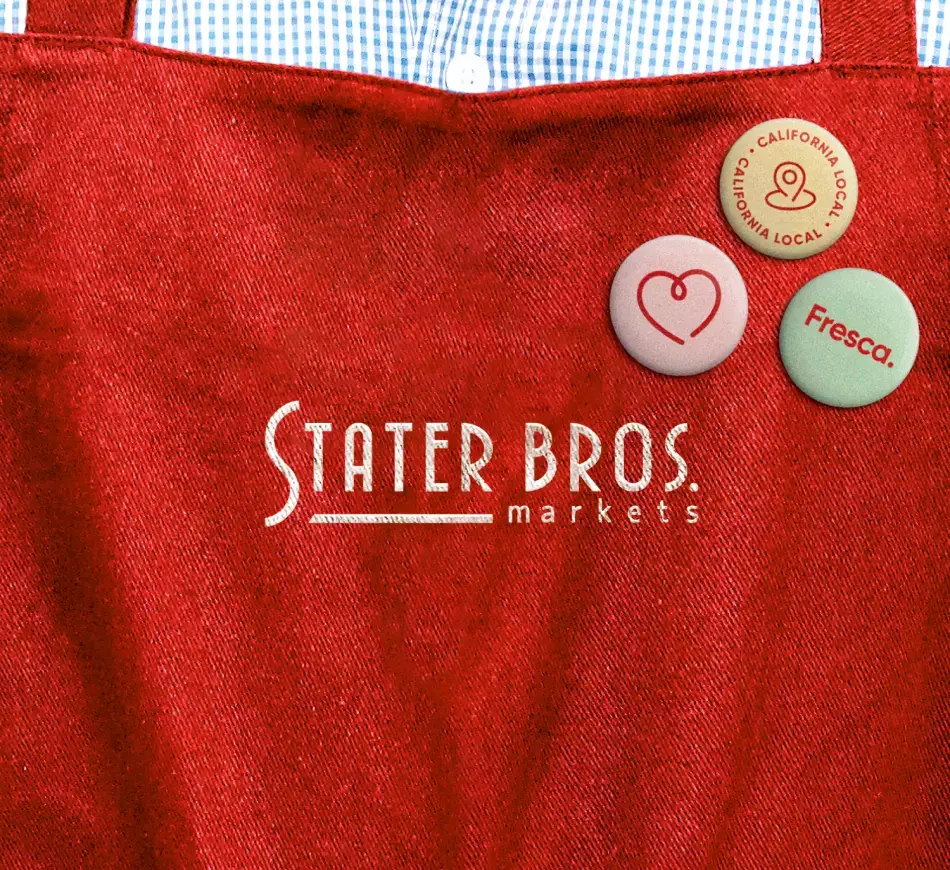
For more than 85 years, Southern California grocer Stater Bros. was known for its low prices and local, grassroots heritage. But with retail giants like Walmart and Target infringing on the grocery space, and an increasingly diverse shopper community at its stores, Stater Bros. recognized the need for a new position. We partnered with the regional grocer for the largest brand activation effort in their history—here’s what we learned about revitalizing a legacy brand:
INSIGHTS
You can turn a new leaf and dig into your roots
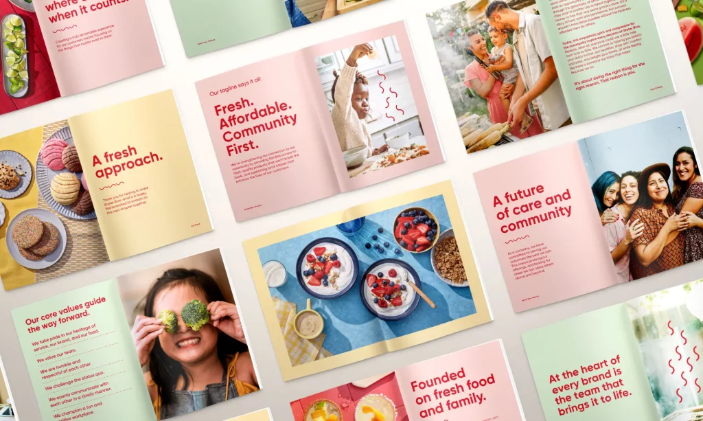
But doing so requires a deep understanding of what those roots really mean. The history of two brothers bootstrapping their store through the Great Depression had been carried through the brand via a strong homage to the past and steadfast commitment to affordability. However, today’s SoCal shoppers are looking for a deeper connection with Stater Bros., one rooted in welcoming inclusivity and a caring, emotional connection.
Through in-depth market research, Traina found the data to confirm what Stater Bros. had long suspected: their heart for the community was what truly set them apart. Community and family became two lenses through which a new brand strategy was envisioned, and Stater Bros. became the champion of modern-day families of all shapes and sizes, while emphasizing greater inclusion of the Hispanic communities they already served.
Inclusivity is more than representation
It’s a much larger behavior that permeates a brand, from core values to marketing and merchandising. For Stater Bros., this meant elevating bilingualism and putting diversity front and center on grocery shelves. A focus on freshness and convenience was designed to appeal to young, on-the-go shoppers, and even new in-store music and messaging was adopted to make the store a reflection of the community it serves. These updated touchpoints modernize the brand experience, while instilling confidence in a new generation of shoppers that they are not only seen, but cared for as people and members of a community. The result is a brand that doesn’t just look different, but behaves differently.
IMPLEMENTATION
A brand should be felt everywhere, in every way
To bring these new behaviors throughout the brand, Traina’s agile workflow allowed for research, strategy and client needs to seamlessly inform the design process:
Activating the “S”
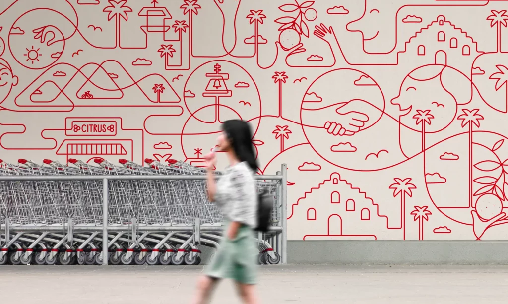
Building on the equity of Stater Bros.’ longstanding logo, the “S” curve was made a signature element across the brand’s visual identity system, softening the crop on anything from printed material to tractor trailers, and offering a “visual hug” to images of fresh food and real people spanning the Stater Bros. community.
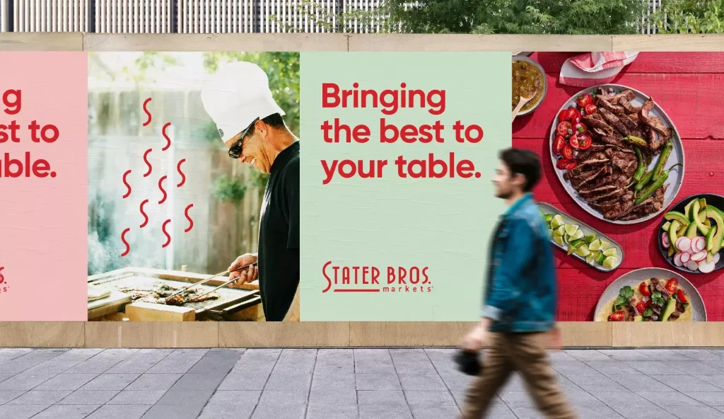
Custom photography
The photography we produced and guidelines we established ensure striking visuals. Food photos are warm, inviting and emphasize flavor—each image has a cue to an occasion and an implied human touch in the composition: a waiting fork, or a first bite just taken.
Lifestyle shots likewise capture a real, candid moment in time, and convey a range of different ages and life stages from the Stater Bros. community, conveying a sense of energy and belonging.
Iconography
Weaving through the brand identity is iconography that uses the fluid movement of red thread to harken back to the signature curve and symbolize many grocery attributes in a unified and elegant visual system.
Digital
We also created a social brand guide for Stater Bros. to express itself in unique ways that further the brand: outlining how to use colors, content, voice and partnerships to be playful and keep up with real people and real trends while still being connected to the heart of who they are.
ROLLOUT
Comprehensive campaign
The new brand comes to life in a comprehensive advertising campaign for which we scripted, conceptualized and produced a pair of lifestyle commercials and led creative for a multichannel rollout across television, OTT, social, digital, OOH, radio and streaming audio to broadcast the new messaging far and wide in their community.
The “Bring It Home” campaign reintroduces the brand to the region they call home, and emphasizes how they are—and have always been—a staple in the lives of families they serve. The unified message expresses the brand’s value as more than just fresh food at a great price, but providing ingredients to make memories that matter.
A pair of 30-second spots captured what “home” means to local families, and why it’s at the heart of the Stater Bros. brand.
TRANSFORMATION
External change starts with internal momentum
A rebrand at the scale of Stater Bros. could not have happened without trust and collaboration between teams—an exchange fostered at every stage of our partnership. In preparation for Stater Bros.’ internal brand launch across 172 stores and 18,000 employees, Traina created a comprehensive brand guide and rollout strategies, held messaging workshops and training sessions, and generated a bespoke curriculum to maximize brand adoption.
The Traina team is every bit as passionate as we are about our brand and its success. The biggest compliment I can give is the way they made us feel special, like we were their top priority, every day.”
Dennis McIntyre, EVP of marketing and CMO at Stater Bros.
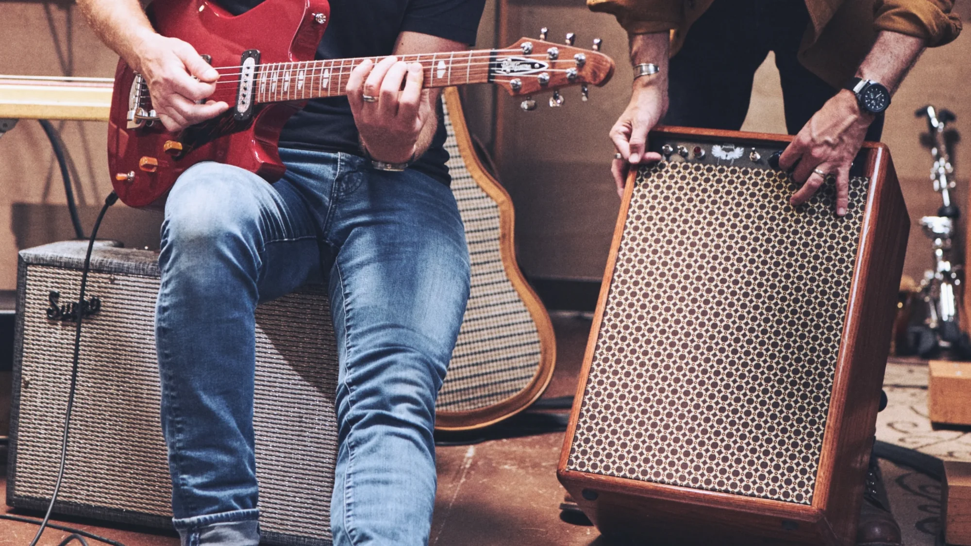
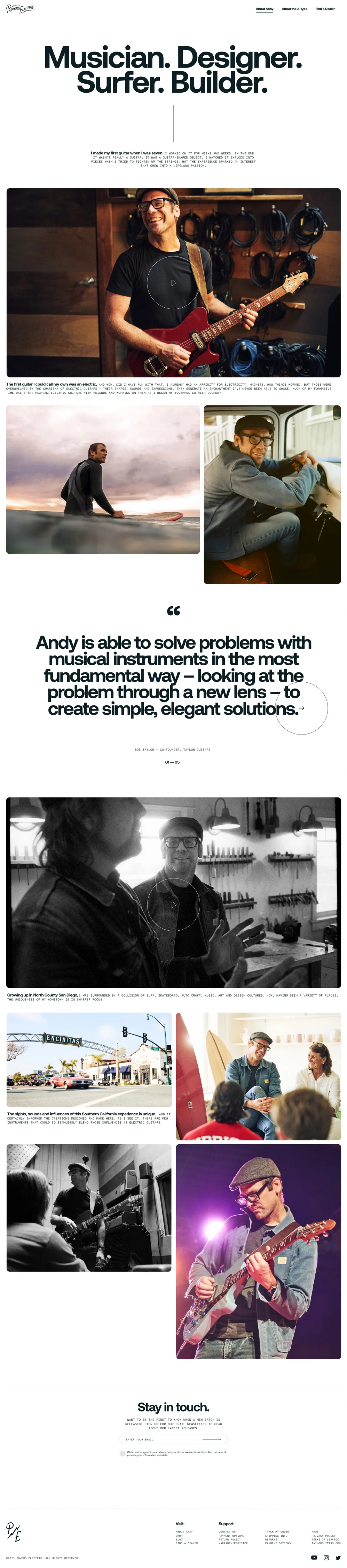
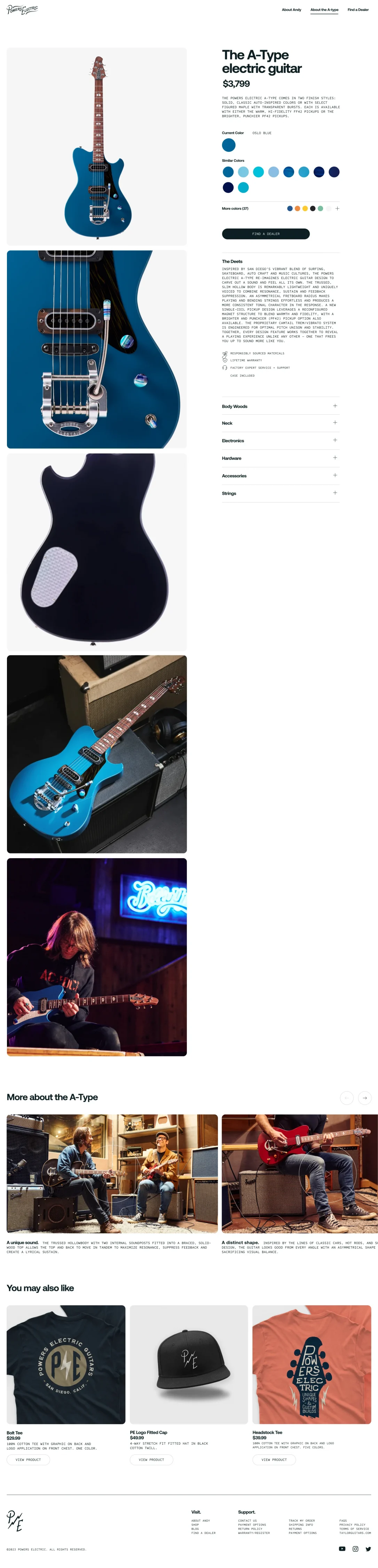
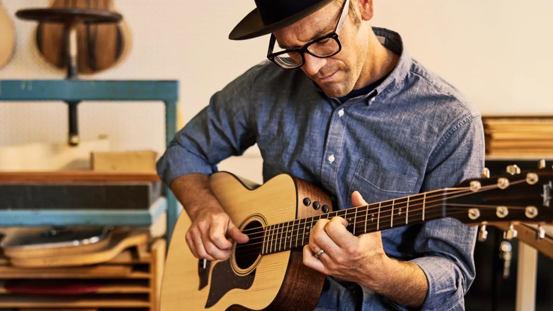
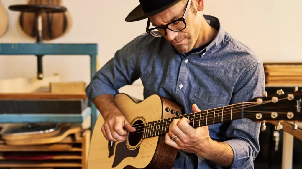
Sometimes the best way to differentiate a brand is to simply let it be itself.
Challenge
While Taylor Guitars is renowned for the craftsmanship and quality of their acoustic guitars, they have little equity when trying to compete in the saturated world of entrenched electric brands.
Solution
Allow master guitar designer and Taylor CEO, Andy Powers, to infuse his unique personality into a novel electric guitar. Then create a brand that celebrates everything about Andy, and his product, that is unconventional.
BRAND STRATEGY
Vintage inspired modern technology
Powers Electric isn’t about competing with iconic electric guitar brands, it’s about being a rebellious alternative. A recourse from a more serious look and sound. The brand needed to capture the playful, throwback spirit of its inventor, yet feel as contemporary and capable as anything on the market.
VISUAL IDENTITY
What real imagery sounds like
This guitar has personality. So do those that play it. That needed to come through in the photography. The photo style foregoes slick and saturated, while also avoiding washed out and grunge. We struck a chord – ahem – in the middle showcasing true emotion through natural tones, diffused lighting and just a touch of distortion (of course).
DIGITAL EXPERIENCE
The sound in full color
One of the unique features of the A-type, and there are many, is the seemingly endless variety of colors available, all inspired by the local surf and car culture of Southern California. To help website visitors truly experience the ever-expanding set of colorways, we designed a unique interactive module where users could gracefully swipe from one end to the other, or select a color set from the menu to quickly jump to their preferred color set.
Finely tuned shopping
The product page continues to emphasize the color and fine details, but also encourages further exploration by suggesting similar colorways and allowing users to select color alts and find local dealers.
RESULTS
Phase 1 of the brand and website have garnered praise from musicians and aficionados alike. Soon, we’ll be expanding the site’s content to include artist partnerships, community engagement and on-site commerce. For now, we’re enjoying some early milestones including the A-type’s first TV appearance with Sheryl Crow’s band on the Tonight Show with Jimmy Fallon.
Traina and 10x Genomics have been partners almost since the beginning: from the company’s startup days through its unicorn status and now as a longstanding industry leader. All throughout, we’ve kept the 10x brand moving, evolving its expression and making sure they stand out in a now-crowded biotech space. With their 10th anniversary this year, we’re celebrating with a collection of greatest hits from our enduring partnership:
PRODUCT CAMPAIGNS
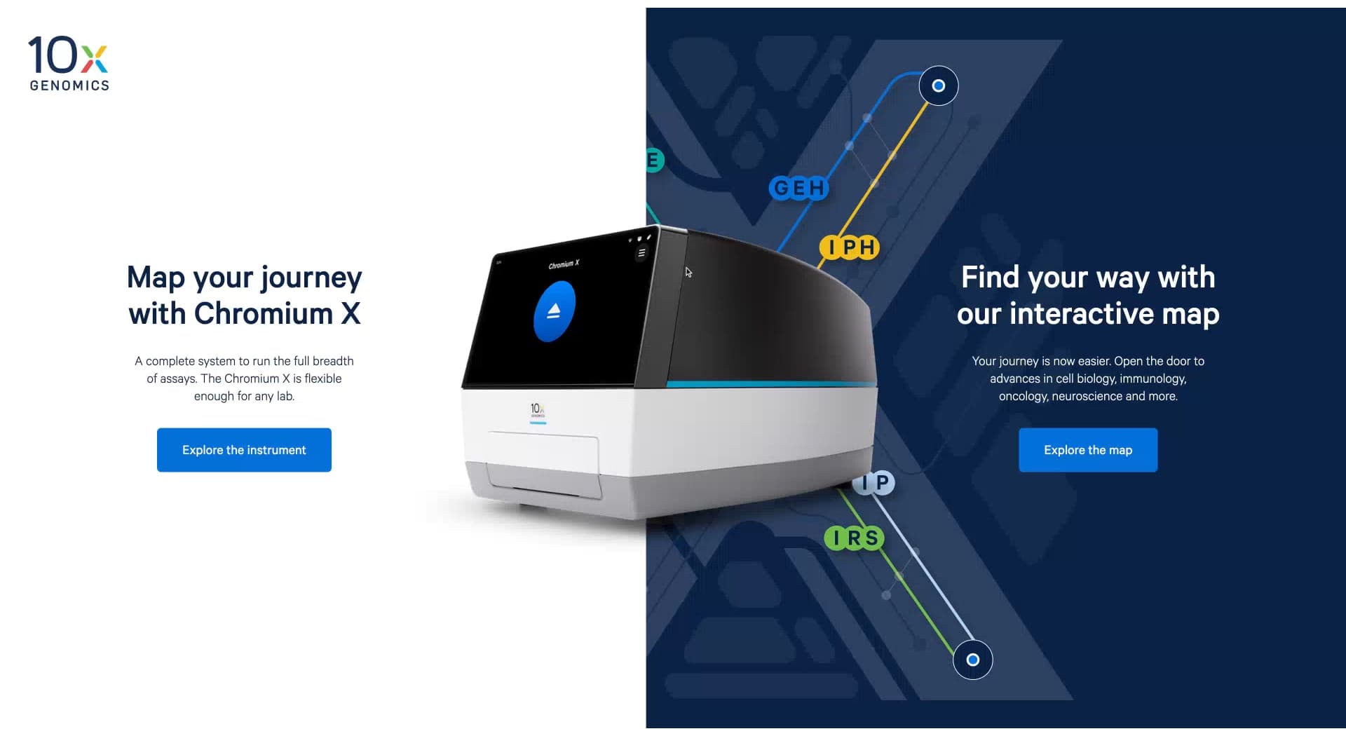
The latest launch
With the 2021 launch of Chromium X, 10x Genomics revealed their most flexible instrument to date, packed with features that open up new worlds of research applications. Traina developed a full launch campaign anchored around a flagship digital experience composed of two parts—one direction focused on the functionality and features, the other immersing the viewer into remarkable new research opportunities.
The product side of the microsite allows for exploration of features and video content detailing the history and purpose behind making Chromium X. On the research side, a dynamic subway map lays out five audience-specific journeys that illustrate how the platform can accomplish specific research goals and enhance the user experience at every step.
The website overall presents a variety of macro and micro perspectives in which the audience can find a specific reason why the platform is right for them and their research. Chromium X quickly became a market leader, and its digital experience likewise led its field—recognized as an honoree in the 2020 Webby Awards for science web and mobile sites.
Interactive campaign microsite to promote the new Chromium X instrument.
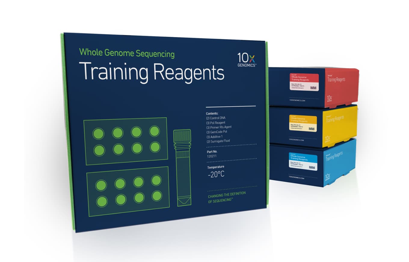
BRAND ORIGINS
Built in six weeks, now seven years strong
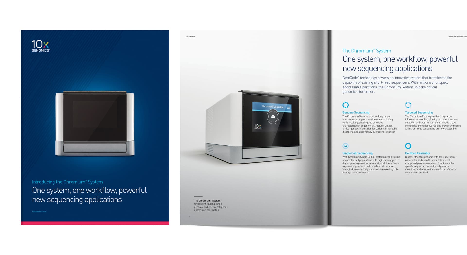
But back in 2015, 10x Genomics was a three-year-old startup with only big ideas, one instrument, and their first booth at the JP Morgan Healthcare Conference coming up in six weeks. Our partnership began fast and furiously inside this timeframe, developing their core brand: a sophisticated visual identity, messaging that captured current and future offerings, packaging that made it real and a website that presented a polished brand to potential investors.
Beyond the range of deliverables produced and the degree of quality achieved in such a short span of time, it’s truly remarkable how such a lasting and unique creative partnership was forged inside of two months. But the crucible of urgency often does engender qualities on which a relationship thrives: close collaboration, confidence and an unprecedented level of trust, all of which were carried through and built upon in the ensuing years of 10x’s brand journey.
The original homepage for the first 10x Genomics website.
The first-ever product brochure introducing 10x’s technology and applications.
Original product packaging featuring a color-coded system and custom illustration.
INTERNAL CAMPAIGNS
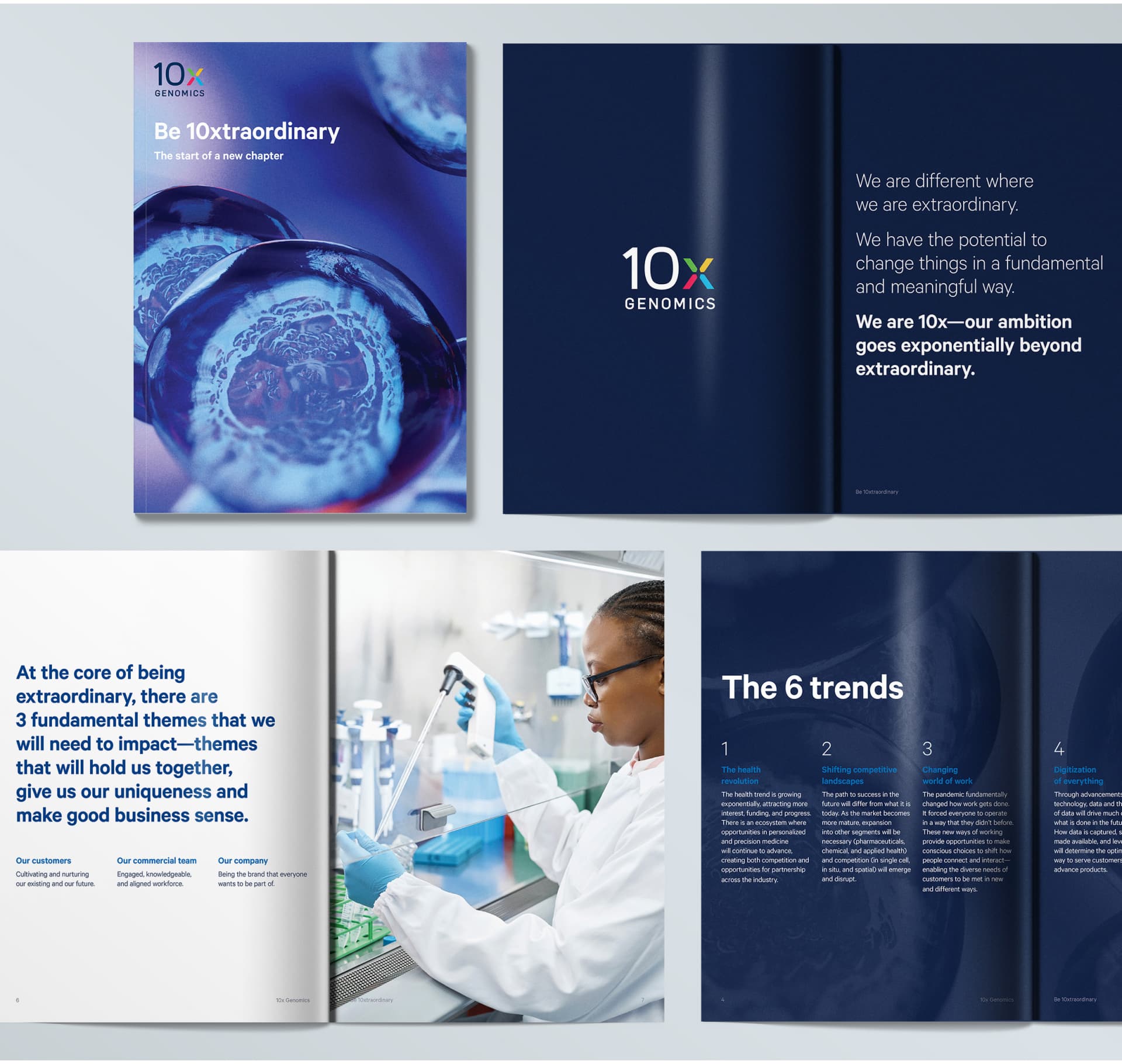
Becoming extraordinary
After attracting investors and making waves in the industry, 10x’s rapid expansion created the need for an internal campaign, a company-wide endeavor to ensure alignment in growth and give employees clarity around 10x’s purpose, direction and impact.
In what became the 10xtraordinary campaign, Traina unearthed a compelling story from internal messaging and made it fully realized in a publication to inspire and engage new and existing 10xers alike. The campaign introduced the core principles, captured their position and value proposition for customers, and lent insights on how the company was responding to trends in the industry.
Traina approached the project from the mindset of an employee, making sure takeaways were clear and accessible in bold callouts, and creating illustrations and graphics that brought content to life. Where the idea of “10xtraordinary” was once buried in copy, we brought it to the fore and made it a concept that the whole company could rally around.
The “Be 10xtraordinary” campaign brochure highlighting trends in the industry and what it means to be extraordinary—the 10x way.
BRAND CAMPAIGNS
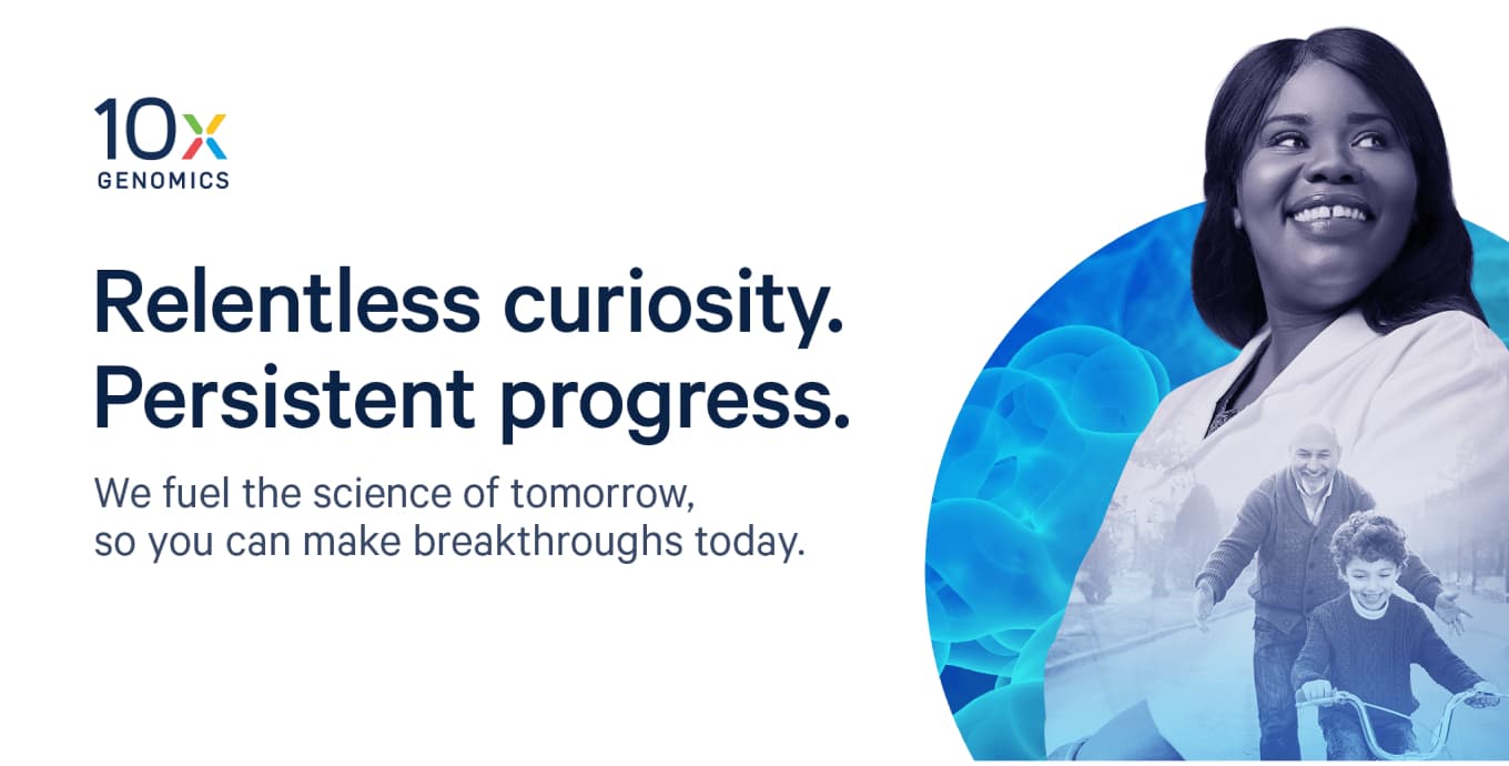
The heart in science
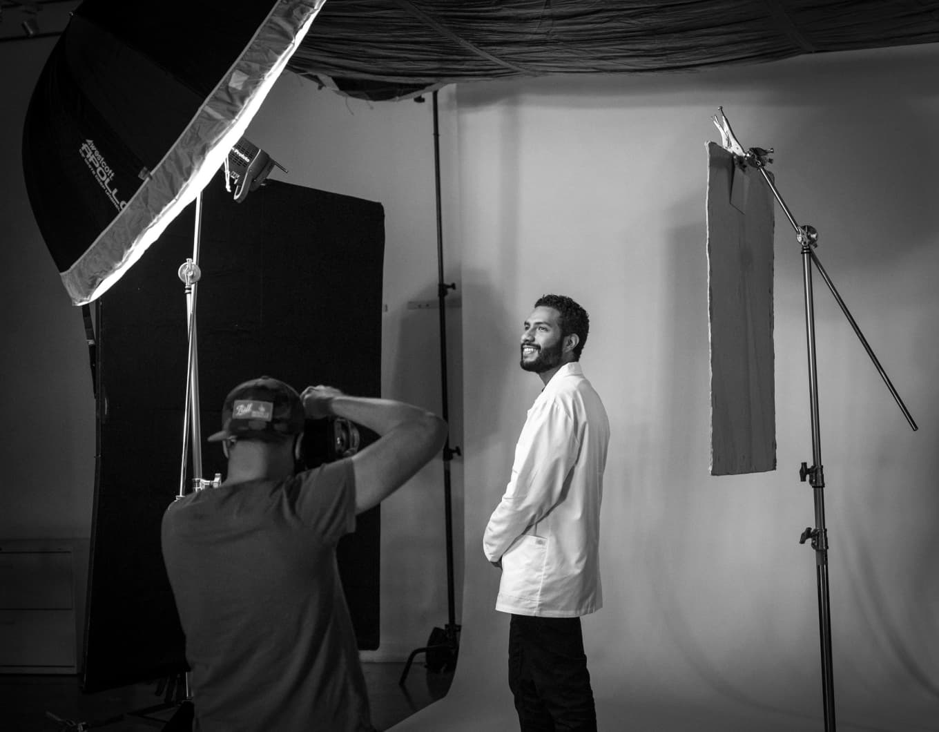
By 2020, 10x Genomics had several more products with robust campaigns for each, giving them a hold on the market and tremendous recognition for their tech. But it was time for a brand campaign to enhance their messaging and firmly position them as a leader in the industry. Traina constructed a novel campaign to draw a clear line from the collaboration between 10x and their customers to the impact it makes in the world—saving lives and improving well-being for real people.
The campaign speaks deeply and directly to the motivation of their customer base, making researchers the star and showing the heart inside them being the driving force behind their work with 10x. Traina executed the full campaign: concept, messaging, photoshoots and asset creation—a suite of digital advertising, plus print ads in all major industry magazines, slide decks, and a microsite that was also a Webby honoree for corporate communications websites.
A campaign microsite rich in motion and emotion, demonstrating how researchers can partner with 10x to solve the world’s most complex diseases.
Cover tip ad to promote the campaign in Science, a leading biotech publication.
A collection of digital banner ads ran on the top life-science websites.
Behind-the-scenes look at the photoshoot that Traina planned and directed for the campaign.
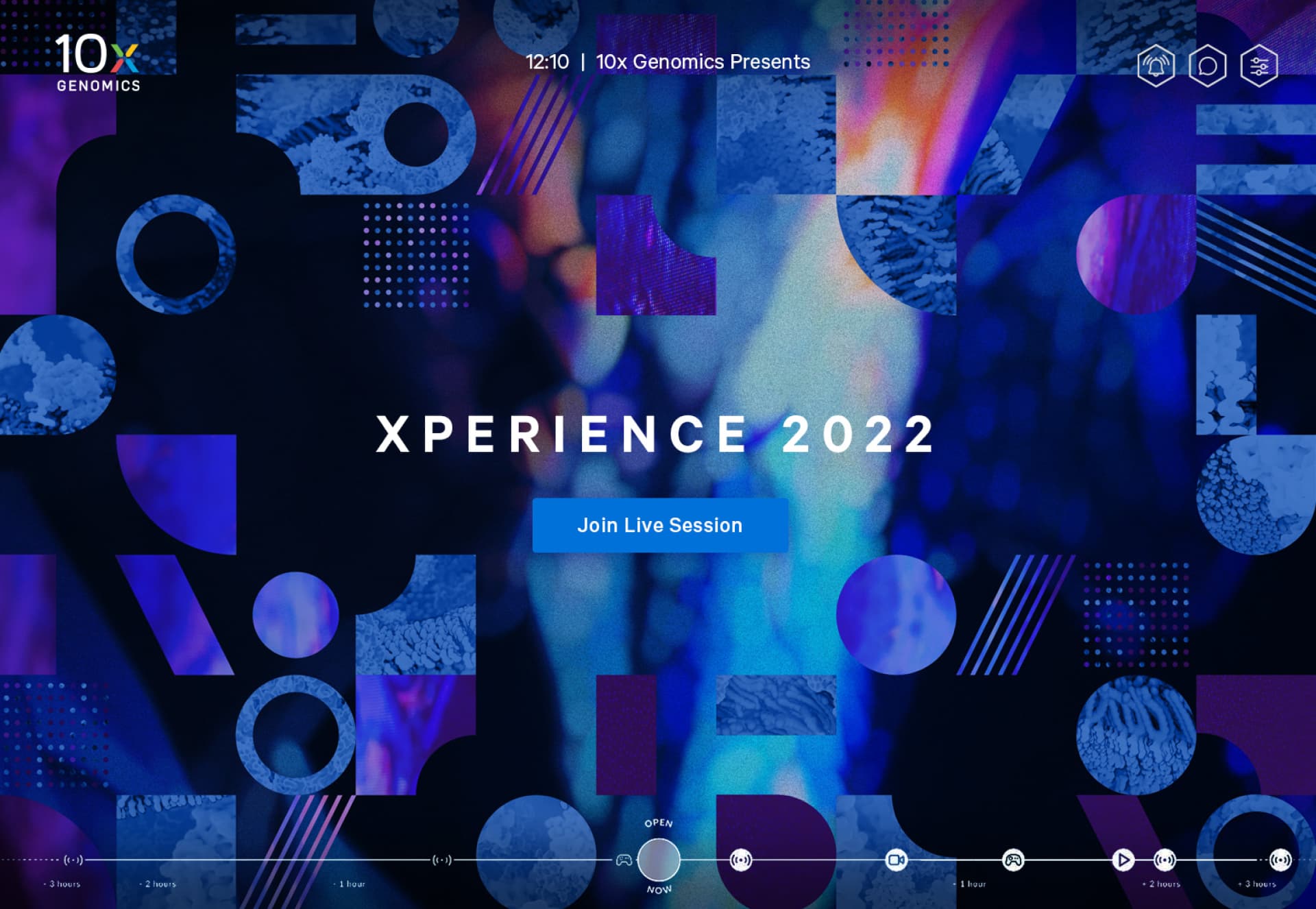
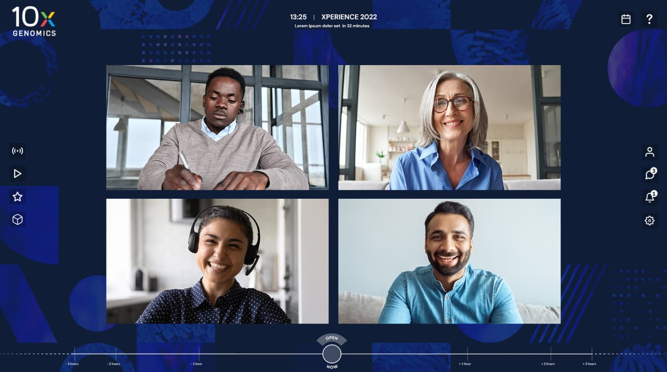
VIRTUAL EVENTS
A versatile event experience
And of course, the pandemic spurred unique innovations for the 10x Genomics brand, namely their Xperience, a virtual trade show and conference that combines user group sessions, panel discussions, new product announcements and keynote addresses from leadership. For this now-annual event, Traina developed a core visual system in which iconographic shapes representing facets of 10x tech allow for myriad applications yet retain a cohesive aesthetic.
Employing a geometric shape language in a modular system, visuals can form in infinite expressions and even incorporate scientific elements like visualized data and cell tissue imagery without any one element overwhelming the composition. With a broad range of applications—dense or sparse, light or dark—the system is versatile in supporting any number of use cases—registration landing pages, promotional banner ads and all manner of social media.
Homepage of the digital event space where users joined sessions, reviewed their schedule and networked.
Custom designed speaker backgrounds for all panelists and presenters.
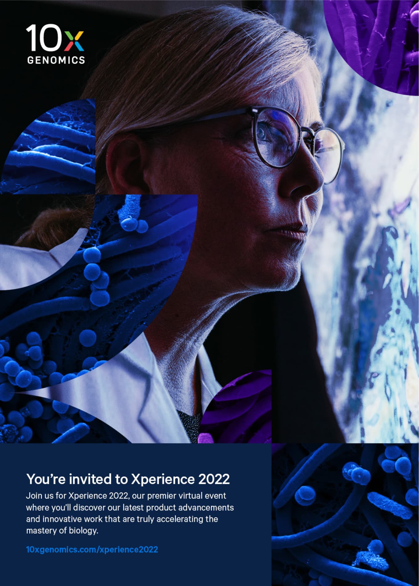
Print flyer targeted towards researchers, inviting them to register for the event.
I have not seen anybody better in terms of their creative horsepower. I think their design expertise is the best I’ve seen.”
Global Marketing Manager, 10x Genomics
A decade of brand leadership
Built with speed, evolving with business, driving success and never resting in its present state, 10x Genomics is a model for how a brand can move and be moved with the right creative partner. Traina is proud to have come so far with a leader in biotech, and looks forward to the new ways in which we will bring the brand through its next decade.
Brand strategy Visual & verbal identity Environmental Graphics Marketing Assets Social Media Templates
Insight
A brand for internal audiences must speak to a company’s existing culture just as much as it promotes desired qualities to that culture. That is the key to authenticity in messaging and design.
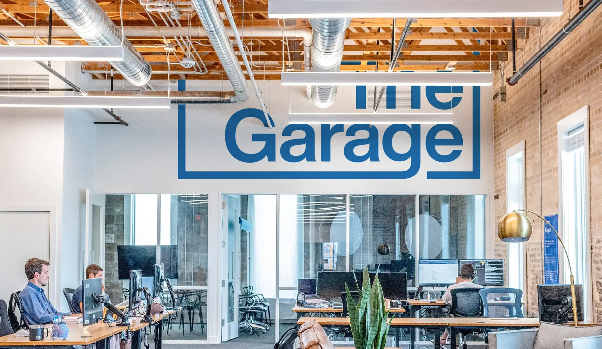
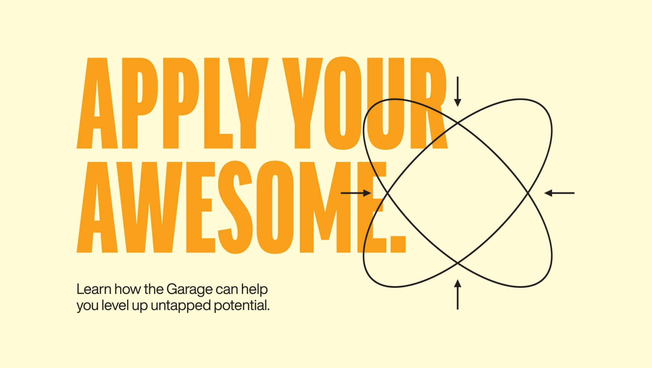
Challenge
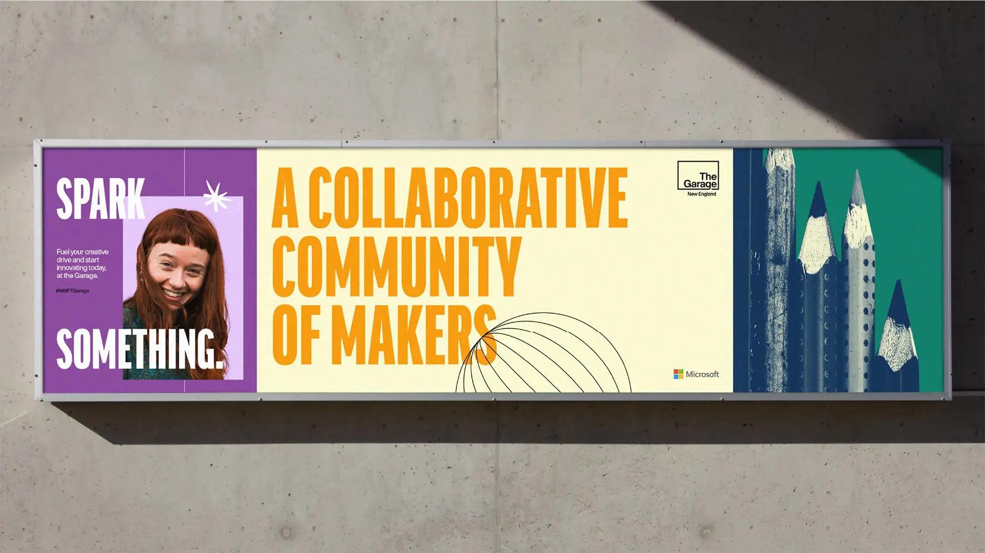
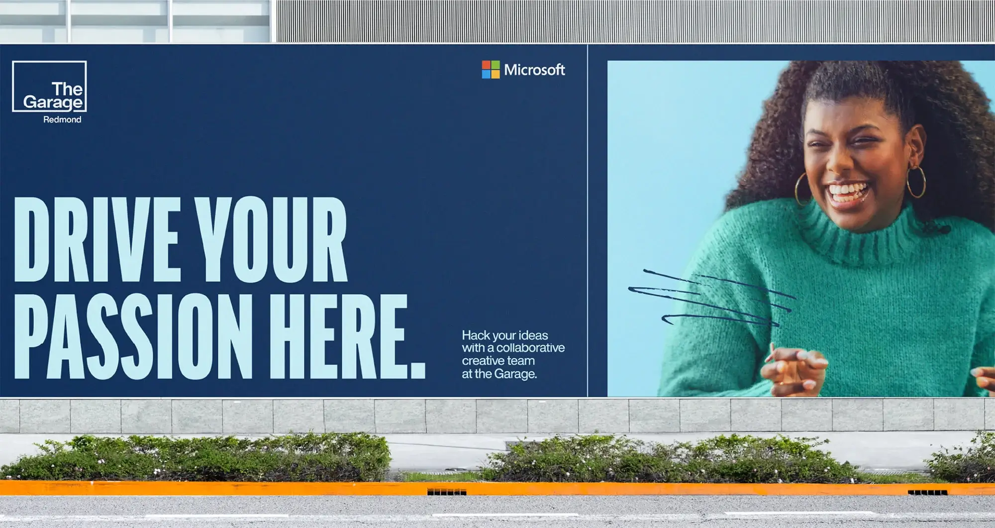
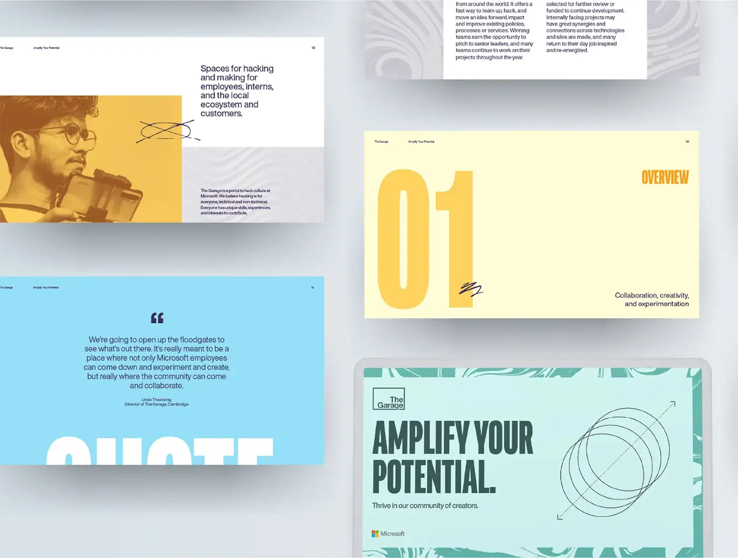
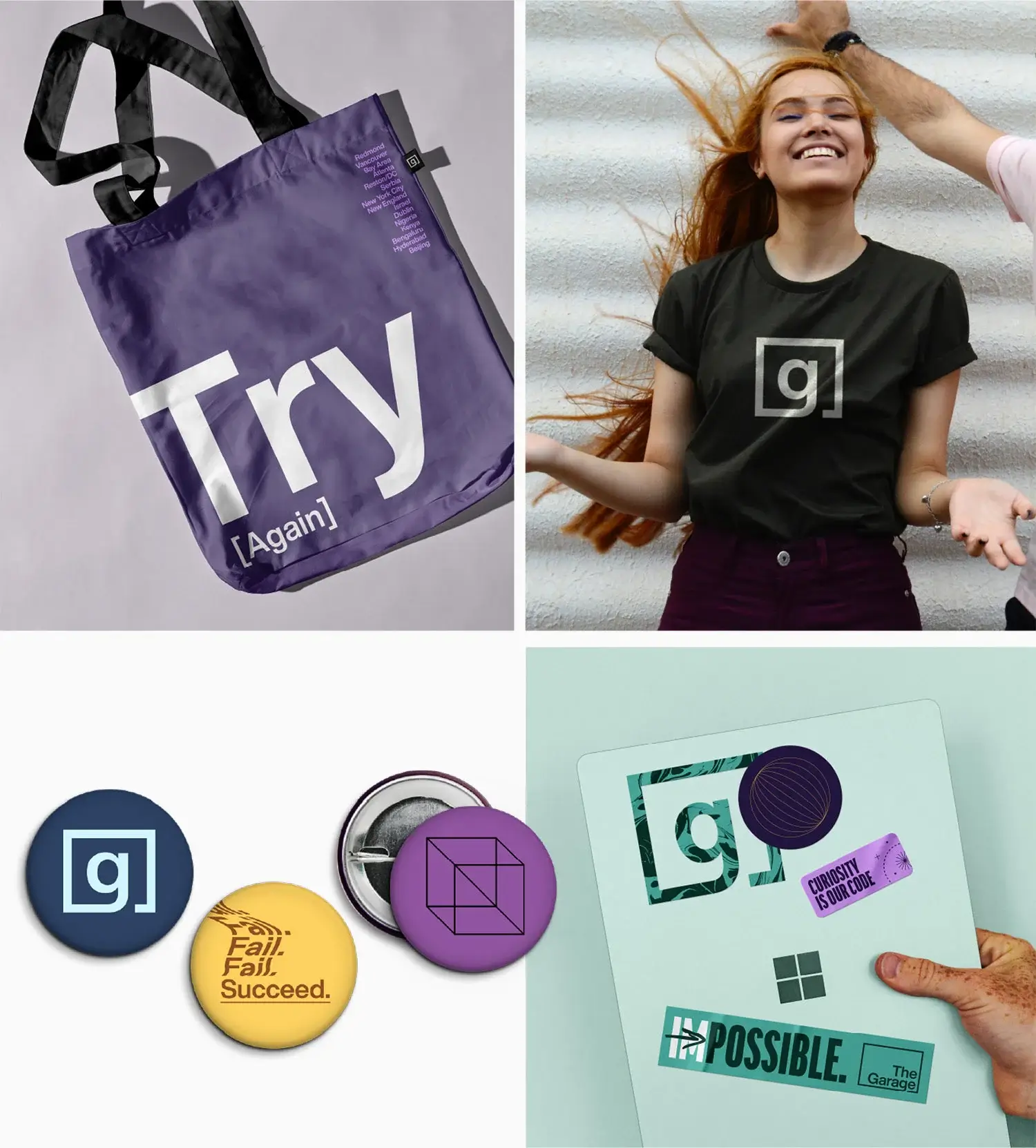
The Garage is Microsoft’s center of creativity, a space for any employee from any department to pursue and collaborate on passion projects. But it needed a brand that better positioned the space as Microsoft’s engine of innovation.
Solution
Traina rebranded The Garage to unite the collective passion of the Microsoft community around a distinct and dynamic brand identity.
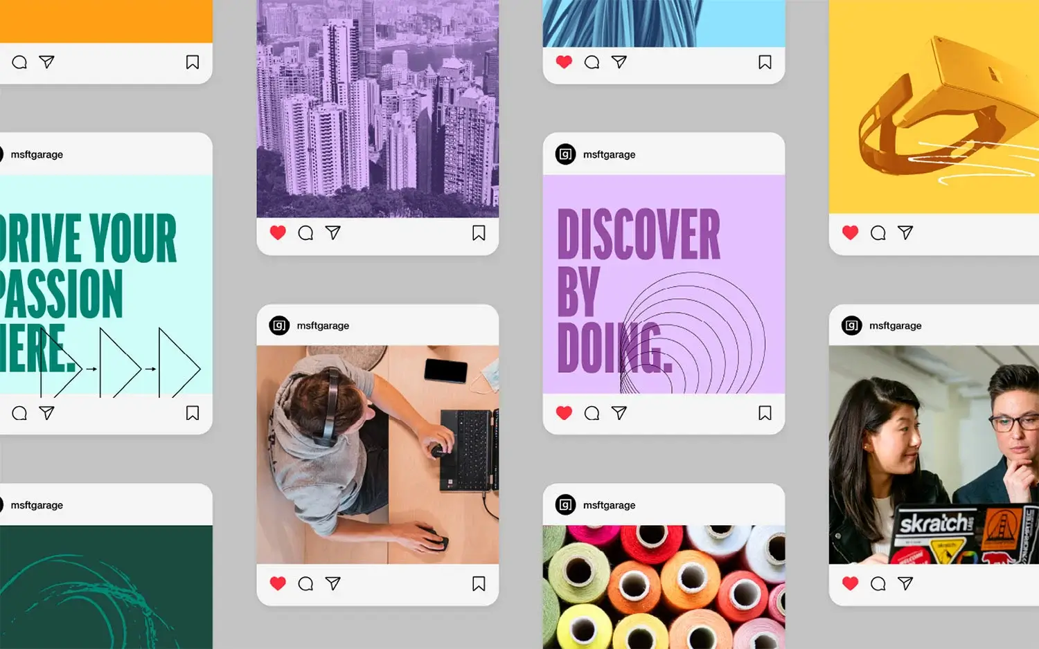
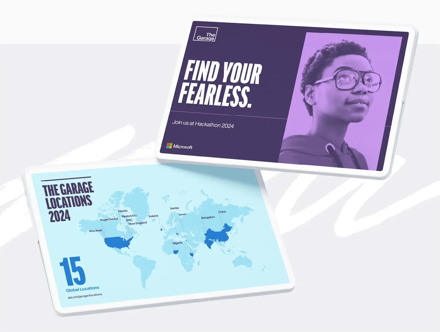
Identity
Logo
The Garage is named for where Microsoft first began back in the 1970’s. Where the prior identity conveyed this literally in a garage door, we abstracted the concept into a rectangular housing that could evoke a maker space, a physical structure or a shape that hearkens to the boxed windows of Microsoft’s ubiquitous OS.
The logo’s modular design adapts into a secondary image mark which can be applied to events like their annual Hackathon, where a scaled down image shows association without overpowering the event’s magnitude.
Color palette
A palette of select colors likewise relates to the Microsoft brand, using complementary hues made bright and vibrant to match the spirit of the space.
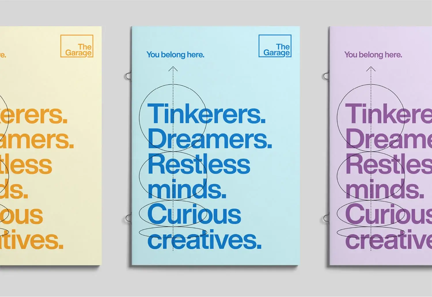
Messaging and identity
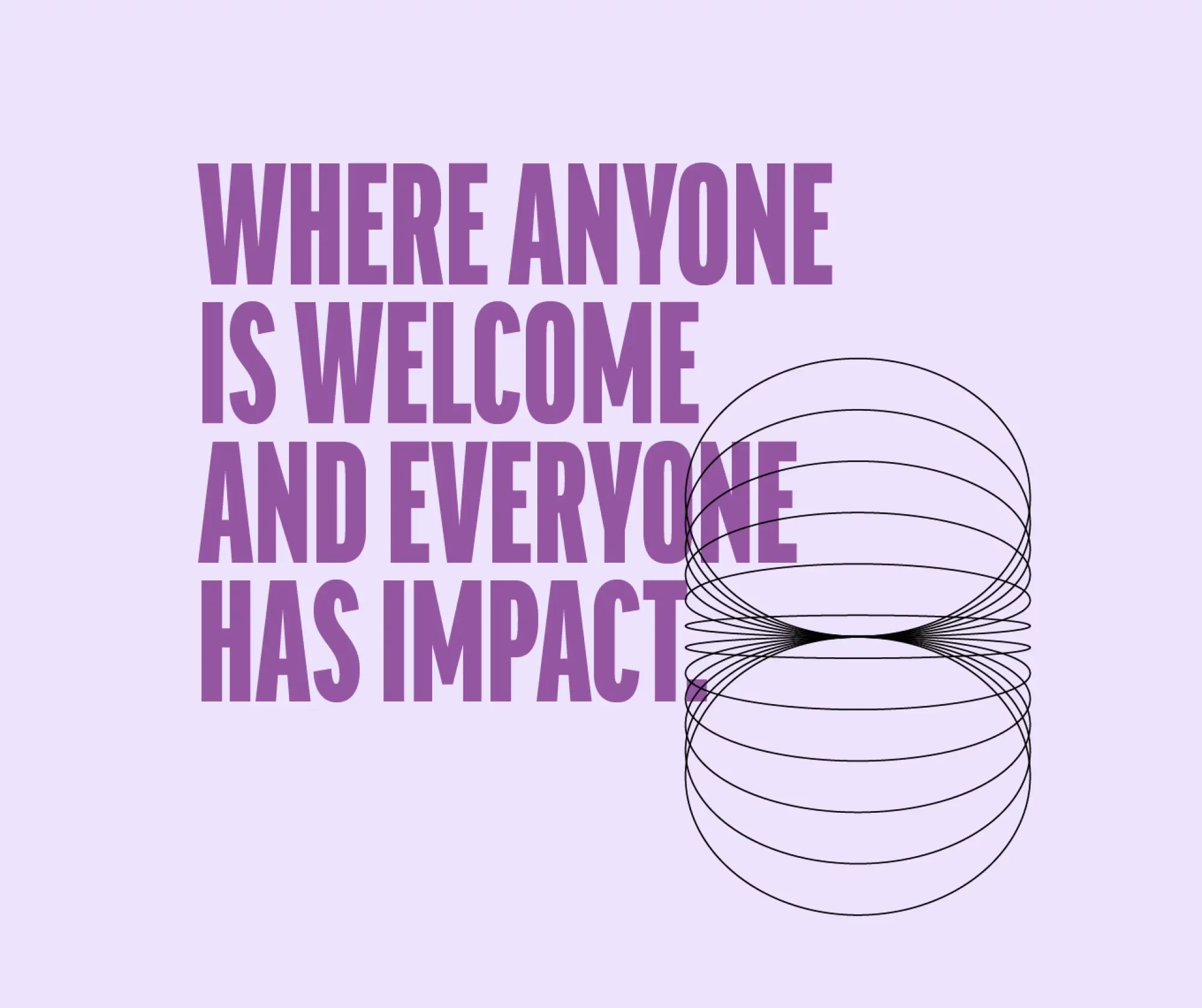
We conceived and customized a suite of messaging that is as bold and welcoming as the thick typeface used to express it. Paired with a series of technically-inspired, playful animations, the two elements complement each other to produce a rich, dynamic presence for the brand.
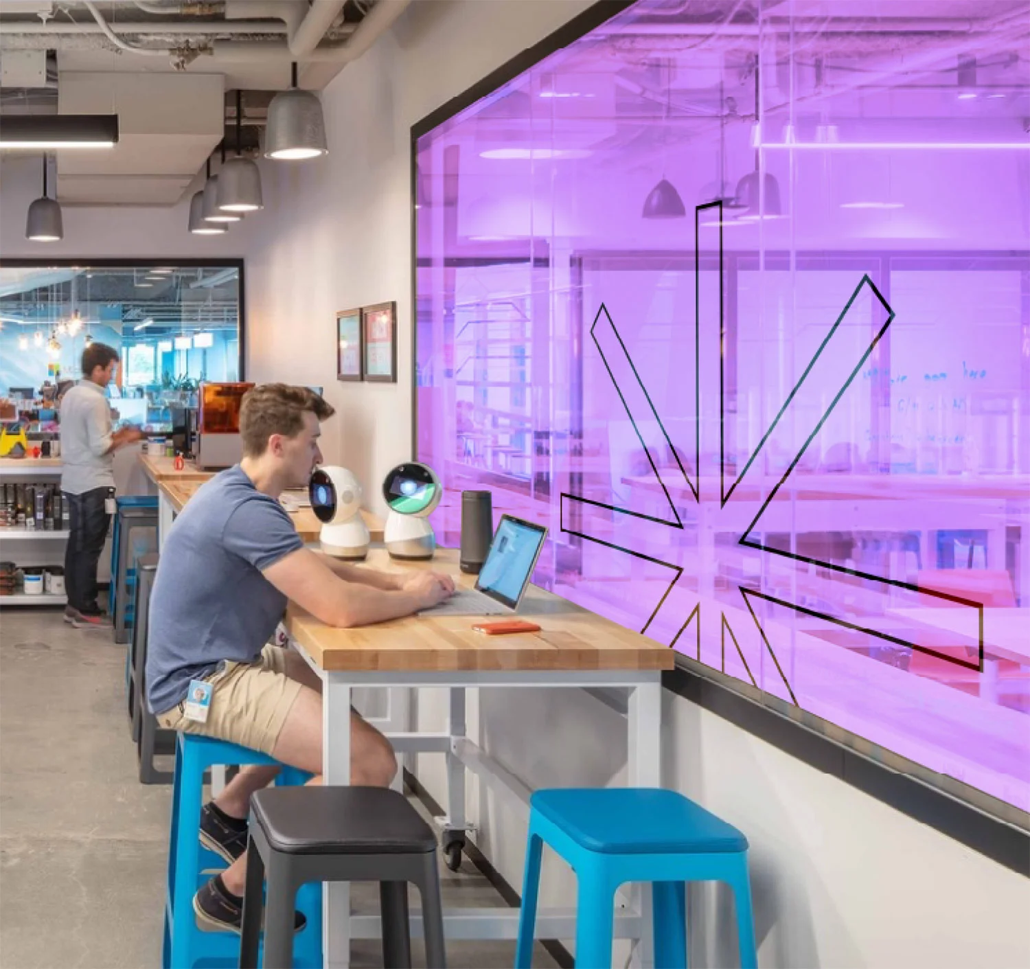
Visual system
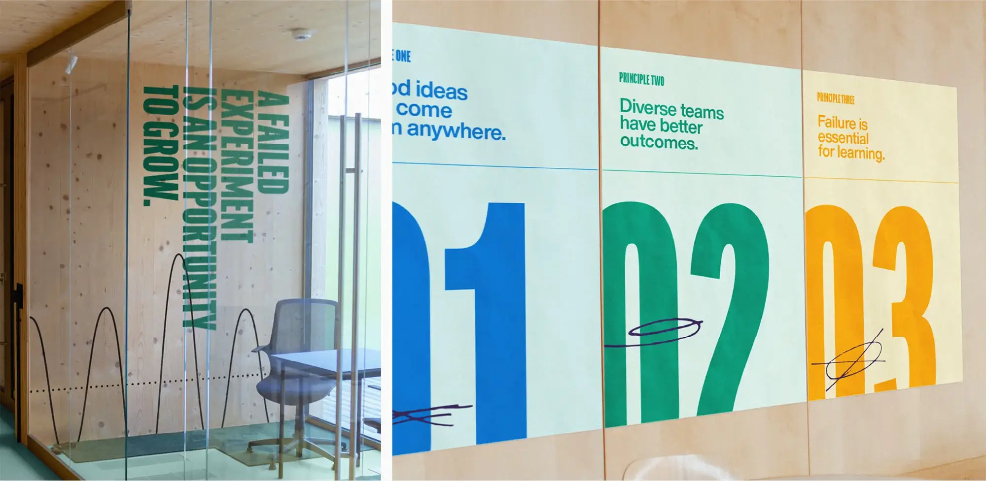
Hand-drawn details further evoke a loose, experimental feel, representing the kind of craft and creativity that can be pursued in The Garage.
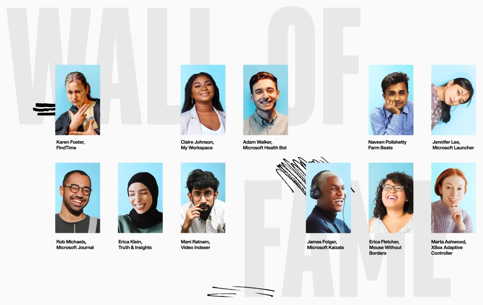
Wall of fame
The Garage’s Wall of Fame celebrates compelling projects and people who have made the most of the space. We explored how this concept could live in a digital form.
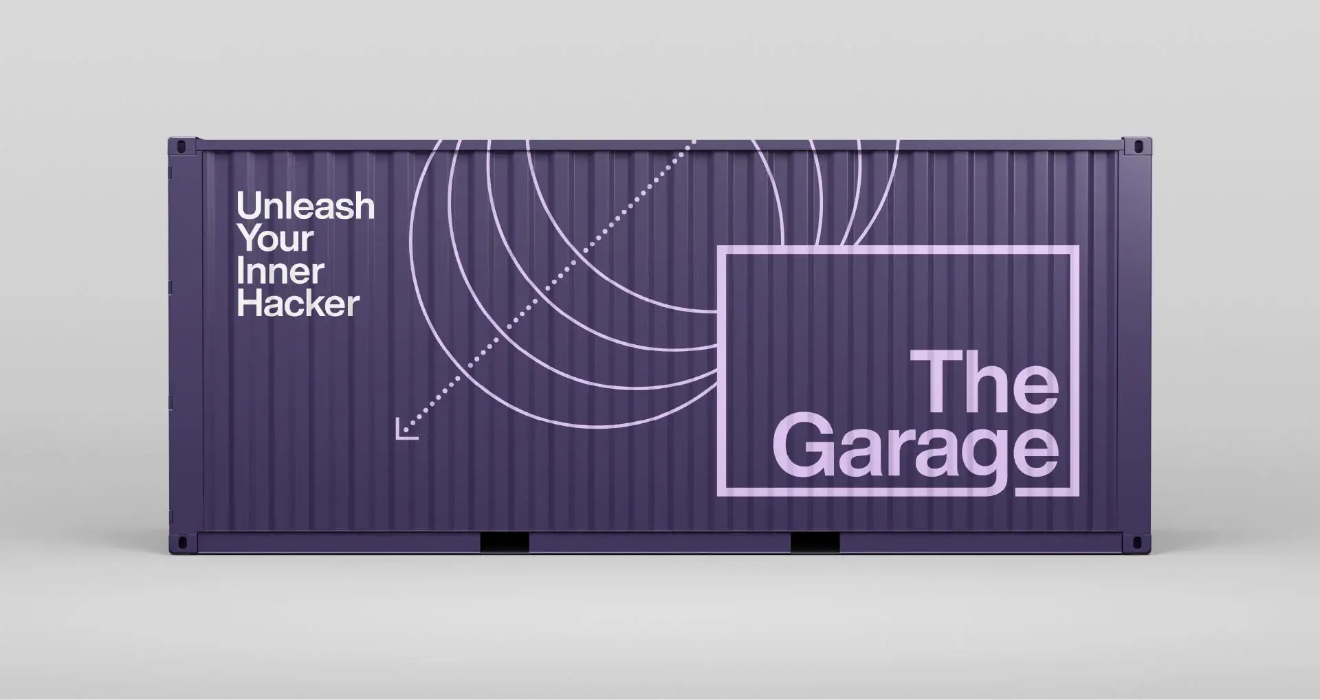
Global reach
The Garage has locations at Microsoft offices worldwide, so we made sure the brand would resonate across communities and stay consistent within a robust visual system.
Design elements
Whether expressed digitally or in a physical context, the brand is built to excite Microsoft employees with a spirit of maximizing potential, a sentiment that can be brandished proudly throughout the organization.
Showing spirit
Rounding out the project, we explored applications from large wall graphics down to swag for employees to embrace the spirit of The Garage as the catalyst of an innovative and creative culture at Microsoft.
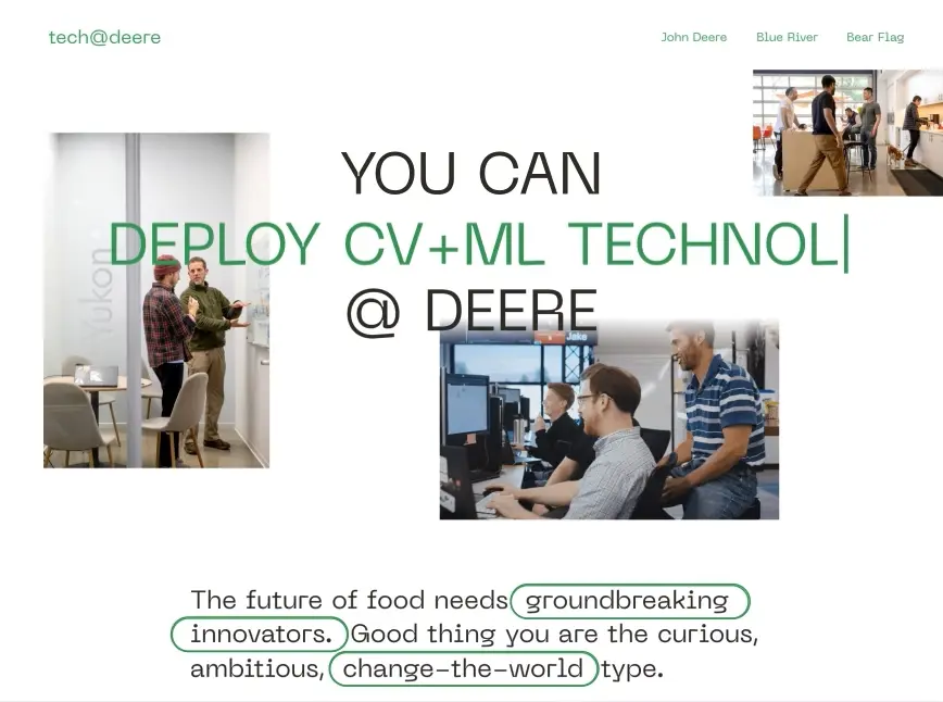
A recruitment brand is not just about attracting top candidates—it makes a lasting first impression that gives an employee’s work meaning. This pays long-term dividends for company culture.
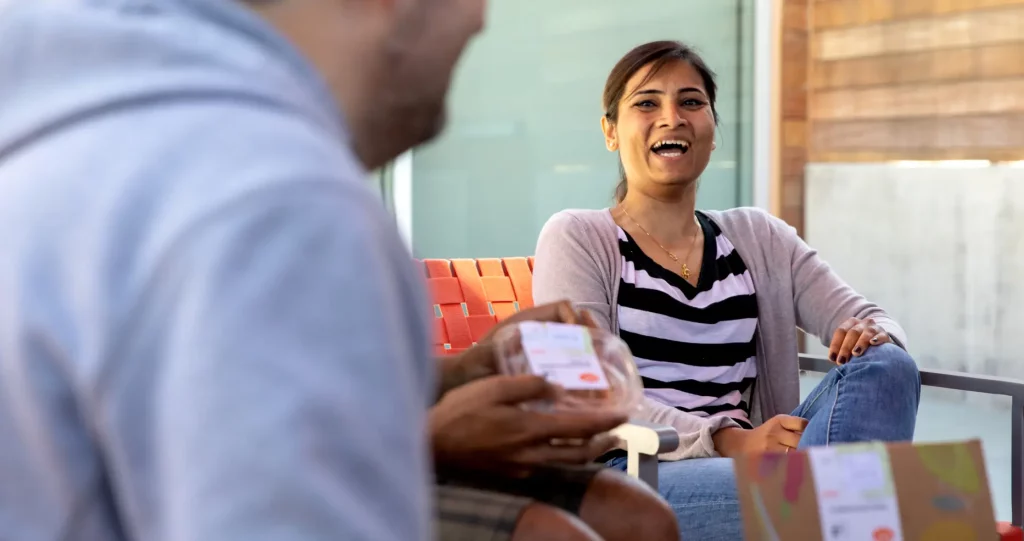
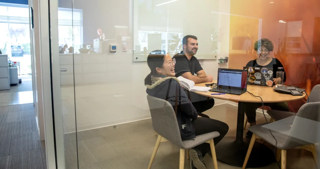
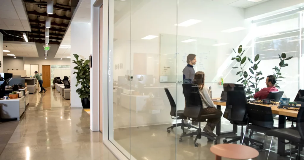
Challenge
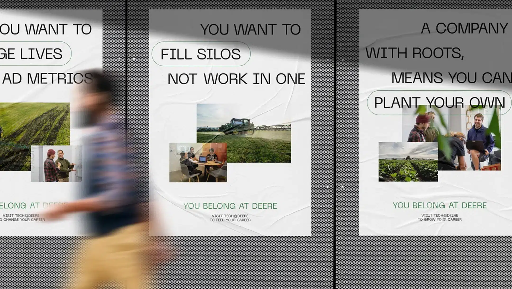
As the leader in agricultural innovation, John Deere sought to highlight their unique tech culture and draw top-tier technologists away from Silicon Valley mainstays.
Solution
Strategy, messaging and a dynamic digital experience help the Tech@Deere recruitment brand showcase real-world impact and demonstrate how they are breaking new ground—literally.
TRANSFORMATION
Recruiting with purpose
John Deere has led agricultural innovation for more than a century. Where that once meant cutting-edge plows, today it means autonomous tractors, sensor fusion and machine vision powered by AI. Deere technologists bring all this into the field; we had to bring it to the fore.
But cutting-edge tech isn’t all it takes to attract top talent. In a purpose-driven job market, compelling messaging and a firm ideology are crucial to foster motivation and belonging.
A series of candidate-centric engagement goals were part of a robust strategy guiding Deere’s recruitment experience.
STRATEGY
Growing talent
Before any technologist could feel they belong at Deere, they’d have to understand the innovative approach behind their three core units—John Deere Intelligent Solutions Group, Blue River Technologies and Bear Flag Robotics. We brought all stakeholders together in exercises and interviews that revealed a common drive to sustain our planet and a fervor for hands-on work that makes a difference.
We positioned Tech@Deere as a different career for a different kind of technologist: one who wants to make products that truly hit the ground and benefit not only farmers, but all of humanity.
MICROSITE
“That’s why you’re Deere”
This ethos is conveyed in a microsite that allows prospective employees to “choose their own adventure” at Deere. Visitors are presented with a dynamic header emphasizing the lasting impact of their career, while animated type conveys the company’s iterative process—a place where reinvention is the norm.
The site is a portal into the entire Deere tech ecosystem. Whether seeking the global reach of John Deere or the leaner, startup-style of its subsidiary brands, users can explore across the company and view the industry-leading tech that awaits applicants.
RESULTS
Fertile ground for the future
We created Tech@Deere to support the grand opening of John Deere’s Austin tech hub, which debuted during SXSW 2022 and marked their entrance as a tech presence in the city. As Deere now fills positions across the globe, their tech-forward brand and compelling recruitment messaging are sure to attract talent the world can count on.
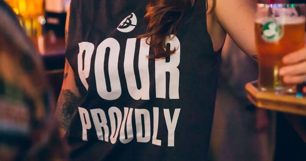
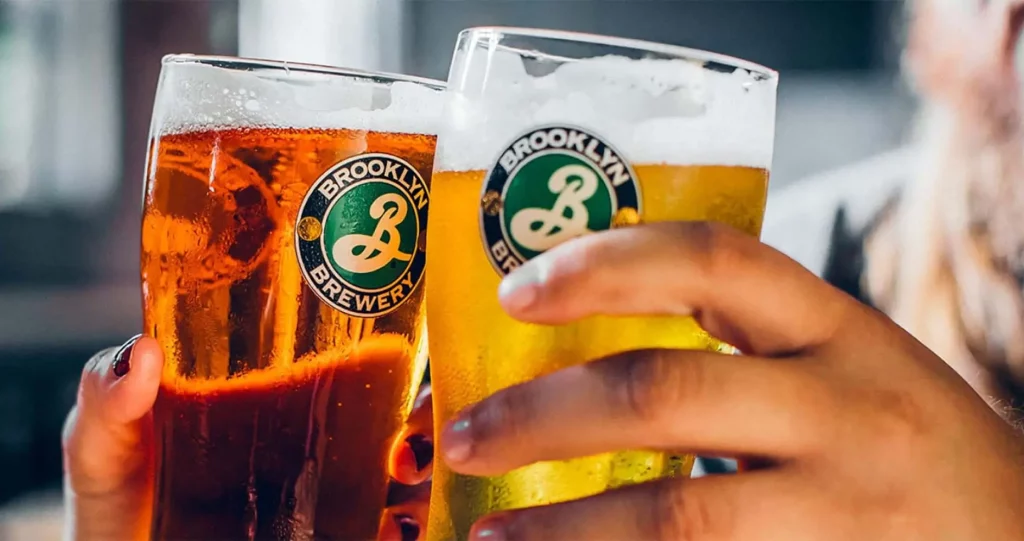
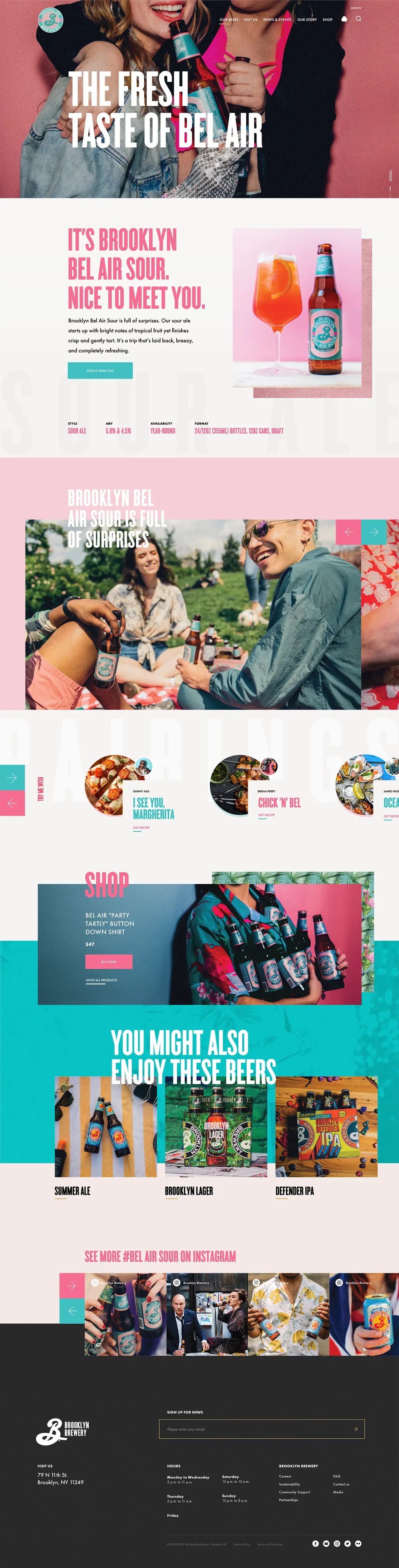
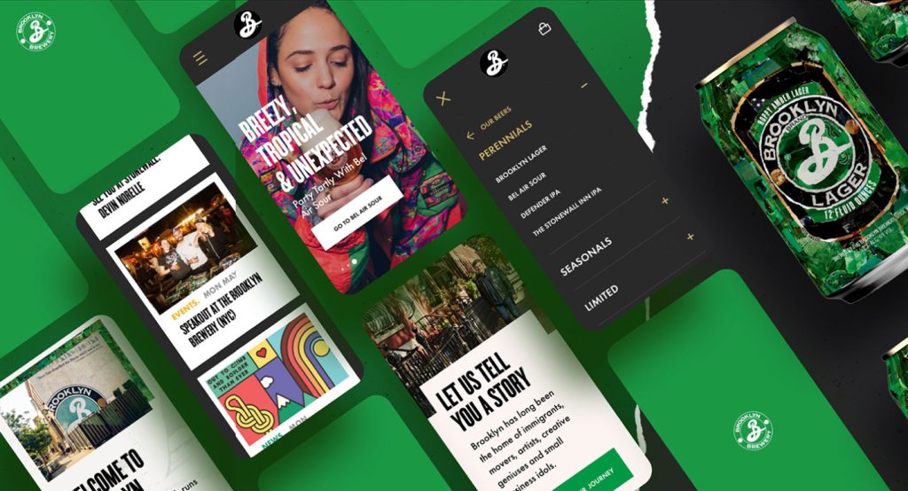
The craft beer space is as crowded as a bar on Saturday night. A clever logo and fun labels are common. The way to stand out now is through immersion in brand culture.
Challenge
Brooklyn Brewery had award-winning products, packaging and design. But they’d fallen behind digitally, with a text-heavy, static website that didn’t match their dynamic character.
Solution
Traina built Brooklyn a new web presence with smooth functionality and a lively feel that reflected the spirit of their city and the craft of their beer.
ADVANTAGE
Hello, Brooklyn
Brooklyn Brewery had a rich history and culture working for them, along with Traina’s roots in the craft beer epicenter of San Diego. Having supported the success of Ballast Point and unique beverage collabs like Moto Sonora, we know how much community informs craft, and how creativity must flow not only from cans and bottles, but every part of a brand.
APPROACH
Get personal
From the first page load, the new Brooklyn Brewery site invites self-expression and personal connection. A custom beer-finding tool helps users discover the ideal match for their personality. Quirky questions show interest in the audience and a streamlined backend allows new questions and products.
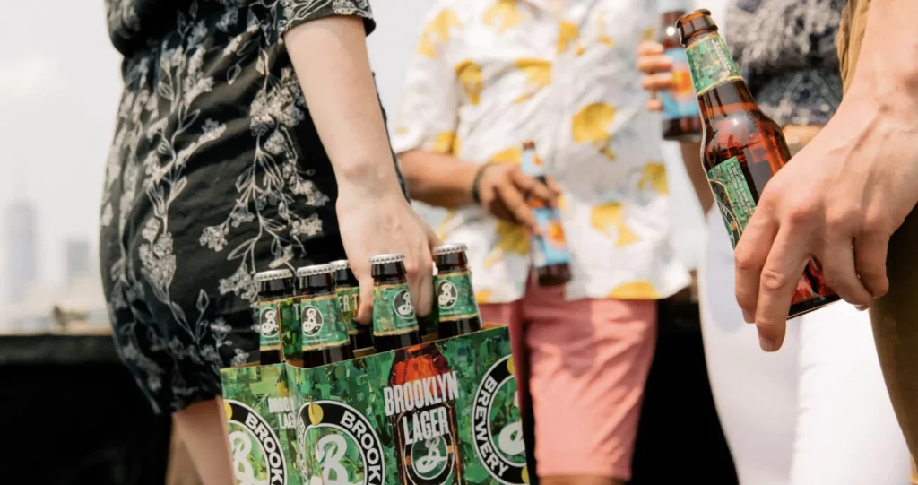
Go local, show global
The eclectic nature of Brooklyn informs product pages, with each beer expressing a unique personality but all tied together with an underlying visual system.
Products can have custom color palettes, photography, even food pairings and stories from Brooklyn’s brewmaster—bringing the local heart of each brew anywhere in the world.
We’re seeing a much lower bounce rate, which was our goal. The website offers a richer experience that keeps users on the site for longer.”
Tim Rozmus, digital marketing manager
CAMPAIGN ACTIVATION
Create space for community
After the site launched, we helped Brooklyn with their Create Space initiative, designing a web experience that amplifies voices from the LGBTQIA+ community. Traina developed an efficient system to share stories, provide resources and magnify the support and impact of LGBTQIA+ activism.
RESULTS
Brooklyn’s own
Many breweries are hyper-creative in their beer, but miss opportunities in their digital identity. Brooklyn’s new online experience not only sets them up for the future but garnered an immediate uptick in user engagement and several industry awards.
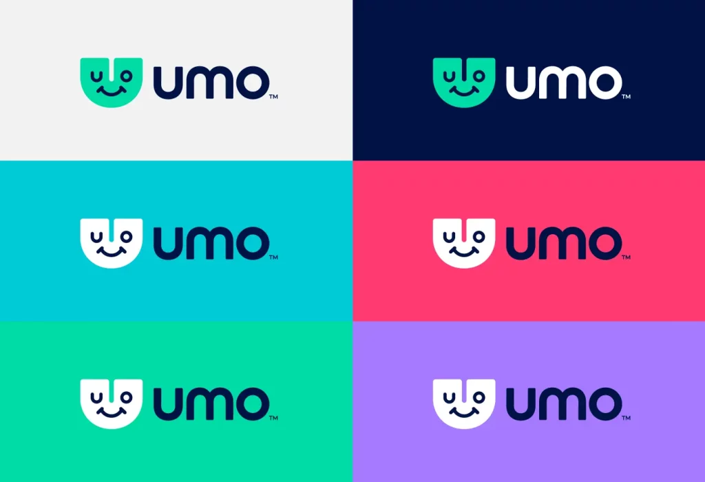
The days of interacting with a bland interface are over. Consumers now demand personality from brands and their products, especially when it comes to apps.
Challenge
Cubic Corporation is a force in urban transportation, with behind-the-scenes systems running the New York Metro and the London Tube. But their new B2B2C app needed a brand that resonated directly with commuters.
Solution
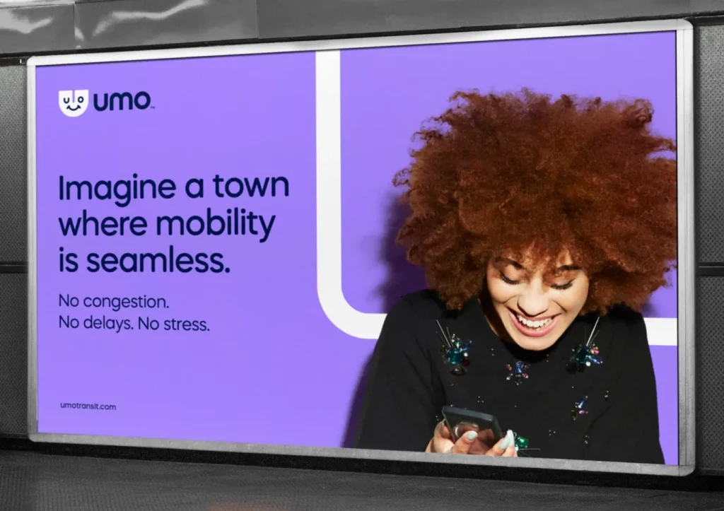
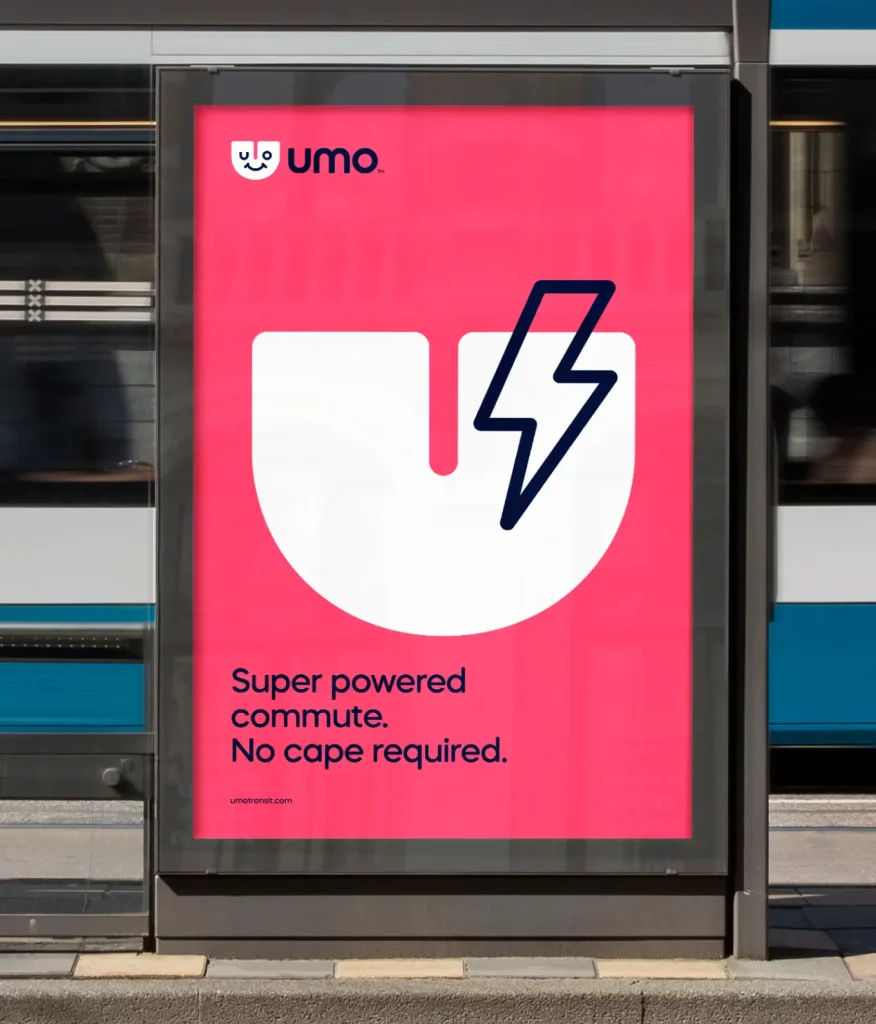
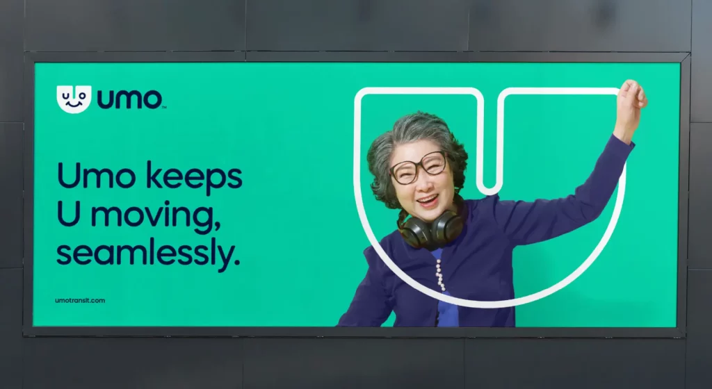
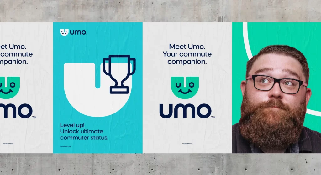
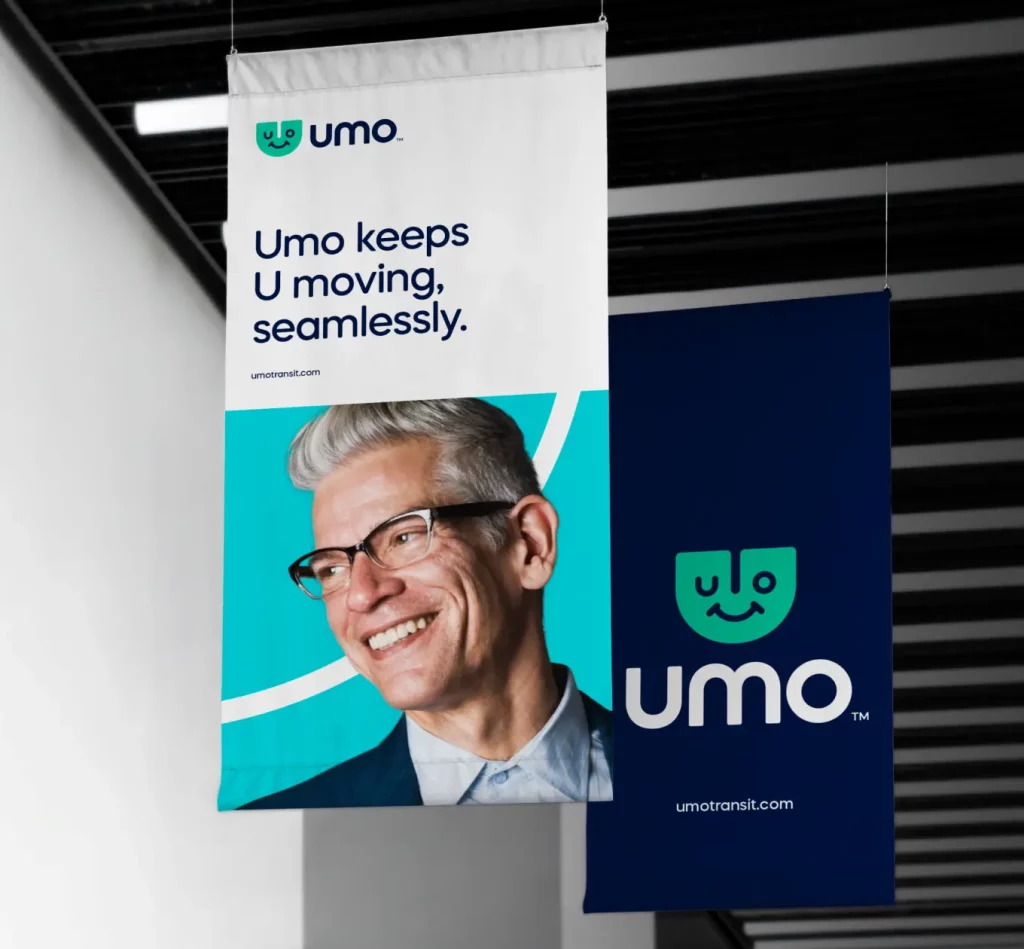
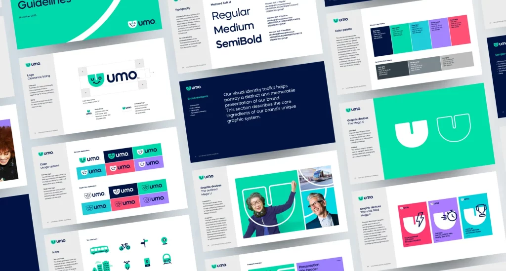
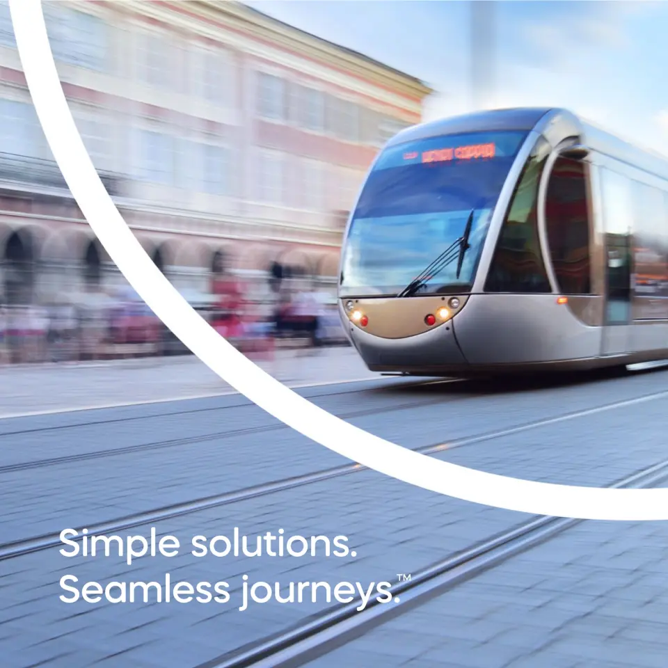
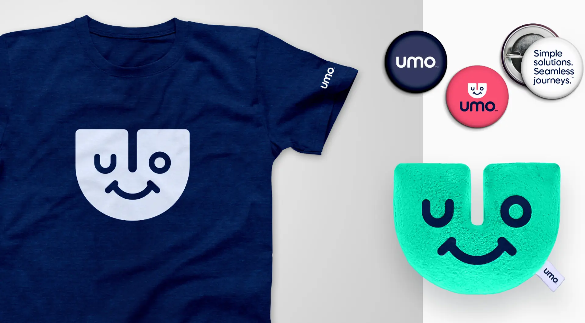
Based on research and competitive analysis, we positioned Umo as the everyday travel buddy, giving it an identity that embodies ease.
APPROACH
Taking the unexpected route
Where most transit apps have the personality of a black-and-white bus schedule, we brought Cubic’s app to life with fun. The quick, clever name serves as a shortcut to “urban mobility” and an allusion to “U move”—its three letters also make up the friendly face of their image mark.
The app’s ease and user-friendliness are also expressed through an expansive visual vocabulary of iconography and joyful photographic treatments.
RESULTS
A true departure
With high functionality complemented by a cheerful personality, Umo has become Cubic’s standout product, currently used in more than 60 metropolitan areas and leading the logistics giant into the B2B2C space.
Traina was able to articulate everything we wanted to say but couldn’t communicate ourselves.”
A brand must speak to its core qualities without saying a word. So a platform meant to simplify must have a clean and cohesive design system at first sight.
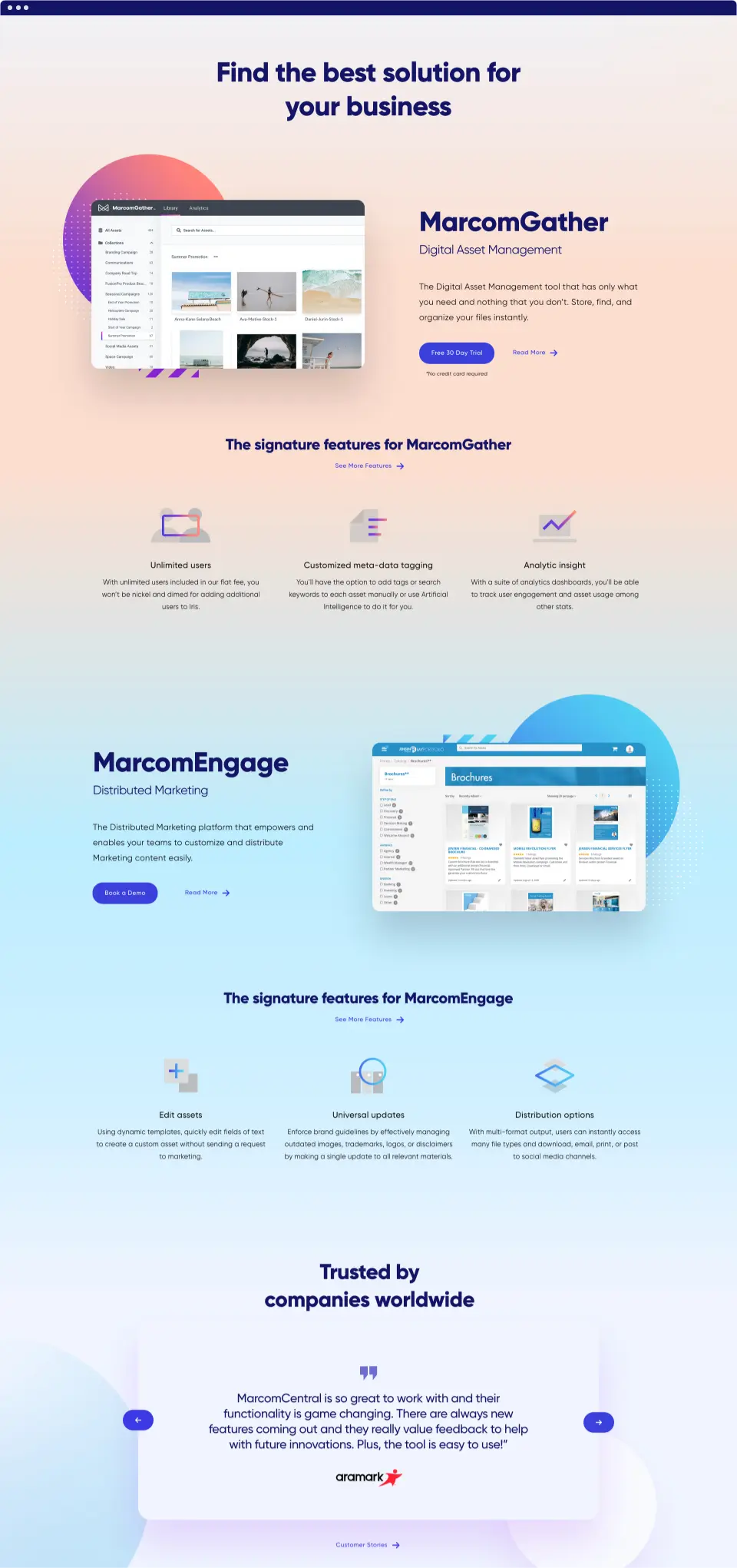
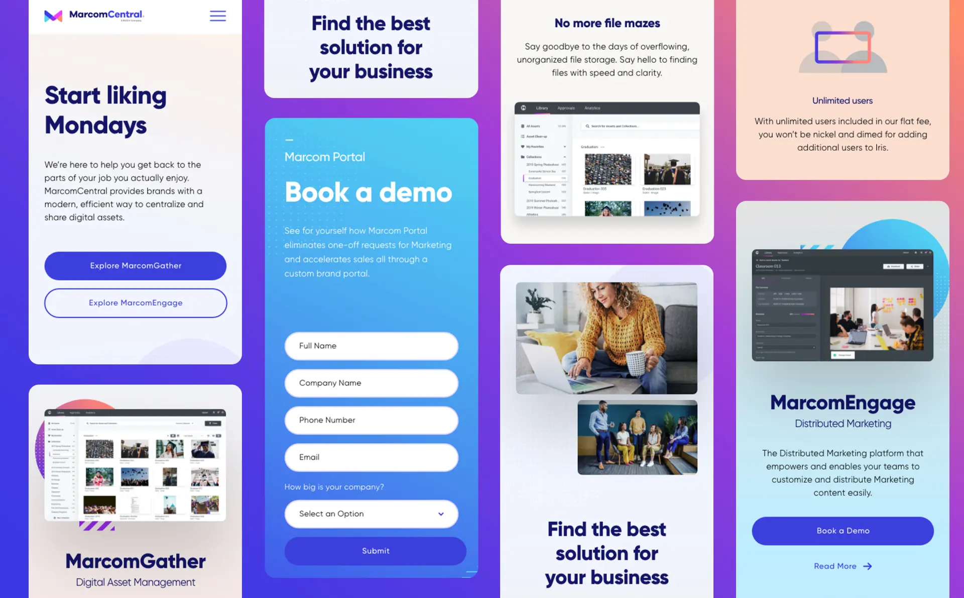
Challenge
After years helping top companies streamline their marketing resources, MarcomCentral expanded their brand architecture to bring digital asset management to the masses.
Solution
Drawing from the ease and agility of their platform, we built a digital-first brand focused on vibrant, beautiful simplicity.
INSIGHTS
Know your audience
Most data asset management systems have either not enough functionality or way too much. MarcomCentral took their enterprise-level solution to small and medium businesses with a focus on simple, streamlined efficiency—which we applied to their new brand.
Our UX strategy winnowed down 20+ web pages into an intentional 12-page user journey showcasing the platform’s organizational strength. Animation further conveys a sleek user experience, creating memorable brand engagements on every page.
IMPLEMENTATION
Simplicity and versatility were focal points in the creation of a visual identity. Where competing data management systems left users drowning in a sea of blue, MarcomCentral’s multifaceted platform lent itself to a bolder, vibrant expression utilizing a spectrum of design techniques.
Flexible logo
A multicolor logo design was inspired by the variety of components in the platform, with different pieces all coming together to form a cohesive and memorable mark.
Smooth animation reflects the simplicity in which digital assets are brought together, while the shape language can be deconstructed and used in elements throughout the brand system.
Color palette
Where competing data management systems swam in a vast sea of blue, our multicolor logo and brand design is a bolder, vibrant expression for a multifaceted platform.
Smooth animation reflects the simplicity in which digital assets are brought together, while the shape language can be deconstructed and used in elements throughout the brand system.
Iconography and Gradient
Shape elements in the design system are used as custom icons to unify and categorize MarcomCentral’s features.A colorful gradient canvas further underpins the system with a range of color spaces evoking the fluidity of the software.
Results
Systemized design
Where MarcomCentral now brings simplicity and multifunctionality to marketing departments of any size, their brand likewise presents the tools, features and possibilities of the platform in a refined and cohesive system.
Printed publications have pros and cons—but they are definitely not ideal for conveying sound. A digital experience can do that, but it must add to what audiences already love in a legacy publication.
Challenge
For years, Taylor Guitars’ Wood&Steel magazine has explored the craftsmanship of their instruments and the artistry that comes out of them. It was time to make that wealth of content work with their website.
Solution
Traina developed a digital Wood&Steel experience with three strategic objectives: reach a new generation of players, kickoff a digital-first ecosystem and integrate rich content with the marketing and selling of magnificent guitars.
OBJECTIVES
A digital experience offered a new world of possibility for Wood&Steel, especially new ways to hear and truly feel what a Taylor guitar can do. Traina was brought in to unleash and expand the magazine into the digital space, and we did so with three strategic objectives: reach a new generation of players that will carry the brand into its future, start the brand’s transition to a digital-first ecosystem, and make the content evergreen—more accessible, engaging and directly linked to their business of crafting, marketing and selling magnificent guitars.
APPROACH
Content that resonates
The online Wood&Steel is a virtual storytelling venue where audiences can hear Taylor guitars and view artists’ performances and interviews. Interactive image galleries, hover hotspots and animations keep readers engaged and add depth for guitar aficionados. Years of content blend seamlessly into Taylor product pages, effectively unlocking their investment in storytelling.
Our thoughtful design retains the look and feel of printed matter, while being easy to administer on the backend for effortless updates and new media integrations.
Audio and video further enriches Taylor’s stories, with interview footage and playlists now embedded within articles—indulging what the next generation of players have come to expect from a digital experience.
LOOKING FORWARD
A bright future for a classic sound
Wood&Steel was the first project in Taylor’s full digital-first ecosystem, and Traina continues our partnership to this day helping the company produce new product lines that build on the quality and craft behind their brand.
Reaching a young market requires a keen understanding of not only what they want, but what they have come to expect from a brand.
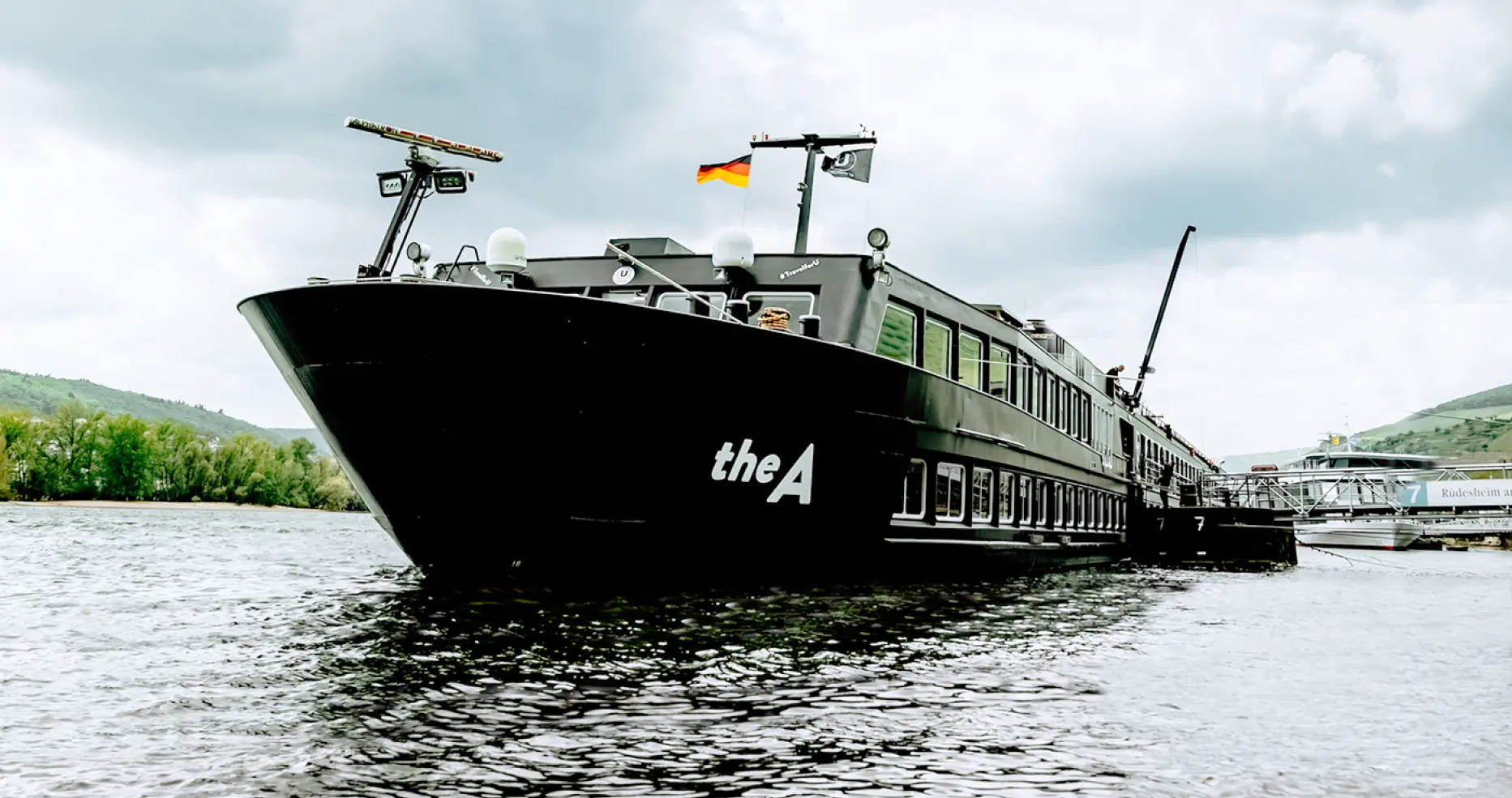
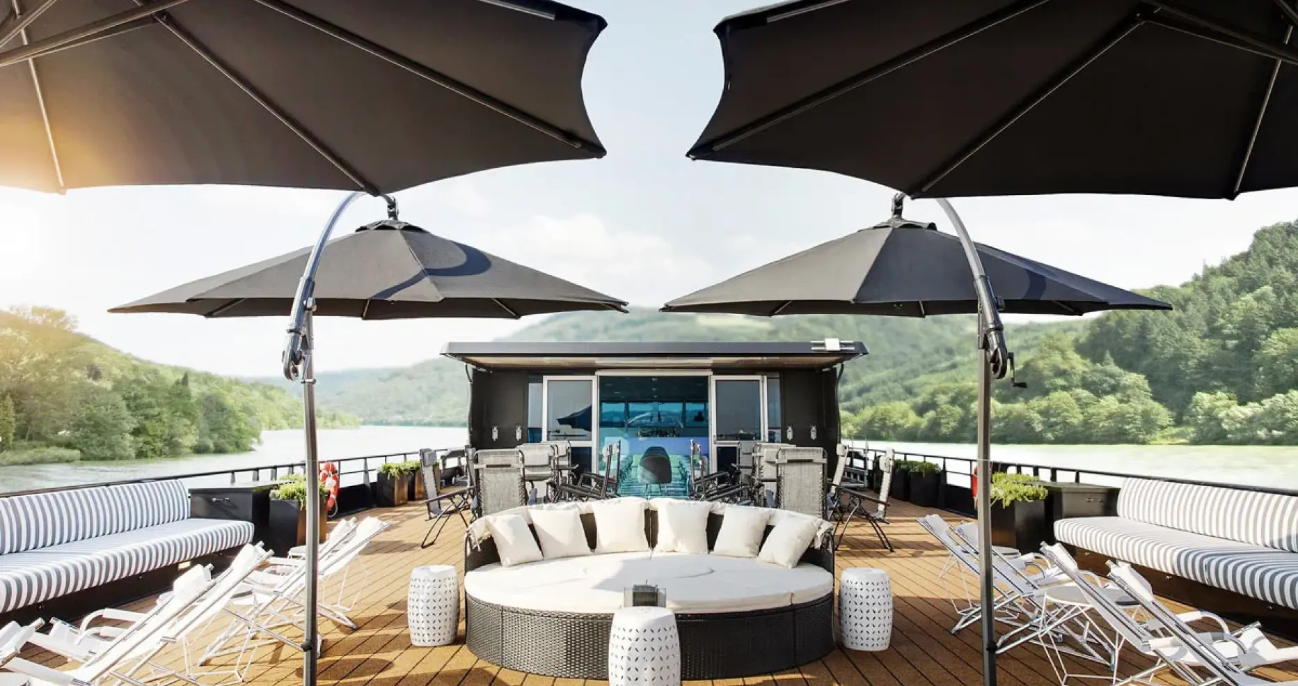
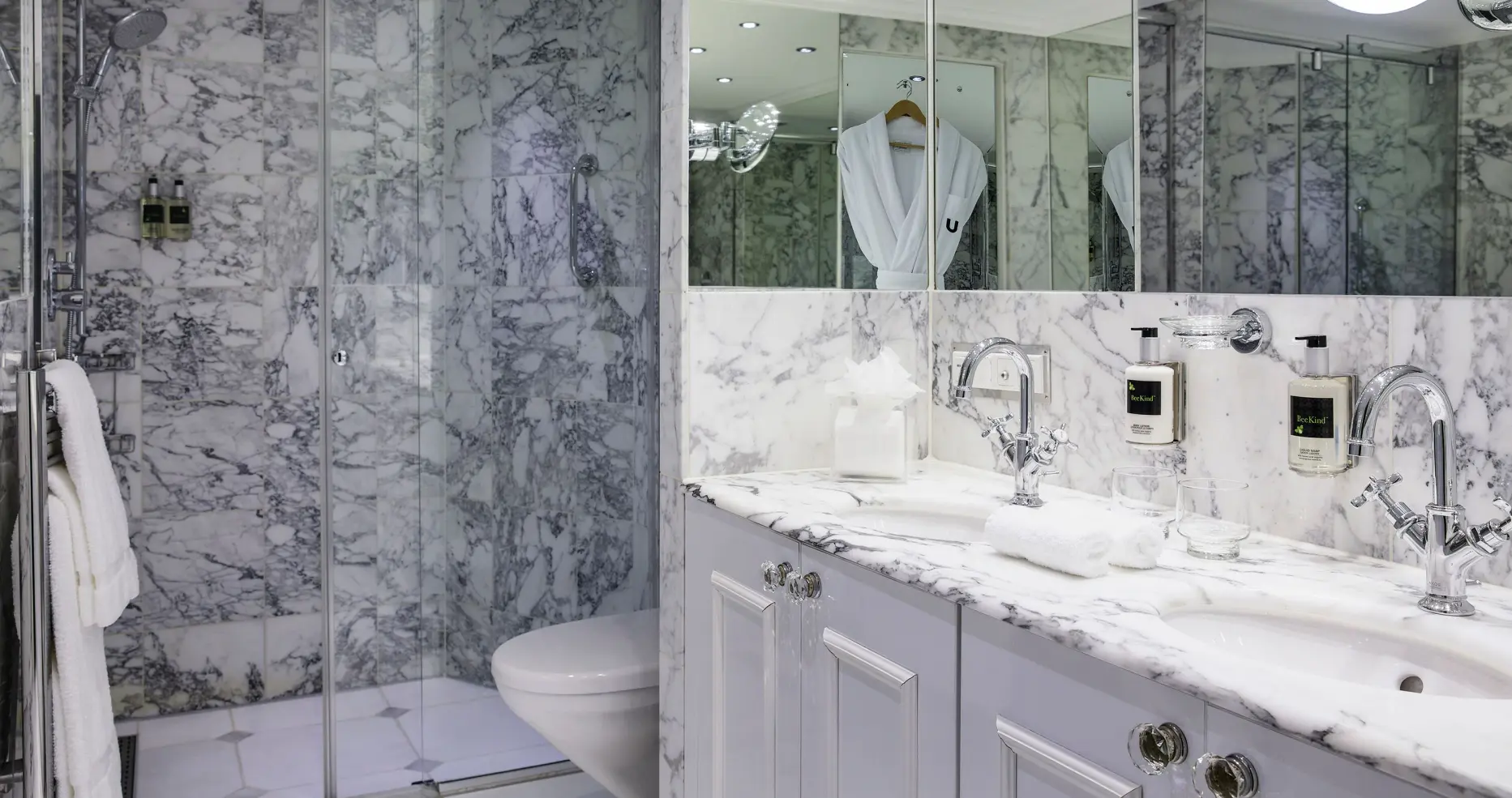
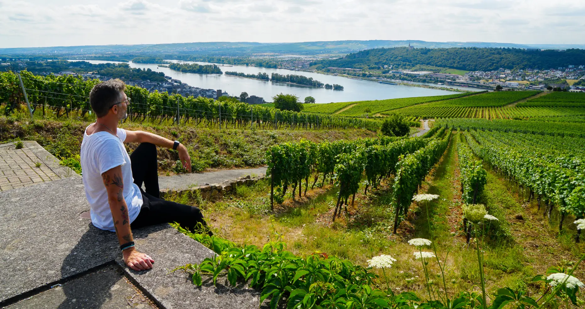
Challenge
Uniworld, the world’s premier luxury river cruise line, created U River Cruises to engage younger, active travelers. The brand thus had to defy notions of shuffleboard and dinner at 4 p.m. and redefine cruising as an ultramodern way to travel.
Solution
We led U’s brand launch with a strategy and identity designed to resonate with Generation X and Millennials—leveraging active excursions, authentic experiences, and total freedom to explore like a local.
APPROACH
It’s all about U
Our research revealed a younger market expects the ability to customize every facet of their vacation. This informed our visual identity, a bold “U” that speaks to individuality, the way it might be expressed in a quick text between friends.
This notion carries through fun messaging depicted in bold type, inviting audiences to go beyond sightseeing and truly experience cities.
Ease and intimacy is a major thread as well—less time spent on logistics, and more freedom to choose your own adventure.
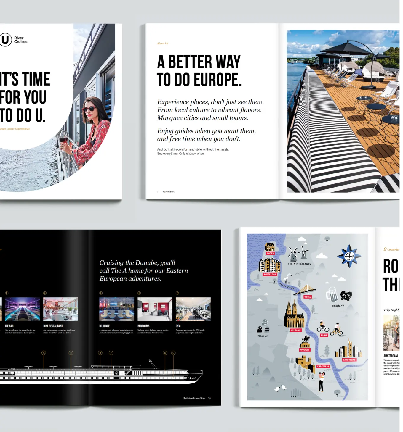
IMPLEMENTATION
Setting sail with e-commerce
To introduce U River Cruises to the world, we wrote, designed and produced a full scope of marketing assets showcasing the spirit of U.
A sleek and immersive e-commerce website gives a first impression of the seamless journey that awaits travelers. The site makes selecting trips simple and showcases the elevated culture of destination cities and the shipboard experience.
Immersive exploration
Given the desire to self-select and customize, we built a robust online booking tool with interactive itineraries and route maps that allow users to experience all that awaits them.
DIGITAL EXPERIENCE
Mobile-first for a younger market
U’s target demographic is not inclined to use a travel agent, so all information needed to be immediately accessible—from room options to city adventures and details about amenities. We customized all of this in a streamlined mobile-first experience.
Persistence of print
Still, U couldn’t alienate their longtime partners in travel agents, for whom the brochure is the rule. We created a print piece every bit as fresh as the website, leveraging the spirit of freedom and self-empowerment.
Fun meets folk
And across digital and print, custom illustrations modernize U’s itinerary maps—blending whimsical fun with folksy culture.
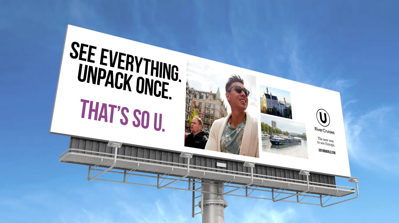
CAMPAIGN
A new brand embarks
U River Cruises launched with a campaign that spanned print and digital advertising, audio commercials on Spotify, and a social push that brought influencers on board and put U ships on-air, with episodes of ABC’s The Bachelor taking place on deck.
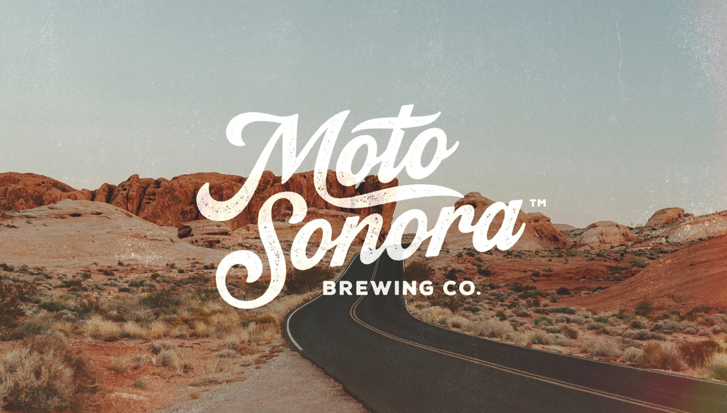
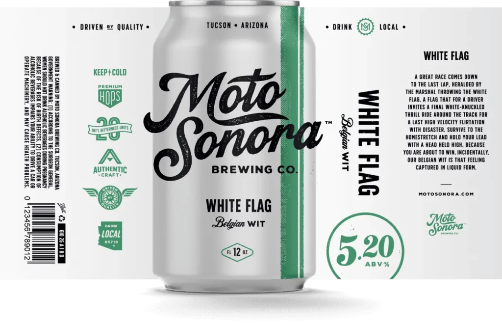
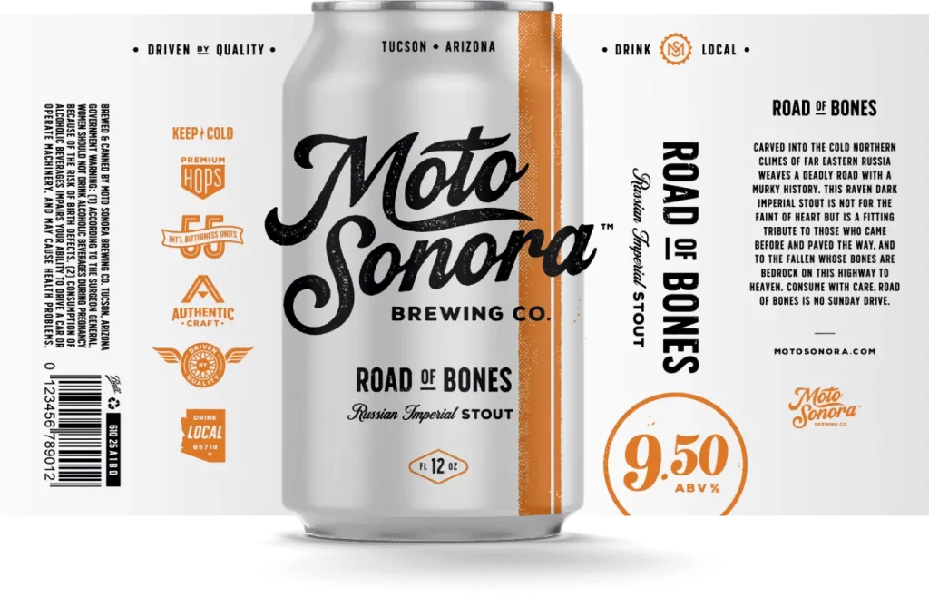
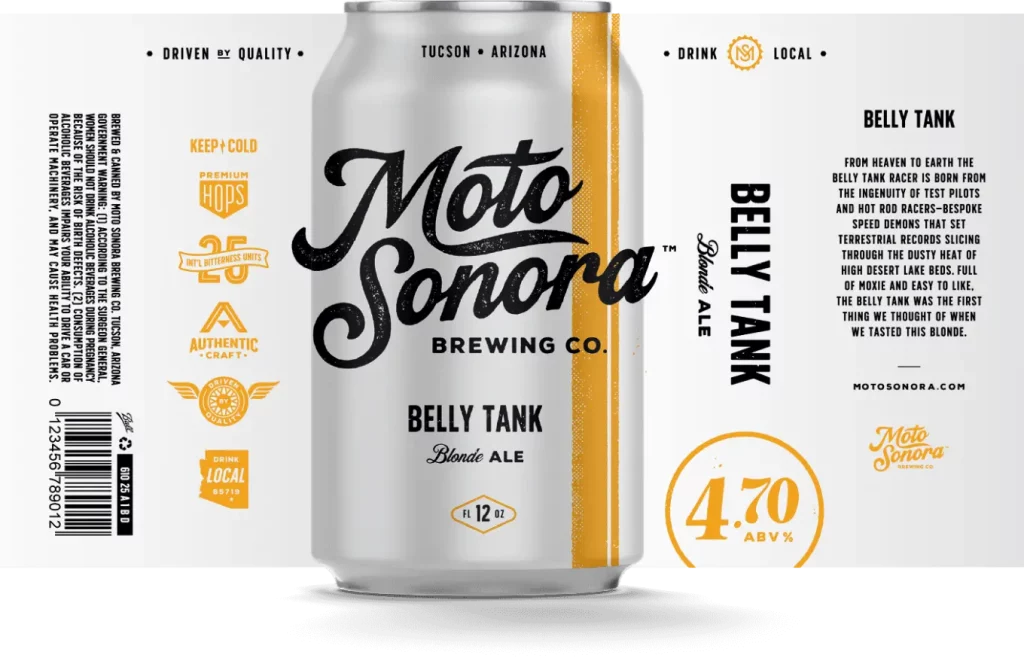
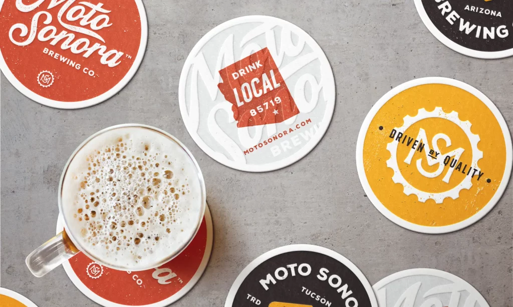
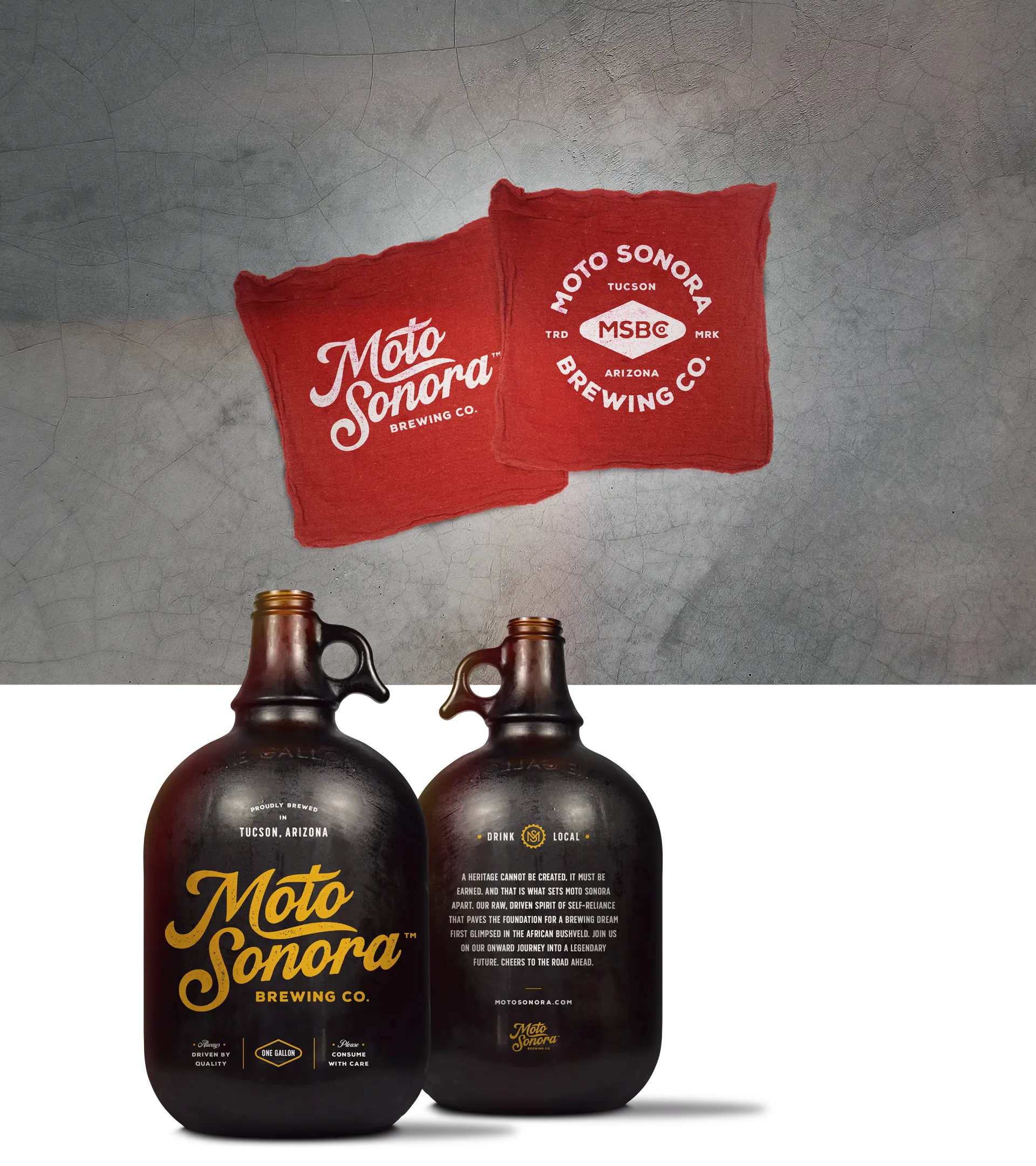
A beer brand is nothing without character—and that character must be unique, genuine and apparent in every touchpoint.
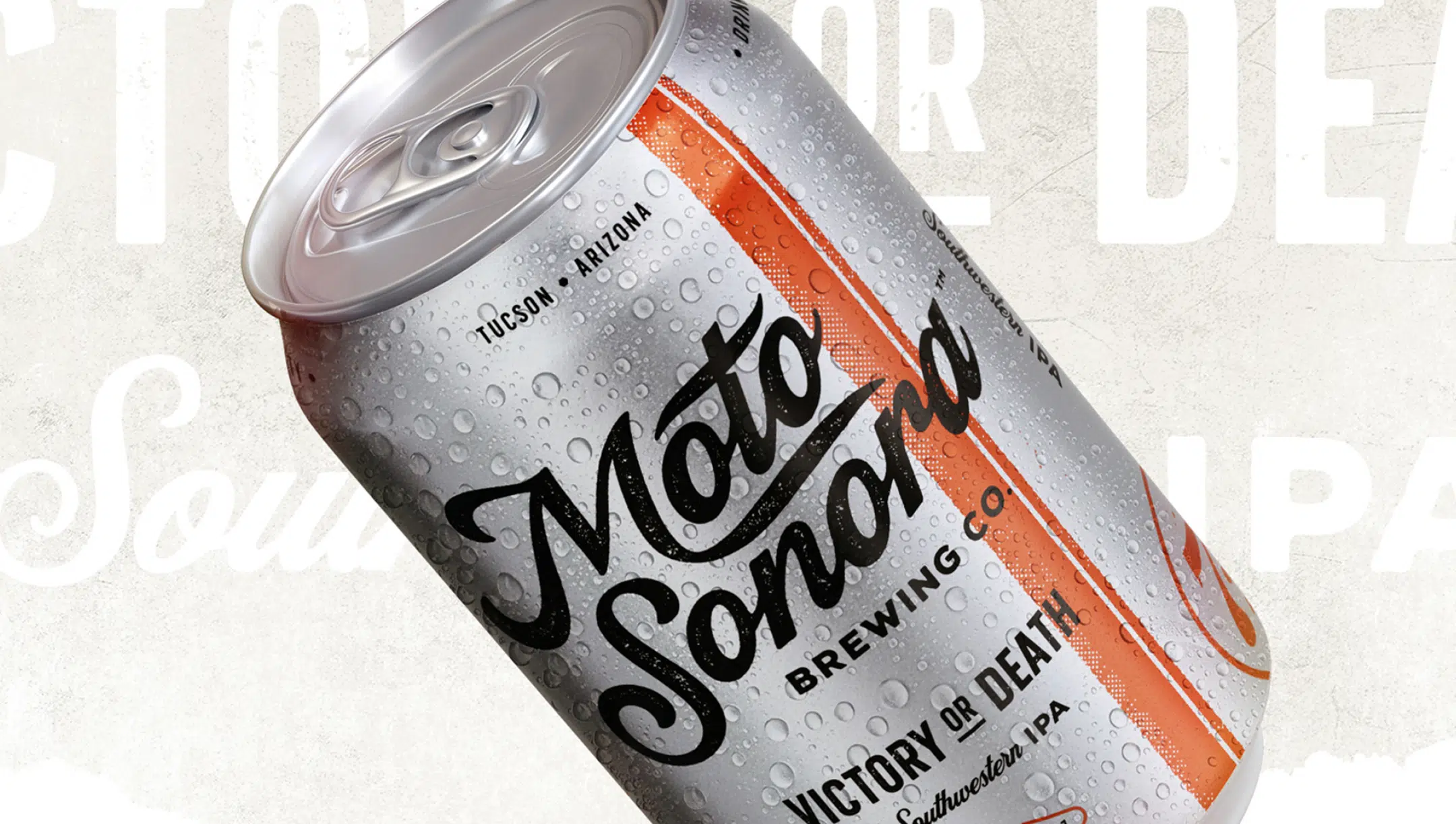
Challenge
MotoSonora Brewing merges its founders’ passions for motocross culture, craft beer and their Sonora Desert roots. These elements had to come together in a way that was authentic.
Solution
Traina kick-started MotoSonora with a raw yet refined brand identity designed to attract adventure-seekers and weekend warriors alike.
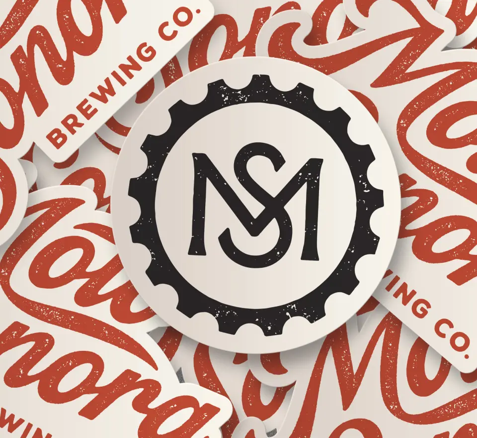
Visual Identity
Craft with character
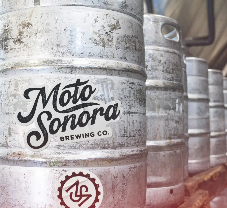
We began with an earth-tone palette and a classic road-worn script logo, evoking the beauty and grit of the desert landscape.
Our can design has nothing to hide. We let the aluminum shine through, conveying the steely character of competition. A unifying stripe color codes each brew, while ABV percentages—traditionally minimized on alcohol packaging—are worn proudly like a vintage racing number.
A supplementary suite of designs inspired by racing decals further express the brand ethos and prevent logo fatigue.
RESULTS
Moving full throttle
MotoSonora has gained traction throughout Arizona, with its Tucson taproom now a destination for craft lovers and gearheads alike—a fitting home base for this unique player in the craft beer landscape.
2000%
Increase in barrels brewed since 2019.
20+
National and international craft beer awards garnered.
Magazines are alive and well in academia. Be it in print, online, or the overwhelming majority doing both, it is a medium tailor-made for university storytelling, one that Traina continually advances with every redesign.
Some universities have engaged us as long-term partners, and others have asked us to build a fresh framework for their internal teams. But in every case, we understand the university’s character and the publication’s voice, crafting a cohesive brand and visual system that ties it all together.
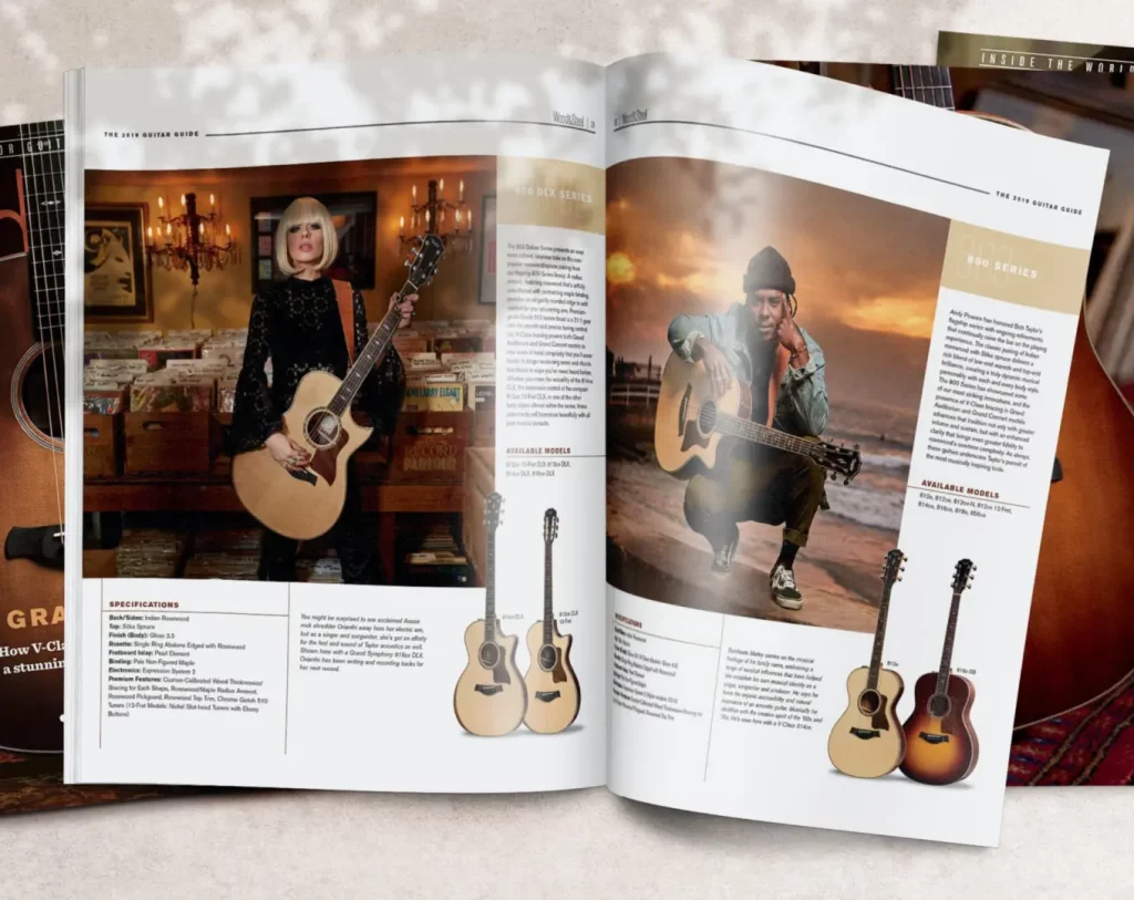
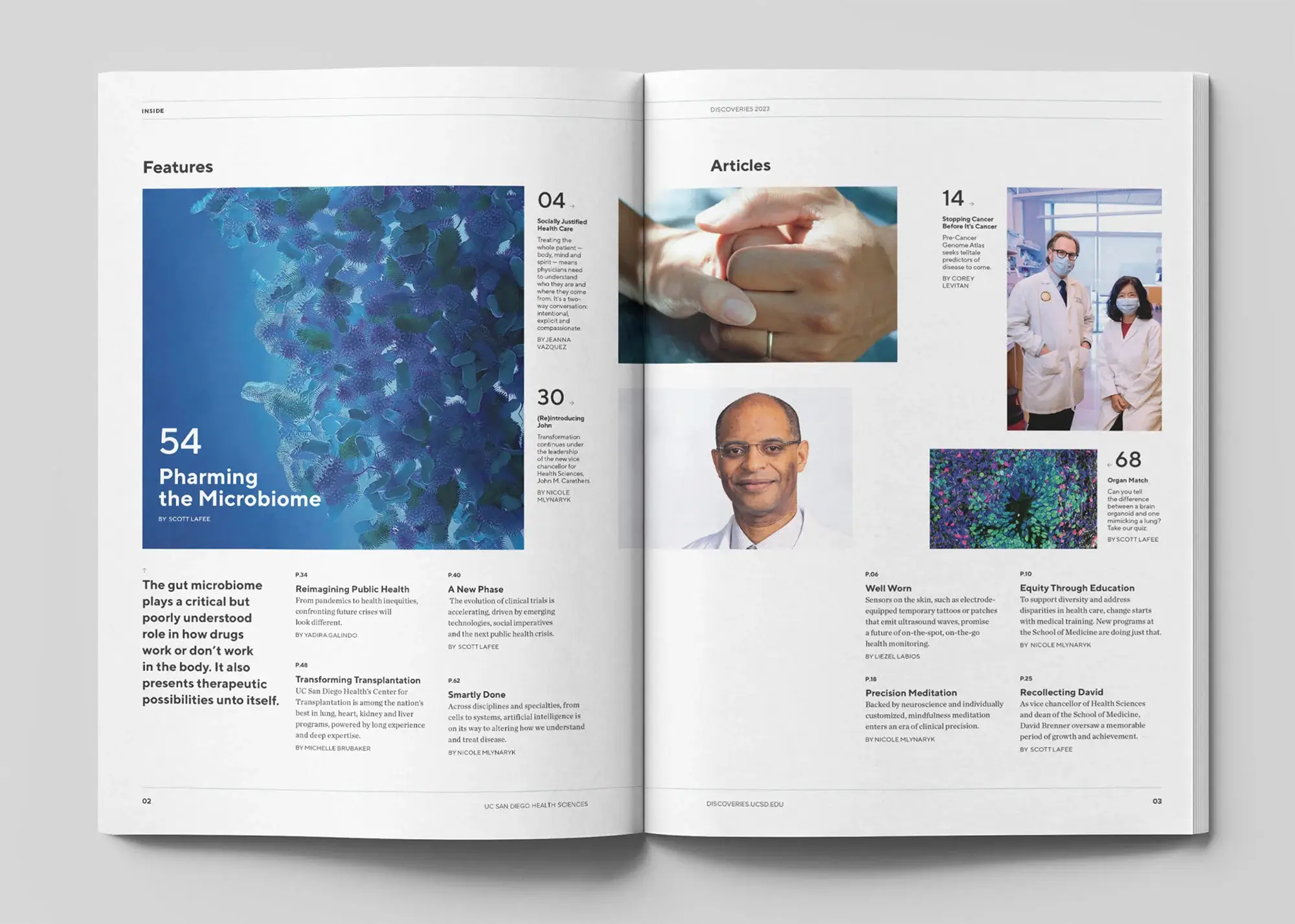
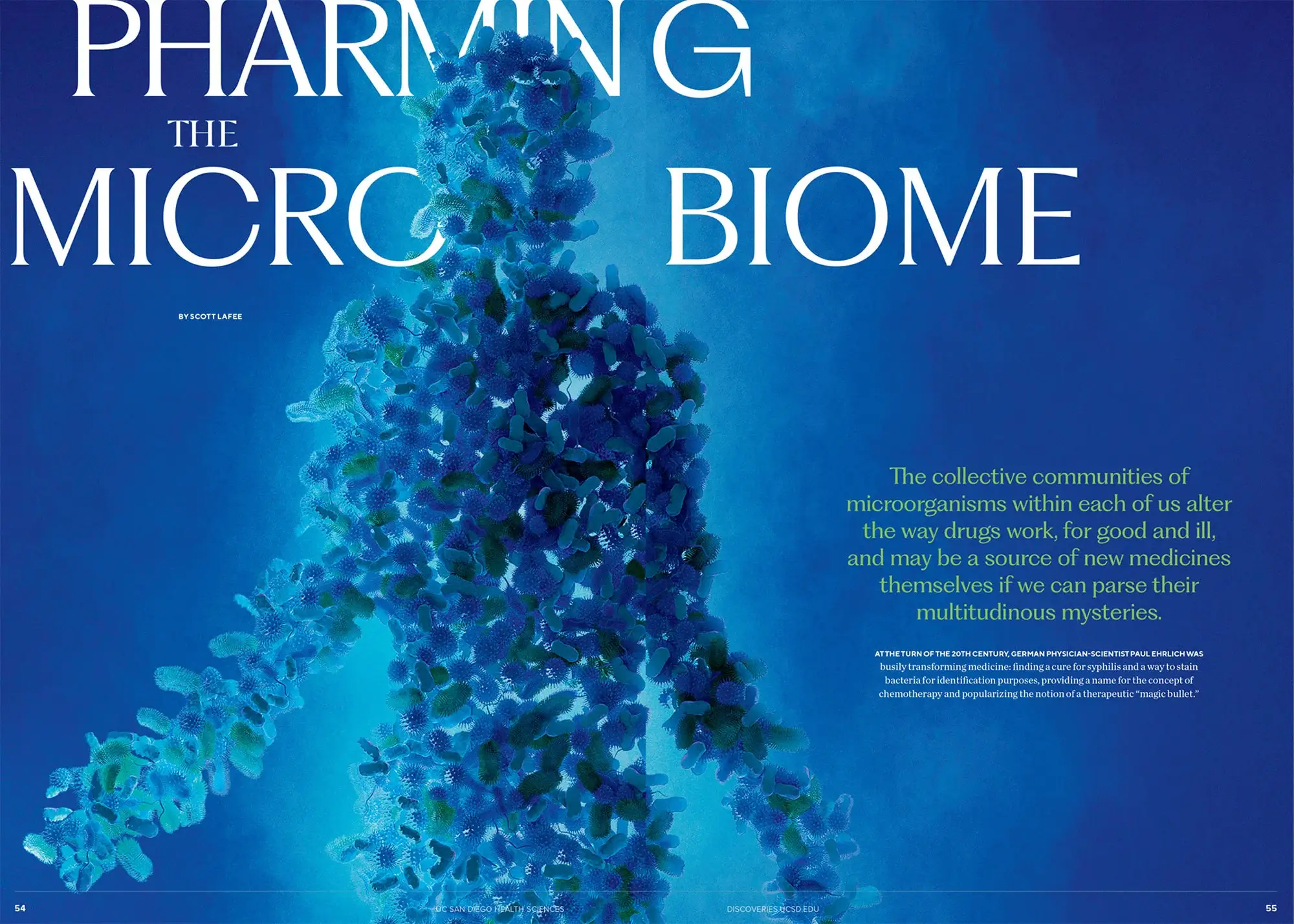
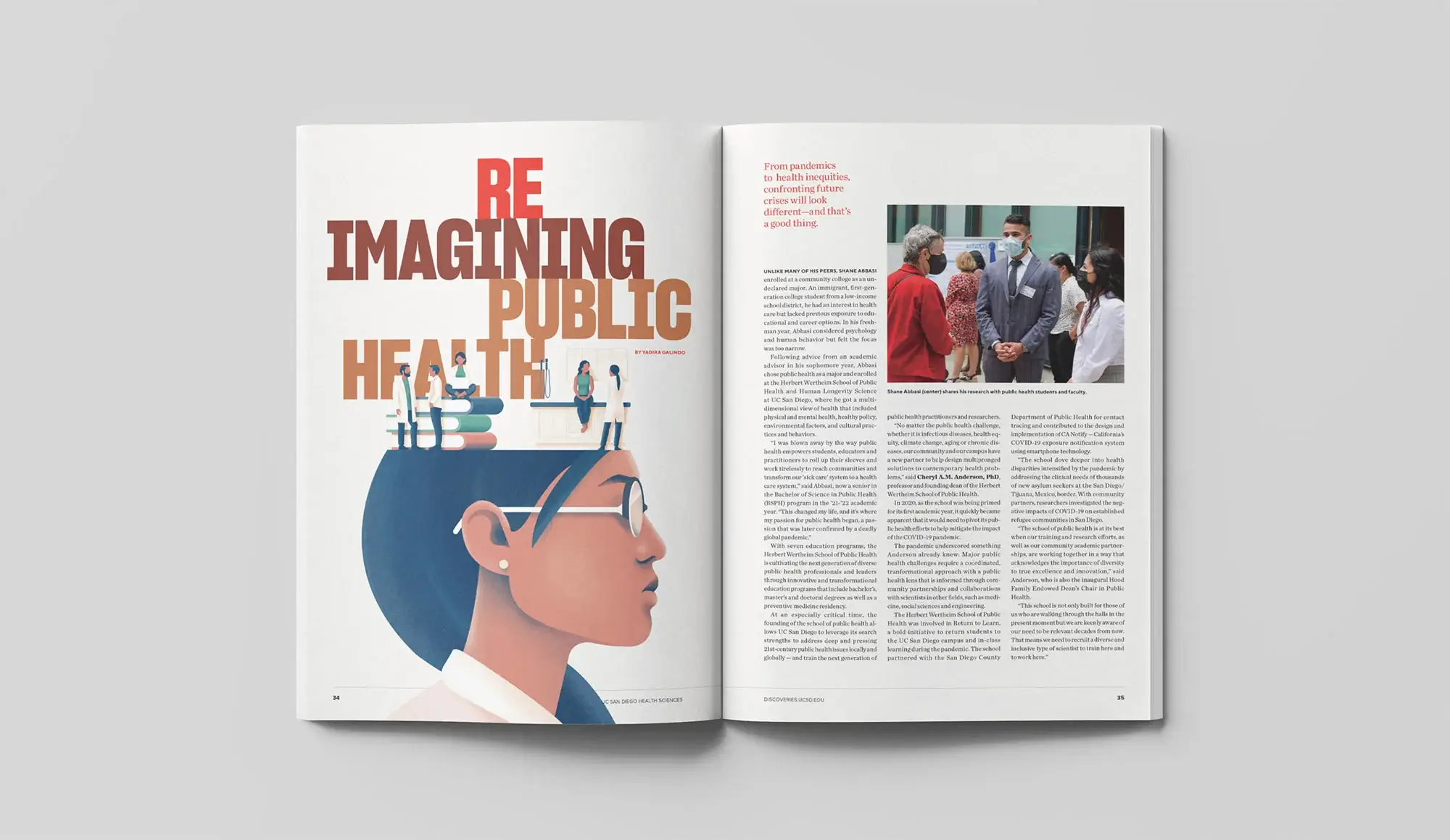
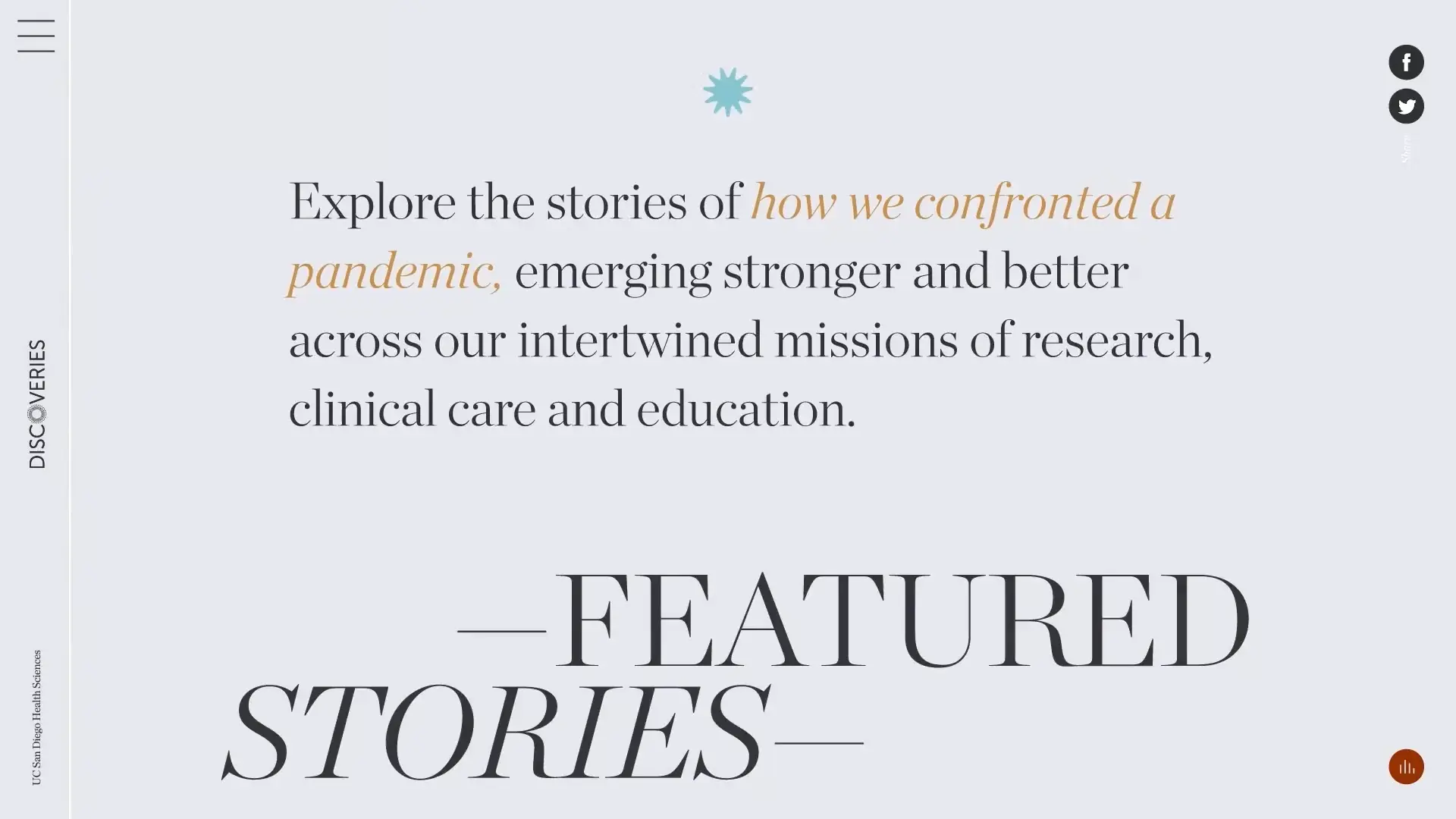
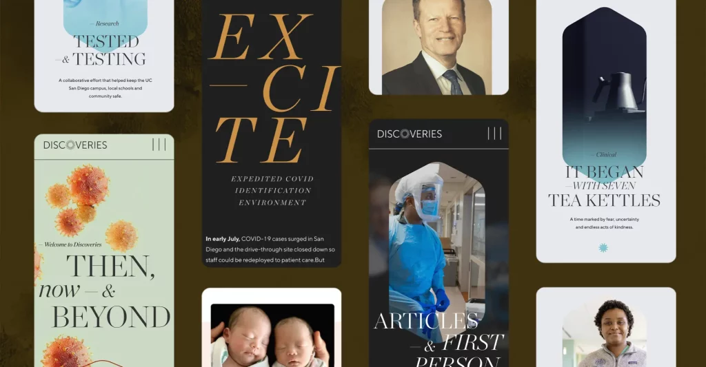
Discoveries, UC San Diego School of Medicine
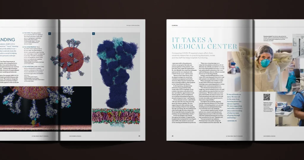
Our longest partnership has been with UC San Diego Health’s Discoveries, starting with a 2011 rebrand. Where early editions used type and image styles more suited for an art magazine, our directive was to create an elite, science-based journal. Our distinct font and article frameworks unified the magazine, and image treatment guidelines allowed for creativity between articles but a consistent feel throughout the book.
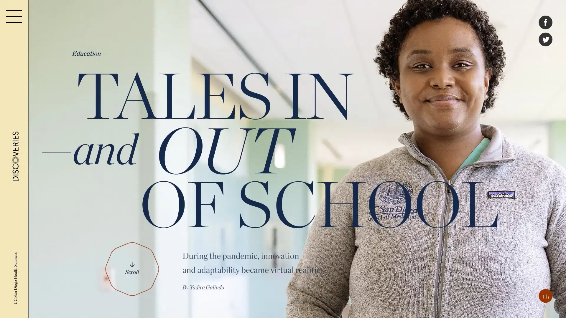
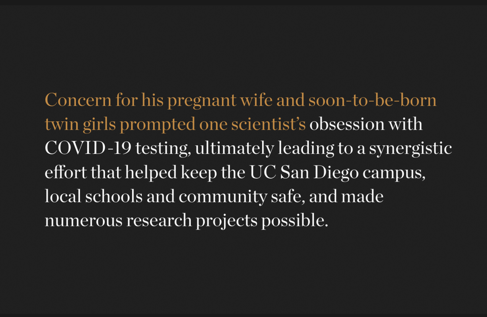
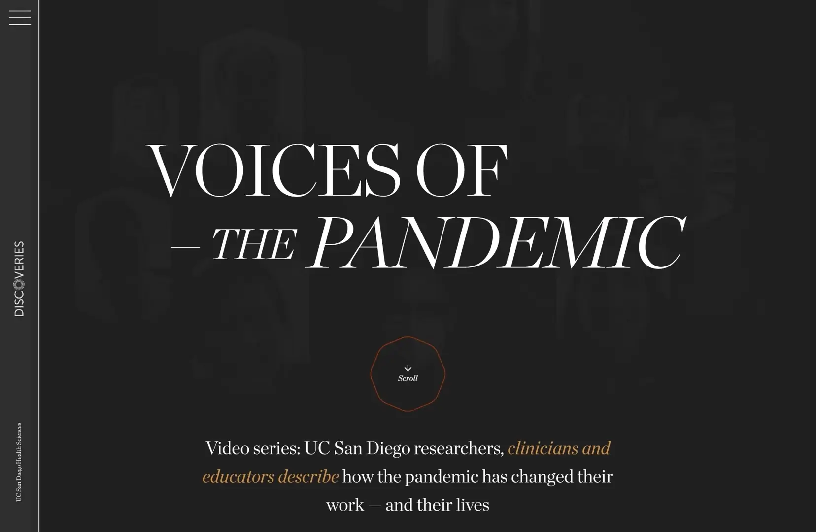
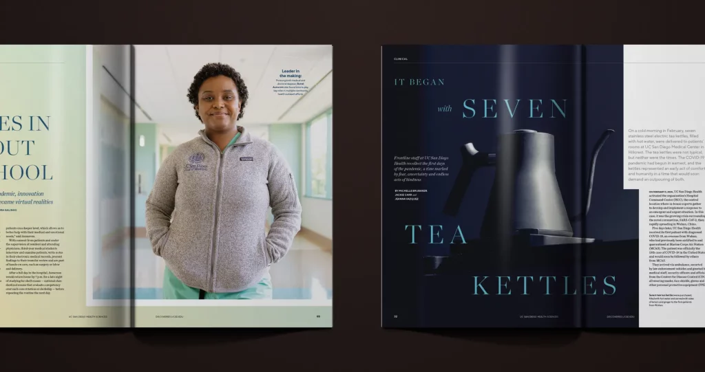
Though the pandemic paused Discoveries’ print cycle, we brought the magazine back with an award-winning print/digital hybrid release—a multimedia retrospective on the university’s vigorous COVID-19 response and the firsthand stories of people who took part.
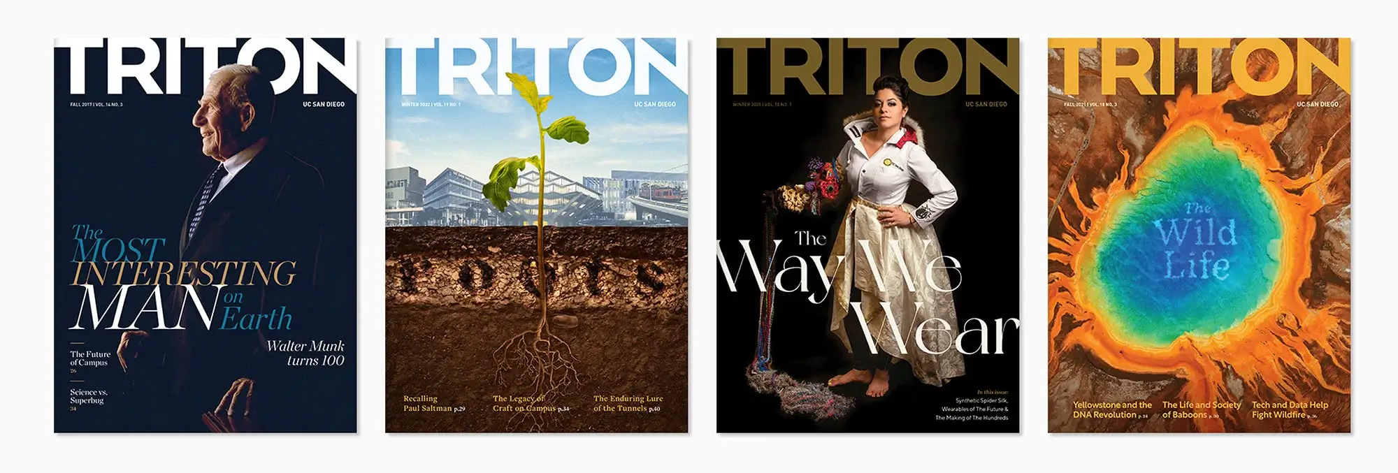
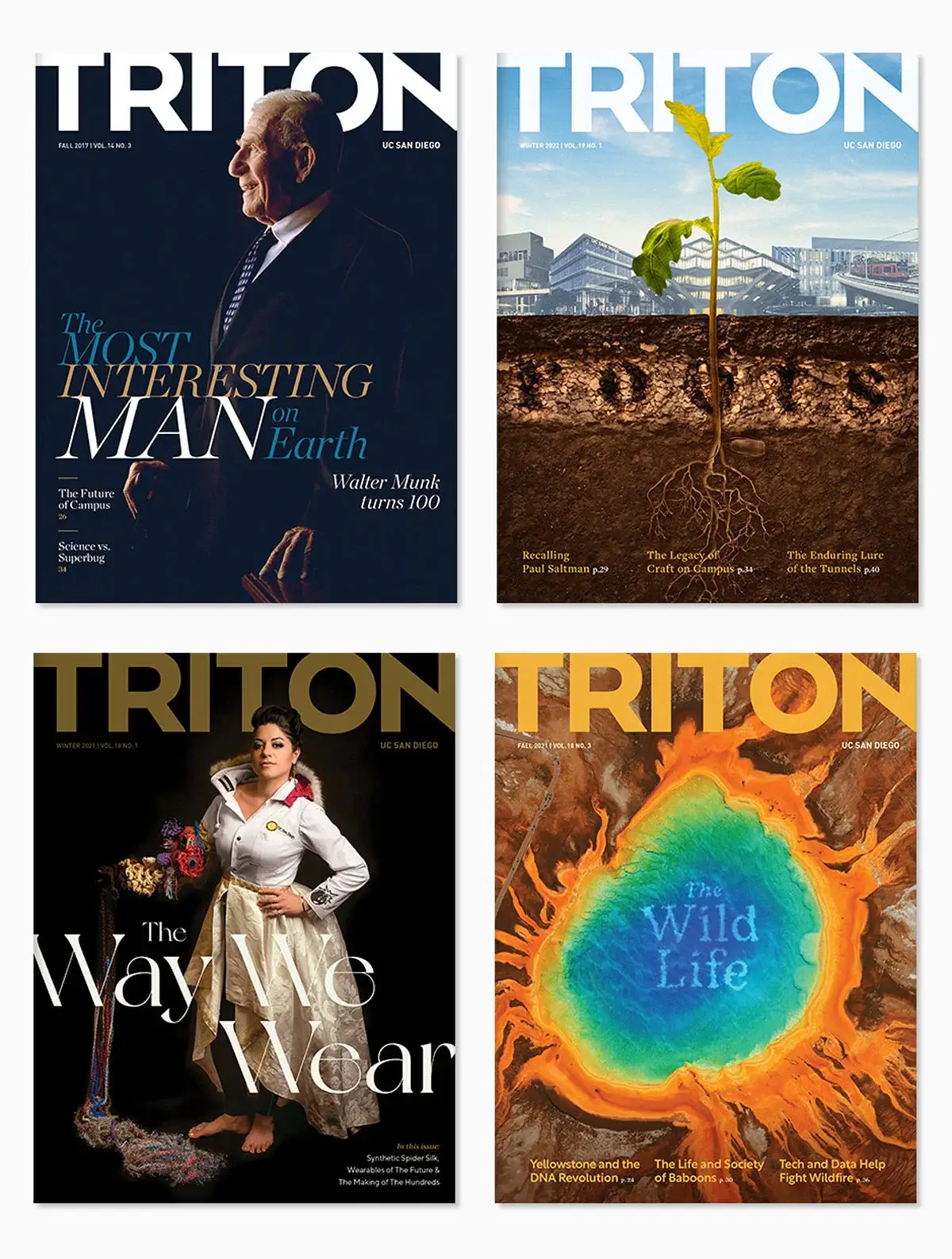
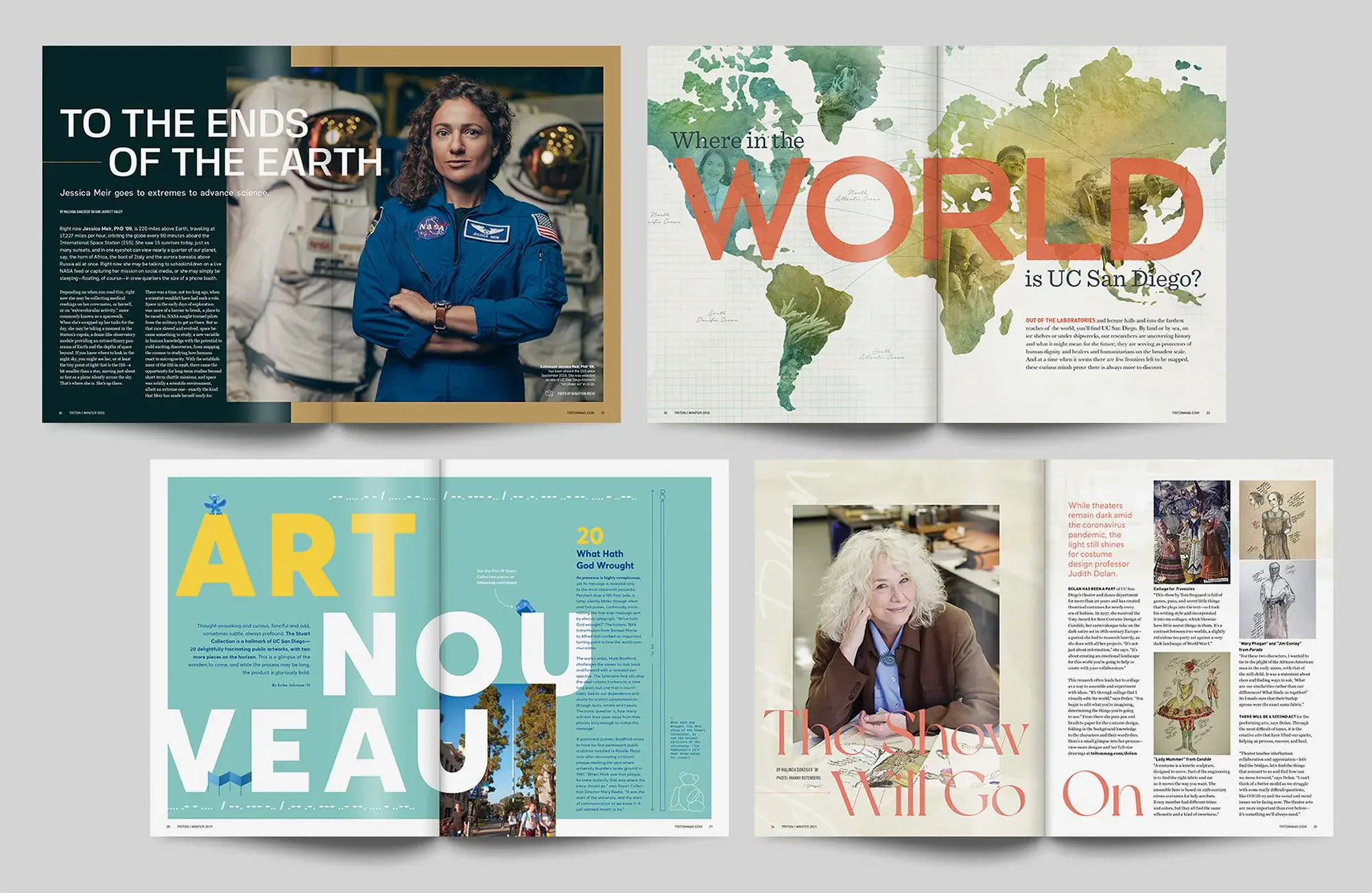
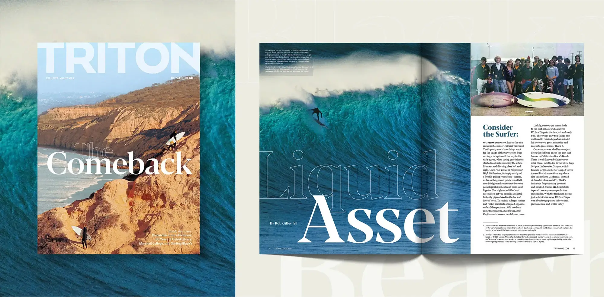
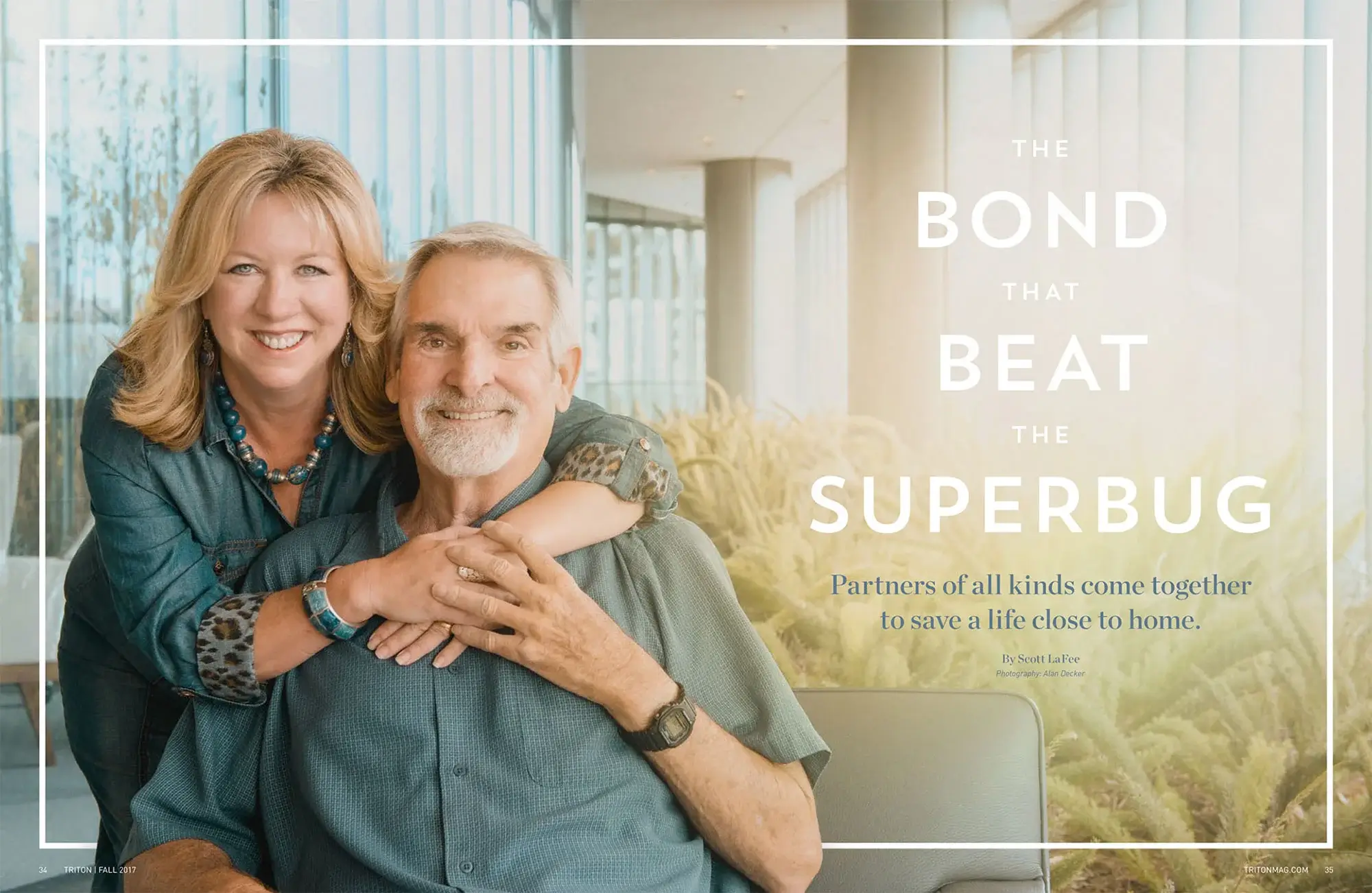
Triton Magazine, UC San Diego Alumni
Triton largely serves UC San Diego’s 200,000+ alumni, but it is also the university’s flagship for deep, rich storytelling. Its redesign was driven by their incoming Chancellor’s desire for a publication that could hold up against anything on a newsstand.
With smart, fun and confident as brand pillars and alumni engagement as the primary goal, Traina helped the editorial team execute truly innovative ways to excite their audience, stretching the very form of a magazine and exhibiting the university’s ethos of “nontraditional” thinking.
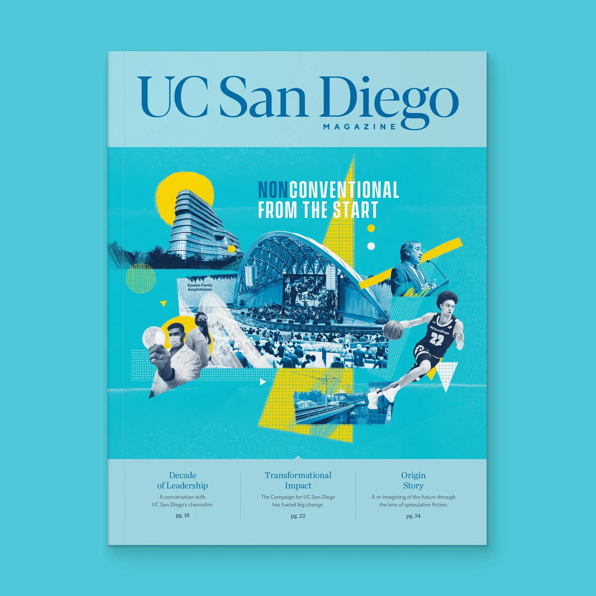
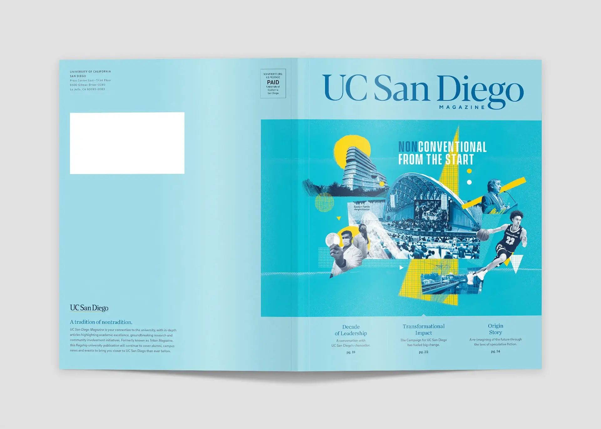
UC San Diego Magazine, UC San Diego Communications
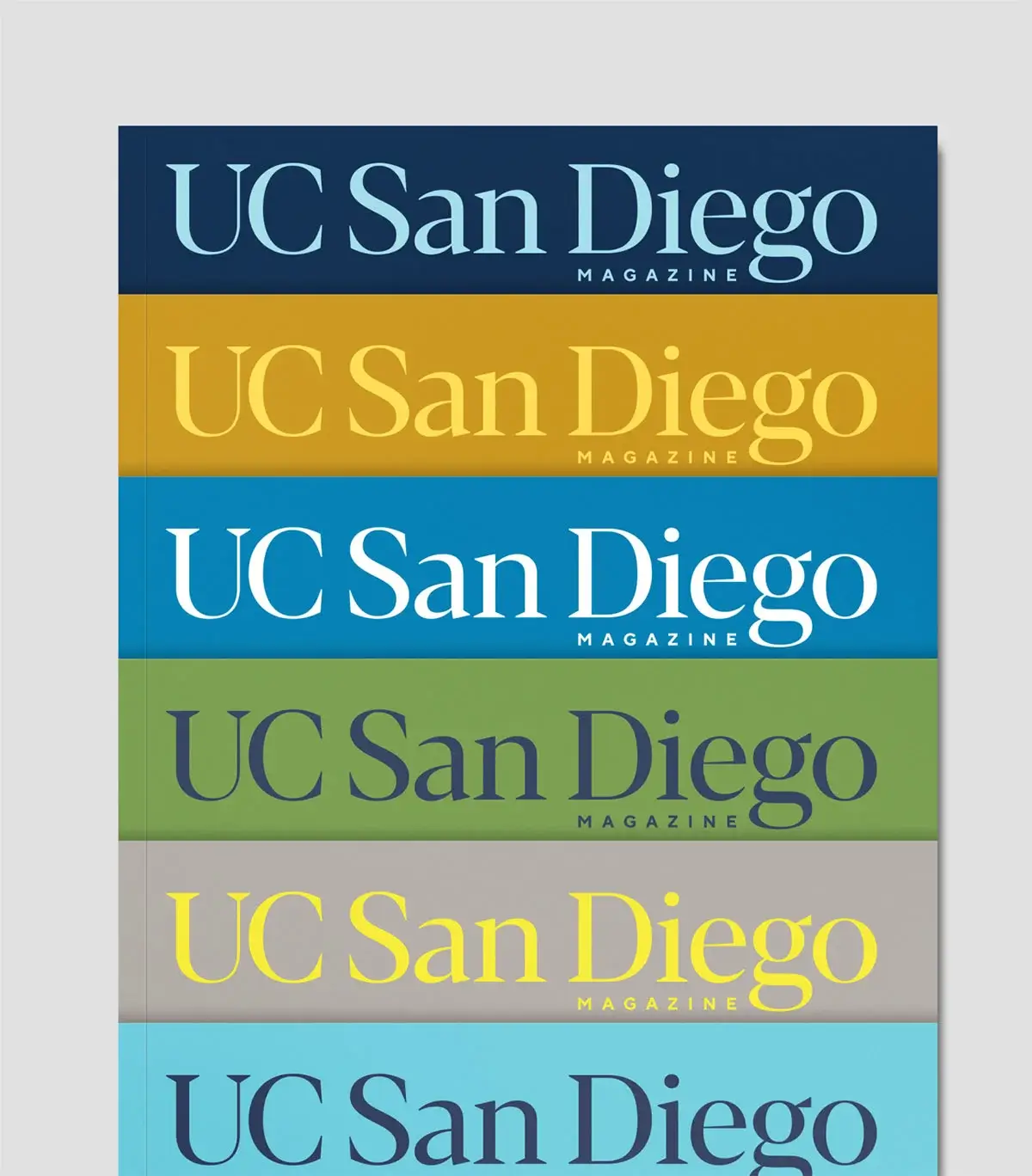
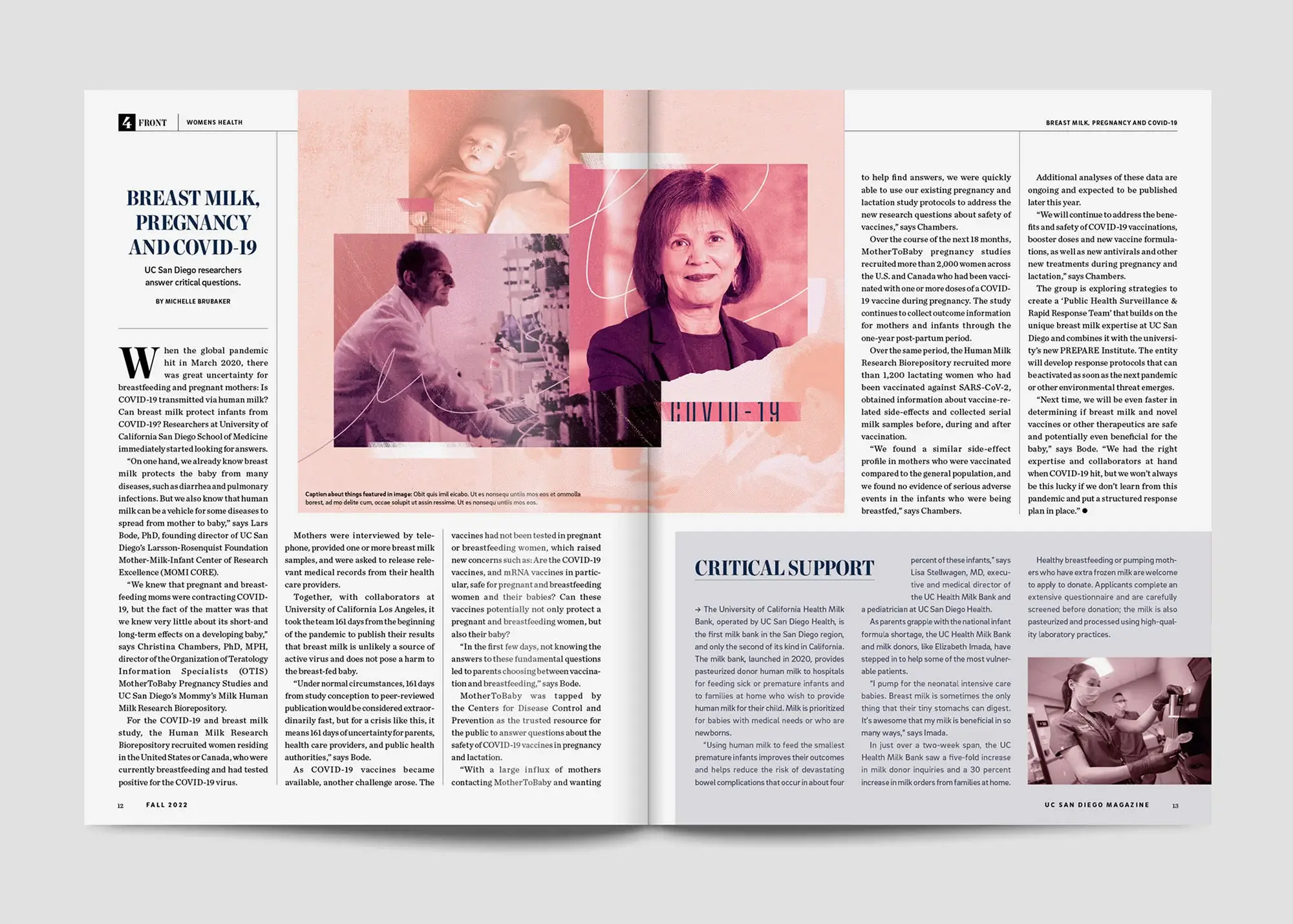
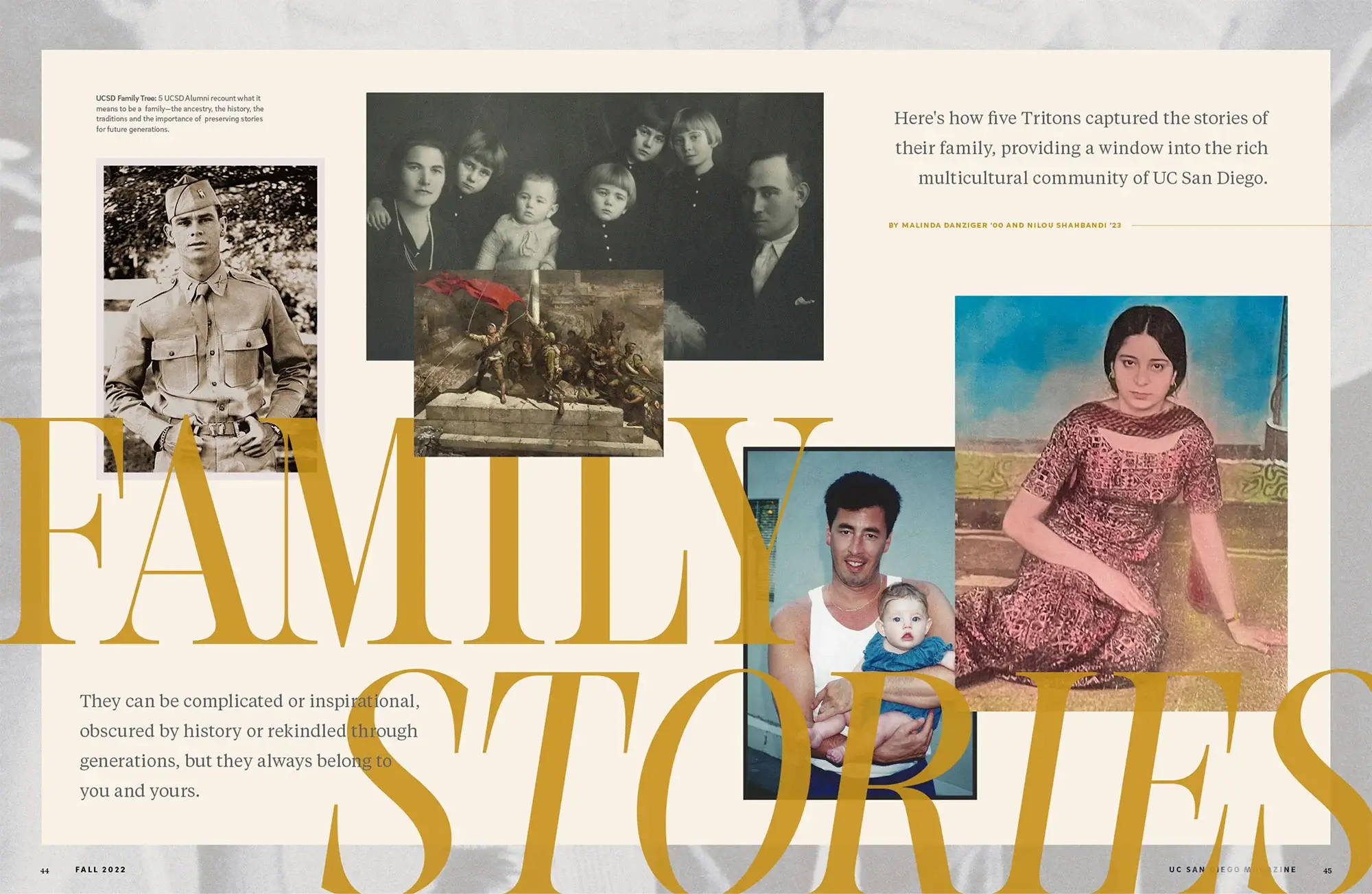
In 2022, Triton shifted departments to University Communications, becoming UC San Diego Magazine—requiring an elevated voice and identity along with a new focus on the prestige and distinction of the university. Traina amplified the sophistication with a cultivated visual system and distinguished layout arrangements.
Where covers were once full-page playgrounds devoted solely to content, our refined cover system balances a window for expression with the institution’s prominence, evoking mood and tone through a spectrum of brand colors.
We paired dignified headlines and textual treatments with a custom illustration style that expands image options, using custom collages to elevate any low-res resources into rich visual stories.
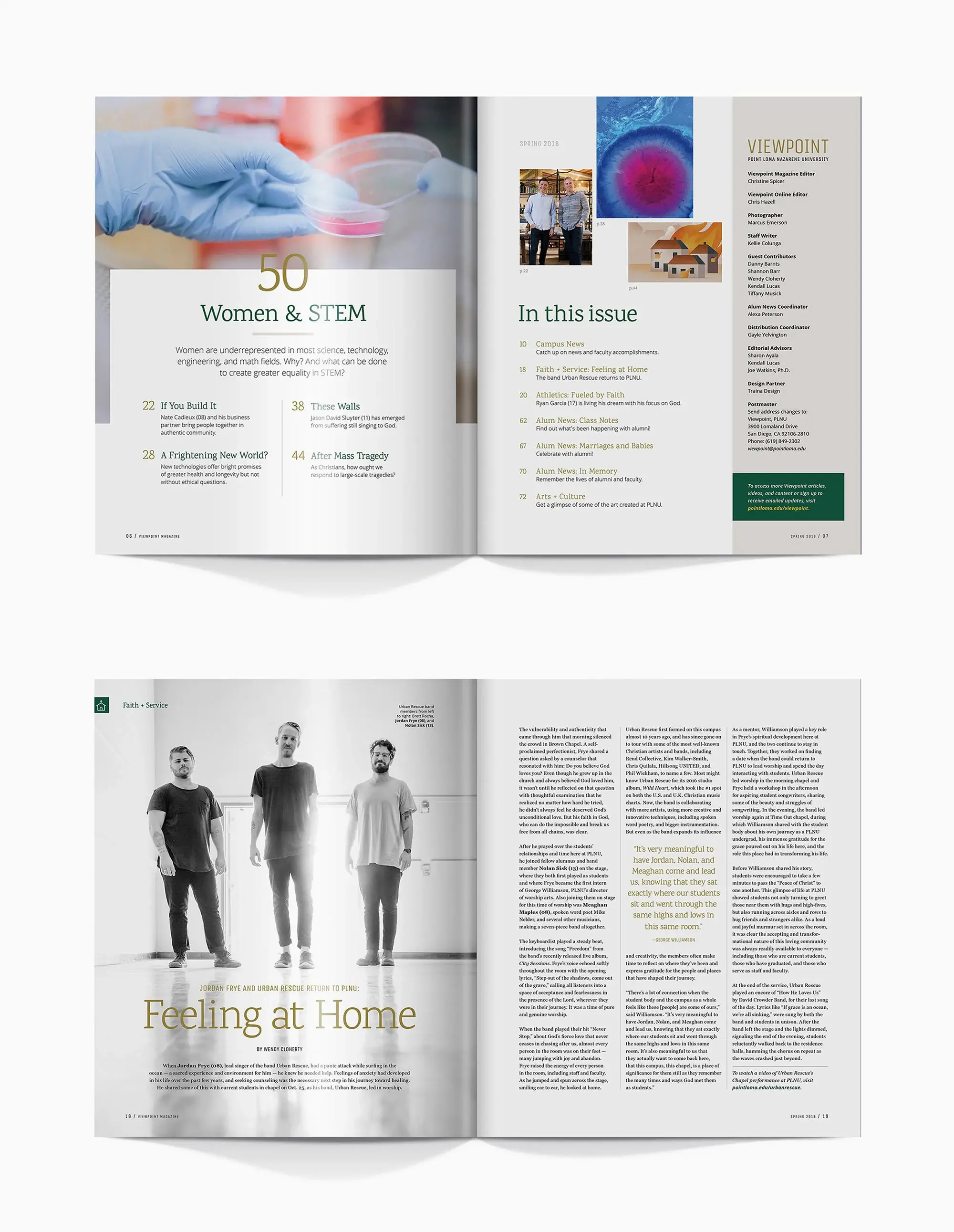
Viewpoint Magazine, Point Loma Nazarene University
Our redesign of Viewpoint brought a new level of collaboration to the production process. We worked with a multidisciplinary team of editors, faculty artists and photographers, as well as design students who would ultimately produce issues following our reimagined release.
We set them up for success by building the book around the team’s natural strengths—impressive imagery and a versatile grid system that provided consistency as well as variety. We were also happy to train their teams in the core design principles of the framework and our thought process behind layout creation.
Ready to partner on your magazine
Whether Traina develops a framework for the future or is a steady partner in production, we knows the ins and outs of the university system and the unique role of publications. With years of experience and a wealth of innovative issues under our belt, we’re here to help magazines explore the character of their university and better connect with their community.
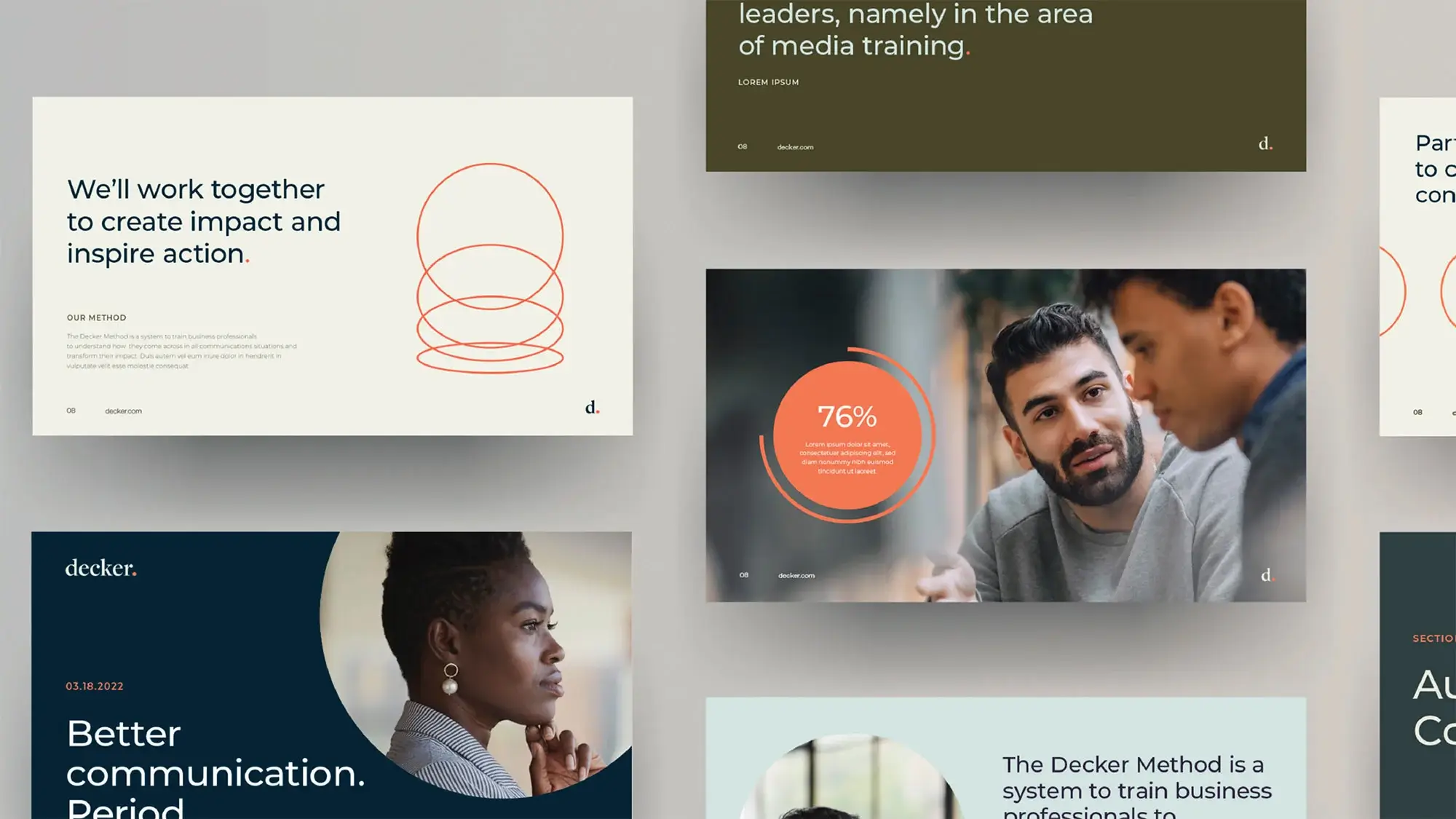
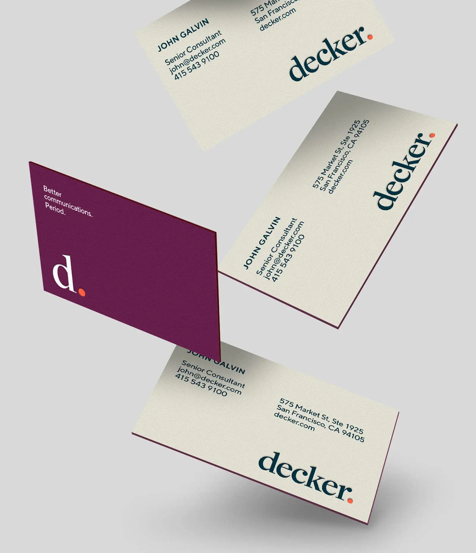
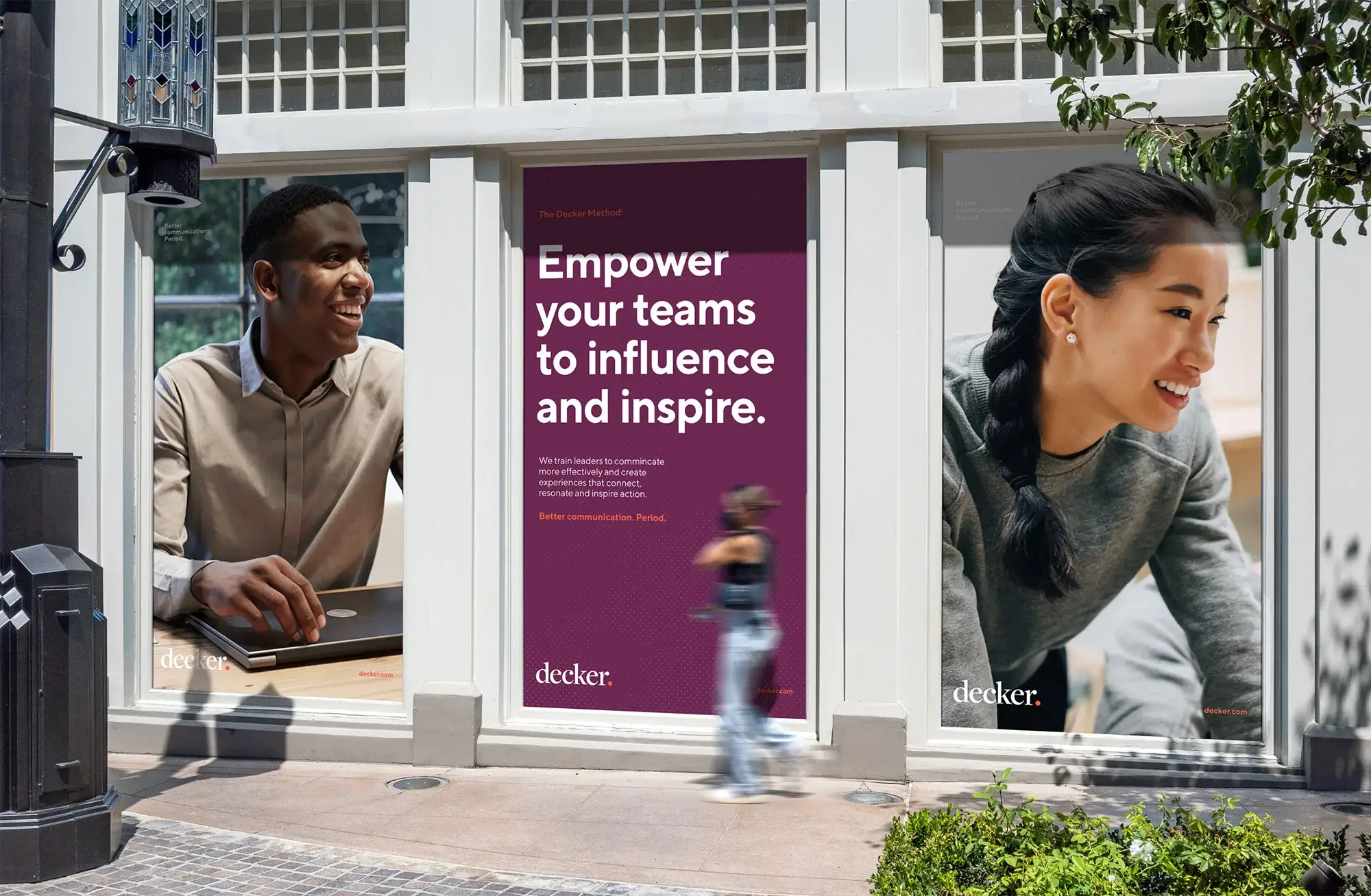
Sometimes a business has profound answers inside itself—it just takes a strategic creative partner to channel them into a brand.
Challenge
Decker is an elite communications consultancy that helps busy professionals become better communicators, yet their brand wasn’t conveying the scale and sophistication of their services.
Solution
Traina put our leadership team through Decker’s executive program, and by understanding their process firsthand, we created an authentic brand built on Decker’s own core principles of communication.
STRATEGY & IDENTITY
About that period.
Effective communication is all about confidence. “I often say we bring out the “backyard barbecue” side of executives,” says Co-CEO Ben Decker, “because there’s no nerves in a backyard. We’re simply ourselves—authentic and confident, telling stories and connecting with those around us.”
Confidence was identified as a brand pillar in our strategy process, which then informed the visual identity. Creative teams captured this quality with the period—a simple, declarative mark that says firmly: This is who we are. This is what we do.
The period was then folded back into the brand’s messaging, illustrating the synergy of Traina and how creativity flows freely between our teams.
DIGITAL EXPERIENCE
Detail benefits, focus audience
How is confidence conveyed in a website? With a clear and direct focus.
Too often websites present a gamut of services upfront, hoping prospective clients will see the one they want. But this “everything for everyone” approach is antithetical to Decker’s main principle of influential storytelling—leading a narrative by detailing what’s in it for your audience.
Decker’s new site begins with clear messaging focused on what clients stand to gain, which flows naturally into the services that deliver those benefits.
Brand photography
Traina curated a library of photos that capture the energy and sophistication of the Decker brand, color-grading selects to align with the brand palette for a cohesive image system.
Content Structure
Convert with clarity.
Traina further restructured and organized Decker’s offerings for clarity and ease. A straightforward calendar framework presents details of courses at a glance, giving viewers all of what they need and none of what they don’t. Or to quote another Decker maxim: “Be quick. Be clear. Be gone.”
Results
With that, what else can be said? Only results: Decker reports double the website engagement and a marked increase in qualified leads. That’s what happens when sound communication meets strategy and design, and clear message is delivered with confidence. Period.
We love our new brand and website, inbound leads have doubled and now come in at a more qualified level than ever before.”
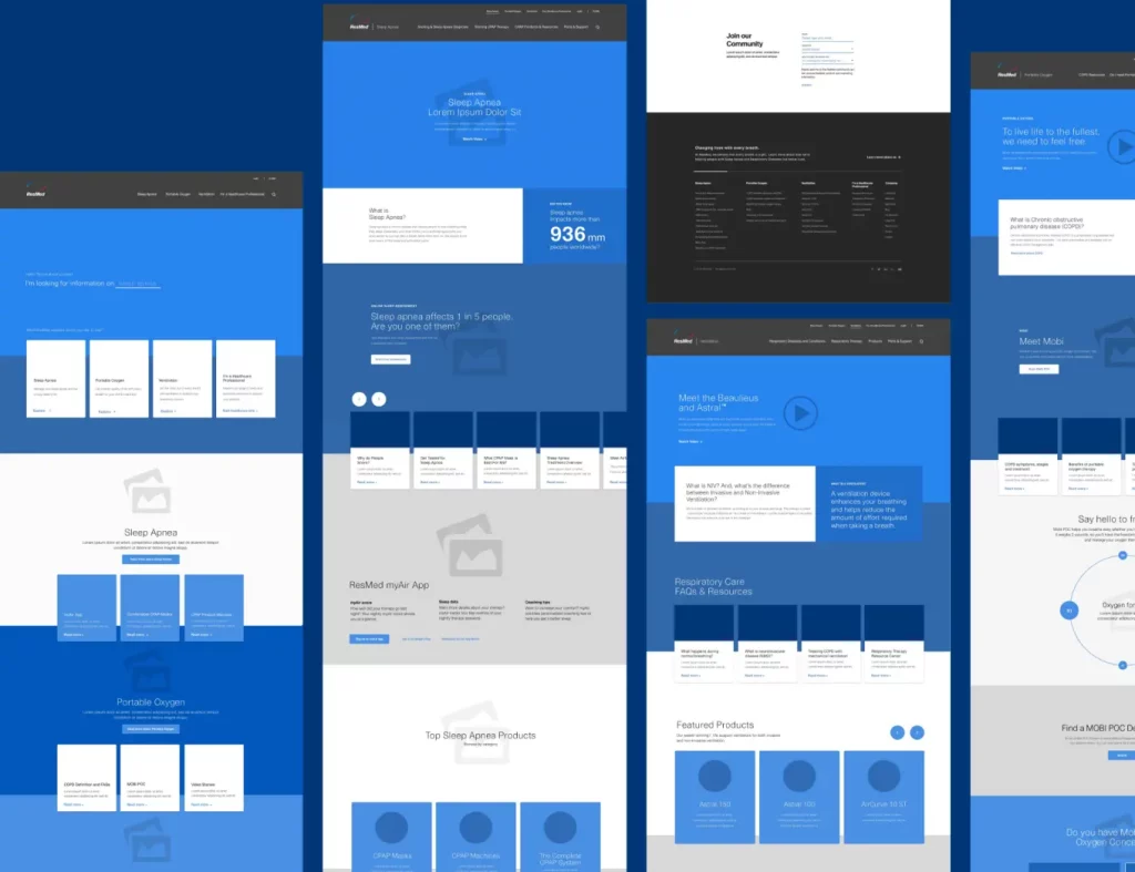
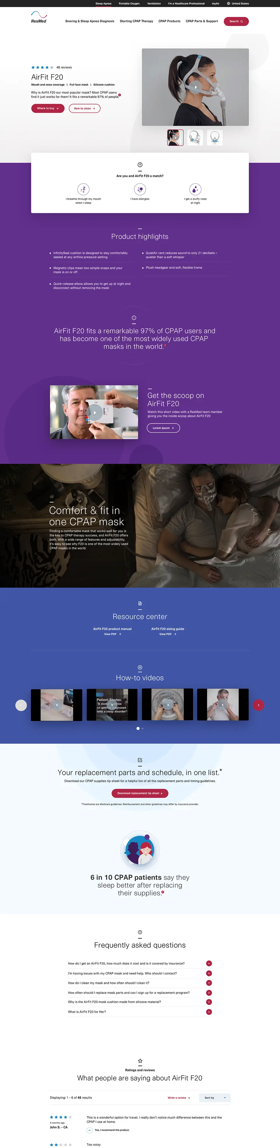
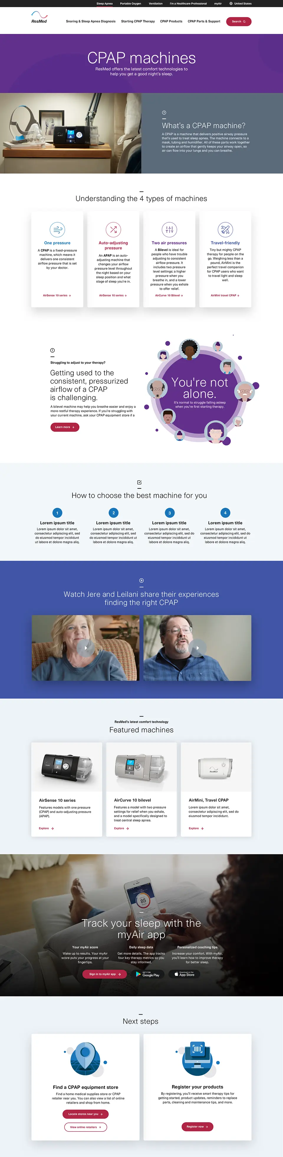
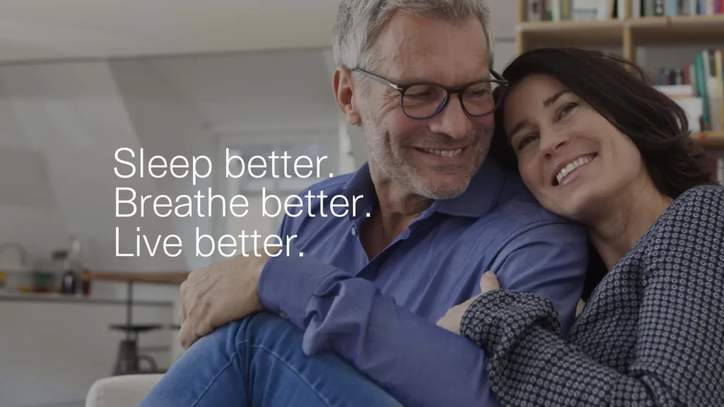
Researching a new diagnosis is overwhelming enough—when it comes to finding the right medical product for a condition, a simplified and approachable user experience is essential.
Challenge
ResMed’s website was receiving over 200,000 visitors per month, but engagement was low and user feedback revealed a general resistance to sleep apnea therapy.
Solution
We designed a digital experience with intuitive user paths and interactive elements that make ResMed a resource in understanding respiratory health and a gateway for life-changing products.
APPROACH
User-centric from the start
A new site map and simplified information architecture eliminated more than 500 extraneous pages from ResMed’s site, creating a focused user experience made personal with interactive questions.
From there, the journey flows through product pages, customer reviews and immersive videos to guide users to what they need.
Personas inform UX
Where ResMed.com was once an expansive, Amazon-like experience of related products, we used site analytics to tailor distinct content flows for user personas.
A majority of personas begin by seeking information, so we developed illustrations and interactive tutorials to explain respiratory conditions along with how ResMed’s products work. These additions turn a previously clinical experience into a friendlier, less intimidating way to incorporate respiratory therapy into one’s life.
This work has been extended throughout the brand experience, enhancing additional digital tools, instructional videos and many other user touchpoints.
RESULTS
In the end, our collaborative effort with ResMed applied research, strategy and streamlined design to deliver an engaging user experience for all those seeking to breathe easier.
Going direct to consumer means understanding customer desires and building a brand experience around them. This needs expertise across the brand landscape—not just in a particular niche. That’s Traina’s advantage.
Challenge
Fulgent Genetics wanted to tap into the high margins and growing market interest in direct-to-consumer genetic testing, so they needed a brand that balanced scientific standards with mass-market approachability.
Solution
We leveraged our strengths in biotech and mastery of the CPG space to create a warm, approachable brand from end to end—executing market analysis and strategy, naming and identity, along with creating a digital experience and physical packaging.
STRATEGY & NAMING
Out of several potential markets, our research revealed parents and parents-to-be having the most defined need for at-home genetic testing for family planning. But we strategized a brand architecture that could expand easily for future applications.
This informed our naming process, with the name Picture evoking insight into one’s health, but also turning into active tense when paired with products: Picture Parenting, Picture Wellness, Picture Newborn—the name invites a vision of your future.
BRAND SYSTEM
Our extensive market research uncovered that Picture’s target market of Millennials designed a test as kind and knowledgeable as a primary care provider, with the convenience of an at-home experience.
Bespoke logo
A hybrid sans-serif and script logo combines a warm, handwritten intimacy with a clean and modern style.
Custom photography
The custom photo library we produced defines the warm and inviting personality for the brand and relates an easy experience for digital users.
Insta-worthy packaging
This feeling of welcome carries through to the unboxing experience, with elegant and intuitive packaging that is friendly and shareable.
Customers have praised the brand and the packaging, calling it clean, modern and welcoming.”
Becky Tsai, PhD, product and marketing manager
RESULTS
The Picture brand has given Fulgent Genetics a whole new revenue stream that is infinitely expandable for future product offerings. Traina proudly continues our work with Picture, branding new lines of testing products and framing the future for this next-level laboratory.
Form follows content. And when the content is as unprecedented and impactful as pandemic response, it calls for an innovative form that can show that impact firsthand.
Challenge
After a year-long hiatus, UC San Diego Health Sciences’ Discoveries magazine wanted to immerse their audience in a year of momentous clinical efforts using multimedia to capture stories from all sides of the response.
Solution
We brought print and digital together to tell the comprehensive story of UC San Diego and COVID-19: from caring for the first evacuees from Wuhan to the ongoing fight against variants. An elevated online experience became a living document of this watershed moment in healthcare.
A gatefold timeline in print comes alive digitally as an interactive infographic.
APPROACH
Design and development
Collaboration between Traina’s creative team and our digital developers brought out a cohesive visual language, with web and print sharing design and structural elements along with typographical treatments rarely seen on a website.
“Digital and physical are not distinct brand experiences anymore,” says chief creative officer, Mark Gallo. “Digital can elevate stories with video, audio and motion, and it can be informed by print design. Each can enhance the other.
Rich media immersion
Our digital medium allowed for new storytelling methods, with introductions that read themselves or pull quotes that become full audio and video narratives, capturing the emotional impact felt on the front lines.
Voices from all levels and all areas of the institution are reflected in the issue, designed to be personal and dive deep into narrative.
UTILITY
Changing times need responsive media
Our project kicked off just as the first COVID-19 variants were starting to appear, and as the saga was still unfolding, a dynamic format was necessary. We built the site to be easily updated and allow seamless access to analytics. From just this one issue, it was determined that thousands more viewers were able to explore Discoveries’ content than via traditional print distribution.
DISTINCTION
Print has a purpose
For all the innovations of the online experience, the printed form has an undeniable prestige. Physical magazines have longevity in the home, and establish an unrivaled intimacy and sense of belonging with the reader.
Essentially a compendium of the pandemic, this issue was designed much like a collectible, a document worth keeping for posterity. For instance, a striking gatefold timeline details UC San Diego’s vigilance throughout the pandemic both in print and online.
The project overall earned many accolades, including a gold award in the 2021 Finest Awards from the Health Care Communicators of Southern California, and several One Awards from the One Club for Creativity.
Form follows content
The essence of Discoveries magazine is showing how an academic health system can work in a truly integrated way. The hybrid form suits this mission perfectly, demonstrating how research, clinical and educational enterprises came together in a historic moment for humanity.
Construction comes with a host of associations: namely delays and headaches. But a refined brand can defy that impression and put a company’s character front and center.
Challenge
Align Builders specializes in technical construction—precision projects for healthcare, higher ed, science and tech. Their brand had to show high-caliber clients how they do it differently.
Solution
We elevated Align’s brand experience with clear strategy, messaging and design, and brought it all to life with a digital experience like no other builder.
INSIGHTS
Start with a strong foundation
Align’s goal was to redefine what clients should expect from a builder: 100% alignment at the outset, transparency throughout the job, and client involvement from start to finish. These qualities became cornerstones for messaging that inspires confidence and conveys what the client will experience: more clarity, greater insight, and less chaos—the Align Way.
Be your difference
Such qualities are the heart of a web experience showcasing their expertise and client-first ethos. A flexible grid system keeps laser focus on alignment and balance, while moving elements convey a page being built in real-time to exacting specifications. It’s a digital experience worthy of Align’s tagline, Building Together.
Sweat the small stuff
Align’s refined logo is complemented by a profound shift in color palette—from safety orange to sophisticated gold, evoking a brand that is less work-in-progress and more finished product. Serif fonts and large typographic features also serve as a visual cue that their approach and experience is informed by thoughtful design.
RESULTS
Built for building
Align’s new brand has resonated throughout the company. “Everyone seems to connect with our new look and voice,” says Align’s marketing director, Melissa Weinberger. “Our employees are proud to share the website and excited to feel the positive effects of leveling up our external presence.”
In a world gone hybrid, the better a virtual experience, the higher the bar for real-life offerings. And vice-versa—that’s the rub. The entire event game has to rise.
Challenge
Degreed is the premier workforce learning platform used by Fortune 500 companies across the globe. With the post-pandemic return of its LENS Conference, corporate leaders were eager to see what a hybrid event would look like.
Solution
Our physical and digital assets made for a world-class conference no matter the medium—a learning experience not just for attendees, but any company hoping to bridge the in-person and virtual experiences.
INSIGHTS
Place matters, even online
The event was held in Los Angeles, so it was imperative that virtual attendees got an equal feel for the city. Our art-deco visuals of L.A. monuments made perfect use of Degreed’s brand color palette, and animation brought the art to life online, putting the SoCal scenery front and center in the virtual conference experience.
Remote access raises in-person stakes
No in-person attendee should ever wonder, Why did I come all the way out here, when I could be on my couch? We made that answer obvious from the first impression and throughout the conference experience, with multiple physical installations to amplify the event’s scale.
IMPLEMENTATION
The medium is the message
Physical events engage physically—virtual, virtually. If it sounds simple, it is. But not so simple as using the same tactics in both spaces. Both experiences may use the same keynotes and breakout sessions, but all around those elements are unique opportunities to connect, inspire and move people.
In real life, we used elements like real palms integrated into the stage design and a live muralist to add dynamism to the atmosphere. Virtually, in between live-streamed speakers and sessions attendees participated in gamified surveys and feedback questions to earn branded items.
RESULTS
Everything you touch turns to goals
Degreed’s hybrid event doubled the conference’s pre-pandemic numbers, with a marked surge in virtual attendance. Such success bodes well for conferences as the world returns to real life, and as the leader in workforce education becomes a pioneer in hybrid events.
The campaign has generated back everything we put into it, and not only the investment with this team. We believe when all is done, we will do 40 times the investment.”
Lauren Lochtefeld, director of field marketing
Attendance
54M
Total in-person & On Air opportunity pipelines prospects
This website uses cookies to ensure you get the best experience.
Functional
Always active
The technical storage or access is strictly necessary for the legitimate purpose of enabling the use of a specific service explicitly requested by the subscriber or user, or for the sole purpose of carrying out the transmission of a communication over an electronic communications network.
Preferences
The technical storage or access is necessary for the legitimate purpose of storing preferences that are not requested by the subscriber or user.
Statistics
The technical storage or access that is used exclusively for statistical purposes.The technical storage or access that is used exclusively for anonymous statistical purposes. Without a subpoena, voluntary compliance on the part of your Internet Service Provider, or additional records from a third party, information stored or retrieved for this purpose alone cannot usually be used to identify you.
Marketing
The technical storage or access is required to create user profiles to send advertising, or to track the user on a website or across several websites for similar marketing purposes.